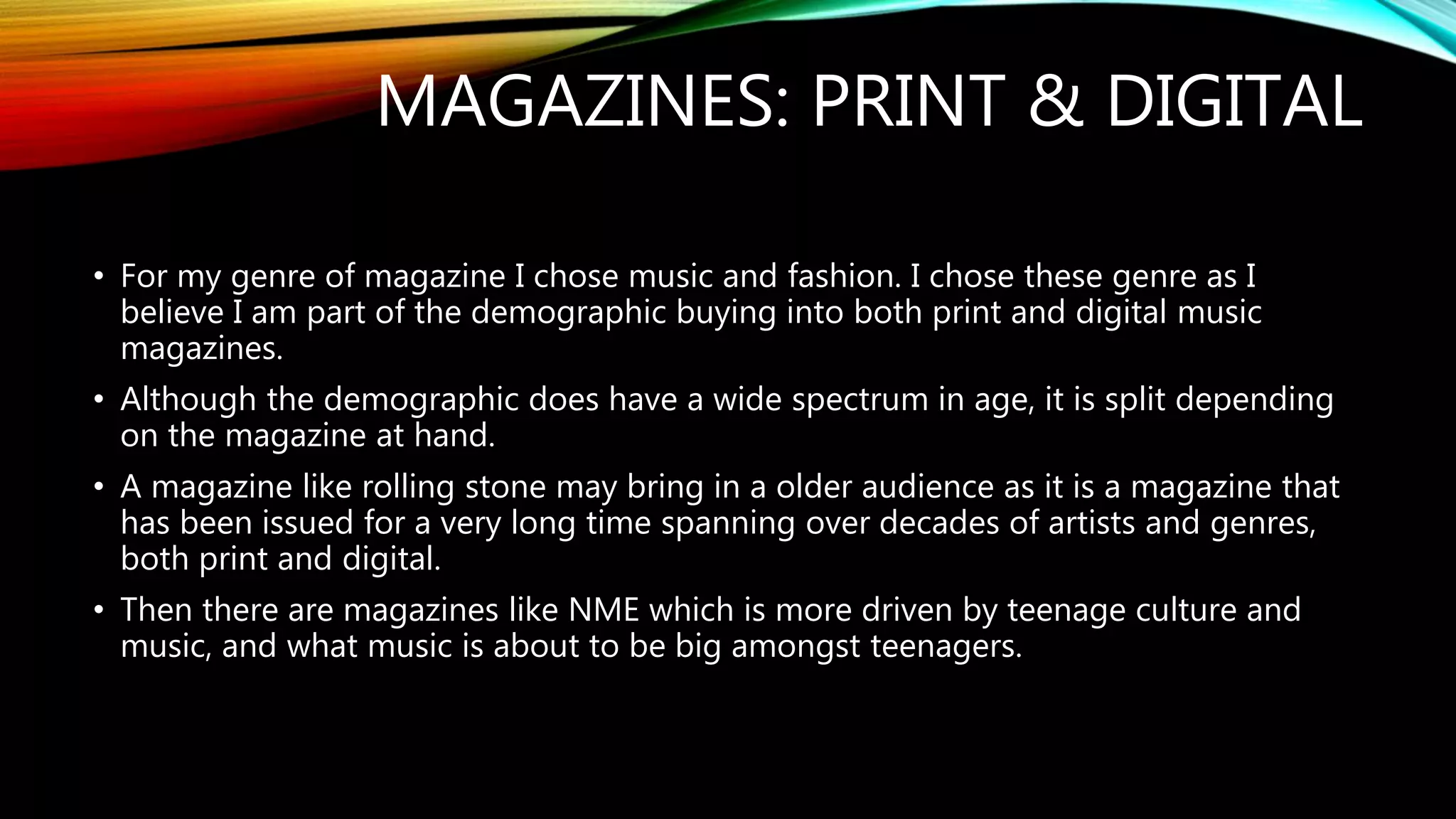
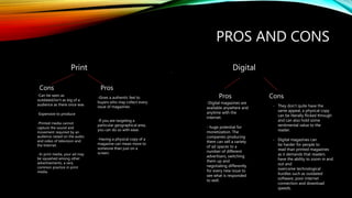
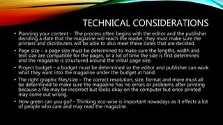
MAGAZINES: PRINT & DIGITAL
• For my genre of magazine I chose music and fashion. I chose these genre as I
believe I am part of the demographic buying into both print and digital music
magazines.
• Although the demographic does have a wide spectrum in age, it is split depending
on the magazine at hand.
• A magazine like rolling stone may bring in a older audience as it is a magazine that
has been issued for a very long time spanning over decades of artists and genres,
both print and digital.
• Then there are magazines like NME which is more driven by teenage culture and
music, and what music is about to be big amongst teenagers.
PROS AND CONS
Print Digital
Cons Pros
-Can be seen as
outdated/isn’t as big of a
audience as there once was
-Expensive to produce
-Printed media cannot
capture the sound and
movement required by an
audience raised on the audio
and video of television and
the Internet.
--In print media, your ad may
be squashed among other
advertisements, a very
common practice in print
media.
-Gives a authentic feel to
buyers who may collect every
issue of magazines
-If you are targeting a
particular geographical area,
you can do so with ease.
-Having a physical copy of a
magazine can mean more to
someone than just on a
screen.
Pros Cons
.
-Digital magazines are
available anywhere and
anytime with the
internet.
- huge potential for
monetization. The
companies producing
them can sell a variety
of ad spaces to a
number of different
advertisers, switching
them up and
negotiating differently
for every new issue to
see what is responded
to well.
- They don’t quite have the
same appeal, a physical copy
can be literally flicked through
and can also hold some
sentimental value to the
reader.
- Digital magazines can
be harder for people to
read than printed magazines
as it demands that readers
have the ability to zoom in and
out and
overcome technological
hurdles such as outdated
software, poor internet
connection and download
speeds.
TECHNICAL CONSIDERATIONS
• Planning your content - The process often begins with the editor and the publisher
deciding a date that the magazine will reach the reader, they must make sure the
printers and distributers will be able to also meet these dates that are decided.
• Page size – a page size must be determined to make sure the lengths, width and
text size are compatible for the pages, or a lot of time the size is first determines
and the magazine is structured around the initial page size.
• Project budget – a budget must be determined so the editor and publisher can work
what they want into the magazine under the budget at hand.
• The right graphic files/size – The correct resolution, size, format and more must all
be determined to make sure the magazine has no errors or problems after printing
because a file may be incorrect but looks okay on the computer but once printed
may come out wrong.
• How green can you go? - Thinking eco-wise is important nowadays as it effects a lot
of people who care and may read the magazine.
Print - Front
Here I have a issue of GQ Australia covered by Kendrick Lamar, GQ is a very established
publication and has been around since the 1930s, and its Logo/font is iconic and instantly
recognizable, this is why they don’t have too much going on in the masthead. There tag lines
‘Gentlemen's quarterly’ and ‘sharper. Smarter. Better.’ tells the reader this is a quarterly released
magazine and has modernized and kept with the times of its newer magazine rivals. The cover is
very straight to the point it is downplayed and features a grey/white colour scheme with Kendrick
Lamar's face being the main focus point, even though this is a ideally fashion magazine Kendrick is
dressed down, in a grey t shirt and grey hoodie. Kendrick is perceived as a very humble person
and tends to stay away from most the flashy lifestyle other rappers base their image off. The
lighter colour scheme could also have been put in place to contrast with Kendrick being black, he
takes much pride in this and a lot of the themes in his music are black orientated and he loves to
lift up the black community in anyway he can often diving into deep politic issues in his music.
Underneath His name we have ‘Poet, Pulitzer-winner, genius’ this keeps up with GQs classy
sophisticated themes and also holds Kendrick to a high regard setting him aside from other artists
by receiving such an award like the pultizer. The sell lines of this cover appeal to the typical
readers of this magazine like ‘The big style issue’ ‘Killer trends, watches, shoes and more’ the
typical readers of this magazine would be considered ‘aspirers’ and ‘suceceders’, aspirers are
young and hungry for success so reading a magazine like GQ which covers successful and wealthy
people as well as business and style is perfect for them and a succeeder may already be
established in his field but wants to stay up to the times with style and business so buys into GQ
to do so. There is also a sell line reading ‘losing streak, AFLs hidden gambling crisis’ which covers a
sporty demographic who may also be buying into this magazine as they cover sporting issues and
controversies as well as general health, well being and diet. The bar code here is not visible as its
displayed on the back of the magazine, I think this is to keep the cover from getting too messy as
the whole aesthetic of GQ is its clean and sleek look. The social grade of those buying into GQ
would be lower-middle class to upper-middle class men as these are men who are established in
their career and fields but want to keep up with the current times and trends to improve their
selves anyway they can. GQ Is available in most big stores that sell magazines and also for delivery
upon subscription, so it is no task to find a ssue for the reader, and they may even stumble across
it without looking.
Drop capital, this is used to
mark the start point of the
body of the article. The drop
capital really brings emphasis
to the beginning of the
interview, like something
important is about to take
place and you must pay
attention.
Main/
Dominant
image – this is the main image as it is the artist being
interviewed in then picture, he has his arms crossed
and is looking at the camera, the lighting is very
subtle and played down, this shows the image is
straight to the point and is just a introduction to the
artist.
Quotation/summary Gives insight into what the interview will cover. This
particular quote will draw the reader into the main article as it shows a nervous
side of Cudi which some people may not even think he has seen as how big of a
celebrity he is. It also mentions Jay-Z, another huge celebrity who also makes rap
music, so is interesting to the reader and demographic who has bought this
magazine as it fits their interests.
Body – the body of text
containing all of the
interviews information.
The way this double
spread is done is half and
half with image and text,
the first page is the photo
and second is the
interview, the way I
interpret this is that they
are giving us the artist (in
this case Cudi) and then
the interview, almost like
here is the person and
here is what he has to say.
There is both contrast in
the title and picture, there
is a dark and white
contrast between the two
sides of the page and
clashing contrasts with the
titles and pictures also, this
could be a interpretation
of his music as he mixes
dark and happy themes
simultaneously. There are
also two fonts used which
are contrasting to also
again reciprocate the
themes of light and dark,
one is bold and black, the
other is almost like
informal handwriting in
white.
Print - Double spread
There is no folio, the
magazine is challenging the
norms of where there would
normally be a page number.
DIGITAL - FRONTHere I have a digital version of a Rolling Stone cover covered by Thom Yorke of Radiohead. We
can see in the masthead along side the iconic Rolling stone logo there is a ‘50th anniversary
sticker’ in the top right indicating to the reader this is a special year for rolling stone so they
might have more content to read in the magazine, going off the cover and headlines we can
see this is true and that this issue will contain some throwback material in it, they are revisiting
Radiohead’s ‘ok computer’ which is considered a classic album. This immediately gives a
nostalgic vibe to the reader, also it matches with the cold themes of the album contrasting
between harsh black and white, and the contrasting red in the mast head and the album title.
The image of Thom Yorke is very hash, irrupt and quite chaotic, he is pictured in the dominant
image doing what looks like a scream at the top of his lungs. The other sell lines on this cover
also seem to point to nostalgic themes, like the Chris Cornell sell line which is boxed off to its
own section as it is a memorial, Chris Cornell was part of some big bands in the 90s including
soundgarden and audioslave. So this provokes emotion in the reader as they may have
memories attached to his work and seeing he has died such tragic death will provoke
emotions. The majority of Text used is bold to catch the readers eyes to specific sell lines, like
‘10 best tv shows to watch this summer’ as this is something the reader is likely to want to
delve more into. Then there are sell lines that are the same font but not bold as are less
important, because they aren't really a selling point/line but more so just a artist covered in the
magazine e.g. ‘halsey’. I would say the target audience for this magazine would be both male
and female, middle age who are looking to delve into the favorite music of their youth with
iconic bands from the 90s like radiohead, audioslave and U2.
The class would be middle to lower-middle class as the people who are so into these type of
music may be looking for some sort of escapism by getting lost in the ethereal music of their
favorite bands and also the mystery that hang over the head of people like Thom Yorker who
doesn't put that much of himself put there. The white background keeps the cover minimal and
focused on Thom and his brassness on the cover. The psychographics of this magazine would
be strugglers as they are looking for ways to escape and relax in a world other than their own.
The purpose of this magazine is to follow cult followed music and give perspective on some
classic music years beyond release.
DIGITAL - DOUBLEPAGE
The drop capital is used for effect here, to let the reader
know a important part of the article may be beginning,
they may do this with certain parts of the article to get
the reader immersed in a important part of the article
as soon as they glance over it.
The quote picked
here was intentional I
think, because it is so
random and would
make me double
take if I didn’t know
the context of what
was being said in the
quote, so this is used
to grab readers
attention if they have
just
Decided to flick
through the issue of
this digital magazine.
Caption for the
image
The purpose of the folio
is to show the page
number, day and date of
the issue at hand and tell
the reader how far into
their read they are.
The body of
text here
contains a
interview and
introspective
look at
Radiohead
themselves,
the members,
how modern
life touring is
and more.
Dominant
image
The dominant image and caption go
hand in hand. The reader first sees
the energetic image of Thom Yorke
performing, looking very in the
moment, so they may wonder what
is the context behind this image,
this is what the caption is for, some
contextual information that will add
the appeal of the image and give it
even more meaning/effectiveness to
the reader. We can see the caption
reads that Thom is performing at a
festival and enjoying himself, adding
to the raw passion we can already
see in the image.
Rolling Stone can be found on any major online publishing store for subscription or single purchase, it can
also be found physically in major stores, I believe Rolling Stone can be found pretty easily and readers may
even stumble across it due to its wide availability.

Magazine analysis

  • 1.
    MAGAZINES: PRINT &DIGITAL • For my genre of magazine I chose music and fashion. I chose these genre as I believe I am part of the demographic buying into both print and digital music magazines. • Although the demographic does have a wide spectrum in age, it is split depending on the magazine at hand. • A magazine like rolling stone may bring in a older audience as it is a magazine that has been issued for a very long time spanning over decades of artists and genres, both print and digital. • Then there are magazines like NME which is more driven by teenage culture and music, and what music is about to be big amongst teenagers.
  • 2.
    PROS AND CONS PrintDigital Cons Pros -Can be seen as outdated/isn’t as big of a audience as there once was -Expensive to produce -Printed media cannot capture the sound and movement required by an audience raised on the audio and video of television and the Internet. --In print media, your ad may be squashed among other advertisements, a very common practice in print media. -Gives a authentic feel to buyers who may collect every issue of magazines -If you are targeting a particular geographical area, you can do so with ease. -Having a physical copy of a magazine can mean more to someone than just on a screen. Pros Cons . -Digital magazines are available anywhere and anytime with the internet. - huge potential for monetization. The companies producing them can sell a variety of ad spaces to a number of different advertisers, switching them up and negotiating differently for every new issue to see what is responded to well. - They don’t quite have the same appeal, a physical copy can be literally flicked through and can also hold some sentimental value to the reader. - Digital magazines can be harder for people to read than printed magazines as it demands that readers have the ability to zoom in and out and overcome technological hurdles such as outdated software, poor internet connection and download speeds.
  • 3.
    TECHNICAL CONSIDERATIONS • Planningyour content - The process often begins with the editor and the publisher deciding a date that the magazine will reach the reader, they must make sure the printers and distributers will be able to also meet these dates that are decided. • Page size – a page size must be determined to make sure the lengths, width and text size are compatible for the pages, or a lot of time the size is first determines and the magazine is structured around the initial page size. • Project budget – a budget must be determined so the editor and publisher can work what they want into the magazine under the budget at hand. • The right graphic files/size – The correct resolution, size, format and more must all be determined to make sure the magazine has no errors or problems after printing because a file may be incorrect but looks okay on the computer but once printed may come out wrong. • How green can you go? - Thinking eco-wise is important nowadays as it effects a lot of people who care and may read the magazine.
  • 4.
    Print - Front HereI have a issue of GQ Australia covered by Kendrick Lamar, GQ is a very established publication and has been around since the 1930s, and its Logo/font is iconic and instantly recognizable, this is why they don’t have too much going on in the masthead. There tag lines ‘Gentlemen's quarterly’ and ‘sharper. Smarter. Better.’ tells the reader this is a quarterly released magazine and has modernized and kept with the times of its newer magazine rivals. The cover is very straight to the point it is downplayed and features a grey/white colour scheme with Kendrick Lamar's face being the main focus point, even though this is a ideally fashion magazine Kendrick is dressed down, in a grey t shirt and grey hoodie. Kendrick is perceived as a very humble person and tends to stay away from most the flashy lifestyle other rappers base their image off. The lighter colour scheme could also have been put in place to contrast with Kendrick being black, he takes much pride in this and a lot of the themes in his music are black orientated and he loves to lift up the black community in anyway he can often diving into deep politic issues in his music. Underneath His name we have ‘Poet, Pulitzer-winner, genius’ this keeps up with GQs classy sophisticated themes and also holds Kendrick to a high regard setting him aside from other artists by receiving such an award like the pultizer. The sell lines of this cover appeal to the typical readers of this magazine like ‘The big style issue’ ‘Killer trends, watches, shoes and more’ the typical readers of this magazine would be considered ‘aspirers’ and ‘suceceders’, aspirers are young and hungry for success so reading a magazine like GQ which covers successful and wealthy people as well as business and style is perfect for them and a succeeder may already be established in his field but wants to stay up to the times with style and business so buys into GQ to do so. There is also a sell line reading ‘losing streak, AFLs hidden gambling crisis’ which covers a sporty demographic who may also be buying into this magazine as they cover sporting issues and controversies as well as general health, well being and diet. The bar code here is not visible as its displayed on the back of the magazine, I think this is to keep the cover from getting too messy as the whole aesthetic of GQ is its clean and sleek look. The social grade of those buying into GQ would be lower-middle class to upper-middle class men as these are men who are established in their career and fields but want to keep up with the current times and trends to improve their selves anyway they can. GQ Is available in most big stores that sell magazines and also for delivery upon subscription, so it is no task to find a ssue for the reader, and they may even stumble across it without looking.
  • 5.
    Drop capital, thisis used to mark the start point of the body of the article. The drop capital really brings emphasis to the beginning of the interview, like something important is about to take place and you must pay attention. Main/ Dominant image – this is the main image as it is the artist being interviewed in then picture, he has his arms crossed and is looking at the camera, the lighting is very subtle and played down, this shows the image is straight to the point and is just a introduction to the artist. Quotation/summary Gives insight into what the interview will cover. This particular quote will draw the reader into the main article as it shows a nervous side of Cudi which some people may not even think he has seen as how big of a celebrity he is. It also mentions Jay-Z, another huge celebrity who also makes rap music, so is interesting to the reader and demographic who has bought this magazine as it fits their interests. Body – the body of text containing all of the interviews information. The way this double spread is done is half and half with image and text, the first page is the photo and second is the interview, the way I interpret this is that they are giving us the artist (in this case Cudi) and then the interview, almost like here is the person and here is what he has to say. There is both contrast in the title and picture, there is a dark and white contrast between the two sides of the page and clashing contrasts with the titles and pictures also, this could be a interpretation of his music as he mixes dark and happy themes simultaneously. There are also two fonts used which are contrasting to also again reciprocate the themes of light and dark, one is bold and black, the other is almost like informal handwriting in white. Print - Double spread There is no folio, the magazine is challenging the norms of where there would normally be a page number.
  • 6.
    DIGITAL - FRONTHereI have a digital version of a Rolling Stone cover covered by Thom Yorke of Radiohead. We can see in the masthead along side the iconic Rolling stone logo there is a ‘50th anniversary sticker’ in the top right indicating to the reader this is a special year for rolling stone so they might have more content to read in the magazine, going off the cover and headlines we can see this is true and that this issue will contain some throwback material in it, they are revisiting Radiohead’s ‘ok computer’ which is considered a classic album. This immediately gives a nostalgic vibe to the reader, also it matches with the cold themes of the album contrasting between harsh black and white, and the contrasting red in the mast head and the album title. The image of Thom Yorke is very hash, irrupt and quite chaotic, he is pictured in the dominant image doing what looks like a scream at the top of his lungs. The other sell lines on this cover also seem to point to nostalgic themes, like the Chris Cornell sell line which is boxed off to its own section as it is a memorial, Chris Cornell was part of some big bands in the 90s including soundgarden and audioslave. So this provokes emotion in the reader as they may have memories attached to his work and seeing he has died such tragic death will provoke emotions. The majority of Text used is bold to catch the readers eyes to specific sell lines, like ‘10 best tv shows to watch this summer’ as this is something the reader is likely to want to delve more into. Then there are sell lines that are the same font but not bold as are less important, because they aren't really a selling point/line but more so just a artist covered in the magazine e.g. ‘halsey’. I would say the target audience for this magazine would be both male and female, middle age who are looking to delve into the favorite music of their youth with iconic bands from the 90s like radiohead, audioslave and U2. The class would be middle to lower-middle class as the people who are so into these type of music may be looking for some sort of escapism by getting lost in the ethereal music of their favorite bands and also the mystery that hang over the head of people like Thom Yorker who doesn't put that much of himself put there. The white background keeps the cover minimal and focused on Thom and his brassness on the cover. The psychographics of this magazine would be strugglers as they are looking for ways to escape and relax in a world other than their own. The purpose of this magazine is to follow cult followed music and give perspective on some classic music years beyond release.
  • 7.
    DIGITAL - DOUBLEPAGE Thedrop capital is used for effect here, to let the reader know a important part of the article may be beginning, they may do this with certain parts of the article to get the reader immersed in a important part of the article as soon as they glance over it. The quote picked here was intentional I think, because it is so random and would make me double take if I didn’t know the context of what was being said in the quote, so this is used to grab readers attention if they have just Decided to flick through the issue of this digital magazine. Caption for the image The purpose of the folio is to show the page number, day and date of the issue at hand and tell the reader how far into their read they are. The body of text here contains a interview and introspective look at Radiohead themselves, the members, how modern life touring is and more. Dominant image The dominant image and caption go hand in hand. The reader first sees the energetic image of Thom Yorke performing, looking very in the moment, so they may wonder what is the context behind this image, this is what the caption is for, some contextual information that will add the appeal of the image and give it even more meaning/effectiveness to the reader. We can see the caption reads that Thom is performing at a festival and enjoying himself, adding to the raw passion we can already see in the image. Rolling Stone can be found on any major online publishing store for subscription or single purchase, it can also be found physically in major stores, I believe Rolling Stone can be found pretty easily and readers may even stumble across it due to its wide availability.