
Recommended
More Related Content
What's hot
What's hot (20)
Viewers also liked
Viewers also liked (15)
Similar to Final Image Edits and Font Selection
Similar to Final Image Edits and Font Selection (20)
Recently uploaded
Recently uploaded (20)
Final Image Edits and Font Selection
- 1. Final Image, Fonts and Image Manipulation
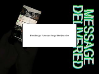
- 2. This is the final edited photo that we used. It has the main focus in the middle of the page, and the protagonists hand, and this relates the magazine, poster and trailer together. Also, as the area around the focus is dark, the film title and credits will be able to stand out.
- 3. This is the final for the film title that would be on both the magazine and in the trailer. It uses colours from the photograph, and the editing that we did included changing the structure of the font, so that it looked as if there were glitches in the text. This relates the idea of technology in our trailer and narrative. Also, by using a bold font, it is clear what the title says, yet doesn’t take away from the image.
- 4. These are some of the fonts that we tested for using on our credits and pull quote. We found that some of the bold fonts looked to comical, and therefore distracted from the ‘horror’ aspects of the poster. The other fonts we tested seemed to thin and therefore were harder to read against the background, however they suited the theme of technology more.
- 5. This is the final font that we decided to use. It is clear and simple, which makes it easier to read against the background. Also, when researching fonts used on posters we found that they often used a font similar to this. This font is also similar to that of the font on smartphones, and we did this so that our target audience would relate to the film more, as it would seem familiar. For its use on the pull quote, we decided to keep it the same so that a ‘house style’ for the film could be developed, and therefore make the poster look cohesive with the trailer.
Editor's Notes
- Edited pic
- Film title
- Font choices example
- Final font used