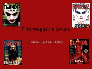
Film magazine covers

  EMPIRE & FANGORIA
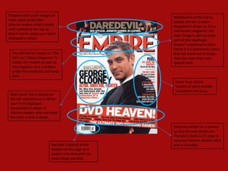
Strapline with small images of                            Masthead is at the top so
main actors in the film;                                  people can see it when
informs readers what’s inside                             displayed in shops; as it is a
and is placed at the top so                               well known magazine, the
that it can be easily seen when                           main image is able to cover
displayed in shops.                                       part of the masthead.
                                                          Empire’s masthead is often
                                                          red as it is a prominent colour
  The sell line for Empire is “The                        that will stand out in shops;
  UK’s no.1 Movie Magazine” it                            they also have their own
  invites the readers to pick up                          specific font.
  the magazine as it is written
  under the masthead and easily
  seen.
                                                           Cover lines inform
                                                           readers of other articles
                                                           included in the issue.
 Main cover line is placed on
 the left-side third so it will be
 seen if it’s displayed
 horizontally in shops. It
 informs readers who and what
 the main article is about.

                                                          Features written on a banner
                                                          so that the text stands out.
                                                          The text is bold so it’s easy to
                                                          read and informs readers what
                             Barcode is placed at the     else is included.
                             bottom of the page so it
                             doesn’t interfere with the
                             main image and text.
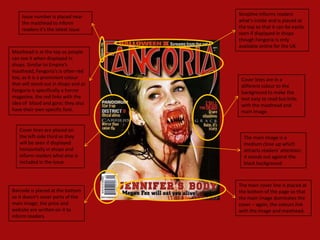
Issue number is placed near       Strapline informs readers
    the masthead to inform            what’s inside and is placed at
    readers it’s the latest issue.    the top so that it can be easily
                                      seen if displayed in shops
                                      though Fangoria is only
                                      available online for the UK.
Masthead is at the top so people
can see it when displayed in
shops. Similar to Empire’s
masthead, Fangoria’s is often red
too, as it is a prominent colour       Cover lines are in a
that will stand out in shops and as    different colour to the
Fangoria is specifically a horror      background to make the
magazine, the red links with the       text easy to read but links
idea of blood and gore; they also      with the masthead and
have their own specific font.          main image.


   Cover lines are placed on
   the left-side third so they          The main image is a
   will be seen if displayed            medium close up which
   horizontally in shops and            attracts readers’ attention;
   inform readers what else is          it stands out against the
   included in the issue.               black background.


                                      The main cover line is placed at
Barcode is placed at the bottom       the bottom of the page so that
so it doesn’t cover parts of the      the main image dominates the
main image; the price and             cover – again, the colours link
website are written on it to          with the image and masthead.
inform readers.
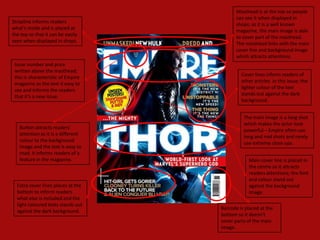
Masthead is at the top so people
                                           can see it when displayed in
Strapline informs readers
                                           shops; as it is a well known
what’s inside and is placed at
                                           magazine, the main image is able
the top so that it can be easily
                                           to cover part of the masthead.
seen when displayed in shops.
                                           The masthead links with the main
                                           cover line and background image
                                           which attracts attentions.
 Issue number and price
 written above the masthead;
                                             Cover lines inform readers of
 this is characteristic of Empire
                                             other articles in this issue; the
 magazine as the text it easy to
                                             lighter colour of the text
 see and informs the readers
                                             stands out against the dark
 that it’s a new issue.
                                             background.


                                              The main image is a long shot
                                              which makes the actor look
   Button attracts readers’
                                              powerful – Empire often use
   attention as it is a different
                                              long and mid shots and rarely
   colour to the background
                                              use extreme close ups.
   image and the text is easy to
   read. It informs readers of a
   feature in the magazine.                     Main cover line is placed in
                                                the centre so it attracts
                                                readers attentions; the font
                                                and colour stand out
  Extra cover lines places at the               against the background
  bottom to inform readers                      image.
  what else is included and the
  light coloured texts stands out
                                    Barcode is placed at the
  against the dark background.
                                    bottom so it doesn’t
                                    cover parts of the main
                                    image.
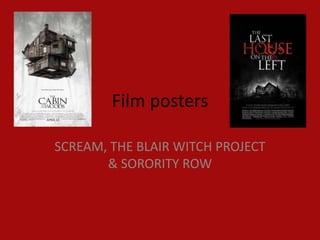
Film posters

SCREAM, THE BLAIR WITCH PROJECT
       & SORORITY ROW
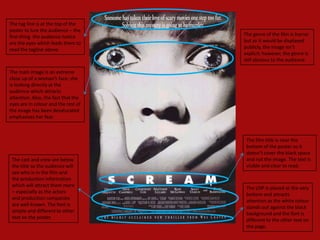
The tag line is at the top of the
poster to lure the audience – the
first thing the audience notice      The genre of the film is horror
are the eyes which leads them to     but as it would be displayed
read the tagline above.              publicly, the image isn’t
                                     explicit; however, the genre is
                                     still obvious to the audience.

The main image is an extreme
close up of a woman’s face; she
is looking directly at the
audience which attracts
attention. Also, the fact that the
eyes are in colour and the rest of
the image has been desaturated
emphasises her fear.


                                      The film title is near the
                                      bottom of the poster so it
                                      doesn’t cover the black space
 The cast and crew are below          and not the image. The text is
 the title so the audience will       visible and clear to read.
 see who is in the film and
 the production information
 which will attract them more
                                      The USP is placed at the very
 – especially as the actors
                                      bottom and attracts
 and production companies
                                      attention as the white colour
 are well known. The font is
                                      stands out against the black
 simple and different to other
                                      background and the font is
 text on the poster.
                                      different to the other text on
                                      the page.
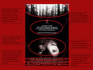
The top half of the image
establishes the setting; this
isn’t common as most              Instead of a tagline, this
posters focus on the main         poster has a short prologue
protagonists and usually          and gives some background
show the main setting as the      information about the film
background image.                 which intrigues the audience.


The main image is an extreme
close up of a woman's eyes
looking directly at the            The film title is near the
audience to attract attention.     bottom of the page so, like
                                   the Scream poster, it fills up
                                   some empty black space.


The cast and crew are under
the film title in white so that
the text can be seen against        Production and distribution
the black background; the           logos at the bottom appeal
font is different to other          to the audience as they
text on the poster and easy         show that well known
to read.                            companies have worked on
                                    the film.
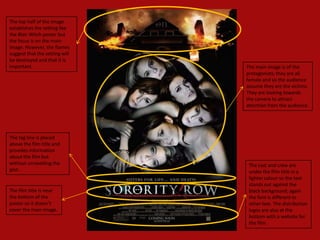
The top half of the image
establishes the setting like
the Blair Witch poster but
the focus is on the main
image. However, the flames
suggest that the setting will
be destroyed and that it is
important.                      The main image is of the
                                protagonists; they are all
                                female and so the audience
                                assume they are the victims.
                                They are looking towards
                                the camera to attract
                                attention from the audience.


The tag line is placed
above the film title and
provides information
about the film but
without unravelling the          The cast and crew are
plot..                           under the film title in a
                                 lighter colour so the text
                                 stands out against the
The film title is near           black background; again
the bottom of the                the font is different to
poster so it doesn’t             other text. The distribution
cover the main image.            logos are also at the
                                 bottom with a website for
                                 the film.

Covers and posters

  • 1.
    Film magazine covers EMPIRE & FANGORIA
  • 2.
    Strapline with smallimages of Masthead is at the top so main actors in the film; people can see it when informs readers what’s inside displayed in shops; as it is a and is placed at the top so well known magazine, the that it can be easily seen when main image is able to cover displayed in shops. part of the masthead. Empire’s masthead is often red as it is a prominent colour The sell line for Empire is “The that will stand out in shops; UK’s no.1 Movie Magazine” it they also have their own invites the readers to pick up specific font. the magazine as it is written under the masthead and easily seen. Cover lines inform readers of other articles included in the issue. Main cover line is placed on the left-side third so it will be seen if it’s displayed horizontally in shops. It informs readers who and what the main article is about. Features written on a banner so that the text stands out. The text is bold so it’s easy to read and informs readers what Barcode is placed at the else is included. bottom of the page so it doesn’t interfere with the main image and text.
  • 3.
    Issue number isplaced near Strapline informs readers the masthead to inform what’s inside and is placed at readers it’s the latest issue. the top so that it can be easily seen if displayed in shops though Fangoria is only available online for the UK. Masthead is at the top so people can see it when displayed in shops. Similar to Empire’s masthead, Fangoria’s is often red too, as it is a prominent colour Cover lines are in a that will stand out in shops and as different colour to the Fangoria is specifically a horror background to make the magazine, the red links with the text easy to read but links idea of blood and gore; they also with the masthead and have their own specific font. main image. Cover lines are placed on the left-side third so they The main image is a will be seen if displayed medium close up which horizontally in shops and attracts readers’ attention; inform readers what else is it stands out against the included in the issue. black background. The main cover line is placed at Barcode is placed at the bottom the bottom of the page so that so it doesn’t cover parts of the the main image dominates the main image; the price and cover – again, the colours link website are written on it to with the image and masthead. inform readers.
  • 4.
    Masthead is atthe top so people can see it when displayed in Strapline informs readers shops; as it is a well known what’s inside and is placed at magazine, the main image is able the top so that it can be easily to cover part of the masthead. seen when displayed in shops. The masthead links with the main cover line and background image which attracts attentions. Issue number and price written above the masthead; Cover lines inform readers of this is characteristic of Empire other articles in this issue; the magazine as the text it easy to lighter colour of the text see and informs the readers stands out against the dark that it’s a new issue. background. The main image is a long shot which makes the actor look Button attracts readers’ powerful – Empire often use attention as it is a different long and mid shots and rarely colour to the background use extreme close ups. image and the text is easy to read. It informs readers of a feature in the magazine. Main cover line is placed in the centre so it attracts readers attentions; the font and colour stand out Extra cover lines places at the against the background bottom to inform readers image. what else is included and the light coloured texts stands out Barcode is placed at the against the dark background. bottom so it doesn’t cover parts of the main image.
  • 5.
    Film posters SCREAM, THEBLAIR WITCH PROJECT & SORORITY ROW
  • 6.
    The tag lineis at the top of the poster to lure the audience – the first thing the audience notice The genre of the film is horror are the eyes which leads them to but as it would be displayed read the tagline above. publicly, the image isn’t explicit; however, the genre is still obvious to the audience. The main image is an extreme close up of a woman’s face; she is looking directly at the audience which attracts attention. Also, the fact that the eyes are in colour and the rest of the image has been desaturated emphasises her fear. The film title is near the bottom of the poster so it doesn’t cover the black space The cast and crew are below and not the image. The text is the title so the audience will visible and clear to read. see who is in the film and the production information which will attract them more The USP is placed at the very – especially as the actors bottom and attracts and production companies attention as the white colour are well known. The font is stands out against the black simple and different to other background and the font is text on the poster. different to the other text on the page.
  • 7.
    The top halfof the image establishes the setting; this isn’t common as most Instead of a tagline, this posters focus on the main poster has a short prologue protagonists and usually and gives some background show the main setting as the information about the film background image. which intrigues the audience. The main image is an extreme close up of a woman's eyes looking directly at the The film title is near the audience to attract attention. bottom of the page so, like the Scream poster, it fills up some empty black space. The cast and crew are under the film title in white so that the text can be seen against Production and distribution the black background; the logos at the bottom appeal font is different to other to the audience as they text on the poster and easy show that well known to read. companies have worked on the film.
  • 8.
    The top halfof the image establishes the setting like the Blair Witch poster but the focus is on the main image. However, the flames suggest that the setting will be destroyed and that it is important. The main image is of the protagonists; they are all female and so the audience assume they are the victims. They are looking towards the camera to attract attention from the audience. The tag line is placed above the film title and provides information about the film but without unravelling the The cast and crew are plot.. under the film title in a lighter colour so the text stands out against the The film title is near black background; again the bottom of the the font is different to poster so it doesn’t other text. The distribution cover the main image. logos are also at the bottom with a website for the film.