This project utilized supervised algorithms to model individual income based on the 1994 U.S. census data, ultimately finding the Adaboost model most effective for predicting if individuals earn over $50,000. The Adaboost model achieved high performance metrics, including an F-score of 85% and accuracy of 86%, with significant features identified as capital-loss, age, and capital gain. The project's findings emphasize the model's appropriateness for binary classification while demonstrating low bias and variance, leading to robust generalization across test data.

![Top Findings
Machine Learning Presentation | Overview
• Adaboost is an appropriate model for this data - Based on the results, the AdaBoost model is most appropriate for the task of
identifying individuals that make more than $50,000
• Highest F-Score out of several models tested
• Low prediction/training time
• Highly suitable for binary classifications
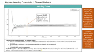
• Model generalizes well to the test set at 10,000 observations and beyond
• High AUC (Area Under Curve) score: – .90
• Appropriate cut-off for test is around .97 for true positives and .58 for false positives (decision/classification threshold)
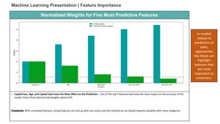
• Capital-loss, Age, and Capital Gain have the Most Effect on the Prediction – Out of the top 5 features that have the most impact
on the accuracy of the model, these three features had weights above 0.05
• Relatively High Model Scores:
• F-Score - 85% of cases where represented by a hormonic average of precision and recall [2 * (Precision * Recall)/(Precision
+ Recall)]
• Accuracy – 86% of predictions were correct [(True Positives + True Negatives) / All Values]](https://image.slidesharecdn.com/machinelearningpowerpoint8-190212005143/85/Machine-Learning-Project-1994-U-S-Census-3-320.jpg)
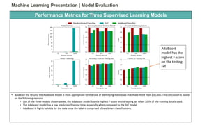
![Confusion Matrix
Machine Learning Presentation | Scoring the Chosen Model
• Relatively High Model Scores:
• F-Score - 85% of cases where represented by a hormonic average of precision and recall [2 * (Precision * Recall)/(Precision +
Recall)]
• Accuracy – 86% of predictions were correct [(True Positives + True Negatives) / All Values]
• Precision – 85% of positive predictions were correct [True Positives/(True Positives + False Positives)]
• Recall – 86% of positive cases were true positives [True Positives/(True Positives + False Negatives)]
Categories Counts
True Positive 6431
True Negative 1342
False Positive 863
False
Negative
409
These numbers
are based on
predictions
generated by
an optimized
Adaboost
algorithm](https://image.slidesharecdn.com/machinelearningpowerpoint8-190212005143/85/Machine-Learning-Project-1994-U-S-Census-5-320.jpg)