MF PRODUCTIONS
FINAL LOGO
MEGAN BYRNE
N E W D E S I G N :
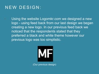
• Using the website Logomkr.com we designed a new
logo - using feed back from our last design we began
creating a new logo. In our previous feed back we
noticed that the respondents stated that they
preferred a black and white theme however our
previous logo was too simplistic.
(Our previous design)
N E W D E S I G N :
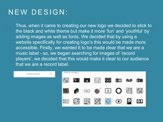
• Thus, when it came to creating our new logo we decided to stick to
the black and white theme but make it more ‘fun’ and ‘youthful’ by
adding images as well as fonts. We decided that by using a
website specifically for creating logo’s this would be made more
accessible. Firstly, we wanted it to be made clear that we are a
music label - so, we began searching for images of ‘record
players’, we decided that this would make it clear to our audience
that we are a record label.
N E W D E S I G N :
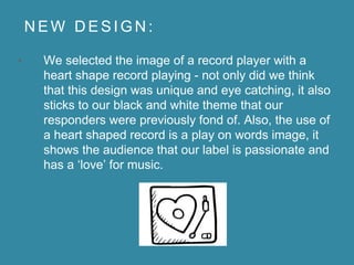
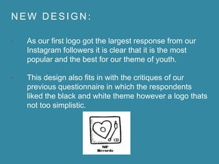
• We selected the image of a record player with a
heart shape record playing - not only did we think
that this design was unique and eye catching, it also
sticks to our black and white theme that our
responders were previously fond of. Also, the use of
a heart shaped record is a play on words image, it
shows the audience that our label is passionate and
has a ‘love’ for music.
N E W D E S I G N :
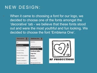
• When it came to choosing a font for our logo, we
decided to choose one of the fonts amongst the
‘decorative’ tab - we believe that these fonts stood
out and were the most youthful and fun looking. We
decided to choose the font ‘Emblema One’.
N E W D E S I G N :
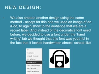
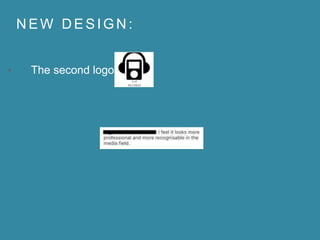
• We also created another design using the same
method - accept for this one we used an image of an
iPod, to again show to the audience that we are a
record label. And instead of the decorative font used
before, we decided to use a font under the ‘hand
writing’ tab we thought that this font was youthful in
the fact that it looked handwritten almost ‘school-like’
N E W D E S I G N :
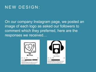
On our company Instagram page, we posted an
image of each logo as asked our followers to
comment which they preferred, here are the
responses we received…
N E W D E S I G N :
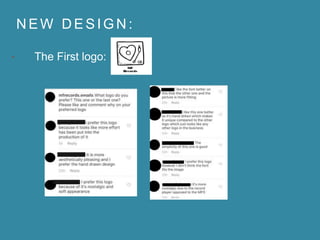
• The First logo:
N E W D E S I G N :
• The second logo:
N E W D E S I G N :
• As our first logo got the largest response from our
Instagram followers it is clear that it is the most
popular and the best for our theme of youth.
• This design also fits in with the critiques of our
previous questionnaire in which the respondents
liked the black and white theme however a logo thats
not too simplistic.

Final Logo Design

  • 1.
  • 2.
    N E WD E S I G N : • Using the website Logomkr.com we designed a new logo - using feed back from our last design we began creating a new logo. In our previous feed back we noticed that the respondents stated that they preferred a black and white theme however our previous logo was too simplistic. (Our previous design)
  • 3.
    N E WD E S I G N : • Thus, when it came to creating our new logo we decided to stick to the black and white theme but make it more ‘fun’ and ‘youthful’ by adding images as well as fonts. We decided that by using a website specifically for creating logo’s this would be made more accessible. Firstly, we wanted it to be made clear that we are a music label - so, we began searching for images of ‘record players’, we decided that this would make it clear to our audience that we are a record label.
  • 4.
    N E WD E S I G N : • We selected the image of a record player with a heart shape record playing - not only did we think that this design was unique and eye catching, it also sticks to our black and white theme that our responders were previously fond of. Also, the use of a heart shaped record is a play on words image, it shows the audience that our label is passionate and has a ‘love’ for music.
  • 5.
    N E WD E S I G N : • When it came to choosing a font for our logo, we decided to choose one of the fonts amongst the ‘decorative’ tab - we believe that these fonts stood out and were the most youthful and fun looking. We decided to choose the font ‘Emblema One’.
  • 6.
    N E WD E S I G N : • We also created another design using the same method - accept for this one we used an image of an iPod, to again show to the audience that we are a record label. And instead of the decorative font used before, we decided to use a font under the ‘hand writing’ tab we thought that this font was youthful in the fact that it looked handwritten almost ‘school-like’
  • 7.
    N E WD E S I G N : On our company Instagram page, we posted an image of each logo as asked our followers to comment which they preferred, here are the responses we received…
  • 8.
    N E WD E S I G N : • The First logo:
  • 9.
    N E WD E S I G N : • The second logo:
  • 10.
    N E WD E S I G N : • As our first logo got the largest response from our Instagram followers it is clear that it is the most popular and the best for our theme of youth. • This design also fits in with the critiques of our previous questionnaire in which the respondents liked the black and white theme however a logo thats not too simplistic.