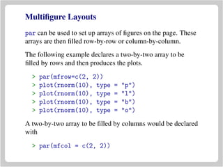
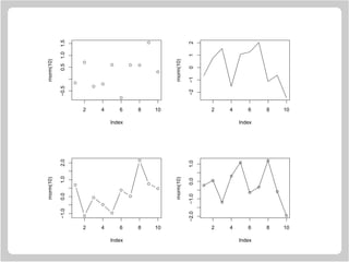
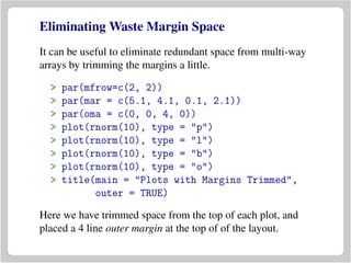
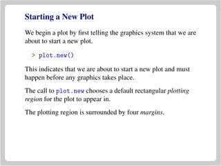
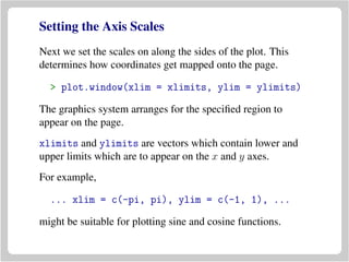
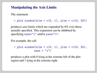
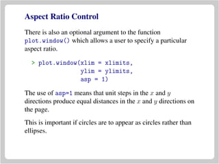
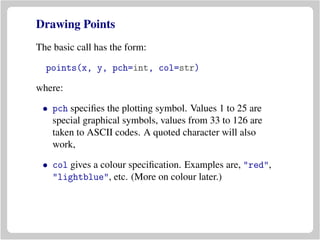
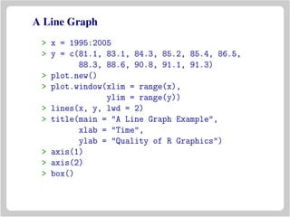
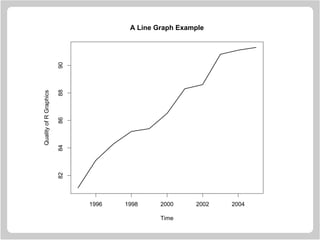
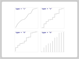
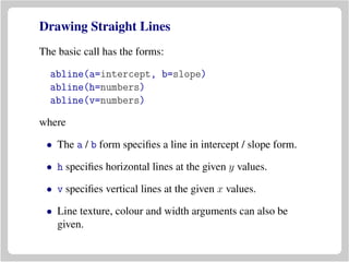
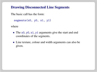
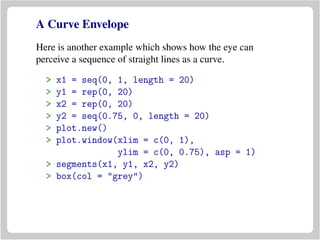
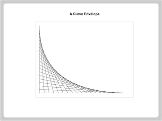
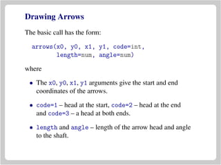
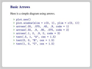
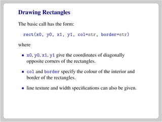
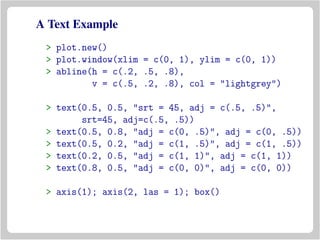
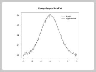
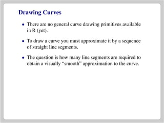
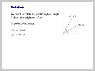
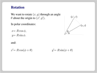
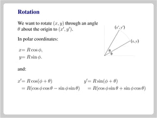
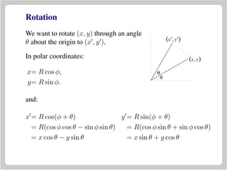
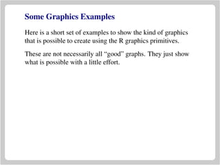
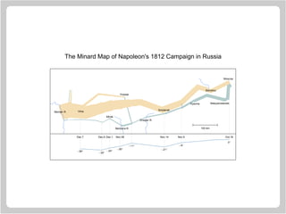
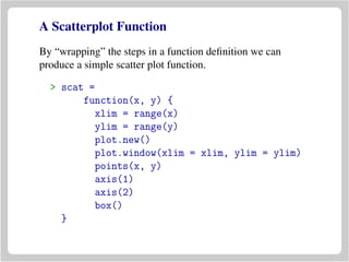
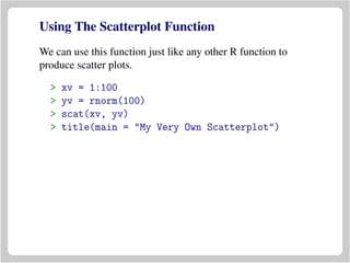
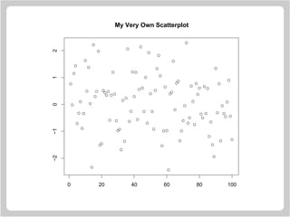
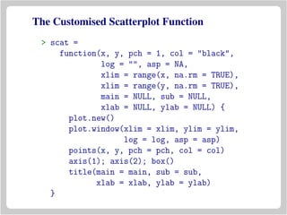
This document provides an overview of graphics functions in R for creating plots and customizing plot elements. It discusses how to start a new plot, set axis scales and limits, draw axes, add titles and labels, and draw different types of graphical elements like points, lines, and shapes. Functions covered include plot.new(), plot.window(), axis(), title(), points(), lines(), abline(), segments(), and box(). The document uses examples to demonstrate how to construct basic and customized plots programmatically in R.


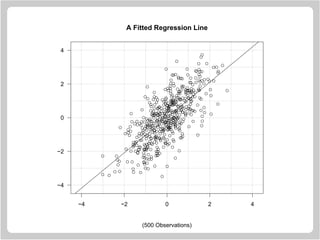
![Straight Line Example
> x = rnorm(500)
> y = x + rnorm(500)
> plot.new()
> plot.window(xlim = c(-4.5, 4.5), xaxs = "i",
ylim = c(-4.5, 4.5), yaxs = "i")
> z = lm(y ~ x)
> abline(h = -4:4, v = -4:4, col = "lightgrey")
> abline(a = coef(z)[1], b = coef(z)[2])
> points(x, y)
> axis(1)
> axis(2, las = 1)
> box()
> title(main = "A Fitted Regression Line")
> title(sub = "(500 Observations)")](https://image.slidesharecdn.com/lectures-r-graphics-190607175601/85/Lectures-r-graphics-28-320.jpg)
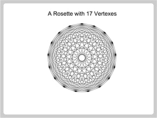
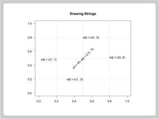
![Rosettes
A rosette is a figure which is created by taking a series of
equally spaced points around the circumference of a circle
and joining each of these points to all the other points.
> n = 17
> theta = seq(0, 2 * pi, length = n + 1)[1:n]
> x = sin(theta)
> y = cos(theta)
> v1 = rep(1:n, n)
> v2 = rep(1:n, rep(n, n))
> plot.new()
> plot.window(xlim = c(-1, 1),
ylim = c(-1, 1), asp = 1)
> segments(x[v1], y[v1], x[v2], y[v2])](https://image.slidesharecdn.com/lectures-r-graphics-190607175601/85/Lectures-r-graphics-31-320.jpg)
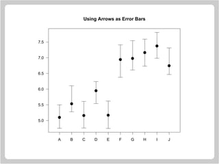
![Using Arrows as Error Bars
> x = 1:10
> y = runif(10) + rep(c(5, 6.5), c(5, 5))
> yl = y - 0.25 - runif(10)/3
> yu = y + 0.25 + runif(10)/3
> plot.new()
> plot.window(xlim = c(0.5, 10.5),
ylim = range(yl, yu))
> arrows(x, yl, x, yu, code = 3,
angle = 90, length = .125)
> points(x, y, pch = 19, cex = 1.5)
> axis(1, at = 1:10, labels = LETTERS[1:10])
> axis(2, las = 1)
> box()](https://image.slidesharecdn.com/lectures-r-graphics-190607175601/85/Lectures-r-graphics-38-320.jpg)
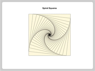
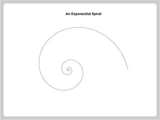
![Spiral Squares
> plot.new()
> plot.window(xlim = c(-1, 1),
ylim = c(-1, 1), asp = 1)
> x = c(-1, 1, 1, -1)
> y = c( 1, 1, -1, -1)
> polygon(x, y, col = "cornsilk")
> vertex1 = c(1, 2, 3, 4)
> vertex2 = c(2, 3, 4, 1)
> for(i in 1:50) {
x = 0.9 * x[vertex1] + 0.1 * x[vertex2]
y = 0.9 * y[vertex1] + 0.1 * y[vertex2]
polygon(x, y, col = "cornsilk")
}](https://image.slidesharecdn.com/lectures-r-graphics-190607175601/85/Lectures-r-graphics-46-320.jpg)

![Drawing Circles
> R = 1
> xc = 0
> yc = 0
> n = 72
> t = seq(0, 2 * pi, length = n)[1:(n-1)]
> x = xc + R * cos(t)
> y = yc + R * sin(t)
> plot.new()
> plot.window(xlim = range(x),
ylim = range(y), asp = 1)
> polygon(x, y, col = "lightblue",
border = "navyblue")](https://image.slidesharecdn.com/lectures-r-graphics-190607175601/85/Lectures-r-graphics-64-320.jpg)

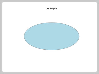
![Drawing Ellipses
> a = 4
> b = 2
> xc = 0
> yc = 0
> n = 72
> t = seq(0, 2 * pi, length = n)[1:(n-1)]
> x = xc + a * cos(t)
> y = yc + b * sin(t)
> plot.new()
> plot.window(xlim = range(x),
ylim = range(y),
asp = 1)
> polygon(x, y, col = "lightblue")](https://image.slidesharecdn.com/lectures-r-graphics-190607175601/85/Lectures-r-graphics-67-320.jpg)
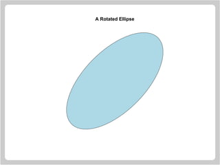
![Drawing Rotated Ellipses
> a = 4
> b = 2
> xc = 0
> yc = 0
> n = 72
> theta = 45 * (pi / 180)
> t = seq(0, 2 * pi, length = n)[1:(n-1)]
> x = xc + a * cos(t) * cos(theta) -
b * sin(t) * sin(theta)
> y = yc + a * cos(t) * sin(theta) +
b * sin(t) * cos(theta)
> plot.new()
> plot.window(xlim = range(x),
ylim = range(y), asp = 1)
> polygon(x, y, col = "lightblue")](https://image.slidesharecdn.com/lectures-r-graphics-190607175601/85/Lectures-r-graphics-76-320.jpg)
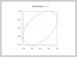
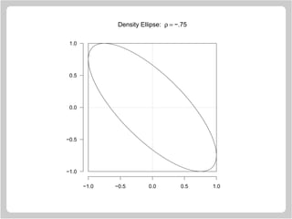
![Statistical Ellipses
Here µ1 = µ2 = 0, σ1 = σ2 = 1 and k = 1.
> n = 72
> rho = 0.5
> d = acos(rho)
> t = seq(0, 2 * pi, length = n)[1:(n-1)]
> plot.new()
> plot.window(xlim = c(-1, 1),
ylim = c(-1, 1), asp = 1)
> rect(-1, -1, 1, 1)
> polygon(cos(t + d), y = cos(t))
> segments(-1, 0, 1, 0, lty = "13")
> segments(0, -1, 0, 1, lty = "13")
> axis(1); axis(2, las = 1)](https://image.slidesharecdn.com/lectures-r-graphics-190607175601/85/Lectures-r-graphics-79-320.jpg)
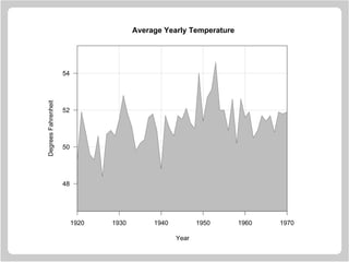
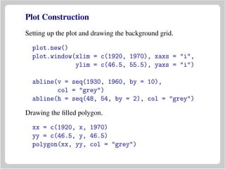
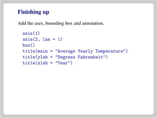
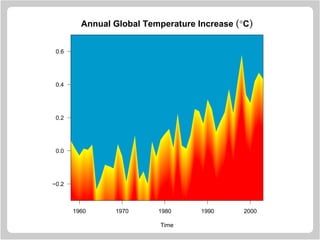
![Filling Areas In Line Graphs
Annual year temperatures in New Haven (1920-1970).
> y
[1] 49.3 51.9 50.8 49.6 49.3 50.6 48.4
[8] 50.7 50.9 50.6 51.5 52.8 51.8 51.1
[15] 49.8 50.2 50.4 51.6 51.8 50.9 48.8
[22] 51.7 51.0 50.6 51.7 51.5 52.1 51.3
[29] 51.0 54.0 51.4 52.7 53.1 54.6 52.0
[36] 52.0 50.9 52.6 50.2 52.6 51.6 51.9
[43] 50.5 50.9 51.7 51.4 51.7 50.8 51.9
[50] 51.8 51.9
The corresponding years.
> x = 1920:1970](https://image.slidesharecdn.com/lectures-r-graphics-190607175601/85/Lectures-r-graphics-85-320.jpg)

![An Ellipse Drawing Function
> ellipse =
function(a = 1, b = 1, theta = 0,
xc = 0, yc = 0, n = 72, ...)
{
t = seq(0, 2 * pi, length = n)[-n]
theta = theta * (pi / 180)
x = xc + a * cos(theta) * cos(t) -
b * sin(theta) * sin(t)
y = yc + a * sin(theta) * cos(t) +
b * cos(theta) * sin(t)
polygon(x, y, ...)
}](https://image.slidesharecdn.com/lectures-r-graphics-190607175601/85/Lectures-r-graphics-111-320.jpg)
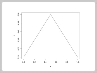
![Computing Direction Change in Degrees
Here is a sketch of how the change of angle computations
were done in the “smooth curve” examples. This works by
transforming from data units to inches.
> x = c(0, 0.5, 1.0)
> y = c(0.25, 0.5, 0.25)
> plot(x, y, type = "l")
> dx = diff(x)
> dy = diff(y)
> pin = par("pin")
> usr = par("usr")
> ax = pin[1]/diff(usr[1:2])
> ay = pin[2]/diff(usr[3:4])
> diff(180 * atan2(ay * dy, ax * dx) / pi)
[1] -115.2753](https://image.slidesharecdn.com/lectures-r-graphics-190607175601/85/Lectures-r-graphics-115-320.jpg)