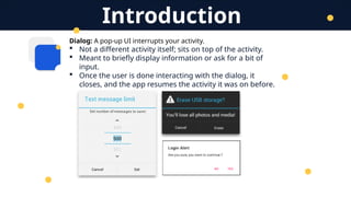
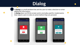
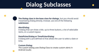
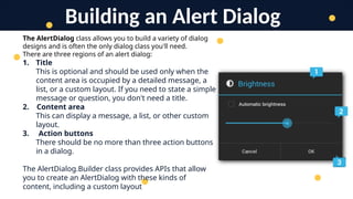
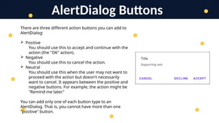
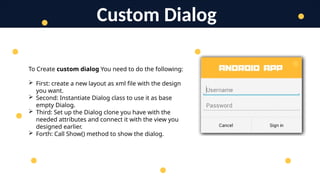
Mobile Application
Development
Lecture 7
Dialogs
Additions and Pop-ups
T. Yousef Alamir
Dialog: A pop-up UI interrupts your activity.
 Not a different activity itself; sits on top of the activity.
 Meant to briefly display information or ask for a bit of
input.
 Once the user is done interacting with the dialog, it
closes, and the app resumes the activity it was on before.
Introduction
A dialog is a small window that ask the user to make a decision or enter
additional information.
A dialog does not fill the screen and is normally used for modal events
that require users to take an action before they can proceed.
Dialog
The Dialog class is the base class for dialogs, but you should avoid
instantiating Dialog directly. Instead, use one of the following
subclasses:
AlertDialog:
A dialog that can show a title, up to three buttons, a list of selectable
items, or a custom layout.
DatePickerDialog or TimePickerDialog:
A dialog with a pre-defined UI that allows the user to select a date or
time.
Custom Dialog:
The custom dialog uses Dialog Class to create custom alerts in
Android studio
Dialog Subclasses
The AlertDialog class allows you to build a variety of dialog
designs and is often the only dialog class you'll need.
There are three regions of an alert dialog:
1. Title
This is optional and should be used only when the
content area is occupied by a detailed message, a
list, or a custom layout. If you need to state a simple
message or question, you don't need a title.
2. Content area
This can display a message, a list, or other custom
layout.
3. Action buttons
There should be no more than three action buttons
in a dialog.
The AlertDialog.Builder class provides APIs that allow
you to create an AlertDialog with these kinds of
content, including a custom layout
Building an Alert Dialog
AlertDialog Buttons
There are three different action buttons you can add to
AlertDialog:
 Positive
You should use this to accept and continue with the
action (the "OK" action).
 Negative
You should use this to cancel the action.
 Neutral
You should use this when the user may not want to
proceed with the action but doesn't necessarily
want to cancel. It appears between the positive and
negative buttons. For example, the action might be
"Remind me later.“
You can add only one of each button type to an
AlertDialog. That is, you cannot have more than one
"positive" button.
Custom Dialog
To Create custom dialog You need to do the following:
 First: create a new layout as xml file with the design
you want.
 Second: Instantiate Dialog class to use it as base
empty Dialog.
 Third: Set up the Dialog clone you have with the
needed attributes and connect it with the view you
designed earlier.
 Forth: Call Show() method to show the dialog.
Thank You
T. Yousef Alamir 2023
http://Yousef.omairtech.com

Lecture 7: Android Kinds of Dialogs.pptx

  • 1.
  • 2.
    Dialog: A pop-upUI interrupts your activity.  Not a different activity itself; sits on top of the activity.  Meant to briefly display information or ask for a bit of input.  Once the user is done interacting with the dialog, it closes, and the app resumes the activity it was on before. Introduction
  • 3.
    A dialog isa small window that ask the user to make a decision or enter additional information. A dialog does not fill the screen and is normally used for modal events that require users to take an action before they can proceed. Dialog
  • 4.
    The Dialog classis the base class for dialogs, but you should avoid instantiating Dialog directly. Instead, use one of the following subclasses: AlertDialog: A dialog that can show a title, up to three buttons, a list of selectable items, or a custom layout. DatePickerDialog or TimePickerDialog: A dialog with a pre-defined UI that allows the user to select a date or time. Custom Dialog: The custom dialog uses Dialog Class to create custom alerts in Android studio Dialog Subclasses
  • 5.
    The AlertDialog classallows you to build a variety of dialog designs and is often the only dialog class you'll need. There are three regions of an alert dialog: 1. Title This is optional and should be used only when the content area is occupied by a detailed message, a list, or a custom layout. If you need to state a simple message or question, you don't need a title. 2. Content area This can display a message, a list, or other custom layout. 3. Action buttons There should be no more than three action buttons in a dialog. The AlertDialog.Builder class provides APIs that allow you to create an AlertDialog with these kinds of content, including a custom layout Building an Alert Dialog
  • 6.
    AlertDialog Buttons There arethree different action buttons you can add to AlertDialog:  Positive You should use this to accept and continue with the action (the "OK" action).  Negative You should use this to cancel the action.  Neutral You should use this when the user may not want to proceed with the action but doesn't necessarily want to cancel. It appears between the positive and negative buttons. For example, the action might be "Remind me later.“ You can add only one of each button type to an AlertDialog. That is, you cannot have more than one "positive" button.
  • 7.
    Custom Dialog To Createcustom dialog You need to do the following:  First: create a new layout as xml file with the design you want.  Second: Instantiate Dialog class to use it as base empty Dialog.  Third: Set up the Dialog clone you have with the needed attributes and connect it with the view you designed earlier.  Forth: Call Show() method to show the dialog.
  • 8.
    Thank You T. YousefAlamir 2023 http://Yousef.omairtech.com