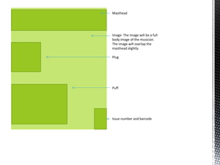
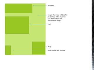
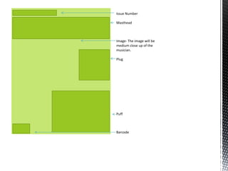
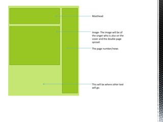
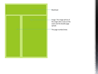
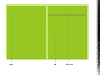
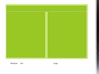
The document discusses layout plans for the front cover, contents page, and double page spread of a magazine. It states that the final front cover layout incorporates successful aspects of all three initial plans. The contents page uses the first layout plan because the second did not look professional. The double page spread also uses the first layout plan as it is suitable for the target market and genre and looks professional compared to other options tested.
2. Masthead
Image- The image will be a full
body image of the musician.
The image will overlap the
masthead slightly.
Plug
Puff
Issue number and barcode
3. Masthead
Image- The image will be a full
body image of the musician.
The masthead will not
influence the image.
Puff
Plug
Issue number and barcode
6. Masthead
Image- The image will be of
the singer who is also on the
cover and the double page
spread.
The page number/news
This will be where other text
will go.
7. Masthead
Image- The image will be of
the singer who is also on the
cover and the double page
spread.
The page number/news
11. Front cover layout-
For my final front cover I have used aspects of all three layout plans. After making
various drafts and testing all of the different layout plans, I chose to pick the best
aspects of all the plans which has left me with my final layout of the font cover. I feel
that the final layout that I have used represents my genre well. I have looked at similar
products to mine and they have similar conventions.
Contents page layout-
For my final contents page layout I used the first layout plan. I made several drafts using
the second layout and I felt it didn’t look professional, therefore I decided to use the first
layout plan for my final contents page layout. This layout represents my genre well, I also
looked at other magazine with similar genres to mine and they have similar layouts.
Double page spread layout-
For my final double page spread layout I decided to use the first layout plan. I made
various drafts and I felt that its suitable for the target market and represents my genre
well, it also looks professional. After looking at other magazines with a similar genre to
mine, they have similar layouts.