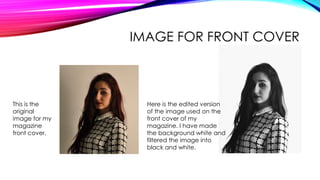
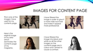
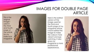
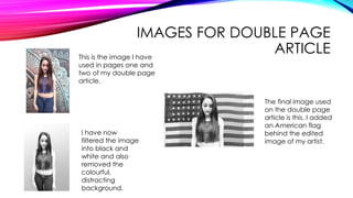
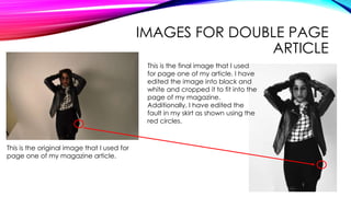
CONTACT SHEET FOR
IMAGES
IMAGE FOR FRONT COVER
This is the
original
image for my
magazine
front cover.
Here is the edited version
of the image used on the
front cover of my
magazine. I have made
the background white and
filtered the image into
black and white.
IMAGES FOR CONTENT PAGE
This is one of the
images I have
used for my
contents page.
I have filtered the
image in order to give it
a more indie rock look
and make it appear
more professional.
Here is the
original image
of my artist
which
dominates the
contents page
of my
magazine.
I have filtered the
image into black and
white as all the other
images on the
contents page are in
colour and I aimed to
cause a contrast.
IMAGES FOR DOUBLE PAGE
ARTICLE
This is the
original
image I
used in
the third
and fourth
page of
the article
for my
indie rock
magazine
Here is the edited
version of the
image used for
the third and
fourth page of my
magazine article.
I have edited the
image to make
the colours more
vibrant and eye
catching. It also
gives my
magazine a more
professional
appearance.
IMAGES FOR DOUBLE PAGE
ARTICLEThis is the image I have
used in pages one and
two of my double page
article.
I have now
filtered the image
into black and
white and also
removed the
colourful,
distracting
background.
The final image used
on the double page
article is this. I added
an American flag
behind the edited
image of my artist.
IMAGES FOR DOUBLE PAGE
ARTICLE
This is the original image that I used for
page one of my magazine article.
This is the final image that I used
for page one of my article. I have
edited the image into black and
white and cropped it to fit into the
page of my magazine.
Additionally, I have edited the
fault in my skirt as shown using the
red circles.

Contact Sheet for Images

  • 1.
  • 2.
    IMAGE FOR FRONTCOVER This is the original image for my magazine front cover. Here is the edited version of the image used on the front cover of my magazine. I have made the background white and filtered the image into black and white.
  • 3.
    IMAGES FOR CONTENTPAGE This is one of the images I have used for my contents page. I have filtered the image in order to give it a more indie rock look and make it appear more professional. Here is the original image of my artist which dominates the contents page of my magazine. I have filtered the image into black and white as all the other images on the contents page are in colour and I aimed to cause a contrast.
  • 4.
    IMAGES FOR DOUBLEPAGE ARTICLE This is the original image I used in the third and fourth page of the article for my indie rock magazine Here is the edited version of the image used for the third and fourth page of my magazine article. I have edited the image to make the colours more vibrant and eye catching. It also gives my magazine a more professional appearance.
  • 5.
    IMAGES FOR DOUBLEPAGE ARTICLEThis is the image I have used in pages one and two of my double page article. I have now filtered the image into black and white and also removed the colourful, distracting background. The final image used on the double page article is this. I added an American flag behind the edited image of my artist.
  • 6.
    IMAGES FOR DOUBLEPAGE ARTICLE This is the original image that I used for page one of my magazine article. This is the final image that I used for page one of my article. I have edited the image into black and white and cropped it to fit into the page of my magazine. Additionally, I have edited the fault in my skirt as shown using the red circles.