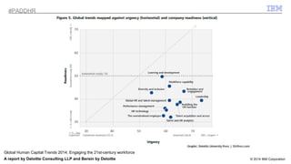
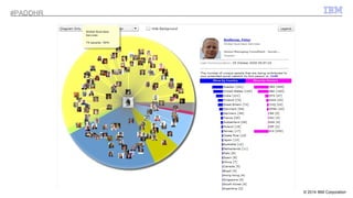
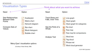
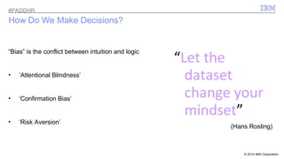
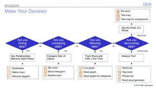
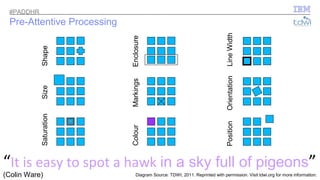
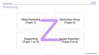
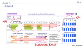
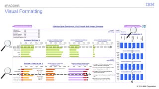
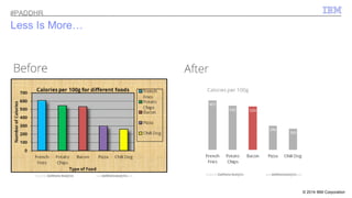
© 2009 IBM Corporation 
Mark Tristam Lawrence @mtlawrence 
Learning Intelligence Leader, Global Business Services #PADDHR 
10 April, 2014 
Can You See It? 
Visualising Your Data For Impact
#IBPMA PDresDenHtaRtion Template Full Version 
“Daddy, how much do you love me?” 
A. “Infinity plus infinity” 
B. “More than most” 
C. “This much” 
D. “Right now?” 
E. “110%” 
© 2014 2 IBM Corporation
I#BPMA PDresDenHtaRtion Template Full Version 
“Daddy, how much do you love me?” 
A. “Infinity plus infinity” ? + ? 
B. “More than most” ? 
C. “This much” 
D. “Right now?” ? 
E. “110%” ???!! 
© 2014 3 IBM Corporation
23 Sec 
© 2014 IBM Corporation 
#PADDHR 
Video Source: Andrew Marritt. Reprinted with permission. Visit www.OrganizationView.com for more information.
© 2014 IBM Corporation 
#PADDHR 
http://www.infovis.info/visuals/Gallery_of_Data_Visualization/Re-Visions_Minard/napon.gif
© 2014 IBM Corporation 
#PADDHR 
http://www.senchalabs.org/philogl/PhiloGL/examples/worldFlights/
© 2014 IBM Corporation 
#PADDHR 
Global Human Capital Trends 2014: Engaging the 21st-century workforce 
A report by Deloitte Consulting LLP and Bersin by Deloitte
© 2014 IBM Corporation 
#PADDHR
© 2014 IBM Corporation 
#PADDHR 
Outline 
Death by Toolset 
It’s a competitive marketplace, and growing – choose wisely 
The Value of Visualisation 
Some examples of good and bad visualisations 
Psychology and Science 
How, and why, does it work? 
Four Pillars of Visualisation 
A framework for you to take away and put to use
© 2014 IBM Corporation 
#PADDHR 
Why Now?
© 2014 IBM Corporation 
#PADDHR 
Growing Market Competitiveness 
Magic Quadrant for Business Intelligence and 
Analytics Platforms, 2014 
•New : split between “BI and Analytics Platforms” 
and “Advanced Analytics Platforms” 
•Data Discovery as a response to data explosion 
•Suggestion that traditional BI (OLAP and ad hoc 
querying) has reached a plateau 
https://www.gartner.com/technology/reprints.do?id=1-1QLGACN&ct=140210&st=sb
© 2014 IBM Corporation 
#PADDHR 
Growth in Choice
© 2014 IBM Corporation 
#PADDHR 
Differentiate to Discover Value 
• Where does Visualisation fit within the spectrum of Business Intelligence? 
• How relevant is the Cloud to Data Visualisation? 
Data 
Cloud 
Engagement • How do you ensure that you are adding value?
Visualisation 
© 2014 IBM Corporation 
Data: Business Intelligence Spectrum 
Architect 
Data Scientist 
ETL OLAP Business Analyst 
Business-User 
Data 
#PADDHR
© 2014 IBM Corporation 
#PADDHR 
CClloouudd: Visualisation Infrastructure
© 2014 IBM Corporation 
#PADDHR 
Get Interactive! 
Cloud 
http://www.theguardian.com/world/interactive/2011/mar/22/middle-east-protest-interactive-timeline
#PADDHR 
EnEgnaggageemmeenntt: Aesthetic = Effective? 
© 2014 IBM Corporation Classroom eLearning
© 2014 IBM Corporation 
#PADDHR 
What about Infographics? 
Engagement 
Created by Mark Tristam Lawrence, IBM 
infogr.am
Think about what you want to achieve 
© 2014 IBM Corporation 
Visualisation Types 
Need Option Need Option 
See Relationships 
Between Data 
Points 
Track Rises and 
Falls, Over Time 
Compare Sets of 
Values 
See the Parts of a 
Whole 
‘Many Eyes’ visualisation options 
(Courtesy of Noah Iliinsky, IBM) 
Analyse Text 
#PADDHR
© 2014 IBM Corporation 
#PADDHR 
How Do We Make Decisions? 
“Let the 
dataset 
change your 
mindset” 
(Hans Rosling) 
“Bias” is the conflict between intuition and logic 
• ‘Attentional Blindness’ 
• ‘Confirmation Bias’ 
• ‘Risk Aversion’
© 2014 IBM Corporation 
#PADDHR 
Make Your Decision
© 2014 IBM Corporation 
#PADDHR 
Pre-Attentive Processing 
Colour 
Saturation 
Size Shape 
Position 
Markings Enclosure 
Orientation Line Width 
“It is easy to spot a hawk in a sky full of pigeons” 
(Colin Ware) 
Diagram Source: TDWI, 2011. Reprinted with permission. Visit tdwi.org for more information.
© 2014 IBM Corporation 
#PADDHR 
An Experiment 
55%! 
Numberphile’s Sarah Wiseman explains: https://www.youtube.com/watch?v=kCSzjExvbTQ
© 2014 IBM Corporation 
Positioning… 
Most Important 
(Topic 1) 
Z Supporting 
(Topic 1 or 3) 
Secondary focus 
(Topic 2) 
Least Important 
(Topic 2 or 4) 
#PADDHR
© 2014 IBM Corporation 
…Layout 
KPI 
KPI 
Supporting Detail 
#PADDHR
© 2014 IBM Corporation 
#PADDHR 
Visual Formatting
35 Sec 
© 2014 IBM Corporation 
#PADDHR
© 2014 IBM Corporation 
#PADDHR 
Less Is More…
© 2014 IBM Corporation 
Case Study: 
#PADDHR 
“The Data Storm – Retail And The Big Data Revolution”
© 2014 IBM Corporation 
Case Study – “The Data Storm” 
What works 
well? 
What doesn’t 
work so well? 
#PADDHR
© 2014 IBM Corporation 
Case Study – “The Data Storm” 
What works 
well? 
What doesn’t 
work so well? 
#PADDHR
© 2014 IBM Corporation 
Case Study – “The Data Storm” 
What works 
well? 
What doesn’t 
work so well? 
#PADDHR
© 2014 IBM Corporation 
Case Study – “The Data Storm” 
Conclusions 
•Sharp, contrasting and ‘slick’ graphics 
•Appealing banner 
•Uncluttered and mostly fits to one screen 
•Clear signposting for downloading data 
•Text highlights helps to focus attention 
•Abilities to choose filters are clear 
•Available on internet browser, via multiple 
devices and ability to share via social media 
•Poor prioritisation or positioning of charts 
•Use of inefficient visualisation types 
•Inefficient use of space 
•Inconsistent dimensions and design 
•Unverifiable textual highlights 
•Hidden navigational links 
•Missing confirmation of limits set 
•Missing confirmation, or explanation, of 
measures 
What works 
well? 
What doesn’t 
work so well? 
Even using a tool like Tableau (which suggests visualisation types 
based upon the type of data it finds), there is no guarantee that your 
visualisation will be perfect! You need to follow a structured model. 
#PADDHR
© 2014 IBM Corporation 
#PADDHR 
The 4 Pillars of Visualization 
Informed by 
Purpose, Content 
and Structure 
Noah Iliinsky, Centre for Advanced Visualization, IBM
© 2014 IBM Corporation 
What’s Next for Data Visualisation? 
• Harnessing the Opportunities afforded by the capture of Big Data? 
• Geo-spatial Analysis and Interactive mapping? 
• Interacting with Visualised Data constructs? 
“data is the new soil” 
David McCandless, The Beauty of Data Visualisation, 2010 (TEDGlobal) 
#PADDHR
© 2014 IBM Corporation 
Visualisation ‘White Papers’ 
Choosing Visual Properties For Successful Visualizations 
• Creating Effective Visualizations 
• Choosing the right visual properties 
Learn how to properly choose the visual property (position, shape, size, color and others) to encode the 
different types of data that will be presented in a visualization. 
http://bit.ly/successfulvis 
Choosing A Successful Structure For Your Visualization 
• Know your purpose 
• Select how much data you need 
The structure defines the landscape for presenting your data and consequently defines what sort of 
information will be most readily available from your visualization. 
https://ibm.biz/structurevis 
#PADDHR
© 2014 IBM Corporation 
References 
Additional Research and Articles: 
Gartner: Magic Quadrant for Business Intelligence and 
Analytics Platforms 
https://www.gartner.com/technology/reprints.do?id=1-1QLGACN&ct=140210&st=sb 
Gartner: Magic Quadrant for Advanced Analytics Platforms 
http://www.gartner.com/technology/reprints.do?id=1-1QXWE6S&ct=140219&st=sb. 
The Data Storm | An Economist Intelligence Unit Report 
Commissioned By Wipro 
http://public.tableausoftware.com/views/The-data-storm_0/Home 
Be Inspired: 
Play with the example visualisations in Google WebGL 
http://www.chromeexperiments.com/globe 
Imagine the possibilities with Dr Jo-Ann Kuchera Morin’s 
tour of the “Allosphere” (University of California) 
http://www.ted.com/talks/joann_kuchera_morin_tours_the_allosphere 
Eminent #dataviz: 
•Stephen Few (perceptualedge.com/) 
–Show Me The Numbers (2nd ed., Analytics Press, 2012) 
•Ed Tufte (edwardtufte.com/) 
–The Visual Display Of Quantitative Information (2nd ed., 
Graphics Press, 2012) 
•Nathan Yau (flowingdata.com/) 
–Visualize This: The Flowing Data Guide to Design, 
Visualization, and Statistics (John Wiley & Sons, 2011) 
•Hans Rosling (gapminder.org/) 
Some notable IBMers I’d recommend: 
•Noah Iliinsky (complexdiagrams.com/) @noahi 
•Jonathan Sidhu @jmsidhu 
•Graham Wills (workingvis.com/) @GrahamWills 
•Steve McDougal @mcdouster 
#PADDHR
Mark Tristam Lawrence +44 (0)7917 270138 
Learning Intelligence Leader, Global Business Services 
#PADDHR @mtlawrence 
© 2009 IBM Corporation 
Can you see it, now?
© 2009 IBM Corporation 
Appendices
© 2014 IBM Corporation 
A note on the novelty value of Infographics 
Do we think the audience were really assessing the content, or 
the visual impact? 
#PADDHR

Tucana HR Analytics Data Visualisation, April 2014 (London)

  • 1.
    © 2009 IBMCorporation Mark Tristam Lawrence @mtlawrence Learning Intelligence Leader, Global Business Services #PADDHR 10 April, 2014 Can You See It? Visualising Your Data For Impact
  • 2.
    #IBPMA PDresDenHtaRtion TemplateFull Version “Daddy, how much do you love me?” A. “Infinity plus infinity” B. “More than most” C. “This much” D. “Right now?” E. “110%” © 2014 2 IBM Corporation
  • 3.
    I#BPMA PDresDenHtaRtion TemplateFull Version “Daddy, how much do you love me?” A. “Infinity plus infinity” ? + ? B. “More than most” ? C. “This much” D. “Right now?” ? E. “110%” ???!! © 2014 3 IBM Corporation
  • 4.
    23 Sec ©2014 IBM Corporation #PADDHR Video Source: Andrew Marritt. Reprinted with permission. Visit www.OrganizationView.com for more information.
  • 5.
    © 2014 IBMCorporation #PADDHR http://www.infovis.info/visuals/Gallery_of_Data_Visualization/Re-Visions_Minard/napon.gif
  • 6.
    © 2014 IBMCorporation #PADDHR http://www.senchalabs.org/philogl/PhiloGL/examples/worldFlights/
  • 7.
    © 2014 IBMCorporation #PADDHR Global Human Capital Trends 2014: Engaging the 21st-century workforce A report by Deloitte Consulting LLP and Bersin by Deloitte
  • 8.
    © 2014 IBMCorporation #PADDHR
  • 9.
    © 2014 IBMCorporation #PADDHR Outline Death by Toolset It’s a competitive marketplace, and growing – choose wisely The Value of Visualisation Some examples of good and bad visualisations Psychology and Science How, and why, does it work? Four Pillars of Visualisation A framework for you to take away and put to use
  • 10.
    © 2014 IBMCorporation #PADDHR Why Now?
  • 11.
    © 2014 IBMCorporation #PADDHR Growing Market Competitiveness Magic Quadrant for Business Intelligence and Analytics Platforms, 2014 •New : split between “BI and Analytics Platforms” and “Advanced Analytics Platforms” •Data Discovery as a response to data explosion •Suggestion that traditional BI (OLAP and ad hoc querying) has reached a plateau https://www.gartner.com/technology/reprints.do?id=1-1QLGACN&ct=140210&st=sb
  • 12.
    © 2014 IBMCorporation #PADDHR Growth in Choice
  • 13.
    © 2014 IBMCorporation #PADDHR Differentiate to Discover Value • Where does Visualisation fit within the spectrum of Business Intelligence? • How relevant is the Cloud to Data Visualisation? Data Cloud Engagement • How do you ensure that you are adding value?
  • 14.
    Visualisation © 2014IBM Corporation Data: Business Intelligence Spectrum Architect Data Scientist ETL OLAP Business Analyst Business-User Data #PADDHR
  • 15.
    © 2014 IBMCorporation #PADDHR CClloouudd: Visualisation Infrastructure
  • 16.
    © 2014 IBMCorporation #PADDHR Get Interactive! Cloud http://www.theguardian.com/world/interactive/2011/mar/22/middle-east-protest-interactive-timeline
  • 17.
    #PADDHR EnEgnaggageemmeenntt: Aesthetic= Effective? © 2014 IBM Corporation Classroom eLearning
  • 18.
    © 2014 IBMCorporation #PADDHR What about Infographics? Engagement Created by Mark Tristam Lawrence, IBM infogr.am
  • 19.
    Think about whatyou want to achieve © 2014 IBM Corporation Visualisation Types Need Option Need Option See Relationships Between Data Points Track Rises and Falls, Over Time Compare Sets of Values See the Parts of a Whole ‘Many Eyes’ visualisation options (Courtesy of Noah Iliinsky, IBM) Analyse Text #PADDHR
  • 20.
    © 2014 IBMCorporation #PADDHR How Do We Make Decisions? “Let the dataset change your mindset” (Hans Rosling) “Bias” is the conflict between intuition and logic • ‘Attentional Blindness’ • ‘Confirmation Bias’ • ‘Risk Aversion’
  • 21.
    © 2014 IBMCorporation #PADDHR Make Your Decision
  • 22.
    © 2014 IBMCorporation #PADDHR Pre-Attentive Processing Colour Saturation Size Shape Position Markings Enclosure Orientation Line Width “It is easy to spot a hawk in a sky full of pigeons” (Colin Ware) Diagram Source: TDWI, 2011. Reprinted with permission. Visit tdwi.org for more information.
  • 23.
    © 2014 IBMCorporation #PADDHR An Experiment 55%! Numberphile’s Sarah Wiseman explains: https://www.youtube.com/watch?v=kCSzjExvbTQ
  • 24.
    © 2014 IBMCorporation Positioning… Most Important (Topic 1) Z Supporting (Topic 1 or 3) Secondary focus (Topic 2) Least Important (Topic 2 or 4) #PADDHR
  • 25.
    © 2014 IBMCorporation …Layout KPI KPI Supporting Detail #PADDHR
  • 26.
    © 2014 IBMCorporation #PADDHR Visual Formatting
  • 27.
    35 Sec ©2014 IBM Corporation #PADDHR
  • 28.
    © 2014 IBMCorporation #PADDHR Less Is More…
  • 29.
    © 2014 IBMCorporation Case Study: #PADDHR “The Data Storm – Retail And The Big Data Revolution”
  • 30.
    © 2014 IBMCorporation Case Study – “The Data Storm” What works well? What doesn’t work so well? #PADDHR
  • 31.
    © 2014 IBMCorporation Case Study – “The Data Storm” What works well? What doesn’t work so well? #PADDHR
  • 32.
    © 2014 IBMCorporation Case Study – “The Data Storm” What works well? What doesn’t work so well? #PADDHR
  • 33.
    © 2014 IBMCorporation Case Study – “The Data Storm” Conclusions •Sharp, contrasting and ‘slick’ graphics •Appealing banner •Uncluttered and mostly fits to one screen •Clear signposting for downloading data •Text highlights helps to focus attention •Abilities to choose filters are clear •Available on internet browser, via multiple devices and ability to share via social media •Poor prioritisation or positioning of charts •Use of inefficient visualisation types •Inefficient use of space •Inconsistent dimensions and design •Unverifiable textual highlights •Hidden navigational links •Missing confirmation of limits set •Missing confirmation, or explanation, of measures What works well? What doesn’t work so well? Even using a tool like Tableau (which suggests visualisation types based upon the type of data it finds), there is no guarantee that your visualisation will be perfect! You need to follow a structured model. #PADDHR
  • 34.
    © 2014 IBMCorporation #PADDHR The 4 Pillars of Visualization Informed by Purpose, Content and Structure Noah Iliinsky, Centre for Advanced Visualization, IBM
  • 35.
    © 2014 IBMCorporation What’s Next for Data Visualisation? • Harnessing the Opportunities afforded by the capture of Big Data? • Geo-spatial Analysis and Interactive mapping? • Interacting with Visualised Data constructs? “data is the new soil” David McCandless, The Beauty of Data Visualisation, 2010 (TEDGlobal) #PADDHR
  • 36.
    © 2014 IBMCorporation Visualisation ‘White Papers’ Choosing Visual Properties For Successful Visualizations • Creating Effective Visualizations • Choosing the right visual properties Learn how to properly choose the visual property (position, shape, size, color and others) to encode the different types of data that will be presented in a visualization. http://bit.ly/successfulvis Choosing A Successful Structure For Your Visualization • Know your purpose • Select how much data you need The structure defines the landscape for presenting your data and consequently defines what sort of information will be most readily available from your visualization. https://ibm.biz/structurevis #PADDHR
  • 37.
    © 2014 IBMCorporation References Additional Research and Articles: Gartner: Magic Quadrant for Business Intelligence and Analytics Platforms https://www.gartner.com/technology/reprints.do?id=1-1QLGACN&ct=140210&st=sb Gartner: Magic Quadrant for Advanced Analytics Platforms http://www.gartner.com/technology/reprints.do?id=1-1QXWE6S&ct=140219&st=sb. The Data Storm | An Economist Intelligence Unit Report Commissioned By Wipro http://public.tableausoftware.com/views/The-data-storm_0/Home Be Inspired: Play with the example visualisations in Google WebGL http://www.chromeexperiments.com/globe Imagine the possibilities with Dr Jo-Ann Kuchera Morin’s tour of the “Allosphere” (University of California) http://www.ted.com/talks/joann_kuchera_morin_tours_the_allosphere Eminent #dataviz: •Stephen Few (perceptualedge.com/) –Show Me The Numbers (2nd ed., Analytics Press, 2012) •Ed Tufte (edwardtufte.com/) –The Visual Display Of Quantitative Information (2nd ed., Graphics Press, 2012) •Nathan Yau (flowingdata.com/) –Visualize This: The Flowing Data Guide to Design, Visualization, and Statistics (John Wiley & Sons, 2011) •Hans Rosling (gapminder.org/) Some notable IBMers I’d recommend: •Noah Iliinsky (complexdiagrams.com/) @noahi •Jonathan Sidhu @jmsidhu •Graham Wills (workingvis.com/) @GrahamWills •Steve McDougal @mcdouster #PADDHR
  • 38.
    Mark Tristam Lawrence+44 (0)7917 270138 Learning Intelligence Leader, Global Business Services #PADDHR @mtlawrence © 2009 IBM Corporation Can you see it, now?
  • 39.
    © 2009 IBMCorporation Appendices
  • 40.
    © 2014 IBMCorporation A note on the novelty value of Infographics Do we think the audience were really assessing the content, or the visual impact? #PADDHR

Editor's Notes

  • #3 Or F. “Depends on whether you’re making something I like…!” Photograph is speaker’s own
  • #4 Or F. “Depends on whether you’re making something I like…!” Photograph is speaker’s own
  • #6 Humble beginnings to the visualisation of data – but imagine the advantage a General would have when able to turn information into insight! Charles Minard (1781-1870)
  • #7 Fast forward 200 years… http://www.senchalabs.org/philogl/PhiloGL/examples/worldFlights/
  • #8 But we needn’t over-complicate matters – often, a simple chart is the right answer. Global Human Capital Trends 2014: Engaging the 21st-century workforce, p10 - A report by Deloitte Consulting LLP and Bersin by Deloitte
  • #9 But if wanting to feed your creative sides, unlock value by visualising new areas for advantage, rather than spending time and energy on gimmicks! Social interactions around Mark T Lawrence (subset)
  • #11 This simple chart, in itself, has demonstrated real power and traction with my own stakeholders. Check against the 4 Pillars Model: Purpose > Content > Structure > Format
  • #14 Green = Data = Innovation that matters Purple = Cloud = Trust and personal responsibility in all relationships Blue = Engagement = Dedication to every client’s success
  • #15 Diagram by Mark T Lawrence, IBM
  • #16 In this globalised world, there are still advantages to be sourced from local processing! Diagram by Mark T Lawrence, IBM
  • #17 http://www.theguardian.com/world/interactive/2011/mar/22/middle-east-protest-interactive-timeline
  • #18 Example Visualisations by Mark T Lawrence, IBM
  • #19 Call out the differences? Colours; Font Sizes and Spacing (right viz has an extra chart and an extra headline)… But: Does anyone notice that the number of people is different in the first histogram? Right = 69/126 (54.7%); Left = 55/100 (55%) In short, Infographics are novel and have an aesthetic appeal, in the same way that a newspaper article might – but they may also be presenting subliminal bias, in the same way, too.
  • #21 ‘Attentional Blindness’ – Fast & Slow (System 1 and System 2) = Habitual Decision-making leads to predictable errors ‘Confirmation Bias’ – Looking for patterns which prove what we think we know ‘Risk Aversion’ – How a problem is framed affects the outcome Hans Rosling, quoted by David McCandless, see slide 26 for reference
  • #22 How the mind makes sense of data - Choose the right visualisation to get your message across Diagram by Mark T Lawrence, IBM
  • #23 Colin Ware (‘Information Visualization: Perception For Design’ 2nd ed. Morgan Kaufmann), quoted by Stephen Few (p75 ‘Show Me The Numbers’)
  • #24 55% chose the format which is so familiar to us now; 8% chose the calculator layout (789, 456, 123, 0); 7% chose to track downwards from top-left
  • #25 Diagram by Mark T Lawrence, IBM
  • #26 Example Visualisations by Mark T Lawrence, IBM [Dummy Data]
  • #27 Gestalt Institute: “Rule of Proximity” Example Visualisations by Mark T Lawrence, IBM [Dummy Data]
  • #28 [Video clip] Distributed publicly, Darkhorse Analytics
  • #29 Distributed publicly, Darkhorse Analytics
  • #30 Example Dashboards by The Economist Intelligence Unit, in partnership with Wipro (distributed publicly)
  • #31 What do we like about this dashboard?What Don’t We Like? Clear charts and contrasting makes easy definitionIs the most important chart, the first you see? Available on webWhat are the charts measuring? Sharing via social mediaWhere is the data? How can we verify or drill? Nice banner; fits to one page Does it fit to one page? Where are the navigational breadcrumbs? There is no link between Geo Split and Country Split: here I try to drill to the UK, but I’m unsure if the other charts updated. I can see Geo Split didn’t; how do I know if Retailer Split and Functional Split are showing UK only or worldwide? Given this, do we think that the map is the most important message? In most cultures (particularly western), our brains are conditioned to follow a reading order (left-right, top-bottom), so the first we see is likely to be the top-left. It doesn’t appear to be linked to anything else, so what value is it? In fact, what is the map telling me? Example Dashboards by The Economist Intelligence Unit, in partnership with Wipro
  • #32 What do we like about this dashboard?What don’t we like? Idea of highlighted text helps reader see message The Treemap – inefficient medium for analysis Ability to choose filter The highlighted text doesn’t relate to any charts and doesn’t update when a selection is made Not too clutteredThe differences in bar widths between charts (- Changing this enables slicker layout, too!) Example Dashboards by The Economist Intelligence Unit, in partnership with Wipro
  • #33 What do we like?What don’t we like? The layout is rushed and ill-thought through The circle chart gives inefficient message transfer The very wide bar chart – waste of space, not comparable with other charts (more important?) Example Dashboards by The Economist Intelligence Unit, in partnership with Wipro
  • #36 WebGL Visualisation by Denny Vrandecic
  • #37 IBM Whitepapers selected for sharing – all rights reserved
  • #38 A search in IBM Connections shows that only 121 IBMers have a tag of Data Visualisation (out of 400,000 = 0.03% = Pacific Islands contributes only 0.03% to Greenhouse Gas Emission) – but those listed here really know their stuff! Those named here are the personal choices of Mark T Lawrence, and are not representative of IBM. IBM is in no way responsible for the content posted by individuals outside IBM infrastructure.