Inkwash1
•Download as PPT, PDF•
2 likes•475 views
This document provides guidance on using ink washes to add tones and shadows to drawings. It explains that tones should be added convincingly based on two-point perspective, with sides of forms facing the same direction shaded similarly. Dark shadows help create convincing space by following the same vanishing point as the object casting it. Different techniques for applying ink washes are demonstrated to create blended washes with tight or loose value contrasts, effects from wet ink on wet paper, contrasts from wet washes hitting dry spots, and textured effects from adding salt.
Report
Share
Report
Share

Recommended
AHSArt: Charcoal on Toned Ground + Value
Mrs. Davis introduces charcoal types and techniques, how to use a toned ground and tone your own ground, how the value of the ground you use plays with the value scale.
Charcoal Drawings
This document discusses different types of charcoal including powdered charcoal, compressed charcoal, vine charcoal, and pure charcoal. It also discusses charcoal accessories like kneaded erasers and gum erasers. Elements of art covered include line, contrast, space, form, and techniques for shading and blending. The last section provides instructions for a bone drawing project requiring an off-center composition that makes the bones look 3D using both light and dark areas. Examples of previous eraser drawings are also shown.
AHSArt: Intro to Value and Pencil
Mrs. Davis introduces the concept of turning a shape into a form through value and contrast by shading and rendering an object ultimately turning the real lines into implied lines to create realism.
Value
Chiaroscuro is an Italian term meaning "light-dark" that describes the use of strong contrasts between light and dark to define volume. It is commonly used by artists such as Leonardo da Vinci and Caravaggio. A value scale ranging from white to black, with middle gray in the center, can help artists see and draw values by comparison. High key artwork uses lighter values while low key artwork uses darker values, with accents providing contrast. Tenebrism uses high contrast for a dramatic effect by focusing on light and shadow. The value of different areas of a 3D object help define its form, with cast shadows being darkest and full light areas brightest.
Value and value_scales
Value refers to the lights and darks in an artwork. There are two types of value: achromatic which uses black, white and grays without color, and chromatic which uses a color and its tints and shades. Value patterns arrange values to control compositional movement and create unity. A value scale shows the range from light to dark. It can be stepped with distinct blocks of gray values or blended with smooth, gradual transitions between values.
Mixed Media - Transparent & Opaque Ink with Wash, Brush and Line
The document discusses different mixed media drawing techniques such as ink drawing over washes, adding opaque paint or ink on top of drawings, using different types of pens and brushes for ink drawing, controlling the value of ink by diluting it with water, and the use of light and dark tones to create a sense of depth in landscapes. It also addresses why drawing is considered beautiful through the variety of lines, values, speeds, and thicknesses an artist can employ. Basic techniques like contour drawing, cross-hatching, stippling, and pattern are also mentioned.
Value drawing
Value drawing uses ranges of tones from light to dark to create a three-dimensional illusion without outlines. Key aspects of value drawing include using a range of tones from white to black to define shapes, eliminating outlines in favor of using value differences to describe objects, and thinking in terms of shading areas rather than lines. Successful value drawings use light and dark tones throughout the entire composition.
Value: form in light
The document discusses value drawing techniques. Value drawing uses ranges of light and dark tones to create a three-dimensional illusion without outlines. An object can be defined solely by its values. Successful value drawings use light and dark tones throughout the entire composition. Creating a value scale is recommended to help artists identify the range of tones in their subject matter.
Tone - an element of Art & Design
The elements of art are the basic building blocks used by artists to create works of art. They include things like line, shape, color, value, texture, and form. Artists use the elements in planned and organized ways according to the principles of design, which can be thought of as the "recipe" for how the elements come together in a work of art.
Element of Art - Value
Value refers to the lightness and darkness of a color, which is achieved through shading techniques like stippling, hatching, cross-hatching, and blending. Value scales can be used for shading practice and to determine if the correct values are used in an artwork. Good art incorporates a variety of values, ranging from black to white. The document discusses value and provides examples of common shading techniques.
Shape&value 2013 web
The document discusses drawing techniques using shape and value. It defines key terms like line, shape, value and form. It explains how to use lines to create shapes and how shapes combined with values can create the illusion of three dimensions. The document provides steps for creating a value scale and using it to identify values in a drawing in order to shade areas consistently. It also presents challenges for drawing without lines and shading without smudging.
Ink
Hatching uses lines of varying closeness to create shading and value. Closer lines produce darker tones, while lines farther apart appear lighter. Hatching has been used effectively in the image to shade the building and provide dark shadows on the coat with thick, heavy lines and lighter tones on the collar, face, and hands with thinner lines spaced farther apart. Cross hatching overlays hatched lines at an angle so the lines cross, resulting in shading. The drawing uses various hatching techniques like long or short lines, evenly spaced versus random lines, to achieve different effects. Our first assignment is to create three nine step value scales using pen with different techniques like hatching, cross hatching, and a texture
Value
Value is an element of art that refers to the lights and darks in a work. It is created using a range of blacks, whites, and grays. An artist can also create values using colors by varying the lights (tints) and darks (shades) of a color. Value scales demonstrate the transition from light to dark and artists can create values in their work through techniques like hatching, stippling, scumbling, shading, smudging, and crosshatching lines.
Zine experiments
The document describes experiments with hand-drawn illustrations for a handwritten fanzine. It discusses scanning pencil sketches and ink drawings, editing them in Photoshop by adjusting exposure and contrast. Overlay textures were added, and the pencil sketch looked best over old paper. Color was added to the sketch by removing the background, filling with flat colors, and adding shading with airbrush tools. Gradient maps and blending modes were used to adjust colors, and liquify was used to create ripples. Final touches included additional shading, highlights, and a "blood moon" behind the helmet to make it stand out.
Values1
Value is an art element concerned with lightness and darkness. It is represented on a value scale that shows a range of lights and darks. Techniques like shading and tints and shades create variations of dark and light in color by adding white or black. Value contrasts are used by artists like Caravaggio and Chuck Close to represent the effects of light and shadow through techniques such as hatching, cross hatching, and stippling.
Drawing with Ink: Variety of Line and Cross-Hatching (Pen and Brush)
This document discusses techniques for pen and ink drawing including different types of lines such as parallel, curving, short dashes, and cross-hatched lines. It also discusses techniques like stippling, parallel lines, contour, patterns, washes, brush and ink, and blind contour drawing. Blind contour drawing involves drawing for 3 minutes without looking at the paper to improve concentration, seeing without preconception, and expanding one's visual vocabulary of line qualities.
Paintingtips
The document provides tips for acrylic painting including starting with an observational sketch to get shapes and placement exact, using a grid for difficult subjects, observing highlights, midtones and shadows in subjects, painting in layers starting with large simplified shapes of tone and waiting for each layer to dry before adding small shapes and details, and continuing to add highlights and shadows until a wide range of tones and hues are created. It also suggests using warm tones for highlights and cool tones for shadows.
Pen And Ink
While pen and ink drawings cannot technically create tonal values, there are techniques that can create the illusion of value through hatching, crosshatching, and scumbling. Hatching uses parallel lines to fill an area and appear darker from a distance. Crosshatching layers lines at angles to each other. Scumbling uses small, varied scribbles to build texture and value. These techniques allow pen and ink drawings to suggest light and shadow through line work alone.
Drawing and value s15
Value refers to the relative lightness or darkness of colors or tones. A range of values can be created within a color through light and shadow. A black and white drawing uses variations in value to represent three-dimensional forms and how light interacts with surfaces. Hatching and cross-hatching use lines of varying darkness to depict space and dimension. An artist arranges areas of contrasting value and shapes of light and dark tones to create structure and balance in a composition. Value contrasts can also be used for dramatic effect or to portray mood.
SFAI Painting Select Student Art Variety of Texture
This document discusses texture and surface in painting. It provides examples from cave paintings where texture was used to leave marks, to contemporary paintings where texture can be imagined even if not felt. Specific techniques are described like mixing sand into paint to add gritty texture, using painting knives to build up thick impasto textures, and scraping paint while still wet to reveal underlying colors. Student works demonstrating various textural techniques like thin lines, patterns, and thick and thin marks made by pressure with blades are also shown.
Local value
When drawing in black and white, an artist must consider the lightness or darkness, called local value, of each object. Local value will vary between objects and be darker in shadows and highlights. Chiaroscuro refers to the use of light and dark values to create the illusion of three-dimensional form and show drama through contrast. For class, students will draw a still life by first blackening the page with charcoal and then using an eraser to pick out highlights and mid-tones, observing local value and avoiding outlining.
Print based production
Hand etching involves engraving into stone, glass or ceramic using a dark material with white etching for contrast. Linocut is a printmaking technique where a design is cut into linoleum and the raised parts are inked to create a mirror image print. Intaglio involves etching, engraving or drypoint into copper or zinc plates, which are then inked and printed under pressure. Screen printing uses a woven mesh screen coated with an impermeable substance to transfer ink through open areas onto paper. Woodcut involves carving away areas of a wood block to leave an inked image when rolled over the surface. Letterpress involves inked printing blocks or type being pressed into paper to leave a positive image. Gravure
Value: Drawing and the art element of value
The document discusses value and light in drawing. It defines value as the lights and darks in a work of art. Light is described as waves of energy that our eyes perceive as light or color. Shadows result when light is blocked. Key terms like high key, low key, and full value range are introduced. Drawing assignments are outlined that involve creating a value scale, reducing values to black and white, depicting the six categories of light on a sphere, and using additive and reductive techniques with charcoal to represent form, light, and shadow. Modeling, chiaroscuro, atmospheric perspective, and tenebrism are also defined in relation to using value and light in artwork.
Chiaroscuro figure
The document discusses key concepts related to value and light in art including:
- Value refers to the lights and darks in a work of art and can be applied to colors.
- Light is perceived through waves of energy from our eyes' light receptors. Shadows are caused by something blocking light.
- Chiaroscuro uses light and dark to create the illusion of three-dimensional surfaces.
- Artists can represent light realistically or expressively through techniques like tenebrism, emphasis, and dramatic use of value.
Light and Color
How does light and color inform art making? What are these art elements used for within an art making context?
Shading handout 2013
The document provides instructions for a drawing exercise using shapes and values. It involves:
1. Creating a value scale from light to dark using a pencil.
2. Outlining each value square with a different colored marker.
3. Identifying areas in a sample drawing that match each value, and outlining with the corresponding color.
Element of Art - Value
The document discusses value in art and provides guidance on a project to create a monochromatic self-portrait using value blocking. It defines value as the lightness or darkness of a color and lists five techniques for creating value: hatching, cross-hatching, stippling, scumbling, and blending. The project objectives are to emphasize tints and shades in a pop art style self-portrait using at least 5-6 blocked values ranging from pure black to pure white. Examples demonstrate the ideal complexity is a portrait utilizing 5-6 values without additional background elements.
Perspective
- Perspective drawing refers to representing objects arranged in space from a single point of view, affecting proportions and composition. The artist's position in relation to the subject is important.
- Looking at a drawing implies the viewer's point of view - whether looking up, down, or straight ahead. The field of vision is cone-shaped, with its apex at eye level.
- Perspective involves converging parallel lines that meet at the vanishing point on the horizon line, and objects diminishing in size with distance from the viewer's position.
Cryptomach_En
Cryptomach Ltd. is a Ukrainian company that provides various cryptographic products and services including software development, hardware development, theoretical research, and consulting. The company has several departments focused on different areas such as scientific research, integrated security systems, and digital signature certification authority. Some of its cryptographic products include loyalty cards, secure readers, network security devices, hardware security modules, encryption software, and cryptographic libraries. The company also offers pre-boot authentication, digital signature services, and technical support.
Toned paper
When using charcoal and white conte on gray paper, do not blend the two but instead use each separately to define different values - white conte for lighter tones, gray paper for mid-tones, and charcoal for darker tones and blacks. The gray paper provides a mid-tone value that falls in the scale depending on how dark or light it is. If filling the background with a darker tone, be sure to cover the entire background evenly rather than just making a dark halo around the subject.
More Related Content
What's hot
Tone - an element of Art & Design
The elements of art are the basic building blocks used by artists to create works of art. They include things like line, shape, color, value, texture, and form. Artists use the elements in planned and organized ways according to the principles of design, which can be thought of as the "recipe" for how the elements come together in a work of art.
Element of Art - Value
Value refers to the lightness and darkness of a color, which is achieved through shading techniques like stippling, hatching, cross-hatching, and blending. Value scales can be used for shading practice and to determine if the correct values are used in an artwork. Good art incorporates a variety of values, ranging from black to white. The document discusses value and provides examples of common shading techniques.
Shape&value 2013 web
The document discusses drawing techniques using shape and value. It defines key terms like line, shape, value and form. It explains how to use lines to create shapes and how shapes combined with values can create the illusion of three dimensions. The document provides steps for creating a value scale and using it to identify values in a drawing in order to shade areas consistently. It also presents challenges for drawing without lines and shading without smudging.
Ink
Hatching uses lines of varying closeness to create shading and value. Closer lines produce darker tones, while lines farther apart appear lighter. Hatching has been used effectively in the image to shade the building and provide dark shadows on the coat with thick, heavy lines and lighter tones on the collar, face, and hands with thinner lines spaced farther apart. Cross hatching overlays hatched lines at an angle so the lines cross, resulting in shading. The drawing uses various hatching techniques like long or short lines, evenly spaced versus random lines, to achieve different effects. Our first assignment is to create three nine step value scales using pen with different techniques like hatching, cross hatching, and a texture
Value
Value is an element of art that refers to the lights and darks in a work. It is created using a range of blacks, whites, and grays. An artist can also create values using colors by varying the lights (tints) and darks (shades) of a color. Value scales demonstrate the transition from light to dark and artists can create values in their work through techniques like hatching, stippling, scumbling, shading, smudging, and crosshatching lines.
Zine experiments
The document describes experiments with hand-drawn illustrations for a handwritten fanzine. It discusses scanning pencil sketches and ink drawings, editing them in Photoshop by adjusting exposure and contrast. Overlay textures were added, and the pencil sketch looked best over old paper. Color was added to the sketch by removing the background, filling with flat colors, and adding shading with airbrush tools. Gradient maps and blending modes were used to adjust colors, and liquify was used to create ripples. Final touches included additional shading, highlights, and a "blood moon" behind the helmet to make it stand out.
Values1
Value is an art element concerned with lightness and darkness. It is represented on a value scale that shows a range of lights and darks. Techniques like shading and tints and shades create variations of dark and light in color by adding white or black. Value contrasts are used by artists like Caravaggio and Chuck Close to represent the effects of light and shadow through techniques such as hatching, cross hatching, and stippling.
Drawing with Ink: Variety of Line and Cross-Hatching (Pen and Brush)
This document discusses techniques for pen and ink drawing including different types of lines such as parallel, curving, short dashes, and cross-hatched lines. It also discusses techniques like stippling, parallel lines, contour, patterns, washes, brush and ink, and blind contour drawing. Blind contour drawing involves drawing for 3 minutes without looking at the paper to improve concentration, seeing without preconception, and expanding one's visual vocabulary of line qualities.
Paintingtips
The document provides tips for acrylic painting including starting with an observational sketch to get shapes and placement exact, using a grid for difficult subjects, observing highlights, midtones and shadows in subjects, painting in layers starting with large simplified shapes of tone and waiting for each layer to dry before adding small shapes and details, and continuing to add highlights and shadows until a wide range of tones and hues are created. It also suggests using warm tones for highlights and cool tones for shadows.
Pen And Ink
While pen and ink drawings cannot technically create tonal values, there are techniques that can create the illusion of value through hatching, crosshatching, and scumbling. Hatching uses parallel lines to fill an area and appear darker from a distance. Crosshatching layers lines at angles to each other. Scumbling uses small, varied scribbles to build texture and value. These techniques allow pen and ink drawings to suggest light and shadow through line work alone.
Drawing and value s15
Value refers to the relative lightness or darkness of colors or tones. A range of values can be created within a color through light and shadow. A black and white drawing uses variations in value to represent three-dimensional forms and how light interacts with surfaces. Hatching and cross-hatching use lines of varying darkness to depict space and dimension. An artist arranges areas of contrasting value and shapes of light and dark tones to create structure and balance in a composition. Value contrasts can also be used for dramatic effect or to portray mood.
SFAI Painting Select Student Art Variety of Texture
This document discusses texture and surface in painting. It provides examples from cave paintings where texture was used to leave marks, to contemporary paintings where texture can be imagined even if not felt. Specific techniques are described like mixing sand into paint to add gritty texture, using painting knives to build up thick impasto textures, and scraping paint while still wet to reveal underlying colors. Student works demonstrating various textural techniques like thin lines, patterns, and thick and thin marks made by pressure with blades are also shown.
Local value
When drawing in black and white, an artist must consider the lightness or darkness, called local value, of each object. Local value will vary between objects and be darker in shadows and highlights. Chiaroscuro refers to the use of light and dark values to create the illusion of three-dimensional form and show drama through contrast. For class, students will draw a still life by first blackening the page with charcoal and then using an eraser to pick out highlights and mid-tones, observing local value and avoiding outlining.
Print based production
Hand etching involves engraving into stone, glass or ceramic using a dark material with white etching for contrast. Linocut is a printmaking technique where a design is cut into linoleum and the raised parts are inked to create a mirror image print. Intaglio involves etching, engraving or drypoint into copper or zinc plates, which are then inked and printed under pressure. Screen printing uses a woven mesh screen coated with an impermeable substance to transfer ink through open areas onto paper. Woodcut involves carving away areas of a wood block to leave an inked image when rolled over the surface. Letterpress involves inked printing blocks or type being pressed into paper to leave a positive image. Gravure
Value: Drawing and the art element of value
The document discusses value and light in drawing. It defines value as the lights and darks in a work of art. Light is described as waves of energy that our eyes perceive as light or color. Shadows result when light is blocked. Key terms like high key, low key, and full value range are introduced. Drawing assignments are outlined that involve creating a value scale, reducing values to black and white, depicting the six categories of light on a sphere, and using additive and reductive techniques with charcoal to represent form, light, and shadow. Modeling, chiaroscuro, atmospheric perspective, and tenebrism are also defined in relation to using value and light in artwork.
Chiaroscuro figure
The document discusses key concepts related to value and light in art including:
- Value refers to the lights and darks in a work of art and can be applied to colors.
- Light is perceived through waves of energy from our eyes' light receptors. Shadows are caused by something blocking light.
- Chiaroscuro uses light and dark to create the illusion of three-dimensional surfaces.
- Artists can represent light realistically or expressively through techniques like tenebrism, emphasis, and dramatic use of value.
Light and Color
How does light and color inform art making? What are these art elements used for within an art making context?
Shading handout 2013
The document provides instructions for a drawing exercise using shapes and values. It involves:
1. Creating a value scale from light to dark using a pencil.
2. Outlining each value square with a different colored marker.
3. Identifying areas in a sample drawing that match each value, and outlining with the corresponding color.
Element of Art - Value
The document discusses value in art and provides guidance on a project to create a monochromatic self-portrait using value blocking. It defines value as the lightness or darkness of a color and lists five techniques for creating value: hatching, cross-hatching, stippling, scumbling, and blending. The project objectives are to emphasize tints and shades in a pop art style self-portrait using at least 5-6 blocked values ranging from pure black to pure white. Examples demonstrate the ideal complexity is a portrait utilizing 5-6 values without additional background elements.
What's hot (19)
Drawing with Ink: Variety of Line and Cross-Hatching (Pen and Brush)
Drawing with Ink: Variety of Line and Cross-Hatching (Pen and Brush)
SFAI Painting Select Student Art Variety of Texture
SFAI Painting Select Student Art Variety of Texture
Viewers also liked
Perspective
- Perspective drawing refers to representing objects arranged in space from a single point of view, affecting proportions and composition. The artist's position in relation to the subject is important.
- Looking at a drawing implies the viewer's point of view - whether looking up, down, or straight ahead. The field of vision is cone-shaped, with its apex at eye level.
- Perspective involves converging parallel lines that meet at the vanishing point on the horizon line, and objects diminishing in size with distance from the viewer's position.
Cryptomach_En
Cryptomach Ltd. is a Ukrainian company that provides various cryptographic products and services including software development, hardware development, theoretical research, and consulting. The company has several departments focused on different areas such as scientific research, integrated security systems, and digital signature certification authority. Some of its cryptographic products include loyalty cards, secure readers, network security devices, hardware security modules, encryption software, and cryptographic libraries. The company also offers pre-boot authentication, digital signature services, and technical support.
Toned paper
When using charcoal and white conte on gray paper, do not blend the two but instead use each separately to define different values - white conte for lighter tones, gray paper for mid-tones, and charcoal for darker tones and blacks. The gray paper provides a mid-tone value that falls in the scale depending on how dark or light it is. If filling the background with a darker tone, be sure to cover the entire background evenly rather than just making a dark halo around the subject.
Art And Technology
Project for the class Ethical and Social Implications of Technology at the University of Minnesota Morris
Narrative still life
The document discusses the benefits of exercise for mental health. Regular physical activity can help reduce anxiety and depression and improve mood and cognitive function. Exercise causes chemical changes in the brain that may help protect against mental illness and improve symptoms.
Mobile_Security_En
The document describes a secure communication service provided by Cryptomach Ltd that enables confidential transmission of voice, data, and messages between mobile subscribers. The service uses cryptography implemented on a secure mobile terminal, public key certification authority, and special SIM card to authenticate subscribers and ensure data integrity and security during transmission. The target customers are medium and large enterprises, remote service providers, and law authorities concerned about confidentiality. The service will be rolled out in pilot, intermediate, and final phases using software and eventually hardware solutions.
Studycircle_041013
This document outlines an agenda for a study circle on learning and educational technology. The agenda includes a 6 minute and 40 second Pecha Kucha presentation on introducing learning and educational technology. It then has groups of students present summaries of articles on global perspectives on educational use of ICT for 20 minutes total. The students will also create posters on this topic and do a SWOT analysis. Finally, students will complete a portfolio assignment describing how their understanding of educational technology has developed and summarizing an article from the study circle wiki.
Viewers also liked (7)
Similar to Inkwash1
1 introduction to watercolor methods
The document provides an overview of various watercolor techniques for painters to use. It begins by introducing basic washes and the importance of tilt when applying paint. It describes different brush stroke patterns like straight, scalloped, and crossed strokes that can be used for washes. Additional techniques discussed include laying multiple washes, graded washes, thin-line graded washes, wet on wet, and dry brushing. The summary emphasizes that watercolorists typically use a combination of these techniques in a specific order, starting with establishing washes and then building up details with other techniques like dry brushing, with practice being essential to creating quality watercolor pieces.
Psv
The document discusses various watercolor techniques including washes, glazing, wet in wet, dry brush, lifting off color, dropping in color, spraying water, back washes, alcohol textures, tissue paper texture, plastic wrap texture, and layer by layer application. Examples are provided for each technique to illustrate how it is used and the effects that are achieved. Reference sources are also included at the end to provide more information on watercolor techniques.
Basicink
Hatching uses lines of varying closeness to create shading and value, from dark to light. Cross hatching overlays hatched lines at an angle to achieve shading. Scumbling uses layers of small scribbled marks in varying directions to build texture and value, such as depicting the texture of walls.
Painting a stippling powerpoint
This document provides instructions for stippling and compares it to the related technique of pointillism. It explains that stippling uses dots of ink or paint to create shading, texture, and value, while pointillism specifically uses colored dots that blend from a distance to create an optical illusion of new colors. The document advises starting with black and white stippling to study value before moving to color techniques. It offers tips for stippling, such as keeping dots close together for darker areas and irregular dots for texture, and encourages the reader to choose a subject with varied values to practice the technique.
Color
The document discusses various techniques for mixing and layering colored pencils to create depth, texture, and realism in drawings. It explains that all color mixing uses primary colors of red, blue, and yellow, and secondary colors are created by combining primaries. Various layering techniques are described such as hatching, cross hatching, scumbling, burnishing, and directional lines to build up color and texture through overlapping layers. Examples of drawings demonstrate how these techniques can be used to render different surfaces and textures like fabric, wood, and fruit.
Methods of Application
This document provides tips and techniques for applying acrylic paint as an underpainting or base layer on a canvas. Some key points covered include:
- Using pure turpentine to thin pigment for underpainting layers to allow it to blend seamlessly with subsequent layers.
- Applying a light tonal ground first if an area will remain exposed to avoid a stark white canvas.
- Avoiding too much medium in initial layers to prevent cracking and peeling as the painting ages.
- Suggestions for cool transparent purple hues to use for overpainted warm layers in shadows, as well as color mixing tips.
- Different approaches for underpainting like blocking local colors, contrasting colors
Interior in PEN
Hatching uses lines of varying closeness to create shading and show differences in light and dark. Cross hatching overlays lines in different directions. Scumbling uses layers of small, varied scribbles to build texture and value. Stippling uses dots of varying density to indicate tone, with closer dots appearing darker. Together, these pen techniques can realistically render the values within interior spaces.
Formal Elements
This document discusses the formal elements of photography through examples of images that showcase different elements. It explores how color, contrast, form, line, shape, space, and texture can be depicted in photographs. For each element, it provides 2-3 short paragraphs explaining how the example images demonstrate that element through techniques like varied tones, lighting, lens usage, and focal points. The overall document serves to analyze how formal composition contributes to effectively conveying visual concepts and appealing to audiences.
A Guide To Pencil Drawing Techniques.pptx
Calligraph Art features original work by Sarah Kay. Sarah Kay is a visual artist born in Lagos, Nigeria, known for original drawings, paintings of vintage objects and modern-day subjects.
Mark making in drawings from the past
The document discusses mark making techniques used in historical drawings. It analyzes 15 drawings from well-known artists such as Bellini, Carpaccio, and Greuze. The drawings demonstrate a variety of mark making including: fine lines to show texture and shape, hatching for tone and shadows, curved lines to depict form, and washes blended with lines. Studying these techniques provides ideas for the author's own drawing practice, such as using fine lines to refine figures and experimenting with different mark making styles.
Ah web-mag
This document provides examples of student artwork and descriptions of those artworks. It includes line drawings of teapots created using different techniques. There are also illustrations done in green with variations in value to create depth. Student quotes are included that describe choices made in reinterpreting original illustrations with different colors or software tools. Further variations show landscapes, buildings, shoes and other subjects with comments on realistic effects or unique color combinations. The document serves to showcase exercises in illustration using a range of techniques.
An introducton to watercolour
Before painting with watercolours, it is very important to consider some elements of painting, such as the materials to use, the composition of the color, the perspective and different washes for painting.
VALUE POWER POINT.pptx
The document discusses the element of art called value. It defines value as the lightness or darkness of an object or surface. Value creates the illusion of three-dimensional form, texture, contrast between light and dark areas, and visual interest through variation. Different artistic mediums like graphite, charcoal, and ink can be used to render values. Value scales demonstrate the range of values. Techniques for applying value include shading, hatching, cross-hatching and stippling. Proper use of value is important for realistically depicting form. The document provides instructions for creating a value scale drawing to practice rendering values from light to dark.
Lino print process
The document provides instructions for applying ink to a printing slab using a brayer. It describes rolling the brayer over the ink on the slab to evenly spread it out in a circular motion from top to bottom. It emphasizes getting the right amount of ink, which should have a crackling texture and not be too thin, thick, or ropey. Instructions are given for fixing ropey ink and applying a good base coat of ink to the printing block.
Different styles, techniques and types of illustration
Here in this article, light has been shed on different techniques and types of illustration. Read more.
Value form in light
Value drawing uses ranges of tones from light to dark to create a three-dimensional illusion without outlines. Key aspects of value drawing include using a range of tones from white (highlights) to black (shadows) to define shapes, filling the entire composition with values rather than just outlines, and focusing on shading areas rather than lines. Successful value drawings eliminate outlines and use values throughout to realistically depict form, light, and shadow.
process portfolio
The document discusses experimenting with colors and techniques for creating realistic portraits and figures using references from artworks and life. It includes notes and sketches exploring color blending, lighting, composition, and rendering techniques for skin, eyes, lips, hands, and other body parts. Thumbnails and sketches show progress on developing portraits and figure studies focusing on realistic textures, shadows, and details.
6. production reflection
Matt Burniston reflects on the processes used to create different graphics elements. To create clouds, Matt rendered clouds at 120x80 and overlaid blue and purple tones for variety. Stars were generated using noise at specific settings, then the magic wand tool was used to remove the background. A scrolling background was created using three strips - two original and one flipped - to create the illusion of infinite scrolling. Health bars and sprites were created by first drawing basic shapes then adding shading in layers of differing opacity to build up texture.
6. production reflection
Matt Burniston created clouds in a production process by rendering clouds on a canvas, overlaying blue and purple tones, and adding further clouds and contrast. Stars were generated using noise at specific settings, selected with the magic wand tool, and given a glow by duplicating and blurring layers. A scrolling background was made using three strip slides - two originals and one flipped center slide - seen as a ratio of the canvas and creating an infinite scroll. The experimentation resulted in keeping a health bar. Main sprites were drawn and shaded in layers of differing opacities using selected darker tones painted around to build up shading and texture.
Value scales
1) The document discusses four different techniques for creating value scales using a pencil on paper: shading, scribbling, hatching, and cross hatching.
2) Value scales have six values ranging from white paper to black, created by varying the pressure and number of passes with a pencil.
3) Techniques like scribbling, hatching with parallel lines, and cross hatching use lines closer together and less white space to create darker values.
Similar to Inkwash1 (20)
Different styles, techniques and types of illustration
Different styles, techniques and types of illustration
More from cjoyce104
Everson portraitdrawing
Portraits drawn while my kids nap. The document provides guidance on selecting good photographs to work from when drawing portraits, including ensuring the image is in focus, large enough, and has clear facial features and contrast. It also emphasizes observing and drawing what you see in the photograph accurately rather than altering features. Basic anatomical proportions and measurements for portraits are described to help artists get proportions correct, including dividing the head and face into sections and using eye placement to guide other facial features. Rendering details like eyes, nose, mouth, and facial contours with value and shadow rather than outlines is emphasized for realistic portraits.
Abstraction through reorganization
This document provides examples and instructions for creating collages by rearranging pieces of photographic images. It explains that collages can be made using a single image by slicing it into geometric shapes and rearranging the pieces. Multiple copies of an image can also be used. The goal is to abstract or disrupt the original image in an interesting way. Students are assigned to create their own collage by rearranging one or two photos and then draw based on their collage.
Contouremphasis
This document discusses using value in contour drawings to add focal points. It explains that adding detailed shading and contour lines with attention to line weight can create a full composition while also focusing the viewer's attention on an important area. Examples are provided of drawings that use value in a small area, like a face or arm, to draw the eye while still providing background information through contour lines. Students will be asked to draw a still life using contour lines for composition and details, and then select a small area to add value and emphasis through shading rather than just contours.
Contour- Intermediate Drawing
The document discusses contour drawing and how line weight is used to define shape, form, and details without using shading. Contour drawings use lines of varying thickness to describe surfaces, shadows, textures, and suggest three-dimensional form. Artists can create darker or lighter lines by pressing harder or softer with the pencil to depict areas that would be in shadow or light.
Portraitplanning
This document lists various artists that inspired students to create self portraits using different mediums like pencil, charcoal, and more. It describes each student's artistic inspiration and the medium they used for their self portrait, with the largest influences being Chuck Close, Jack Beal, and Frida Kahlo based on the multiple mentions.
Negativeexamples
This document provides feedback on student collage assignments. It notes that one collage works well due to consistent paper sizing and breaking up space throughout, while another is less successful because colors and image scales are distracting. A third collage effectively uses a continuous background image to make a positive image stand out, but pencil lines distract from this effect. Students should rely only on collage materials to define spaces.
Final portrait
Chuck Close is famous for his extremely detailed portraits which are created by photographing subjects, gridding the images, and carefully reproducing each square to capture every hair, pore, and flaw; this process results in large-scale, highly realistic portraits that feel personal because they choose not to idealize subjects but depict each wrinkle and expression.
Abstractobserv
Georgia O'Keefe was an influential American artist in the 1920s who challenged conventions by abstracting subjects she painted from life. She examined common natural objects like flowers from unusual perspectives and compositions, simplifying forms while using the entire composition space. This allowed her works to be both realistic paintings and abstract representations, as she carefully depicted shadows, surfaces, and tonal shifts despite manipulating scale and perspective.
Pen Interiors
This document provides guidance for drawing interior spaces using pen. It recommends not including people in the drawing. A dark pen drawing is shown as an example that beautifully depicts lighting in a room.
Collagedsurface
Creating a varied surface by collaging different papers together provides an interesting surface to draw on. The drawing materials will react differently to the textures and colors of the collaged papers, adding depth and interest to the drawing. While the collaged papers are not the focus, they provide an engaging surface. Notice how charcoal reacts differently across the varied collaged surface in this example. There are many ways to build a collaged surface, such as layering circles of paper or using strips to create controlled variation. In class, students will spend 45 minutes collaging papers together to create a surface for drawing a still life over two days.
Outdoorsketches 090924000725 Phpapp02
This document provides guidance on how to draw landscape drawings that are well-observed and detailed. It instructs students to pay attention to the specific shapes, textures, proportions and lighting when drawing trees, leaves, bark, and other natural elements. Students are advised to draw loose and gestural landscapes that capture light, dark, and texture, rather than generalized tree and rock shapes. The assignment is to complete at least one landscape drawing using pencil or charcoal that demonstrates composition, shapes of light and dark, texture, form and proportion through close observation.
Nature
This document discusses nature drawings and studies from before the invention of photography. Such drawings aimed to accurately record natural objects and their details to aid future identification and study. Artists would meticulously draw plants, animals, and insects, representing each leaf vein, feather, or bark texture as closely as possible. The document provides examples of drawings showing intricate plant textures through use of dots, lines, and varying line weights. It describes an in-class exercise where students divide a page into squares and fill each with a texture study from objects they brought. The assignment is then to create a page of nature studies drawing all objects in detail while varying their size and angles to fill the entire page.
Intermediate Drawing2010
This document discusses various drawing techniques and concepts, encouraging the development of observational drawing skills while experimenting with materials and mark-making to convey meaning and mood. It highlights examples that demonstrate mastery of fundamental drawing principles like value, perspective and composition, even when incorporating imagination or stylization, showing how a grounding in observation informs successful expressive works.
Mark
Using expressive marks in drawing can add interest and show action. Different sized hatched lines can convey both movement and shading. Drawing the subject multiple times, erasing, and redrawing on top adds motion. Artists like William Kentridge use expressive marks that are smudged and moved to create animation in still images. Controlled hatching can provide great detail while still expressing movement. Varied marks can define different elements, such as sweeping lines suggesting light.
Reflective
Drawing reflective surfaces requires careful observation of the environment and object being reflected. Reflections can show different parts of objects than what is directly visible, and reflections in curved surfaces will appear warped. The type of reflective material, whether glass, metal, or other smooth surface, impacts what is reflected and how distortions appear. Successful drawings of reflections involve paying close attention to lighting and all potential objects and surroundings that could be reflected.
Miniscule To Monumental
The document discusses three drawings of the same still life objects from different points of view, showing how perspective can affect the feeling of a drawing. The overhead view makes the simple objects feel large and grand by taking up the entire composition. Dramatic lighting is also used to give small objects a sense of action and importance.
Intermediate Contour
The document discusses contour drawing and how line weight is used to define shape, form, and details without using shading. Contour drawings use lines of varying thickness to describe surfaces, shadows, textures, and suggest three-dimensional form. Artists can create darker or lighter lines by pressing harder or softer with the pencil to help define important areas and guide the viewer's eye.
Contour1
This document discusses line weight techniques used in coloring book pages, specifically contour portraits and still lifes. Thicker, darker lines are used to depict areas of shadow or objects closer to the viewer, while thinner, lighter lines show fine details or objects in the background to convey depth and detail through line variation alone.
Three Dimensional Space
The picture plane refers to both the actual surface of the drawing and the imaginary transparent plane through which the artist views the subject. When drawing, the artist looks through the imaginary plane to observe the subject, then transfers this information to the actual drawing surface. Different uses of the picture plane can change the perceived spatial relationship between elements in the drawing.
Drawing day one
Drawing has a long history used for expression, communication, and recording the natural world. It is used in many contexts from children's early drawings to technical drawings, political cartoons, comic strips, and planning future artworks or projects. While some drawings are made through observation, others are conceived through imagination, perspective, and composition rules.
More from cjoyce104 (20)
Recently uploaded
All the images mentioned in 'See What You're Missing'
We've gathered together all of the images mentioned in Will Gompertz's 'See What You're Missing'
Fashionista Chic Couture Mazes and Coloring AdventureA
Fashionista Chic Couture Maze & Coloring Adventures is a coloring and activity book filled with many maze games and coloring activities designed to delight and engage young fashion enthusiasts. Each page offers a unique blend of fashion-themed mazes and stylish illustrations to color, inspiring creativity and problem-solving skills in children.
A Brief Introduction About Hadj Ounis
Hadj Ounis's most notable work is his sculpture titled "Metamorphosis." This piece showcases Ounis's mastery of form and texture, as he seamlessly combines metal and wood to create a dynamic and visually striking composition. The juxtaposition of the two materials creates a sense of tension and harmony, inviting viewers to contemplate the relationship between nature and industry.
Domino Express Storyboard - TV Adv Toys 30"
Storyboard for a tv commercial about a toy "Domino Express"
My storyboard for a sword fight scene with lightsabers
My storyboard for a sword fight scene with lightsabers
一比一原版(UniSA毕业证)南澳大学毕业证成绩单如何办理
UniSA毕业证【微信95270640】(南澳大学毕业证高仿学位证书((+《Q微信95270640》)))购买UniSA毕业证修改UniSA成绩单购买南澳大学毕业证办UniSA文凭办高仿毕业证南澳大学毕业证购买修改成绩单挂科退学如何进行学历认证留学退学办毕业证书/ 出国留学无法毕业买毕业证留学被劝退买毕业证(非正常毕业教育部认证咨询) University of South Australia
办国外南澳大学南澳大学毕业证假文凭教育部学历学位认证留信认证大使馆认证留学回国人员证明修改成绩单信封申请学校offer录取通知书在读证明offer letter。
快速办理高仿国外毕业证成绩单:
1南澳大学毕业证+成绩单+留学回国人员证明+教育部学历认证(全套留学回国必备证明材料给父母及亲朋好友一份完美交代);
2雅思成绩单托福成绩单OFFER在读证明等留学相关材料(申请学校转学甚至是申请工签都可以用到)。
3.毕业证 #成绩单等全套材料从防伪到印刷从水印到钢印烫金高精仿度跟学校原版100%相同。
专业服务请勿犹豫联系我!联系人微信号:95270640诚招代理:本公司诚聘当地代理人员如果你有业余时间有兴趣就请联系我们。
国外南澳大学南澳大学毕业证假文凭办理过程:
1客户提供办理信息:姓名生日专业学位毕业时间等(如信息不确定可以咨询顾问:我们有专业老师帮你查询);
2开始安排制作毕业证成绩单电子图;
3毕业证成绩单电子版做好以后发送给您确认;
4毕业证成绩单电子版您确认信息无误之后安排制作成品;
5成品做好拍照或者视频给您确认;
6快递给客户(国内顺丰国外DHLUPS等快读邮寄)。让我们的父母幸福快乐地度过一生挽着清风芒耀似金的骄阳如将之绽放的花蕾一般静静的从远方的山峦间缓缓升起这一片寂静的城市默默的等待着它的第一缕光芒将之唤醒那飘散在它前方的几层薄云像是新娘的婚纱一般为它的光芒添上了几分淡淡的浮晕在悄无声息间这熙和的阳光默默的照射在大地上像是母亲的手轻轻抚摸熟睡中的孩子般柔情似水五月的盛夏从这一缕柔情中揭开了第一抹的清香清晨本是繁华喧闹的街道此时只有稀薄的人群围着冒着层聋
一比一原版(QUT毕业证)昆士兰科技大学毕业证成绩单如何办理
QUT毕业证【微信95270640】办理QUT毕业证【Q微信95270640】昆士兰科技大学毕业证书原版↑制作昆士兰科技大学学历认证文凭办理昆士兰科技大学留信网认证,留学回国办理毕业证成绩单文凭学历认证【Q微信95270640】专业为海外学子办理毕业证成绩单、文凭制作,学历仿制,回国人员证明、做文凭,研究生、本科、硕士学历认证、留信认证、结业证、学位证书样本、美国教育部认证百分百真实存档可查】
全套服务:昆士兰科技大学昆士兰科技大学毕业证offer真实回国人员证明 #真实教育部认证。让您回国发展信心十足#铸就十年品质!信誉!实体公司!可以视频看办公环境样板如需办理真实可查可以先到公司面谈勿轻信小中介黑作坊!
可以提供昆士兰科技大学钢印 #水印 #烫金 #激光防伪 #凹凸版 #最新版的毕业证 #百分之百让您绝对满意
印刷DHL快递毕业证 #成绩单7个工作日真实大使馆教育部认证1个月。为了达到高水准高效率
请您先以qq或微信的方式对我们的服务进行了解后如果有昆士兰科技大学昆士兰科技大学毕业证offer帮助再进行电话咨询。
国外毕业证学位证成绩单如何办理:
1客户提供办理信息:姓名生日专业学位毕业时间等(如信息不确定可以咨询顾问:我们有专业老师帮你查询);
2开始安排制作昆士兰科技大学毕业证成绩单电子图;
3毕业证成绩单电子版做好以后发送给您确认;
4毕业证成绩单电子版您确认信息无误之后安排制作成品;
5成品做好拍照或者视频给您确认;
6快递给客户(国内顺丰国外DHLUPS等快读邮寄)。望着父亲山娃反问道父亲听了并不回答只是吃吃地笑山娃很精神越逛越起劲父亲却越逛越疲倦望着父亲呵欠连天的样子山娃也说困了累了回家吧小屋闷罐一般头顶上的三叶扇彻夜呜呜作响搅得满屋热气腾腾也搅得山娃心烦意乱父亲一上床就呼呼大睡山娃却辗转反侧睡不着山娃一次又一次摸索着爬起来一遍又一遍地用暖乎乎的冷水擦身往水泥地板上一勺一勺的洒水也不知过了多久山娃竟迷迷糊糊地睡着了迷迷糊糊地又闻到了闹钟刺耳的铃声和哐咣的关和
一比一原版加拿大多伦多大学毕业证(uoft毕业证书)如何办理
一模一样【微信:A575476】【加拿大多伦多大学毕业证(uoft毕业证书)成绩单Offer】【微信:A575476】(留信学历认证永久存档查询)采用学校原版纸张、特殊工艺完全按照原版一比一制作(包括:隐形水印,阴影底纹,钢印LOGO烫金烫银,LOGO烫金烫银复合重叠,文字图案浮雕,激光镭射,紫外荧光,温感,复印防伪)行业标杆!精益求精,诚心合作,真诚制作!多年品质 ,按需精细制作,24小时接单,全套进口原装设备,十五年致力于帮助留学生解决难题,业务范围有加拿大、英国、澳洲、韩国、美国、新加坡,新西兰等学历材料,包您满意。
【业务选择办理准则】
一、工作未确定,回国需先给父母、亲戚朋友看下文凭的情况,办理一份就读学校的毕业证【微信:A575476】文凭即可
二、回国进私企、外企、自己做生意的情况,这些单位是不查询毕业证真伪的,而且国内没有渠道去查询国外文凭的真假,也不需要提供真实教育部认证。鉴于此,办理一份毕业证【微信:A575476】即可
三、进国企,银行,事业单位,考公务员等等,这些单位是必需要提供真实教育部认证的,办理教育部认证所需资料众多且烦琐,所有材料您都必须提供原件,我们凭借丰富的经验,快捷的绿色通道帮您快速整合材料,让您少走弯路。
留信网认证的作用:
1:该专业认证可证明留学生真实身份
2:同时对留学生所学专业登记给予评定
3:国家专业人才认证中心颁发入库证书
4:这个认证书并且可以归档倒地方
5:凡事获得留信网入网的信息将会逐步更新到个人身份内,将在公安局网内查询个人身份证信息后,同步读取人才网入库信息
6:个人职称评审加20分
7:个人信誉贷款加10分
8:在国家人才网主办的国家网络招聘大会中纳入资料,供国家高端企业选择人才
→ 【关于价格问题(保证一手价格)
我们所定的价格是非常合理的,而且我们现在做得单子大多数都是代理和回头客户介绍的所以一般现在有新的单子 我给客户的都是第一手的代理价格,因为我想坦诚对待大家 不想跟大家在价格方面浪费时间
对于老客户或者被老客户介绍过来的朋友,我们都会适当给一些优惠。
选择实体注册公司办理,更放心,更安全!我们的承诺:可来公司面谈,可签订合同,会陪同客户一起到教育部认证窗口递交认证材料,客户在教育部官方认证查询网站查询到认证通过结果后付款,不成功不收费!
➒➌➎➏➑➐➋➑➐➐ Dpboss Satta Matka Matka Guessing Kalyan Chart Indian Matka Satta ...
➒➌➎➏➑➐➋➑➐➐ Dpboss Satta Matka Matka Guessing Kalyan Chart Indian Matka Satta ...➒➌➎➏➑➐➋➑➐➐Dpboss Matka Guessing Satta Matka Kalyan Chart Indian Matka
➒➌➎➏➑➐➋➑➐➐ Dpboss Satta Matta Matka Kalyan Chart Indian Matka Dpboss Matka Kalyan panel Chart Matka Guessing Satta Matka Cherries 32 collection of colorful paintings
The cherry: beauty, softness, its heart-shaped plastic has inspired artists since Antiquity. Cherries and strawberries were considered the fruits of paradise and thus represented the souls of men.
Colour Theory for Painting - Fine Artist.pdf
This document is all about Colour Theory for Fine Artist / Painter.
2024 MATFORCE Youth Poster Contest Winners
This document announces the winners of the 2024 Youth Poster Contest organized by MATFORCE. It lists the grand prize and age category winners for grades K-6, 7-12, and individual age groups from 5 years old to 18 years old.
Recently uploaded (20)
All the images mentioned in 'See What You're Missing'
All the images mentioned in 'See What You're Missing'
Fashionista Chic Couture Mazes and Coloring AdventureA
Fashionista Chic Couture Mazes and Coloring AdventureA
My storyboard for a sword fight scene with lightsabers
My storyboard for a sword fight scene with lightsabers
➒➌➎➏➑➐➋➑➐➐ Dpboss Satta Matka Matka Guessing Kalyan Chart Indian Matka Satta ...
➒➌➎➏➑➐➋➑➐➐ Dpboss Satta Matka Matka Guessing Kalyan Chart Indian Matka Satta ...
storyboard: Victor and Verlin discussing about top hat
storyboard: Victor and Verlin discussing about top hat
Inkwash1
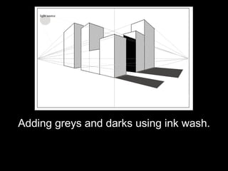
- 1. Adding greys and darks using ink wash.
- 2. As we begin to add light and dark to your drawings, it is important to try and add these tones in a convincing way.
- 3. Working with two-point perspective you can easily guess at how to apply your grey tones. In this image you can see that the sides of the forms facing the same direction have all been shaded in the same way.
- 4. In this image a dark shadow has been added to help further create convincing space. The shadow was found by following the vanishing point that was used to draw the tall building which is casting the shadow.
- 5. The shadows cast by the buildings are also following the vanishing points and they occur on the same side of the buildings that are shaded.
- 6. We began our drawings with simple outlines. The next step is to add a few different tones of grey, providing some definition to the drawing. Our final step will be adding blacks to the drawing using pen and ink to show detail and dark shadows.
- 7. INK WASH: THE BLACK AND WHITE "WATERCOLOR" Black ink is a powerful and unpredictable ally that when tamed, produces delicate gray washes that are very unique. They can be controlled as smooth layers just like watercolor applications or allowed to "do its thing" by giving it motion freedom. Let's look as some typical wash samples. Above each is a small brush application of that technique.
- 8. A blended wash can have value contrasts very tightly (left) or less controlled (right). Ink is applied first. The resulting grays are pushed and pulled into smoothness by additional water and brush containment.
- 9. Wet ink on wet paper is "runny". Bold thrusts of black swirl into the water ending in smokey tendrils and feathered grays. Each touch of new water and ink causes new stirrings. The brush merely applies and lets the unexpected happen. Ink paper is best for this effect.
- 10. Wet into partially wet background forces grays to have a hard white line where it hits bare, dry paper spots. This increases the reflection effect and affords whiter "whites" in the drawing.
- 11. Salt added to wet washes (top left) creates a spotted texture (top right). Some salt absorbs the wash and makes those spots lighter. Some ink settles around the salt grains and effects a black pitted texture. This can add nice texture to the ground or a building.
- 12. Dry brush is a less detailed, broad stroke application. The brush is dabbed on a towel to remove excess ink and immediately stroked on the paper in several directions.