
Recommended
More Related Content
What's hot
What's hot (20)
Viewers also liked
Viewers also liked (17)
Similar to process portfolio
Similar to process portfolio (20)
process portfolio
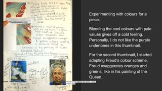
- 1. Experimenting with colours for a piece. Blending the cool colours with pale values gives off a cold feeling. Personally, I do not like the purple undertones in this thumbnail. For the second thumbnail, I started adapting Freud’s colour scheme. Freud exaggerates oranges and greens, like in his painting of the Queen. Passage, Jenny Saville, 2004 Portrait of Her Majesty the Queen, Lucian Freud, 2000 Thumbnails by me
- 2. Examination of Freud’s work. I looked at these paintings primarily to copy how Freud pints flesh. In the top painting, I noticed how he exaggerates shadows by creating high points with a singular solid, pale yellow. The legs, which are darker, is mixed with blues and purples, to create dimension. In the second painting, I noticed more the colours he mixed into the skin tone. He mixed purple into the forehead area to colour contrast the yellow, and it created shadows which weren’t too harsh due to blending. NAKED GIRL WITH EGG, Lucian Freud,1981 NAKED GIRL, Lucian Freud,1922
- 3. More facial sketches using a real life model (my face’s reflection in the mirror). Makeup causes the face to look different. When drawn, the eyeliner makes the lashline darker and mascara makes the eyes appear bigger. For the final piece, the darkest shade would have to be the eyeliner, due it it being solid black. If I want a more natural look, I can adjust the colour to a dark blue. Sketches by me
- 4. Practicing using reference from life. When looking at a face from below (an angle of about 30 degrees), the jawline is not as defined and creates a softer shadow. Additionally, when eyes are downcast, eyelid is visible. Since the ‘camera’ is from below, nostrils can be seen making the nose look bigger. Pastel of life from life. Eyes are NOT a pure white. I thus experimented with adding blues and greys. Thin, fine tip pastels were used to create eyelashes, however they were not pressed down enough. Adding mind green and an undertone of purple under a peach pastel added dimension and made the eye appear more realistic. While the yellow, however, makes it look more like a painting, it attracts the eye and matches the purple undertone aesthetically. The green above the eye was supposed to help with dimension, however it simply looks like eyeshadow. Therefore, if green is to be used, it must be used lightly or underneath a layer of pale yellow or peach. Lastly, paying attention to light source is what makes an eye come alive. I added a thin layer of white, mimicking the reflection of the overhead lights in the classroom which allows the eye look ‘awake’ and ‘alive’. Art by me
- 5. Rough sketch of a sketch Van Gogh had done once before. The main method was to create different shades through pencil pressure and crosshatching. While I personally feel crosshatching is difficult, I like the effect. Using a traditional pencil as opposed to a mechanical pencil makes it easier to vary line quality. It is quicker than traditional shading. Sketch by me Portrait of Postman Roulin, Vincent Van Gogh, 1888
- 6. Composition working The main focus of my piece were lips, so I copied a thumbnail and added more originality. By not following the exact colours and using warm oranges to contrast with the blue and green used for shadows, I created depth and made the composition more interesting to look at. paint thumbnail and sketches by me URL source: https://www.pinterest.com/pin/4 38960294909950464/
- 7. stp Thumbnails for piece. Blood creates a giant contrast with the colour of the lip due to being a deep red colour. The second thumbnail has a very thin upper lip. Thumbnails by me URL source: https://www.pinterest.com/p in/428264245786388637/ URL source: http://mf- chao.tumblr.com/.
- 8. I purchased small canvases for my pieces. Thus, I decided on using each canvas to create a series. When put together, the pieces create an overall appearance of lips, but when separated and viewed individually, it is abstract. I used this page to create a final composition. I took a concept from my previous sketches and decided to feature scabs, blood, and bruises on a pair of lips for my piece. This way, it creates a timeline of the wounds and a metaphor for the storyline of a relationship Thumbnails by me
- 9. The colours I chose for the face were bold, yet the texture blends it well with the others to make the figure recognizable. Using blues to shade is something I want to do for my final piece. Painting by me
- 10. Notes halfway through sketch: While negative space is still undecided and I am having issues with the figure in my photo, I have decided on drawing water at the bottom of the piece. Water is more complex to draw than expected due to the ripples and how it reflects the sun. Thus, rather than having an ideal shape, there are a lot of high points and low points. The two thumbnails use a lighter layer of white as the highlights and deeper blues and greens as the shading to create depth and give the water dimension. Thumbnails by me
- 11. Notes for composition: Asides from drawing hand I will be drawing a stomach. Generally, stomachs are photoshopped flat or muscles are made more extreme. I would like to draw a realistic stomach with some fat - preferably an “average” size. Sketches are of hand surrealism covering a “chubby” body. Sketches by me
- 12. Part of colour swatches and composition thumbnails. The first features a close crop around bruised knuckles. The bruise was created with purples and blues. By blending them together, it makes it difficult to see where the bruise starts and ends, yet the purple areas hints that the side of the hand they appear on was hit harder than the surrounding area. Despite believing my composition would feature a bruise, I ended up featuring as bloody wound, The second thumbnail is an example of a bloody wound. To make the red darker and appear deeper, I blended purple to the middle and added a highlight layer of white. The contrast between red and pale flesh makes the wound look fresh and painful. Thumbnails by me
- 13. Vector portrait notes: Characteristic of vector portraits are the blocks of colour used and laid atop of each other. The only form of blending are gradients within a selection. Other than that, there are defined lines between each selection of a vector. Vector portraits can be done Lineart w/ line quality of the paths Using colour families Monochromatic colours Contrastic colours Vector edges are smooth, and use layers in photoshop
- 14. I want my digital vector piece to be similar to Lau’s; solid selections layered on top of selections filled with gradients. Shown in the thumbnail above, I used a gradient for the face and the backdrop of the skin, as well as the shadow of the nose. Hair and eyes were done with solid colour. For the background, I decided to contrast with warm values with cold. The gradient from blue to white mimics the foreground. Finally, I planned to add a layer of text similar to how magazines are set up, keeping the face clear, yet all else covered Thumbnails by me