
Recommended
More Related Content
What's hot
Viewers also liked
Viewers also liked (18)
More from cjoyce104
More from cjoyce104 (20)
Toned paper
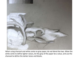
- 1. When using charcoal and white conte on gray paper, do not blend the two. Allow the white conte to define lighter values, let the gray of the paper be a value, and use the charcoal to define the darker tones and blacks.
- 2. Notice that in the value scale the gray of the page is one of the mid-tone values. Where the value falls on your scale will depend on how dark or light the grey of the paper is.
- 3. If you choose to fill in the background with a darker tone, be certain to fill in the entire background– do not just make a dark halo around the still life.