Download as PDF, PPTX
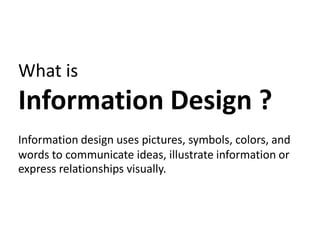

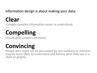
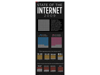


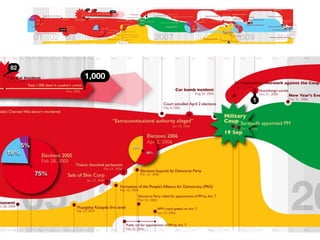


This document provides an overview of information design and how to create effective data visualizations. It discusses that information design uses visual elements to communicate ideas and relationships. Effective information design tells stories with data by showing trends, comparisons, or patterns in a clear, compelling and convincing manner. The document provides tips on planning information design projects by focusing on the audience and desired outcome, assessing the relevant data to include, and considering the best design elements and technologies. Examples from 1940 Thailand are also shown.