In what way does your media product use, develop or challenges forms and conventions?
•Download as PPTX, PDF•
0 likes•172 views
My media product challenges conventions by using color on the contents page rather than a plain background. The color scheme matches the front cover and is intended to make the magazine stand out. While most magazines feature the main artist on the contents page, mine only includes pictures of featured artists to avoid clutter. The double page spread uses a simple black and white background to reflect the artist, without a stereotypical large central image. A pull quote is used as the heading to immediately give the audience an idea of the story.
Report
Share
Report
Share

Recommended
Question1 Media Evaluation
This document discusses how the media product uses and develops conventions of the magazine format. It compares the cover of the product to another magazine, noting their use of color schemes. It also discusses design elements like additional images on the contents page to make it stand out, using only photos of featured artists, and a simple black and white double page spread with a pull quote to give readers an idea of the story without a large central image.
Question 1
The document compares features of the student's Christian magazine to a real magazine called Vibe. Both magazines use similar conventions like direct address of the subject on the cover and inclusion of things like mastheads, barcodes and QR codes. However, the student's magazine also challenges conventions by including things not seen in Vibe like a featured article callout on the contents page. Overall the comparison shows the student drawing inspiration from real magazines while also including their own unique design elements.
Q1
This document analyzes how the media product uses, develops, or challenges conventions of real media products. Specifically, it notes several conventions that are used or developed in similar ways between the media product and real magazines, such as using bright colors and free gifts to grab attention, including barcodes and issue numbers, using multiple photos and live action shots on pages, and including reviews and quotes. It also notes one way the media product challenges conventions by making the price clearly visible, rather than hidden.
Evaluation
Jacob Ellis evaluated his media product and found that:
1) He used conventions of real magazines such as a masthead, cover lines, contents page, and barcode.
2) He developed forms by using unique fonts and colors consistently throughout.
3) He challenged conventions by including free items and a competition to encourage purchases, straying from a purely informative format.
Produce raw images
These images are for a magazine, including a front cover, contents page, and double page article spread. The images are raw and unedited versions that will be used to create and layout the final magazine.
Magazine evaluation
The document summarizes the student's work on creating a front cover and contents page for a college magazine as part of a course assignment. It compares their work to real magazine covers and contents pages from Glamour and Vogue magazines. The student discusses similarities and differences between their work and the professional magazines in terms of design elements, images used, and information included. They also list the software and resources used to complete the assignment, noting they learned about using various technologies through the process of constructing the magazine pages.
Evaluation q1
1. The document describes how a media product uses and develops conventions of real magazines. It includes a cover, contents page, and double-page article spread that follow conventions such as placement of mastheads and images but also develop conventions through design choices like unique color schemes and layouts of images and text.
2. Key elements like mastheads, images, cover lines, page numbers, and bylines are included and positioned according to typical magazine standards. However, the document also discusses how the layout, colors, and pairing of images challenge conventions to create a cohesive dark theme.
3. Overall, the media product draws from real magazine formats but puts its own spin through modified design elements to both adhere to and
Preliminary task powerpoint Amy Willetts
My media product uses some conventions of real magazines such as including a masthead, cover lines, and images on the front cover and contents page. However, it also challenges conventions by having the masthead under the image on the front cover rather than covering it. I have learned how to use InDesign to create double page spreads and content pages, and how to place and resize images. I also used Photoshop to create the front cover, where I learned how to add strokes, outlines and shapes to images and text.
Question 2,4 & 5 Evaluation
I used an attractive male model on the front cover of my fashion magazine wearing fashionable clothing to promote an enigmatic look. I drew sketches of what I wanted my front cover to look like and showed it to my audience to get their feedback. I also distributed a questionnaire to a variety of people to get their opinions on concepts for my music magazine.
Media analysis
This magazine contents page summarizes the genres and target audience. The masthead is split into three sections in a unique style. The main image is of R&B artist Ciara in a provocative pose that could represent the magazine title and stereotypical views of female artists. Text is in white which draws the reader in against a dark background. The page promotes confidence in embracing one's body while also potentially making some feel intimidated.
Graphs
This document contains the results of a survey about music video viewing habits. The survey collected data on respondents' ages (majority 16-17), gender (equal boys and girls), how often they watch music videos (most every week or two), preferred music genres (mostly hip-hop, R&B, and pop), and what they expect to see in music videos (mainly dancing and images related to the lyrics). It also shows how respondents find out about new music (mostly internet and friends) and their opinions on whether lyrics and visuals should match and if the artist should appear in the video.
Presentation2
The document summarizes changes made to improve a music magazine from the first draft to the current version. The front cover image was re-shot with a new artist in a different setting related to the "Bashment" genre. The color scheme was changed to better merge with the cover image used throughout. The contents page layout is now more readable with sub-headings that stand out more clearly. Images in the double-paged spread are now better edited and blended with text for a more professional look. Feedback from peers was used to make further improvements by using more image effects and focusing more on layout and color scheme relating to the genre.
Draft album cover designs
The document discusses several draft album cover designs for an artist. Design 1 features an abstract image that is seen as dull. Design 2 shows the artist in color on an estate, seen as too stereotypical. Design 3 has too many colors distracting from the artist. The inlay photo is seen as showing the artist's cheeky side and relaxed natural pose, which could attract young female listeners.
Audience Profile
This document summarizes demographic information and spending habits of Passa-Passa readers. It finds that two-thirds of readers are women, with an average age of 18. Most readers work part-time or are still studying, and they spend the most on going to clubs, gigs and comedy shows each month, as well as cinema trips. Their favorite technology includes laptops, smartphones and game consoles.
Music Magazine; Front cover, Contents page and Double paged spread
1) The document discusses the process of designing a magazine, including choosing a color scheme for the cover and contents page, grouping photo numbers to stay with pictures, and using typography from the cover on other pages.
2) Before adding photos to the magazine, the student placed them in PowerPoint and changed their shape and edges to be blurry or smooth.
3) The background uses two layers of black, green, and yellow to represent the genre of the music magazine, and photos were cropped and backgrounds erased using selection and erasure tools.
China Dental System
- China has a population of 1.3 billion people and spends around 5% of its national wealth on health care.
- Oral healthcare was traditionally provided based on patient demand, but the government is now promoting prevention through programs in schools and communities.
- Most dentists work for government hospitals, but private dental clinics and hospitals are growing. Funding comes from individual health accounts as well as government subsidies.
Media Front cover, double paged spread and contents page
The document discusses the process of designing a music magazine, including choosing a color scheme for the contents page using the gradient editor, grouping page numbers with images, using typography from the front cover, editing photos in PowerPoint before adding them, using two layers for the background to represent the genre, cropping images with the magnetic lasso tool and eraser tool, and bringing everything together using a variety of design tools and ensuring the colors and layout worked well.
Evaluation
The document discusses using an attractive male model on the front cover of a magazine in fashionable clothing to promote an enigmatic look. Sketches were drawn of the desired front cover and shown to an audience to get feedback. A questionnaire was also distributed to a variety of people for a music magazine to get their opinions.
Question 2, 4 & 5 Evaluation
The document discusses using an attractive male model on the front cover of a magazine in fashionable clothing to promote an enigmatic look. Sketches were drawn of the desired front cover and shown to an audience to get feedback. A questionnaire was also distributed to various people for a music magazine to get their opinions.
Survey
This document contains the results from surveys about music magazine preferences. The key findings are:
1) The majority of respondents preferred R&B music and thought an R&B-focused magazine would be most successful.
2) 16-20 year olds were the most interested in music magazines, so the magazine should target that age group.
3) Most respondents do not regularly buy magazines but would be willing to pay £1-2 for a music magazine. Eye-catching photos would increase interest.
4) Websites are the main way people hear about new music, so including website listings would be beneficial. Popular artists, interesting articles, and photos of celebrities are the top things people
Cap srtucture hotdebt
This document summarizes a research paper that examines "hot" debt markets and their impact on corporate capital structure. The paper finds that:
1) Perceived favorable capital market conditions and information asymmetry costs are important factors that lead firms to issue more debt during hot debt market periods.
2) Firms with high information asymmetry costs issue significantly more debt when debt market conditions are hot compared to when markets are cold.
3) Hot debt market issuance has a persistent effect on the capital structure of issuing firms, which do not actively rebalance their leverage levels over the long-term as capital structure theories would predict.
Evaluation part 1
The document summarizes the ways in which the media product uses conventions of real magazines, represents social groups, and the type of media institution that might distribute it. Specifically, it includes conventions like price tags, dates, and layouts seen in real music magazines. It represents teenagers and young adults, particularly Asian females, through the music artists and genres featured. Finally, it suggests that IPC would be interested in distributing the product as they focus on female audiences and already produce magazines about music and in similar genres.
Evaluation of magazine
My magazine uses conventions of real magazines such as a striking cover image, limited color palette, catchy header, and barcode. The contents page includes cover lines with page numbers and images. The double page spread features a large main image, plain background for text, and grab quote. Conducting a questionnaire helped address the target audience of 15-19 year olds interested in R&B artists like Rihanna and Drake. Distribution companies like IPC that have experience with music magazines would be suitable to publish. Photoshop skills like adjusting colors and adding effects were utilized to construct the magazine pages.
Evaluation of magazine
My magazine targets young adults interested in R&B music. It uses neutral colors, large easy to read text, and images of diverse models to appeal to both male and female readers of all ethnicities. The content focuses on popular R&B artists like Rihanna and upcoming concerts/songs to attract fans of the genre. Conducting a questionnaire helped ensure the magazine design and topics matched the interests of the target audience. Photoshop was used to enhance images and add professional design elements like drop shadows.
Music magazine evaluation1 5
The document summarizes how the student's media magazine project uses, develops, and challenges conventions of real music magazines. It compares elements of the student's magazine cover, contents page, and articles to those in Vibe magazine. Specifically, it notes the use of color schemes, placement of images and text, and formatting techniques like drop caps that are common across both magazines. The target audience for the student's magazine is described as people ages 16-24 interested in mainstream, hip hop, and drum and bass music.
Evaluation
My product uses many of the same forms and conventions as real music magazines, such as a large headline, prominent images, band/artist names in titles, and columns for article titles on the contents page. However, it also challenges some conventions by using two contrasting colors on the cover background and having two feature images on the double page spread rather than one. Through this project, I have improved my photography, editing, and design skills by using Adobe Photoshop and researching real magazines for inspiration. Comparing my preliminary task to the final product shows development in mixing styles and using lighting/shot types to achieve different effects.
Evaluation question 1
This document summarizes how the student's media product uses and develops conventions of real music magazines. Key conventions included are:
- Using a consistent color scheme, fonts, and layout elements across pages to create continuity
- Including typical magazine elements like a masthead, date, price, and barcode
- Featuring artists and images relevant to the R&B genre
- Drawing inspiration from conventions of existing magazines in the genre, while making some unconventional design choices to suit their product
More Related Content
Viewers also liked
Question 2,4 & 5 Evaluation
I used an attractive male model on the front cover of my fashion magazine wearing fashionable clothing to promote an enigmatic look. I drew sketches of what I wanted my front cover to look like and showed it to my audience to get their feedback. I also distributed a questionnaire to a variety of people to get their opinions on concepts for my music magazine.
Media analysis
This magazine contents page summarizes the genres and target audience. The masthead is split into three sections in a unique style. The main image is of R&B artist Ciara in a provocative pose that could represent the magazine title and stereotypical views of female artists. Text is in white which draws the reader in against a dark background. The page promotes confidence in embracing one's body while also potentially making some feel intimidated.
Graphs
This document contains the results of a survey about music video viewing habits. The survey collected data on respondents' ages (majority 16-17), gender (equal boys and girls), how often they watch music videos (most every week or two), preferred music genres (mostly hip-hop, R&B, and pop), and what they expect to see in music videos (mainly dancing and images related to the lyrics). It also shows how respondents find out about new music (mostly internet and friends) and their opinions on whether lyrics and visuals should match and if the artist should appear in the video.
Presentation2
The document summarizes changes made to improve a music magazine from the first draft to the current version. The front cover image was re-shot with a new artist in a different setting related to the "Bashment" genre. The color scheme was changed to better merge with the cover image used throughout. The contents page layout is now more readable with sub-headings that stand out more clearly. Images in the double-paged spread are now better edited and blended with text for a more professional look. Feedback from peers was used to make further improvements by using more image effects and focusing more on layout and color scheme relating to the genre.
Draft album cover designs
The document discusses several draft album cover designs for an artist. Design 1 features an abstract image that is seen as dull. Design 2 shows the artist in color on an estate, seen as too stereotypical. Design 3 has too many colors distracting from the artist. The inlay photo is seen as showing the artist's cheeky side and relaxed natural pose, which could attract young female listeners.
Audience Profile
This document summarizes demographic information and spending habits of Passa-Passa readers. It finds that two-thirds of readers are women, with an average age of 18. Most readers work part-time or are still studying, and they spend the most on going to clubs, gigs and comedy shows each month, as well as cinema trips. Their favorite technology includes laptops, smartphones and game consoles.
Music Magazine; Front cover, Contents page and Double paged spread
1) The document discusses the process of designing a magazine, including choosing a color scheme for the cover and contents page, grouping photo numbers to stay with pictures, and using typography from the cover on other pages.
2) Before adding photos to the magazine, the student placed them in PowerPoint and changed their shape and edges to be blurry or smooth.
3) The background uses two layers of black, green, and yellow to represent the genre of the music magazine, and photos were cropped and backgrounds erased using selection and erasure tools.
China Dental System
- China has a population of 1.3 billion people and spends around 5% of its national wealth on health care.
- Oral healthcare was traditionally provided based on patient demand, but the government is now promoting prevention through programs in schools and communities.
- Most dentists work for government hospitals, but private dental clinics and hospitals are growing. Funding comes from individual health accounts as well as government subsidies.
Media Front cover, double paged spread and contents page
The document discusses the process of designing a music magazine, including choosing a color scheme for the contents page using the gradient editor, grouping page numbers with images, using typography from the front cover, editing photos in PowerPoint before adding them, using two layers for the background to represent the genre, cropping images with the magnetic lasso tool and eraser tool, and bringing everything together using a variety of design tools and ensuring the colors and layout worked well.
Evaluation
The document discusses using an attractive male model on the front cover of a magazine in fashionable clothing to promote an enigmatic look. Sketches were drawn of the desired front cover and shown to an audience to get feedback. A questionnaire was also distributed to a variety of people for a music magazine to get their opinions.
Question 2, 4 & 5 Evaluation
The document discusses using an attractive male model on the front cover of a magazine in fashionable clothing to promote an enigmatic look. Sketches were drawn of the desired front cover and shown to an audience to get feedback. A questionnaire was also distributed to various people for a music magazine to get their opinions.
Survey
This document contains the results from surveys about music magazine preferences. The key findings are:
1) The majority of respondents preferred R&B music and thought an R&B-focused magazine would be most successful.
2) 16-20 year olds were the most interested in music magazines, so the magazine should target that age group.
3) Most respondents do not regularly buy magazines but would be willing to pay £1-2 for a music magazine. Eye-catching photos would increase interest.
4) Websites are the main way people hear about new music, so including website listings would be beneficial. Popular artists, interesting articles, and photos of celebrities are the top things people
Cap srtucture hotdebt
This document summarizes a research paper that examines "hot" debt markets and their impact on corporate capital structure. The paper finds that:
1) Perceived favorable capital market conditions and information asymmetry costs are important factors that lead firms to issue more debt during hot debt market periods.
2) Firms with high information asymmetry costs issue significantly more debt when debt market conditions are hot compared to when markets are cold.
3) Hot debt market issuance has a persistent effect on the capital structure of issuing firms, which do not actively rebalance their leverage levels over the long-term as capital structure theories would predict.
Viewers also liked (16)
Music Magazine; Front cover, Contents page and Double paged spread
Music Magazine; Front cover, Contents page and Double paged spread
Media Front cover, double paged spread and contents page
Media Front cover, double paged spread and contents page
Similar to In what way does your media product use, develop or challenges forms and conventions?
Evaluation part 1
The document summarizes the ways in which the media product uses conventions of real magazines, represents social groups, and the type of media institution that might distribute it. Specifically, it includes conventions like price tags, dates, and layouts seen in real music magazines. It represents teenagers and young adults, particularly Asian females, through the music artists and genres featured. Finally, it suggests that IPC would be interested in distributing the product as they focus on female audiences and already produce magazines about music and in similar genres.
Evaluation of magazine
My magazine uses conventions of real magazines such as a striking cover image, limited color palette, catchy header, and barcode. The contents page includes cover lines with page numbers and images. The double page spread features a large main image, plain background for text, and grab quote. Conducting a questionnaire helped address the target audience of 15-19 year olds interested in R&B artists like Rihanna and Drake. Distribution companies like IPC that have experience with music magazines would be suitable to publish. Photoshop skills like adjusting colors and adding effects were utilized to construct the magazine pages.
Evaluation of magazine
My magazine targets young adults interested in R&B music. It uses neutral colors, large easy to read text, and images of diverse models to appeal to both male and female readers of all ethnicities. The content focuses on popular R&B artists like Rihanna and upcoming concerts/songs to attract fans of the genre. Conducting a questionnaire helped ensure the magazine design and topics matched the interests of the target audience. Photoshop was used to enhance images and add professional design elements like drop shadows.
Music magazine evaluation1 5
The document summarizes how the student's media magazine project uses, develops, and challenges conventions of real music magazines. It compares elements of the student's magazine cover, contents page, and articles to those in Vibe magazine. Specifically, it notes the use of color schemes, placement of images and text, and formatting techniques like drop caps that are common across both magazines. The target audience for the student's magazine is described as people ages 16-24 interested in mainstream, hip hop, and drum and bass music.
Evaluation
My product uses many of the same forms and conventions as real music magazines, such as a large headline, prominent images, band/artist names in titles, and columns for article titles on the contents page. However, it also challenges some conventions by using two contrasting colors on the cover background and having two feature images on the double page spread rather than one. Through this project, I have improved my photography, editing, and design skills by using Adobe Photoshop and researching real magazines for inspiration. Comparing my preliminary task to the final product shows development in mixing styles and using lighting/shot types to achieve different effects.
Evaluation question 1
This document summarizes how the student's media product uses and develops conventions of real music magazines. Key conventions included are:
- Using a consistent color scheme, fonts, and layout elements across pages to create continuity
- Including typical magazine elements like a masthead, date, price, and barcode
- Featuring artists and images relevant to the R&B genre
- Drawing inspiration from conventions of existing magazines in the genre, while making some unconventional design choices to suit their product
Evaluation question 1
This document summarizes the ways in which the student's media product uses and develops conventions from real music magazines. The student researched conventions from magazines like VIBE and FLAVOUR to inform design choices for their front cover, contents page, and double page spread. Key conventions included color scheme, fonts, masthead placement, images, captions, and page numbers. The student also experimented with some unconventional design choices to develop their own style appropriate for their R&B genre target audience. Overall, the student strived to create a cohesive magazine design that drew from real magazine formats.
Evaluation question 1
The document analyzes how the media product, a music magazine, both follows and challenges conventions of real music magazines. It provides examples of layout elements and design features from the magazine's mock front cover, contents page, and double-page article spread that emulate conventions like central images, varying typography sizes, and floating quotes. It also notes some unconventional elements like fewer supporting images. Overall, the magazine aims to look realistic while including some unique qualities.
In what ways does your media product use, develop or challenge forms and conv...
The document discusses how a media product uses, develops, and challenges conventions of real media magazines. It summarizes that the product uses conventions like placing the masthead on the front cover's left third and including a skyline and banner. Images and text are also placed similarly to conventions from NME. However, conventions are also developed, like using different colors for the cover lines and barcode. Conventions are challenged too, such as placing text around the double page image instead of beside it, and including a digital barcode on the contents page to subscribe.
Evaluation question 1
The document summarizes how the media product uses conventions from real music magazines in its genre. Key conventions included are:
1. Using a consistent color scheme, fonts, and layout elements like mastheads and page numbers to create continuity across pages similar to magazines like Vibe and Flavour.
2. Choosing photography, styles, and article formats inspired by magazines in the genre to appeal to the target audience.
3. Adapting some atypical conventions like unusual masthead and date placements, pull quotes, and bylines to make the pages more distinctive while still being recognizable as a music magazine.
Media evaluation
The document discusses the author's music magazine genre project. They chose to focus their magazine on R&B and hip hop music as these genres were most popular with their target audience of teenagers aged 16-19. For the project, the author created a front cover, contents page, and double page spread. In creating the magazine, they referred to existing products and research to help shape their magazine for their target audience.
Evaluation part 1
The document provides an evaluation of the student's media product, a music magazine. It summarizes how the magazine uses conventions of real magazines in its front cover, contents page, and double-page spread. This includes including things like prices, dates, logos and layouts that real magazines use. It also discusses changes made from initial drafts in the planning process and how the final product developed some elements differently than initially planned.
Q1
This document discusses how the media product uses and develops conventions of real music magazines. It summarizes how the front cover, contents page, and double page spread follow typical magazine structures and styles. The front cover uses a large central image and masthead like real music magazines. The contents page includes images and lists sections similarly to other magazines. The double page spread employs a black border, large heading, and black and white image consistent with conventions.
In what ways does your media product use , develop or challenge forms and con...
This document discusses how the student's media product, a magazine called "Mercy", both uses conventions from real music magazines and challenges some conventions. The student structured their magazine similarly to magazines like "Vibe" by featuring the main artist prominently on the cover and using consistent formatting, layout, and design elements throughout. However, the student also challenged conventions by including an untraditional smiling photograph of a rapper, as rappers are typically portrayed seriously in hip hop magazines.
Question 1
The document discusses how a student's media product for a music magazine uses, develops, or challenges conventions of real magazines. The student uses standard magazine formatting conventions like mastheads, fonts, and color schemes for the front cover. For the contents page, the student develops conventions by including photos of multiple artists. The double-page spread challenges conventions by including three pulled quotes instead of the typical one, and two mastheads, to highlight the featured artist and make the spread stand out more. The front cover and contents page aim to be mainstream, while the double-page spread emphasizes uniqueness.
Evaluation q1 neww
The document analyzes the ways in which the student's media product uses, develops, and challenges conventions of real media products. It compares the student's magazine cover and contents page to examples from an existing hip-hop magazine. Both products use similar layouts and elements, but the student incorporates some unique design choices such as a brick wall background and quote wrap text on the double page spread. The student aims to develop conventions to make the magazine engaging while maintaining consistency and professional appearance.
Magazine comparision
The document compares elements of the student's mock magazine with real magazines to analyze how it uses, develops, or challenges their conventions and forms.
The front cover summary portrays elements found in real magazines like Blender and Billboard covers, such as branding at the top, sell lines around the main image, and direct model addressing. However, it challenges conventions by writing text on top of the main image rather than surrounding it.
The contents page similarly compares to Billboard and NME with pictures and highlighted headings, but lacks additional real magazine features.
The double-page spread uses conventions like titles, differentiated question/answer colors, and balanced images/text. It challenges forms by not taking a full page image and includes
Evaluation 1
The document compares and contrasts the front cover, contents page, and double page spread of the student's magazine to real published magazines.
1) The front cover is compared to Vibe magazine, noting similarities in direct address of models and overlapping of masthead, as well as differences in color scheme.
2) The contents page is compared to The Source, with similarities in logo placement and background image style, but differences in model positioning and color scheme.
3) The double page spread is compared to NME, with similarities in model placement and intro paragraph style, but differences in linking to other media and number of images.
Question 1
My media product follows many conventions of real music magazines, such as mastheads, coverlines, and contents pages. However, it also challenges some conventions. On the front cover, social media icons are included to address the target audience, unlike the example magazine cover. The double page spread challenges conventions by including a Twitter Q&A column for audience interaction and a blurb introducing the article, features not seen in example magazines. While some conventions like mastheads and images are followed, conventions are challenged through inclusion of social media features and explanatory text to better engage the audience.
Evaluation question 1
This document discusses how the author's media product uses and challenges conventions of real magazines. It summarizes how each section of the magazine - the front page, contents page, and double-page spread - both follows and challenges typical magazine conventions in terms of design, formatting, color schemes, fonts, and photography. For example, the front page masthead uses a purple color which challenges conventions by being feminine, while the fonts and color scheme otherwise follow conventions. The contents page challenges conventions by using many images rather than just text, and the double-page spread changes the color scheme to match the subject of the photography. Throughout, the author considers typical magazine designs but also makes intentional changes to challenge norms.
Similar to In what way does your media product use, develop or challenges forms and conventions? (20)
In what ways does your media product use, develop or challenge forms and conv...
In what ways does your media product use, develop or challenge forms and conv...
In what ways does your media product use , develop or challenge forms and con...
In what ways does your media product use , develop or challenge forms and con...
More from shanay11230
Equipment list
This document lists various equipment needed for a production including a tripod, green screen, voice recorder, lighting, video camera, bookshelf, bed, and stage. A skateboard is also included in the list.
Unused pics and why
This document discusses a photo shoot for a rap artist and feedback on a picture taken. It notes that the picture shows a more relaxed side of the artist but his face cannot be seen, which prevents understanding his emotion and connecting with audiences. Moving the camera higher to show his face would make the picture more capturing and help audiences understand his message and genre. The low camera angle was meant to show superiority but he looks too relaxed, which may give the impression of not being serious about his music career.
Cd names
The document discusses potential album title choices for an upcoming release. Several options are presented such as "Good Life", "True Colours", and "Dreams", however each is found to have flaws such as being too cliche, not linking to the album's other tracks, or sounding repetitive when combined with the artist's name. Ultimately, none of the initial choices are deemed ideal for the album name.
Paparazzi
Postmodernism rejects the idea that any media text is more valuable than another. Lady Gaga's "Paparazzi" music video uses techniques of postmodernism by referencing and blending elements from popular culture and classic films to tell a narrative about the dark side of fame. The video references Sunset Boulevard and Vertigo through its narrative and visuals while also incorporating symbols from Minnie Mouse. Lady Gaga portrays a character who experiences the ups and downs of celebrity, from riches to a dramatic fall from her balcony staged by her boyfriend, showing some realities some celebrities face due to fame.
Paparazzi
The document discusses the concept of postmodernism and analyzes Lady Gaga's "Paparazzi" music video. It summarizes that the video uses techniques like pastiche, homage, and intertextuality to reference popular culture and blur boundaries. Specifically, the video acts as a short Hollywood film highlighting celebrity fame and tragedy, making references to films like Sunset Boulevard and Vertigo through its narrative and stylistic elements.
Info for media
Tom Tripp is a rapper from London born in 1994. The song he chose, "Dreamsville", explores themes of enjoying life and having fun. It was chosen because it had a more positive message than other songs considered and received the most positive feedback from classmates and teachers due to its lyrical content focusing on positive themes in a way that stands out from typical rap/hip-hop music.
Unused pics
A woman's hair covered part of her face and a ladder was visible in her tights in one image. Another image was blurry and part of a shoe was cut off. An image was not used on a contents page because clothing string was visible and the woman's pose seemed to be for a fashion magazine rather than music.
What is bashment music
Bashment music, also known as dancehall, is a popular genre in Jamaica developed in 1978 that blends reggae and grime with a fast, danceable beat. While dancehall gained popularity in the mid-1990s, it has received criticism for sometimes violent and homophobic lyrics. Bashment music is popular in the Caribbean and UK on private radio but not public radio, as record labels do not see it as competitive in the global market. The author chose to create a Bashment magazine to showcase the genre and artists in a more sophisticated light, addressing stereotypes, and fill a gap, as research found no existing Bashment magazines.
More from shanay11230 (8)
Recently uploaded
AWS Cloud Cost Optimization Presentation.pptx
This presentation provides valuable insights into effective cost-saving techniques on AWS. Learn how to optimize your AWS resources by rightsizing, increasing elasticity, picking the right storage class, and choosing the best pricing model. Additionally, discover essential governance mechanisms to ensure continuous cost efficiency. Whether you are new to AWS or an experienced user, this presentation provides clear and practical tips to help you reduce your cloud costs and get the most out of your budget.
Nunit vs XUnit vs MSTest Differences Between These Unit Testing Frameworks.pdf
When it comes to unit testing in the .NET ecosystem, developers have a wide range of options available. Among the most popular choices are NUnit, XUnit, and MSTest. These unit testing frameworks provide essential tools and features to help ensure the quality and reliability of code. However, understanding the differences between these frameworks is crucial for selecting the most suitable one for your projects.
TrustArc Webinar - 2024 Global Privacy Survey
How does your privacy program stack up against your peers? What challenges are privacy teams tackling and prioritizing in 2024?
In the fifth annual Global Privacy Benchmarks Survey, we asked over 1,800 global privacy professionals and business executives to share their perspectives on the current state of privacy inside and outside of their organizations. This year’s report focused on emerging areas of importance for privacy and compliance professionals, including considerations and implications of Artificial Intelligence (AI) technologies, building brand trust, and different approaches for achieving higher privacy competence scores.
See how organizational priorities and strategic approaches to data security and privacy are evolving around the globe.
This webinar will review:
- The top 10 privacy insights from the fifth annual Global Privacy Benchmarks Survey
- The top challenges for privacy leaders, practitioners, and organizations in 2024
- Key themes to consider in developing and maintaining your privacy program
Operating System Used by Users in day-to-day life.pptx
Dive into the realm of operating systems (OS) with Pravash Chandra Das, a seasoned Digital Forensic Analyst, as your guide. 🚀 This comprehensive presentation illuminates the core concepts, types, and evolution of OS, essential for understanding modern computing landscapes.
Beginning with the foundational definition, Das clarifies the pivotal role of OS as system software orchestrating hardware resources, software applications, and user interactions. Through succinct descriptions, he delineates the diverse types of OS, from single-user, single-task environments like early MS-DOS iterations, to multi-user, multi-tasking systems exemplified by modern Linux distributions.
Crucial components like the kernel and shell are dissected, highlighting their indispensable functions in resource management and user interface interaction. Das elucidates how the kernel acts as the central nervous system, orchestrating process scheduling, memory allocation, and device management. Meanwhile, the shell serves as the gateway for user commands, bridging the gap between human input and machine execution. 💻
The narrative then shifts to a captivating exploration of prominent desktop OSs, Windows, macOS, and Linux. Windows, with its globally ubiquitous presence and user-friendly interface, emerges as a cornerstone in personal computing history. macOS, lauded for its sleek design and seamless integration with Apple's ecosystem, stands as a beacon of stability and creativity. Linux, an open-source marvel, offers unparalleled flexibility and security, revolutionizing the computing landscape. 🖥️
Moving to the realm of mobile devices, Das unravels the dominance of Android and iOS. Android's open-source ethos fosters a vibrant ecosystem of customization and innovation, while iOS boasts a seamless user experience and robust security infrastructure. Meanwhile, discontinued platforms like Symbian and Palm OS evoke nostalgia for their pioneering roles in the smartphone revolution.
The journey concludes with a reflection on the ever-evolving landscape of OS, underscored by the emergence of real-time operating systems (RTOS) and the persistent quest for innovation and efficiency. As technology continues to shape our world, understanding the foundations and evolution of operating systems remains paramount. Join Pravash Chandra Das on this illuminating journey through the heart of computing. 🌟
leewayhertz.com-AI in predictive maintenance Use cases technologies benefits ...
Predictive maintenance is a proactive approach that anticipates equipment failures before they happen. At the forefront of this innovative strategy is Artificial Intelligence (AI), which brings unprecedented precision and efficiency. AI in predictive maintenance is transforming industries by reducing downtime, minimizing costs, and enhancing productivity.
A Comprehensive Guide to DeFi Development Services in 2024
DeFi represents a paradigm shift in the financial industry. Instead of relying on traditional, centralized institutions like banks, DeFi leverages blockchain technology to create a decentralized network of financial services. This means that financial transactions can occur directly between parties, without intermediaries, using smart contracts on platforms like Ethereum.
In 2024, we are witnessing an explosion of new DeFi projects and protocols, each pushing the boundaries of what’s possible in finance.
In summary, DeFi in 2024 is not just a trend; it’s a revolution that democratizes finance, enhances security and transparency, and fosters continuous innovation. As we proceed through this presentation, we'll explore the various components and services of DeFi in detail, shedding light on how they are transforming the financial landscape.
At Intelisync, we specialize in providing comprehensive DeFi development services tailored to meet the unique needs of our clients. From smart contract development to dApp creation and security audits, we ensure that your DeFi project is built with innovation, security, and scalability in mind. Trust Intelisync to guide you through the intricate landscape of decentralized finance and unlock the full potential of blockchain technology.
Ready to take your DeFi project to the next level? Partner with Intelisync for expert DeFi development services today!
Salesforce Integration for Bonterra Impact Management (fka Social Solutions A...
Sidekick Solutions uses Bonterra Impact Management (fka Social Solutions Apricot) and automation solutions to integrate data for business workflows.
We believe integration and automation are essential to user experience and the promise of efficient work through technology. Automation is the critical ingredient to realizing that full vision. We develop integration products and services for Bonterra Case Management software to support the deployment of automations for a variety of use cases.
This video focuses on integration of Salesforce with Bonterra Impact Management.
Interested in deploying an integration with Salesforce for Bonterra Impact Management? Contact us at sales@sidekicksolutionsllc.com to discuss next steps.
Driving Business Innovation: Latest Generative AI Advancements & Success Story
Are you ready to revolutionize how you handle data? Join us for a webinar where we’ll bring you up to speed with the latest advancements in Generative AI technology and discover how leveraging FME with tools from giants like Google Gemini, Amazon, and Microsoft OpenAI can supercharge your workflow efficiency.
During the hour, we’ll take you through:
Guest Speaker Segment with Hannah Barrington: Dive into the world of dynamic real estate marketing with Hannah, the Marketing Manager at Workspace Group. Hear firsthand how their team generates engaging descriptions for thousands of office units by integrating diverse data sources—from PDF floorplans to web pages—using FME transformers, like OpenAIVisionConnector and AnthropicVisionConnector. This use case will show you how GenAI can streamline content creation for marketing across the board.
Ollama Use Case: Learn how Scenario Specialist Dmitri Bagh has utilized Ollama within FME to input data, create custom models, and enhance security protocols. This segment will include demos to illustrate the full capabilities of FME in AI-driven processes.
Custom AI Models: Discover how to leverage FME to build personalized AI models using your data. Whether it’s populating a model with local data for added security or integrating public AI tools, find out how FME facilitates a versatile and secure approach to AI.
We’ll wrap up with a live Q&A session where you can engage with our experts on your specific use cases, and learn more about optimizing your data workflows with AI.
This webinar is ideal for professionals seeking to harness the power of AI within their data management systems while ensuring high levels of customization and security. Whether you're a novice or an expert, gain actionable insights and strategies to elevate your data processes. Join us to see how FME and AI can revolutionize how you work with data!
Skybuffer AI: Advanced Conversational and Generative AI Solution on SAP Busin...
Skybuffer AI, built on the robust SAP Business Technology Platform (SAP BTP), is the latest and most advanced version of our AI development, reaffirming our commitment to delivering top-tier AI solutions. Skybuffer AI harnesses all the innovative capabilities of the SAP BTP in the AI domain, from Conversational AI to cutting-edge Generative AI and Retrieval-Augmented Generation (RAG). It also helps SAP customers safeguard their investments into SAP Conversational AI and ensure a seamless, one-click transition to SAP Business AI.
With Skybuffer AI, various AI models can be integrated into a single communication channel such as Microsoft Teams. This integration empowers business users with insights drawn from SAP backend systems, enterprise documents, and the expansive knowledge of Generative AI. And the best part of it is that it is all managed through our intuitive no-code Action Server interface, requiring no extensive coding knowledge and making the advanced AI accessible to more users.
Finale of the Year: Apply for Next One!
Presentation for the event called "Finale of the Year: Apply for Next One!" organized by GDSC PJATK
Digital Marketing Trends in 2024 | Guide for Staying Ahead
https://www.wask.co/ebooks/digital-marketing-trends-in-2024
Feeling lost in the digital marketing whirlwind of 2024? Technology is changing, consumer habits are evolving, and staying ahead of the curve feels like a never-ending pursuit. This e-book is your compass. Dive into actionable insights to handle the complexities of modern marketing. From hyper-personalization to the power of user-generated content, learn how to build long-term relationships with your audience and unlock the secrets to success in the ever-shifting digital landscape.
Monitoring and Managing Anomaly Detection on OpenShift.pdf
Monitoring and Managing Anomaly Detection on OpenShift
Overview
Dive into the world of anomaly detection on edge devices with our comprehensive hands-on tutorial. This SlideShare presentation will guide you through the entire process, from data collection and model training to edge deployment and real-time monitoring. Perfect for those looking to implement robust anomaly detection systems on resource-constrained IoT/edge devices.
Key Topics Covered
1. Introduction to Anomaly Detection
- Understand the fundamentals of anomaly detection and its importance in identifying unusual behavior or failures in systems.
2. Understanding Edge (IoT)
- Learn about edge computing and IoT, and how they enable real-time data processing and decision-making at the source.
3. What is ArgoCD?
- Discover ArgoCD, a declarative, GitOps continuous delivery tool for Kubernetes, and its role in deploying applications on edge devices.
4. Deployment Using ArgoCD for Edge Devices
- Step-by-step guide on deploying anomaly detection models on edge devices using ArgoCD.
5. Introduction to Apache Kafka and S3
- Explore Apache Kafka for real-time data streaming and Amazon S3 for scalable storage solutions.
6. Viewing Kafka Messages in the Data Lake
- Learn how to view and analyze Kafka messages stored in a data lake for better insights.
7. What is Prometheus?
- Get to know Prometheus, an open-source monitoring and alerting toolkit, and its application in monitoring edge devices.
8. Monitoring Application Metrics with Prometheus
- Detailed instructions on setting up Prometheus to monitor the performance and health of your anomaly detection system.
9. What is Camel K?
- Introduction to Camel K, a lightweight integration framework built on Apache Camel, designed for Kubernetes.
10. Configuring Camel K Integrations for Data Pipelines
- Learn how to configure Camel K for seamless data pipeline integrations in your anomaly detection workflow.
11. What is a Jupyter Notebook?
- Overview of Jupyter Notebooks, an open-source web application for creating and sharing documents with live code, equations, visualizations, and narrative text.
12. Jupyter Notebooks with Code Examples
- Hands-on examples and code snippets in Jupyter Notebooks to help you implement and test anomaly detection models.
dbms calicut university B. sc Cs 4th sem.pdf
Its a seminar ppt on database management system using sql
Best 20 SEO Techniques To Improve Website Visibility In SERP
Boost your website's visibility with proven SEO techniques! Our latest blog dives into essential strategies to enhance your online presence, increase traffic, and rank higher on search engines. From keyword optimization to quality content creation, learn how to make your site stand out in the crowded digital landscape. Discover actionable tips and expert insights to elevate your SEO game.
Your One-Stop Shop for Python Success: Top 10 US Python Development Providers
Simplify your search for a reliable Python development partner! This list presents the top 10 trusted US providers offering comprehensive Python development services, ensuring your project's success from conception to completion.
Recently uploaded (20)
Nunit vs XUnit vs MSTest Differences Between These Unit Testing Frameworks.pdf
Nunit vs XUnit vs MSTest Differences Between These Unit Testing Frameworks.pdf
Operating System Used by Users in day-to-day life.pptx
Operating System Used by Users in day-to-day life.pptx
leewayhertz.com-AI in predictive maintenance Use cases technologies benefits ...
leewayhertz.com-AI in predictive maintenance Use cases technologies benefits ...
A Comprehensive Guide to DeFi Development Services in 2024
A Comprehensive Guide to DeFi Development Services in 2024
Overcoming the PLG Trap: Lessons from Canva's Head of Sales & Head of EMEA Da...
Overcoming the PLG Trap: Lessons from Canva's Head of Sales & Head of EMEA Da...
Salesforce Integration for Bonterra Impact Management (fka Social Solutions A...
Salesforce Integration for Bonterra Impact Management (fka Social Solutions A...
Driving Business Innovation: Latest Generative AI Advancements & Success Story
Driving Business Innovation: Latest Generative AI Advancements & Success Story
Skybuffer AI: Advanced Conversational and Generative AI Solution on SAP Busin...
Skybuffer AI: Advanced Conversational and Generative AI Solution on SAP Busin...
Digital Marketing Trends in 2024 | Guide for Staying Ahead
Digital Marketing Trends in 2024 | Guide for Staying Ahead
Monitoring and Managing Anomaly Detection on OpenShift.pdf
Monitoring and Managing Anomaly Detection on OpenShift.pdf
Best 20 SEO Techniques To Improve Website Visibility In SERP
Best 20 SEO Techniques To Improve Website Visibility In SERP
Deep Dive: AI-Powered Marketing to Get More Leads and Customers with HyperGro...
Deep Dive: AI-Powered Marketing to Get More Leads and Customers with HyperGro...
Your One-Stop Shop for Python Success: Top 10 US Python Development Providers
Your One-Stop Shop for Python Success: Top 10 US Python Development Providers
In what way does your media product use, develop or challenges forms and conventions?
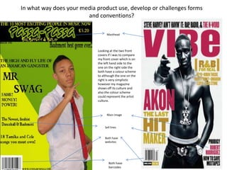
- 1. In what way does your media product use, develop or challenges forms and conventions? Masthead Looking at the two front covers if I was to compare my front cover which is on the left hand side to the one on the right side the both have a colour scheme to although the one on the right is very simplistic however my magazine shows off its culture and also the colour scheme could represent the artist culture. Main image Sell lines Both have websites Both have barcodes
- 2. With my contents page I have additional images and text, most of the backgrounds that I’ve seen on content pages have been colourless and plain so I decided to use the same colour’s that I used on my front cover on my contents page. The reason why I never done a colourless contents page is because I wanted my magazine to stand out more to my audience. Most magazine’s would have a picture of their main artist on their contents page but I decided to just use pictures of the featured artist in my magazine first of all I didn't want my contents page to look cluttered so I only used two pictures and also only have a few pages listed.
- 3. In my double page spread I decided to use a natural black and white background so that the simplicity of it reflects on my artist, I decided not to make my double paged spread look stereotypical by this I mean making my double paged spread have a big fat image of the artist either in the middle of the page or on one whole page. I also used a pull quote as my heading on this page so that when my audience looks at the page they straight away get a rough idea to what the story is about. Page numbers Pull quote