The document compares and contrasts the front cover, contents page, and double page spread of the student's magazine to real published magazines.
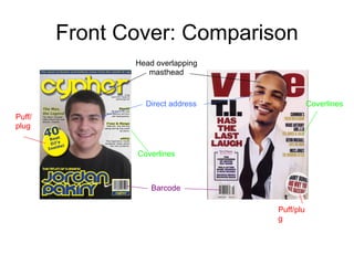
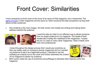
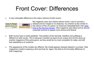
1) The front cover is compared to Vibe magazine, noting similarities in direct address of models and overlapping of masthead, as well as differences in color scheme.
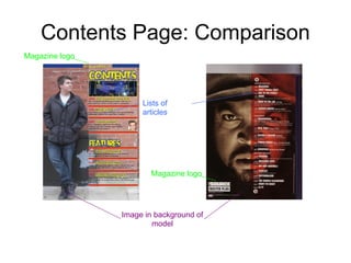
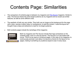
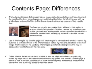
2) The contents page is compared to The Source, with similarities in logo placement and background image style, but differences in model positioning and color scheme.
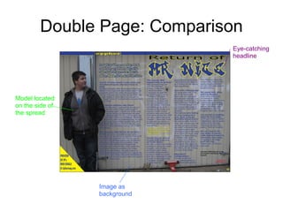
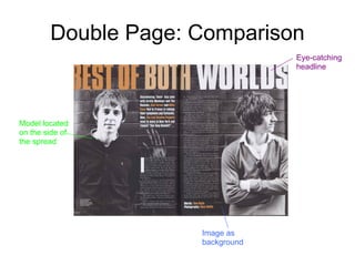
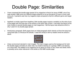
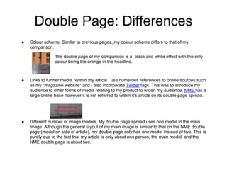
3) The double page spread is compared to NME, with similarities in model placement and intro paragraph style, but differences in linking to other media and number of images.


![Presentation2[1]](https://cdn.slidesharecdn.com/ss_thumbnails/presentation21-121106043656-phpapp02-thumbnail.jpg?width=640&height=640&fit=bounds)


