
Recommended
More Related Content
What's hot
What's hot (18)
Viewers also liked
Viewers also liked (14)
Similar to Evaluation part 1
Similar to Evaluation part 1 (20)
Recently uploaded
Recently uploaded (20)
Evaluation part 1
- 1. Evaluation Rina Bansal
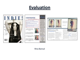
- 2. 1. In what ways does your media product use, develop or challenge forms and conventions of real media products? Front Cover Headlines Masthead Cover lines Main cover line Barcode, issue date & price Main Image which anchors the main cover line. Also the model stares directly into the camera My front cover has included many conventions of a real music magazine cover. I have included a price tag, barcode, date and issue number, which are essential to a magazine cover. As well as this, I have used the ‘magic C’ rule for the layout of the magazine cover. I have included a flash in the corner of the magazine, which shows more advertisement. There is only one image used here, which draws more attention to the mainly focused article. The medium close-up shot of the model also is effective as it does not overcrowd the cover. Also, the model is staring directly into the camera to grab the readers attention. I have also used the ‘drop-shadow’ effect and used ‘Edwardian Script ITC’, for the main cover line to make it stand out more from the page. The title of the magazine also overlaps the main image.
- 3. Contents Page Contents title Issue date Cover line title Page reference in the image Images of artists’ Page references with some information on the page Extra information about events and more about the articles- some page references My contents page also contains conventions of a real contents cover. I have included the issue date underneath the main title, as well as using the same font style for the contents title, to show continuity. I have included a ‘top 10 UK charts’ to portray further that this is a music magazine, but also to inform the reader of the ‘latest music hits’ that are popular- I have also categorised them. I have used only two images, which I have edited, to show that the main focused article is about the artist within the image. To anchor this idea, I have made the page reference with information on the article, in a larger font size compared to the others. I have included an extra section, which is bordered to make it stand out from the page, where is gives more insight on what else is in the magazine. It includes a competition to interest the readers. The colour scheme of the page also show continuity to the front cover, however I have added more to make it slightly different so it would not appear boring.
- 4. Double-Page Spread Magazine logo Main focused image overlaps the content Page numbers Main title of the article columns Grab quote Extra advertisement Tells us who wrote the article and The website of the magazine photographed the images My double-page spread is an interview with an artist. It is written in columns and includes a ‘grab quote’ of what the artist has said. The ‘grab quote’ wraps around the text and is highlighted as it is in a different font colour to make it stand out. The artists name is in a different font style and colour to make it stand out more, as well as ‘best selling acoustic single’ to show that they are the important part of the article title. The main image also overlaps the decoration of the 3 lines, and the text wraps around the bottom of the image, which makes the image more or less stand out. This image is purposely focused on as the artist is looking directly at the camera smiling, which would instantly build a relationship with the reader and gives off a positive atmosphere. Each of the 3 images have a different border, however the same effect (to show continuity), to make the page more outstanding from the others. The page numbers are also included. The colour scheme of blue, white and grey is consistent with the front colour and looks more professional.
- 5. Planning Before I created the music magazine, I had planned out my designs and information by carefully sketching some drafts of the production along with annotations of the colour schemes and font size, style and colour. Throughout the development of the magazine however, some of the designs had changed as these drafts were only a rough outline of the magazine. For example, the draft for the contents and double page spread, the placement of images and the layout of the page have been changed slightly. As well as this, the article for the double-page spread had also been planned out on a Microsoft Word document. This was to ensure that it was suitable for the content. We then imported the article from the word document into the ‘InDesign’ document (which was the software I used to create the double page spread). The Drafts: