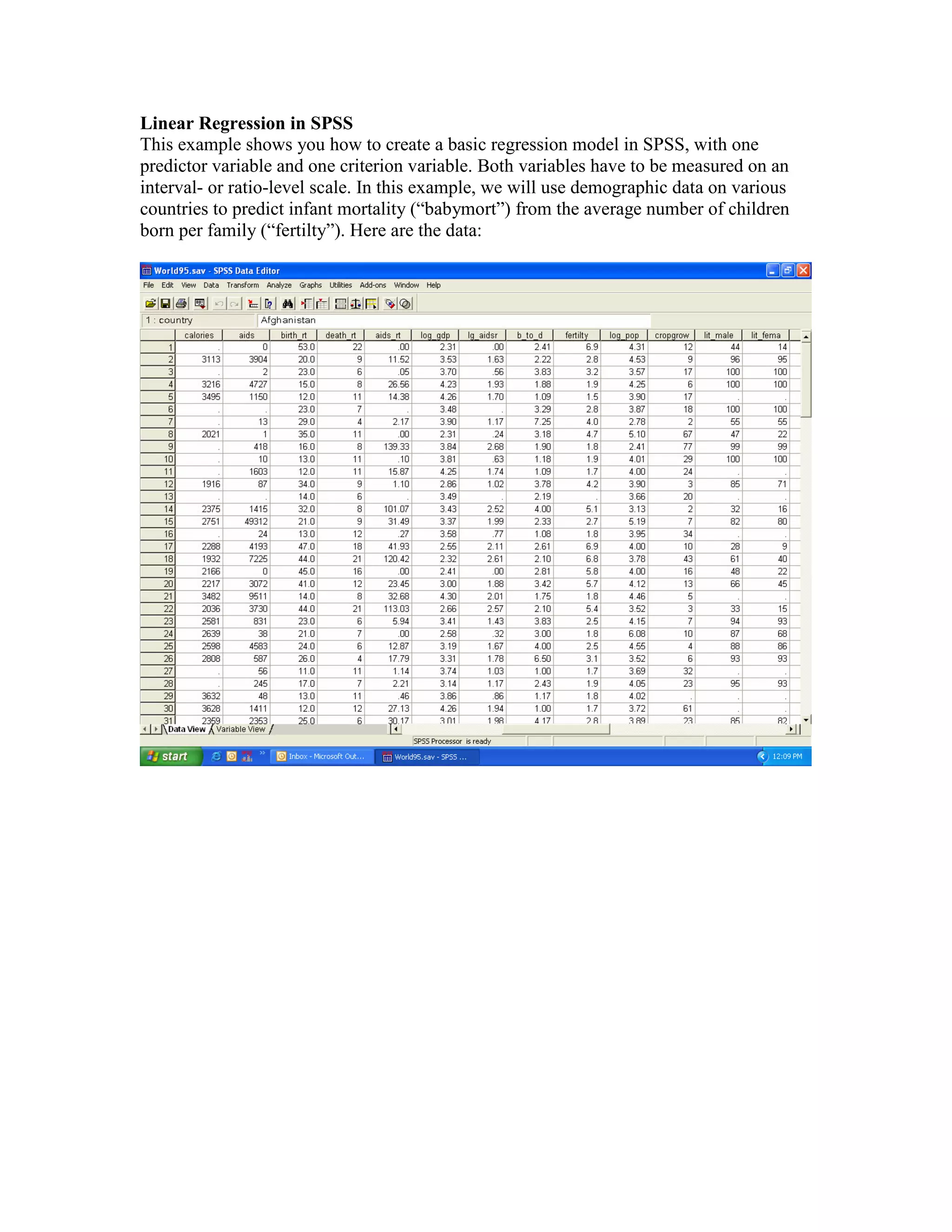
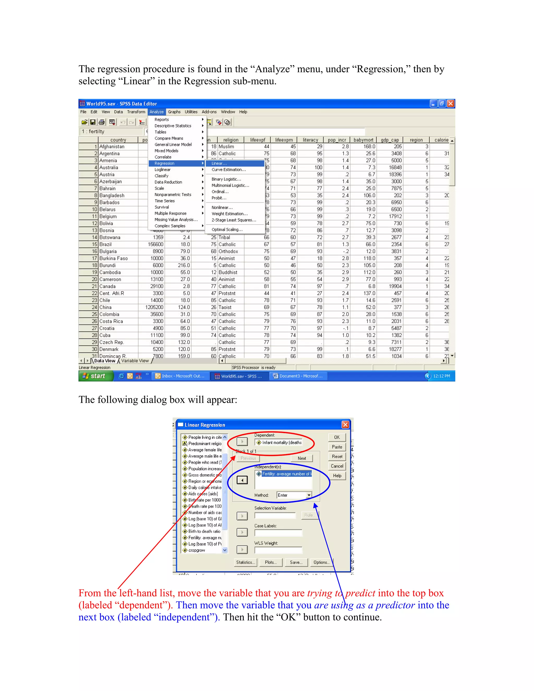
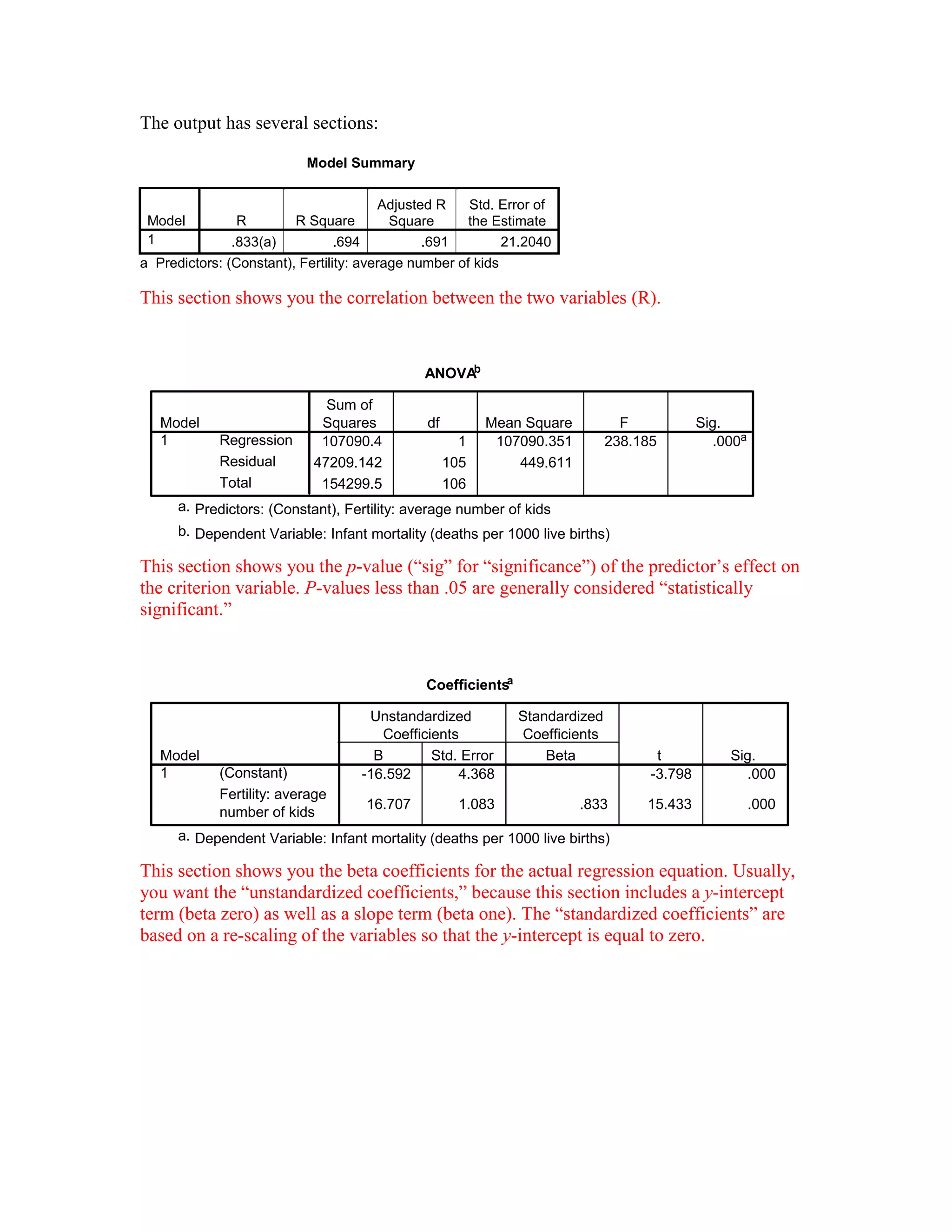
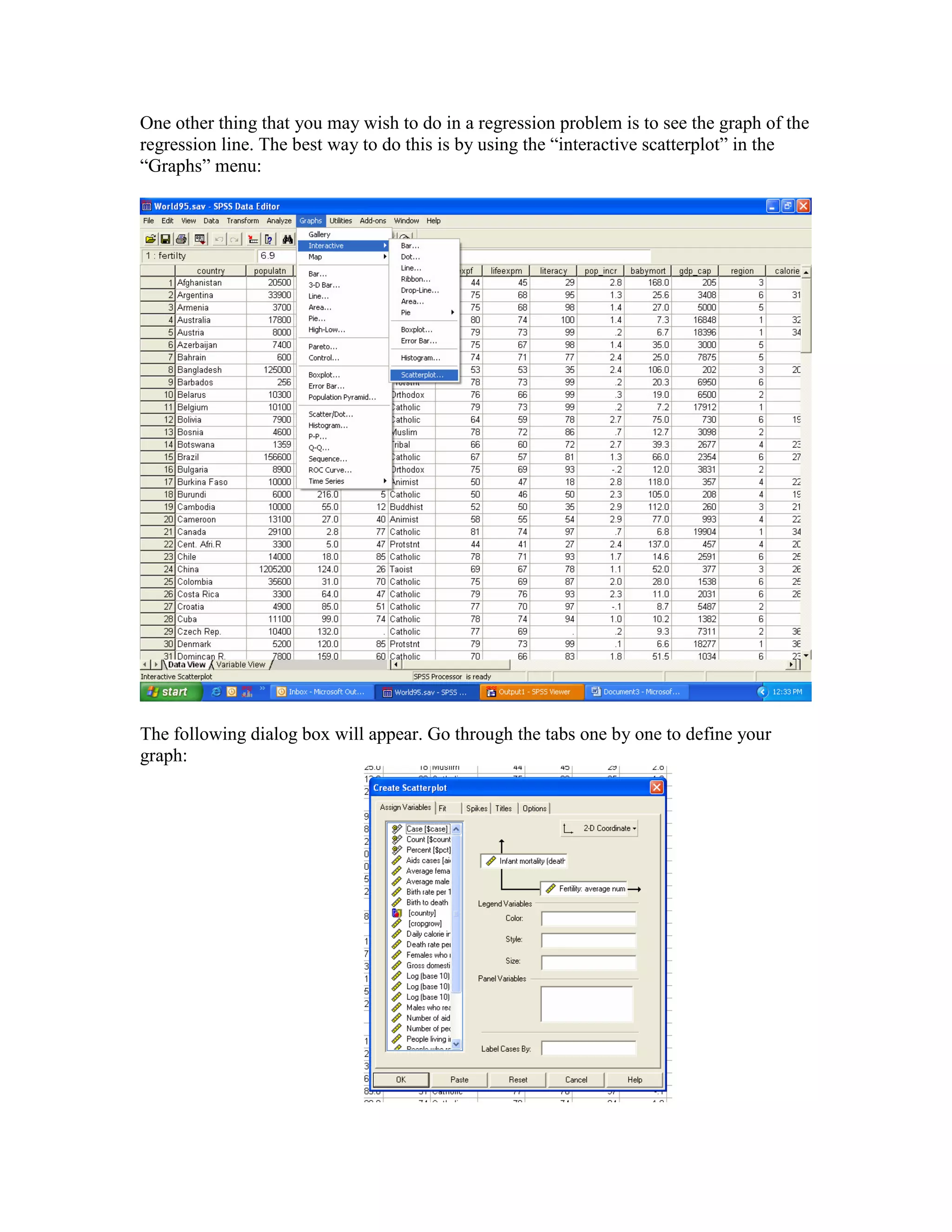
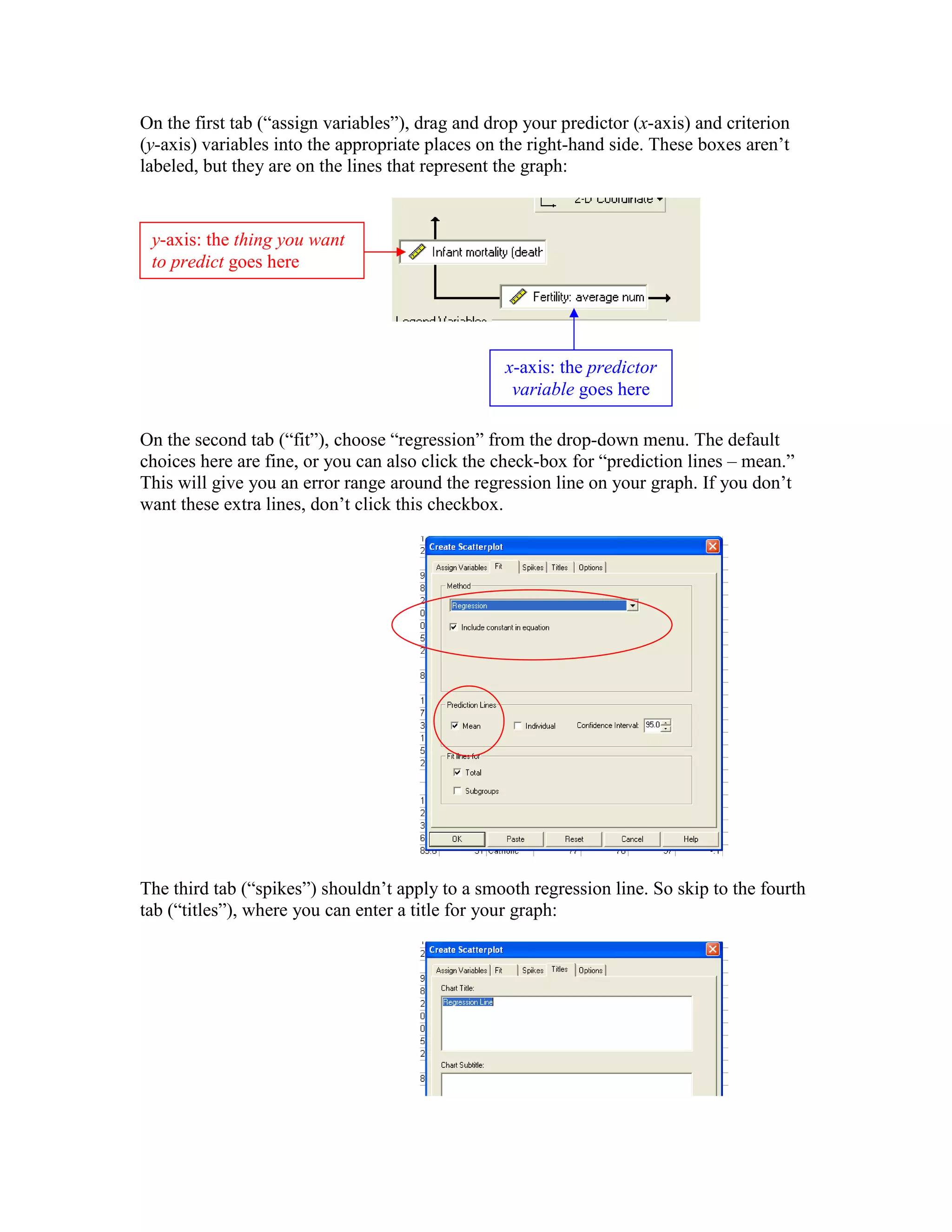
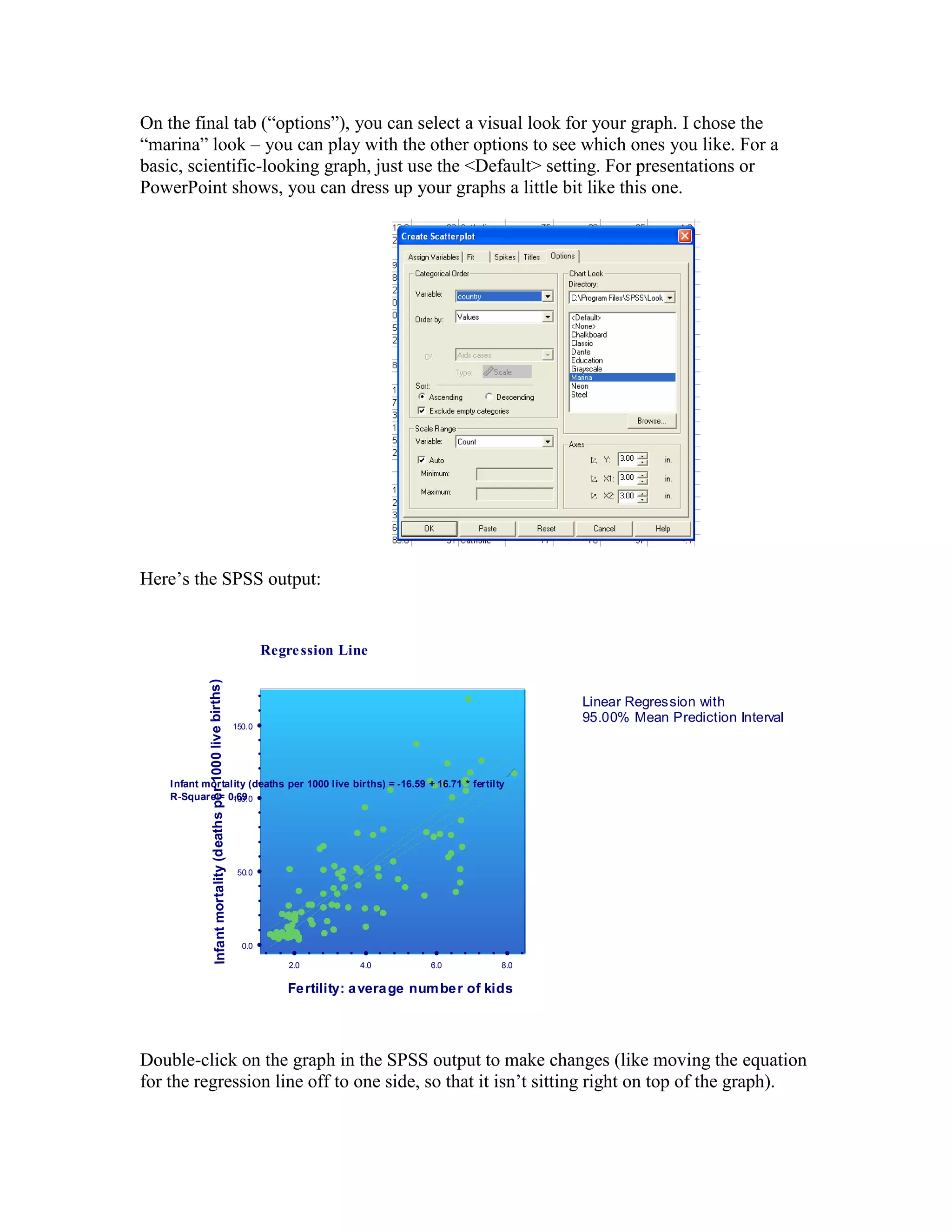
Linear Regression in SPSS
This example shows you how to create a basic regression model in SPSS, with one
predictor variable and one criterion variable. Both variables have to be measured on an
interval- or ratio-level scale. In this example, we will use demographic data on various
countries to predict infant mortality (“babymort”) from the average number of children
born per family (“fertilty”). Here are the data:
The regression procedure is found in the “Analyze” menu, under “Regression,” then by
selecting “Linear” in the Regression sub-menu.
The following dialog box will appear:
From the left-hand list, move the variable that you are trying to predict into the top box
(labeled “dependent”). Then move the variable that you are using as a predictor into the
next box (labeled “independent”). Then hit the “OK” button to continue.
The output has several sections:
Model Summary
Model R R Square
Adjusted R
Square
Std. Error of
the Estimate
1 .833(a) .694 .691 21.2040
a Predictors: (Constant), Fertility: average number of kids
This section shows you the correlation between the two variables (R).
ANOVAb
107090.4 1 107090.351 238.185 .000a
47209.142 105 449.611
154299.5 106
Regression
Residual
Total
Model
1
Sum of
Squares df Mean Square F Sig.
Predictors: (Constant), Fertility: average number of kidsa.
Dependent Variable: Infant mortality (deaths per 1000 live births)b.
This section shows you the p-value (“sig” for “significance”) of the predictor’s effect on
the criterion variable. P-values less than .05 are generally considered “statistically
significant.”
Coefficientsa
-16.592 4.368 -3.798 .000
16.707 1.083 .833 15.433 .000
(Constant)
Fertility: average
number of kids
Model
1
B Std. Error
Unstandardized
Coefficients
Beta
Standardized
Coefficients
t Sig.
Dependent Variable: Infant mortality (deaths per 1000 live births)a.
This section shows you the beta coefficients for the actual regression equation. Usually,
you want the “unstandardized coefficients,” because this section includes a y-intercept
term (beta zero) as well as a slope term (beta one). The “standardized coefficients” are
based on a re-scaling of the variables so that the y-intercept is equal to zero.
One other thing that you may wish to do in a regression problem is to see the graph of the
regression line. The best way to do this is by using the “interactive scatterplot” in the
“Graphs” menu:
The following dialog box will appear. Go through the tabs one by one to define your
graph:
On the first tab (“assign variables”), drag and drop your predictor (x-axis) and criterion
(y-axis) variables into the appropriate places on the right-hand side. These boxes aren’t
labeled, but they are on the lines that represent the graph:
On the second tab (“fit”), choose “regression” from the drop-down menu. The default
choices here are fine, or you can also click the check-box for “prediction lines – mean.”
This will give you an error range around the regression line on your graph. If you don’t
want these extra lines, don’t click this checkbox.
The third tab (“spikes”) shouldn’t apply to a smooth regression line. So skip to the fourth
tab (“titles”), where you can enter a title for your graph:
y-axis: the thing you want
to predict goes here
x-axis: the predictor
variable goes here
On the final tab (“options”), you can select a visual look for your graph. I chose the
“marina” look – you can play with the other options to see which ones you like. For a
basic, scientific-looking graph, just use the <Default> setting. For presentations or
PowerPoint shows, you can dress up your graphs a little bit like this one.
Here’s the SPSS output:
Linear Regression with
95.00% Mean Prediction Interval
ê ê ê êê ê ê ê ê ê ê ê ê ê ê ê ê ê ê
2.0 4.0 6.0 8.0
Fertility: average number of kids
ê
ê
ê
ê
ê
ê
ê
ê
ê
ê
ê
ê
ê
ê
ê
ê
ê
ê
0.0
50.0
100.0
150.0
Infantmortality(deathsper1000livebirths)
W
W W
WW
W
W
W
WW
W
W
W
W
W
W
W
W
W
W
W
W
W
W
WW WW
W
W
W
W
W
W
W
WW
W
W
W
WW
W
W
W
W
W
W
W
W
W
W
W WW
W
W
W
W
W
W
W
W
W
W
W
W
W
W
W
W
W
W
W
W
W
W
W
W
W
W
W
W
W
W
W
W
W
W
W
W WW
W
W
W
W
W
WW
W
W
W
W
W
W
W
Infant mortality (deaths per 1000 live births) = -16.59 + 16.71 * fertilty
R-Square = 0.69
Regression Line
Double-click on the graph in the SPSS output to make changes (like moving the equation
for the regression line off to one side, so that it isn’t sitting right on top of the graph).

How to perform linear regression

  • 1.
    Linear Regression inSPSS This example shows you how to create a basic regression model in SPSS, with one predictor variable and one criterion variable. Both variables have to be measured on an interval- or ratio-level scale. In this example, we will use demographic data on various countries to predict infant mortality (“babymort”) from the average number of children born per family (“fertilty”). Here are the data:
  • 2.
    The regression procedureis found in the “Analyze” menu, under “Regression,” then by selecting “Linear” in the Regression sub-menu. The following dialog box will appear: From the left-hand list, move the variable that you are trying to predict into the top box (labeled “dependent”). Then move the variable that you are using as a predictor into the next box (labeled “independent”). Then hit the “OK” button to continue.
  • 3.
    The output hasseveral sections: Model Summary Model R R Square Adjusted R Square Std. Error of the Estimate 1 .833(a) .694 .691 21.2040 a Predictors: (Constant), Fertility: average number of kids This section shows you the correlation between the two variables (R). ANOVAb 107090.4 1 107090.351 238.185 .000a 47209.142 105 449.611 154299.5 106 Regression Residual Total Model 1 Sum of Squares df Mean Square F Sig. Predictors: (Constant), Fertility: average number of kidsa. Dependent Variable: Infant mortality (deaths per 1000 live births)b. This section shows you the p-value (“sig” for “significance”) of the predictor’s effect on the criterion variable. P-values less than .05 are generally considered “statistically significant.” Coefficientsa -16.592 4.368 -3.798 .000 16.707 1.083 .833 15.433 .000 (Constant) Fertility: average number of kids Model 1 B Std. Error Unstandardized Coefficients Beta Standardized Coefficients t Sig. Dependent Variable: Infant mortality (deaths per 1000 live births)a. This section shows you the beta coefficients for the actual regression equation. Usually, you want the “unstandardized coefficients,” because this section includes a y-intercept term (beta zero) as well as a slope term (beta one). The “standardized coefficients” are based on a re-scaling of the variables so that the y-intercept is equal to zero.
  • 4.
    One other thingthat you may wish to do in a regression problem is to see the graph of the regression line. The best way to do this is by using the “interactive scatterplot” in the “Graphs” menu: The following dialog box will appear. Go through the tabs one by one to define your graph:
  • 5.
    On the firsttab (“assign variables”), drag and drop your predictor (x-axis) and criterion (y-axis) variables into the appropriate places on the right-hand side. These boxes aren’t labeled, but they are on the lines that represent the graph: On the second tab (“fit”), choose “regression” from the drop-down menu. The default choices here are fine, or you can also click the check-box for “prediction lines – mean.” This will give you an error range around the regression line on your graph. If you don’t want these extra lines, don’t click this checkbox. The third tab (“spikes”) shouldn’t apply to a smooth regression line. So skip to the fourth tab (“titles”), where you can enter a title for your graph: y-axis: the thing you want to predict goes here x-axis: the predictor variable goes here
  • 6.
    On the finaltab (“options”), you can select a visual look for your graph. I chose the “marina” look – you can play with the other options to see which ones you like. For a basic, scientific-looking graph, just use the <Default> setting. For presentations or PowerPoint shows, you can dress up your graphs a little bit like this one. Here’s the SPSS output: Linear Regression with 95.00% Mean Prediction Interval ê ê ê êê ê ê ê ê ê ê ê ê ê ê ê ê ê ê 2.0 4.0 6.0 8.0 Fertility: average number of kids ê ê ê ê ê ê ê ê ê ê ê ê ê ê ê ê ê ê 0.0 50.0 100.0 150.0 Infantmortality(deathsper1000livebirths) W W W WW W W W WW W W W W W W W W W W W W W W WW WW W W W W W W W WW W W W WW W W W W W W W W W W W WW W W W W W W W W W W W W W W W W W W W W W W W W W W W W W W W W W W W W WW W W W W W WW W W W W W W W Infant mortality (deaths per 1000 live births) = -16.59 + 16.71 * fertilty R-Square = 0.69 Regression Line Double-click on the graph in the SPSS output to make changes (like moving the equation for the regression line off to one side, so that it isn’t sitting right on top of the graph).