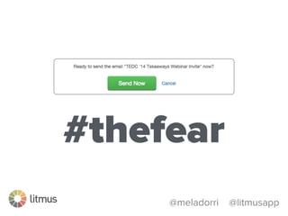
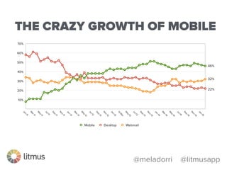
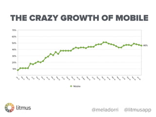
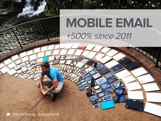
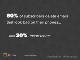
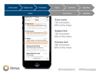
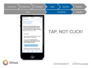
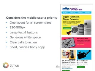
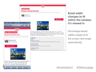
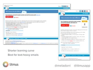
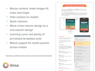
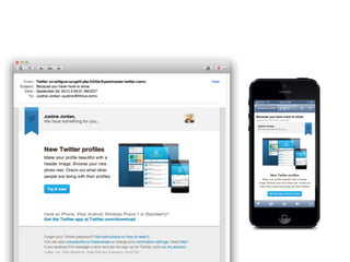
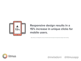
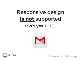
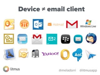
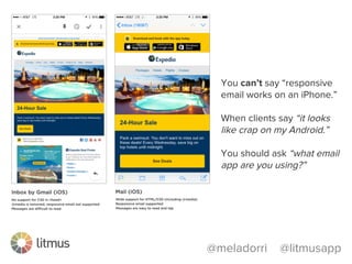
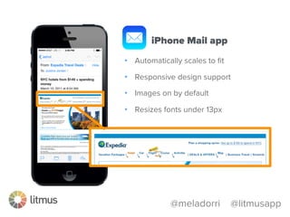
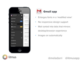
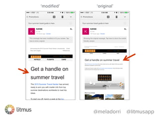
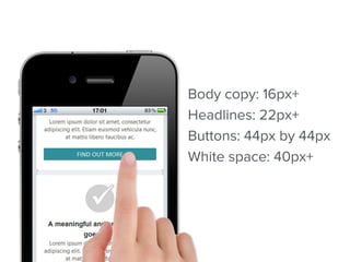
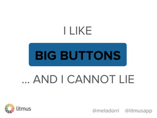
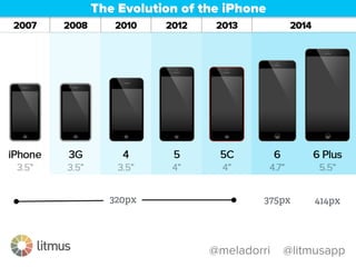
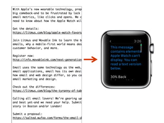
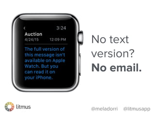
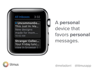
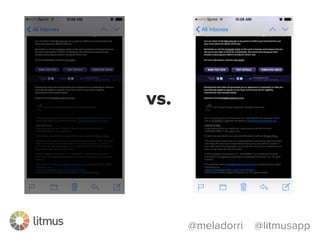
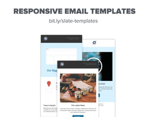
@meladorri @litmusapp
How to Optimize Email
For All Inboxes in a
Mobile World
JUSTINE JORDAN
@meladorri @litmusapp
litmus.com/lp/marketingunited
@meladorri @litmusapp
I HAVE SOME
BAD NEWS
(Y)OUR
EMAILS
SUCK.
@meladorri @litmusapp
#thefear
@meladorri @litmusapp
MEANWHILE…
“…the following vehicle has been reported towed…”
<no-reply@cityofboston.gov>
@meladorri @litmusapp
YOUR CAR!
(This actually happened to @lozzzytweets )
@meladorri @litmusapp
MOBILE EMAIL
REALLY SUCKS
email receipt
requested
from an ATM
transaction!
@meladorri @litmusapp
LET’S
UNSUCK
EMAIL,
SHALL WE?
@meladorri @litmusapp
DELIVERING
EXPERIENCES
@meladorri @litmusapp
DELIVERING
EXPERIENCES
@meladorri @litmusapp
How to Optimize Email
For All Inboxes in a
Mobile World
@meladorri @litmusapp
EMAIL IS NOT
JPG
PPC SEO CPC
ONE-PAGE WEBSITE
@meladorri @litmusapp
EMAIL IS NOT
@meladorri @litmusapp
DIRECT
QUANTITATIVE
REAL-TIME
@meladorri @litmusapp
EMAIL IS A
personal
MEDIUM
EMAIL IS A
1-to-1
MEDIUM
EMAIL IS A
1-to-1
MEDIUM
@meladorri @litmusapp
THE CRAZY GROWTH OF MOBILE
@meladorri @litmusapp
THE CRAZY GROWTH OF MOBILE
MOBILE EMAIL
+500% since 2011
@ryanmheap @degdigital
@meladorri @litmusapp
80% of subscribers delete emails
that look bad on their phones…
…and 30% unsubscribe
source: BlueHornet
@meladorri @litmusapp
31%of marketers don’t know their
mobile email open rate
source:
marketingsherpa.com
@meladorri @litmusapp
KNOW YOUR AUDIENCE
70% read on mobile
15% read on mobile
@meladorri @litmusapp
You need an
“any inbox, any device”
email marketing strategy
@meladorri @litmusapp
CRUSTY
Context Relevance
Useful SimpliciTY
EMAIL IS A
unique
MEDIUM
@meladorri @litmusapp
Email
HTML
CSS
Images
Text
Design
Links
Web
HTML
CSS
Images
Text
Design
Links
✔
✔
✔
✔
✔
✔
✔
Email and web are the same
@meladorri @litmusapp
Web
<div>
<h1>
<p>
em
<style>
background-color
margin
Email
<table>
<td>
<td>
px
style=“font-face”
bgcolor
padding
… just kidding
GO WITH THE
flow
@meladorri @litmusapp
From name Subject line Preheader Open Tap/Click Page/Site
Inbox Email/Body Page/Site
Email user flow
Subscriber experience
@meladorri @litmusapp
From name Subject line Preheader Open Tap/Click Page/Site
Inbox Email/Body Page/Site
58
From name
~25 characters
25% of the inbox
Subject line
~35 characters
25% of the inbox
Preview text
~85 characters
50% of the inbox
@meladorri @litmusapp
From name Subject line Preheader Open Tap/Click Page/Site
Inbox Email/Body Page/Site
59
TAP, NOT CLICK!
@meladorri @litmusapp
“Does your iPhone fold?”
@meladorri @litmusapp
#EmbraceTheScroll
@meladorri @litmusapp
From name Subject line Preheader Open Tap/Click Page/Site
Inbox Email/Body Page/Site
62
FOLLOW THROUGH!
@meladorri @litmusapp
> wtfmobileweb.com
THINK INSIDE
the inbox
@meladorri @litmusapp
75% of emails are
displayed with preview text
in the inbox
@meladorri @litmusapp
bit.ly/preview-text
The Ultimate Guide
@meladorri @litmusapp
✔	

✔	

✔	

✘	

✘
@meladorri @litmusapp
UN-SUCKING
strategies
FOR MOBILE
@meladorri @litmusapp
strategy #1
mobile first
aka agnostic, aware, scalable
@meladorri @litmusapp
Considers the mobile user a priority
•  One layout for all screen sizes
•  320-500px
•  Large text & buttons
•  Generous white space
•  Clear calls to action
•  Short, concise body copy
@meladorri @litmusapp
strategy #2
fluid
@meladorri @litmusapp
Email width
changes to fit
within the window
it’s viewed in
Percentage-based
widths adapts to fit
the screen; text wraps
automatically
@meladorri @litmusapp
Shorter learning curve
Best for text-heavy emails
@meladorri @litmusapp
strategy #3
responsive
@meladorri @litmusapp
•  Resize content: make images fit,
make text larger
•  Hide content on mobile
•  Stack columns
•  Move a two-column design to a
one-column design
•  Learning curve; but plenty of
pre-tested templates exist
•  Mixed support for media queries
across mobile
https://litmus.com/blog/the-how-to-guide-to-responsive-email-design-infographic
@meladorri @litmusapp
•  More than a “line of code”
•  Set of conditional statements that enables specific styles
Ø  If the screen size is x, then display y
Ø  If the screen size is x, then increase headline size to y
Ø  If screen size is x, then show image at 100%
•  Detects screen size, not device type
Uses media queries to detect screen size and alter
content accordingly
@meladorri @litmusapp
Responsive design results in a
15% increase in unique clicks for
mobile users.
https://litmus.com/blog/the-science-of-email-clicks-the-impact-of-responsive-design-inbox-testing
@meladorri @litmusapp
Rendering is inconsistent
across devices and operating systems
@meladorri @litmusapp
Responsive design
is not supported
everywhere.
@meladorri @litmusapp
Device ≠ email client
@meladorri @litmusapp
You can’t say “responsive
email works on an iPhone.”
When clients say “it looks
like crap on my Android.”
You should ask “what email
app are you using?”
@meladorri @litmusapp
•  Automatically scales to fit
•  Responsive design support
•  Images on by default
•  Resizes fonts under 13px
iPhone Mail app
@meladorri @litmusapp
•  Enlarges fonts in a ‘modified view’
•  No responsive design support
•  Mail sorted into tabs that mirrors
desktop/browser experience
•  Images on automatically
Gmail app
@meladorri @litmusapp
‘modified’ ‘original’
@meladorri @litmusapp
•  No responsive design support
•  Displays a sender icon/image in the
inbox—sometimes
•  Emails bundled into categories
•  Images on automatically
Inbox by Gmail
@meladorri @litmusapp
•  Samsung Hell
•  Support for ALT text
•  Various screen sizes, OS and app
versions
•  Mixed support for media queries
•  Some auto-scale, some do not
Android Gmail
@meladorri @litmusapp
•  Sometimes responsive works
•  Inconsistent font display
•  Blocks images
•  No ALT text
Windows Phone
@meladorri @litmusapp
•  Support for responsive design
•  Blocks images; supports ALT text
•  Does not scale/auto-zoom
•  No separate app; email joins social,
SMS and voice in the “hub”
BlackBerry
TACTICS
for less suckage
@meladorri @litmusapp
UGH
Body copy: 16px+
Headlines: 22px+
Buttons: 44px by 44px
White space: 40px+
@meladorri @litmusapp
I LIKE
BIG BUTTONS
… AND I CANNOT LIE
@meladorri @litmusapp
320px 375px 414px
@meladorri @litmusapp
iPhone 5 iPhone 6 iPhone 6 Plus
WATCH
yourself
@meladorri @litmusapp
Apple Watch
shows the plain
text version.
@meladorri @litmusapp
CRUSTY
Context Relevance
Useful SimpliciTY
@meladorri @litmusapp
No text
version?
No email.
@meladorri @litmusapp
Links are
disabled.
(no browser)
@meladorri @litmusapp
A personal
device that
favors personal
messages.
>> bit.ly/watch-email
EMAIL IS A
personal
MEDIUM
BONUS
tips
@meladorri @litmusapp
vs.
@meladorri @litmusapp
OS-specific
content
@meladorri @litmusapp
bit.ly/gifs-email
@meladorri @litmusapp
bit.ly/bulletproof-buttons
Defensive design: Image Blocking
@meladorri @litmusapp
Defensive design: Image Blocking
@meladorri @litmusapp
Defensive design: Image Blocking
@meladorri @litmusapp
Defensive design: Image Blocking
Guide to styled ALT text >> bit.ly/styledALT
Guide to image blocking >> bit.ly/image-block
!
BONUS
goodies
litmus.com/lp/2015-state-of-email-report
litmus.com/conference
RESPONSIVE EMAIL TEMPLATES
bit.ly/slate-templates
LITMUS TESTING + ANALYTICS
litmus.com/giftcard // coupon code: EMMA
litmus.com/lp/marketingunited
@meladorri

How to Optimize Email for All Inboxes in a Mobile World