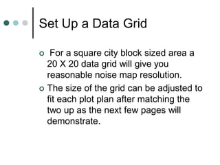
1. How to Make Noise Maps
with PowerPoint
This presentation outlines the process of
automating area noise map creation and
coloring with Microsoft PowerPoint
A similar work product can be obtained
using the graphing functions of Excel
Dale Rhodes
Ferndale Refinery
3. Set Up a Data Grid
For a square city block sized area a
20 X 20 data grid will give you
reasonable noise map resolution.
The size of the grid can be adjusted to
fit each plot plan after matching the
two up as the next few pages will
demonstrate.
4. Setting Up a Data Grid
Select “Insert” / “Chart” from the
PowerPoint menu and you will get
a data table and a chart template
similar to these:
5. Setting Up a Data Grid
We will first work with the data table.
On the PowerPoint menu select
“Data” and then set “Series in
columns”. This will make the data table upper Left
hand cell correspond with the northwest corner of
your drawing if it is oriented with north end of the
drawing on the left side of the paper.
You can play with different
orientations later when you gain
familiarity with the process.
6. Setting Up a Data Grid
1. You will need to replace column and row titles in the
PowerPoint Master with grid references to create a 20 X 20
matrix.
2. Number them 1 – 20 starting with the template cell labeled
“East” and going down that column.
3. Repeat for the titles in the title row. For instance “1st Qtr”
becomes “1” and so forth through 20.
7. Setting Up a Data Grid
4. For now, fill all data cells with “0” for a place holder to force the
program to draw those grid cells for your map plot. (use copy,
and paste to multiple cells to speed this task)
8. Your chart should now look like this:
1
1
0.9 2
0.8 3
0.7 4
0.6 5
0.5 6
0.4 7
0.3 8
0.2 9
0.1 10
0 11
1 3 5 7 9 11 13 15 17 19
12
13
1. Next, double left click on the chart. This
should change the page top PowerPoint
menu to the one you need.
2. Select Chart / Chart Type from the
menu.
3. Select Surface chart and pick the 2-D
colored option which is the lower left
hand option of the four examples shown
9. The Map Grid
You should now have a chart
that looks similar to the one at
19
17
the left
15 You can keep the reference
13 0.8-1 labels 1-20 on each axes or
0.6-0.8
11 turn them off using the chart
0.4-0.6
9
0.2-0.4
menu “Chart Options” / “Axes”
7 menu selections and un-
0-0.2
5
checking the boxes (see
3
below)
1
1
4
7
10
13
16
19
If you later want to customize the
grid size or shape you can come
back and add or delete data table
columns and rows to fit your
situation or preferences.
10. The Map Grid
I prefer to either turn off display of the X and Y axes labels (1 to
20) or go back to the data table and enter distance coordinates
for those labels. (This is done after I get the plot plan matched up to the grid
and know the scale of distance on the ground between the data points.)
The next step is pasting the plot plan over the grid and adjusting
it’s size to match the portion for which you want to display noise
data.
This is a good point to save what you have already done as a
template for setting up all of your noise area data grids.
At this point I need to digress to the side issue of creating your
plot plan graphics files
11. Preparing Your Plot Plans
Using Microsoft Photo
Editor or any
program that has a
function for setting
the background to
“Transparent”:
1) Open the graphics
file you want to
work with
2) Select “Set
Transparent Color “
function
12. Preparing Your Plot Plans
3. Using the pointer for
the “Set Transparent
Color” function, Point to
any location on the
white drawing
background and right
click your mouse.
13. Preparing Your Plot Plans
4. The background in
Photo Editor will take
on a checkered
appearance indicating it
is transparent.
5. The background will no
longer obscure your
noise map color coding.
6. You can now resize,
crop or proceed directly
to save the drawing.
7. Save as *.GIF type file
for easy use with
PowerPoint.
14. Matching Plot Plan and Grid
1. From the PowerPoint menu use
the “Insert / Picture/ From File”
function and select your graphic
file for the noise map.
2. Align your graphic with the
lower left hand corner of the
grid and resize it to match using
the mouse to click on it and
move the upper right hand
corner in.
3. This step is easier if the lowest
0.8-1 range is set to the color
data
0.6-0.8 Skip to instructions.
white.
4. 0.4-0.6 Grid cross point
Each
0.2-0.4
corresponds to a field noise
0-0.2 collection point except
data
where inaccessible.
5. You will save this chart as the
template for this process area
and print this chart to go collect
data.
15. Matching Plot Plan and Grid
1. If you want to adjust the
number of rows or columns in
your grid to match the aspect
ratio of the drawing, double
click on the chart (grid) to
bring up the data table.
2. Turn off the number of
desired bottom rows by
clicking on icon for toggling
display of the row
16. Matching Plot Plan and Grid
3. To adjust the number of
columns to make the grid
smaller in the horizontal
dimension, use your mouse
to select the number of right
hand data columns
corresponding to the number
of grid columns you need to
remove.
4. Use the PowerPoint “Edit /
Delete” function to eliminate
those columns.
5. Final adjustments can be
made by dragging the corners
of the chart area or the
drawing to make them match
up to your satisfaction.
17. The Noise Data
You’ve collected your noise data and now you’re back from the field and are ready to fill
in your area noise data. See PowerPoint instructions if you need help with data tables.
Remember, data cell A1 is the NW corner of your map and A20 is the SW corner.
18. The Noise Data
As you fill in data, if you exit the data chart to
look at the noise map, you will notice it will start
to color up as PowerPoint auto assigns ranges
and colors to the data series.
You will need to adjust, data minimum,
maximum and range colors to make the noise
map convey the situation with greatest clarity.
19. Adjusting Data Range Colors
Mouse click on a single legend color box to select for editing. Brackets will
appear when you have achieved a selection.
Next double left click to bring up the edit pop-up menu.
20. Adjusting Data Range Colors
1. This menu allows you to choose colors for each data range or “noise isopleth” to
create a color scale that conveys the relative noise levels at a glance.
2. Repeat color selection process for each data range.
21. Adjusting Scales
If you double click on
the legend box a pop-
up menu comes up
that allows you to
modify data ranges
and scales.
Set minor units to 1
Experiment with other
factors to get the data
breaks that best
convey your data.