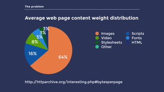
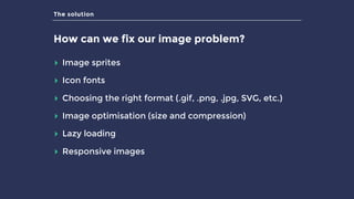
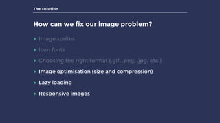
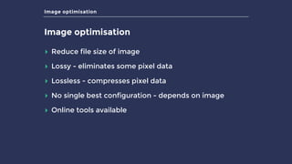
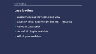
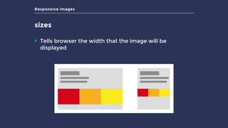
The document discusses the challenges of using images on websites, particularly their excessive size and the impact of device pixel ratios. It offers solutions such as image optimization, lazy loading, and responsive images to improve performance. The presentation emphasizes the importance of using appropriate formats and techniques to enhance user experience and website efficiency.


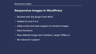
![Responsive images
Using responsive images in your theme
$img = get_field(‘image’); // get image from ACF field
$img_id = $img['ID'];
$img_src = $img['sizes']['archive'];
$img_meta = wp_get_attachment_metadata($img_id);
$image_html = '<img src="'.$img_src.'" alt="'.$img['alt'].'" />’;
echo wp_image_add_srcset_and_sizes ( $image_html,
$img_meta, $img_id );](https://image.slidesharecdn.com/highperformanceimagesinwordpress-lightningpdf-160410091424/85/High-Performance-Images-in-WordPress-23-320.jpg)


![How Big Brands are Taking Your Traffic in Alberta [Data Inside].pptx](https://cdn.slidesharecdn.com/ss_thumbnails/howbigbrandsaretakingyourtrafficinalbertadatainside-260123180142-42d276f3-thumbnail.jpg?width=640&height=640&fit=bounds)


