Download as PDF, PPTX
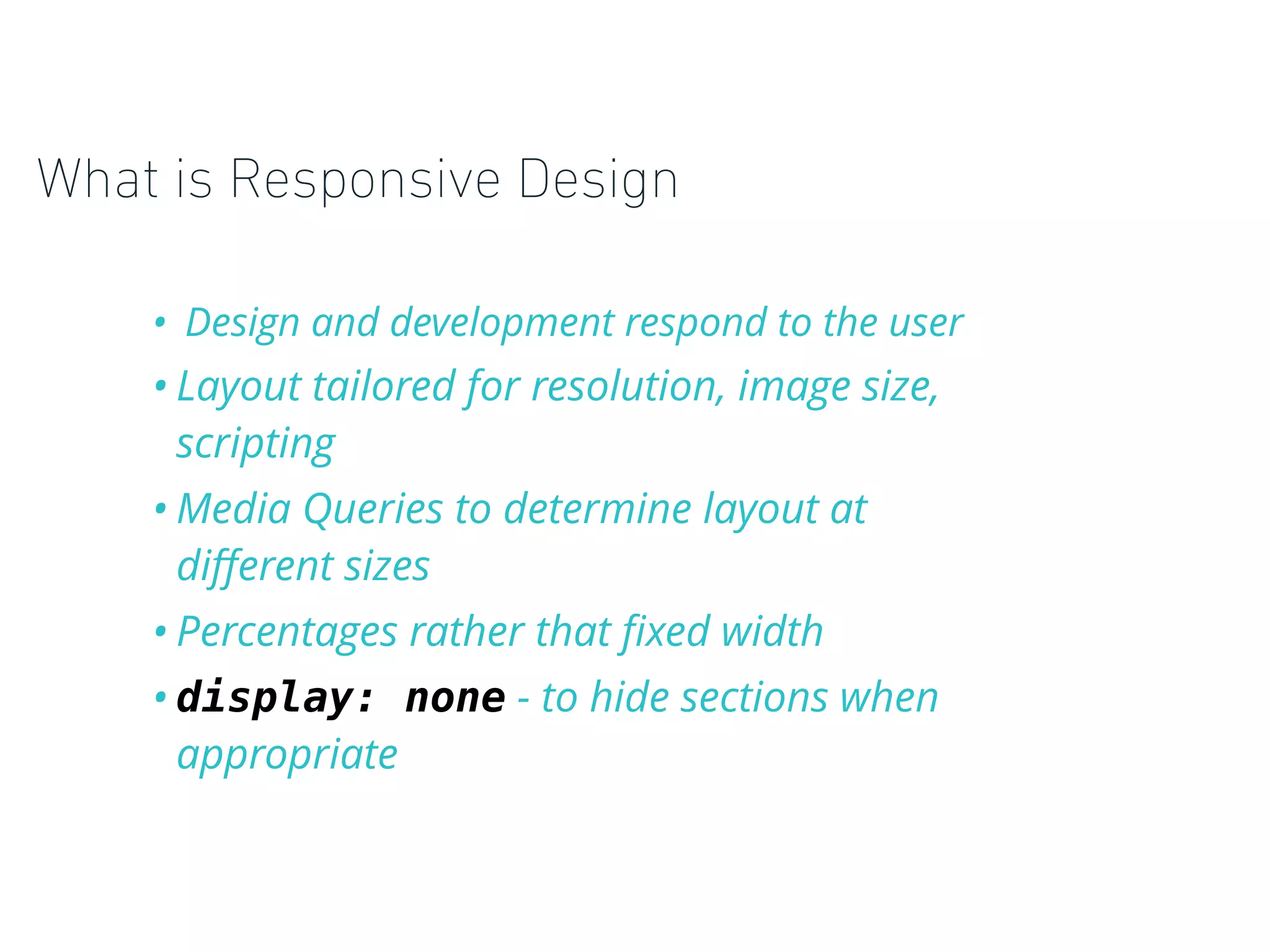
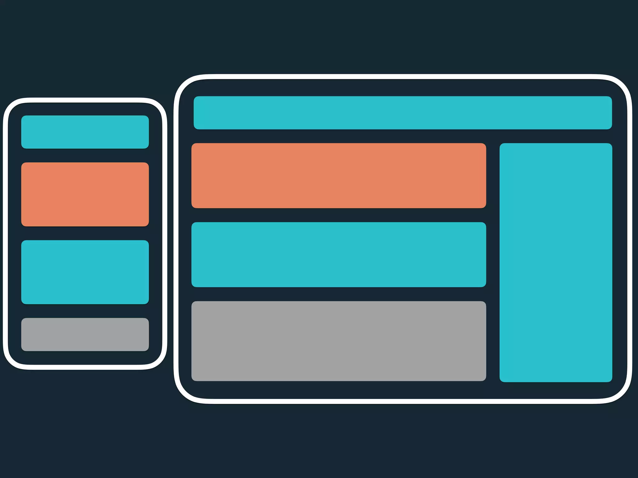

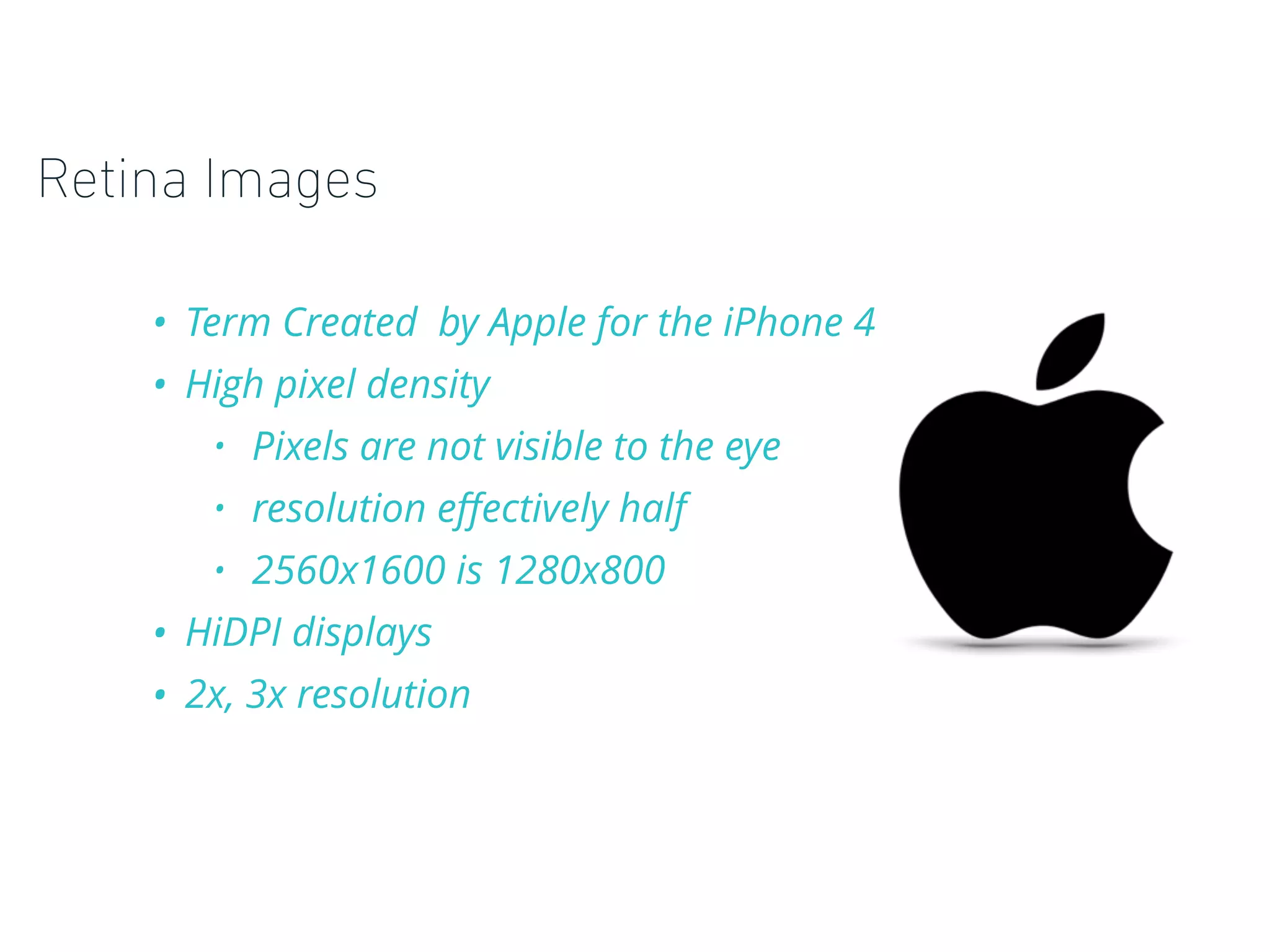
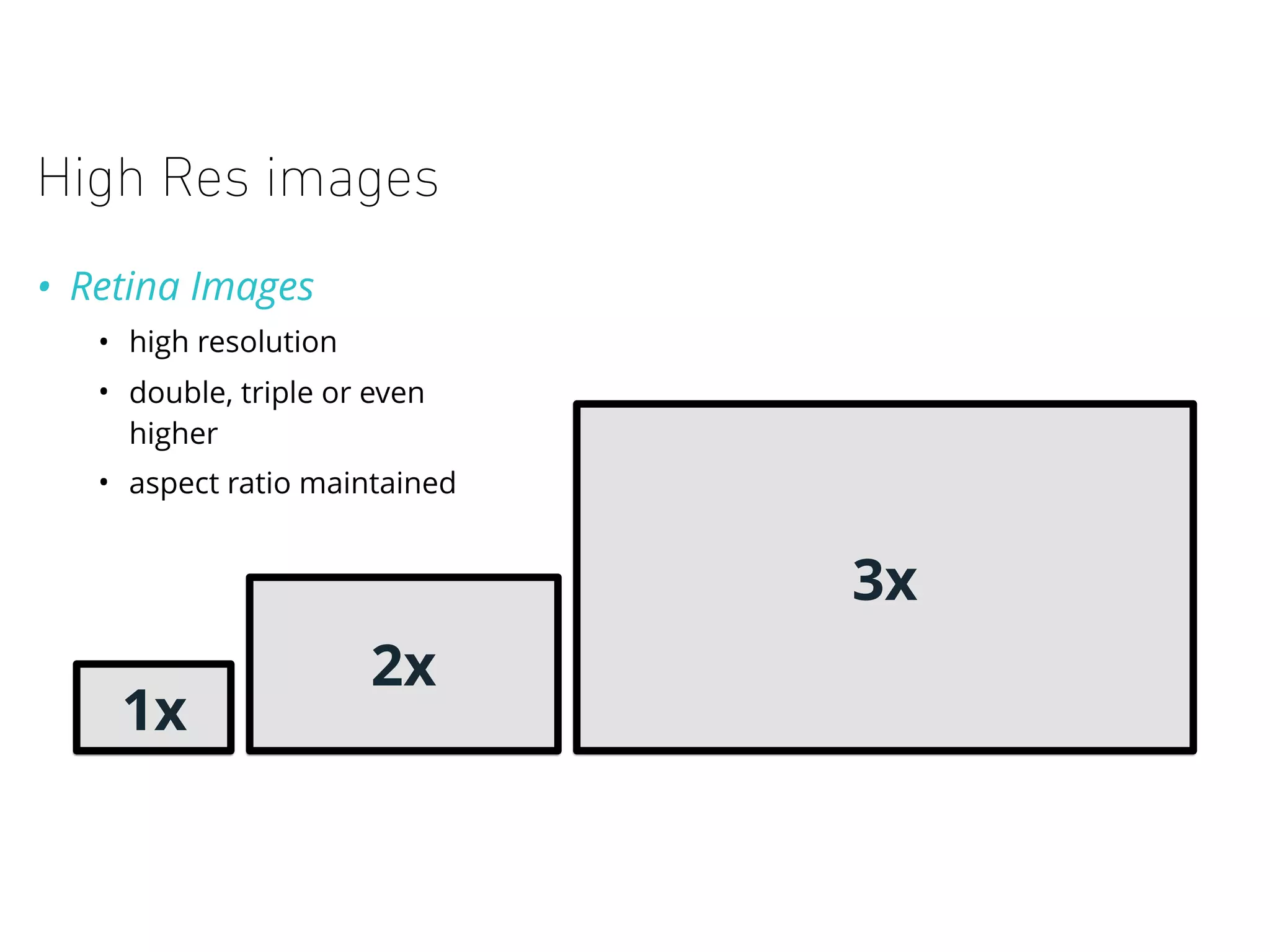
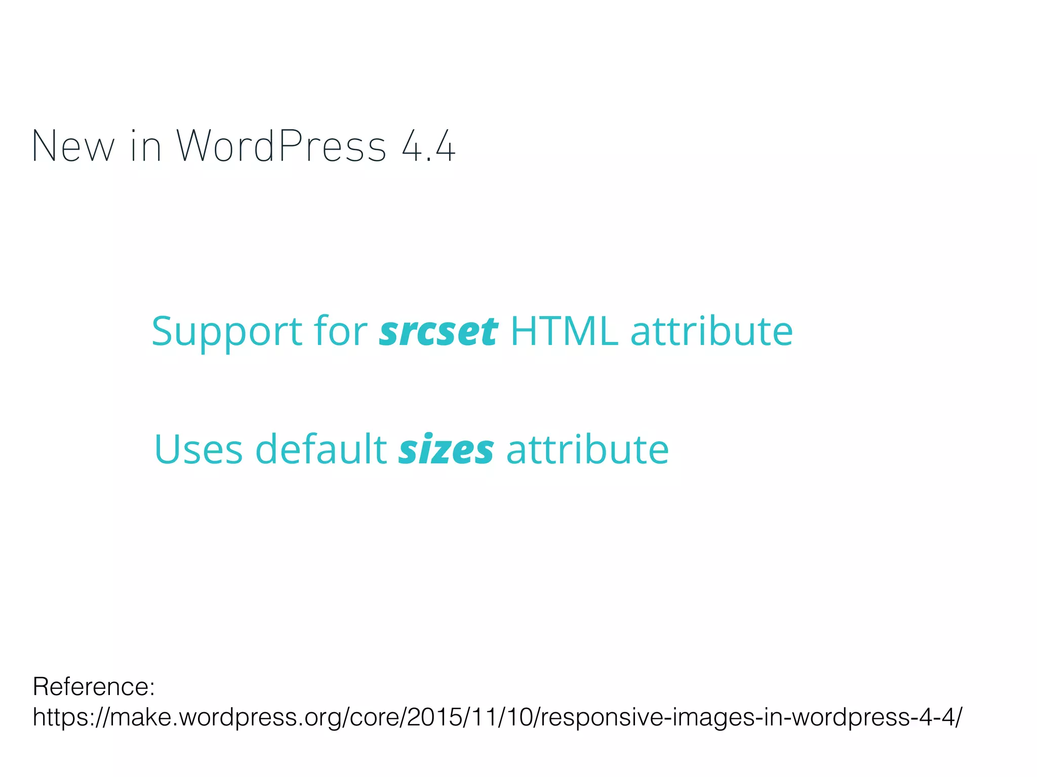
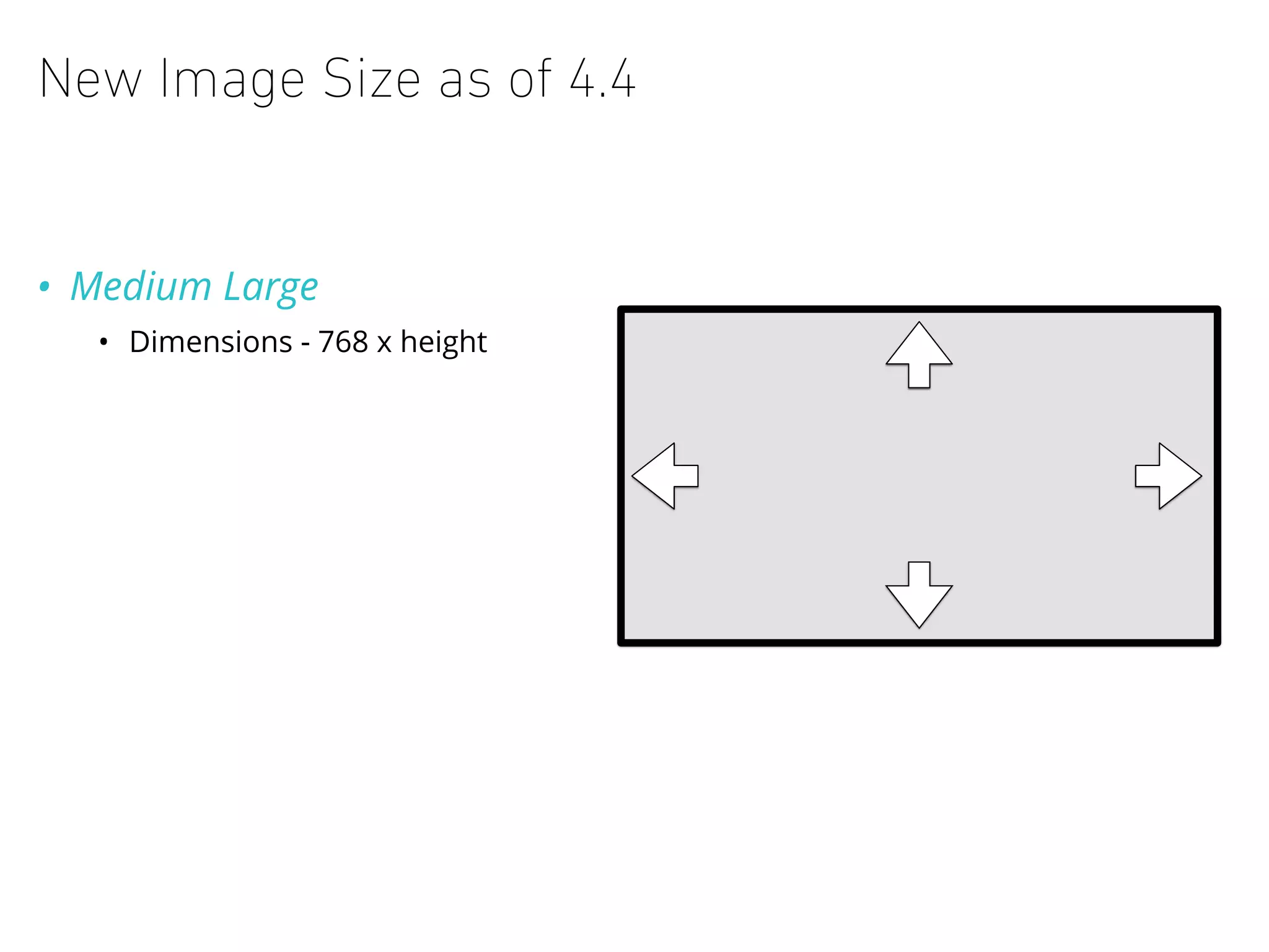
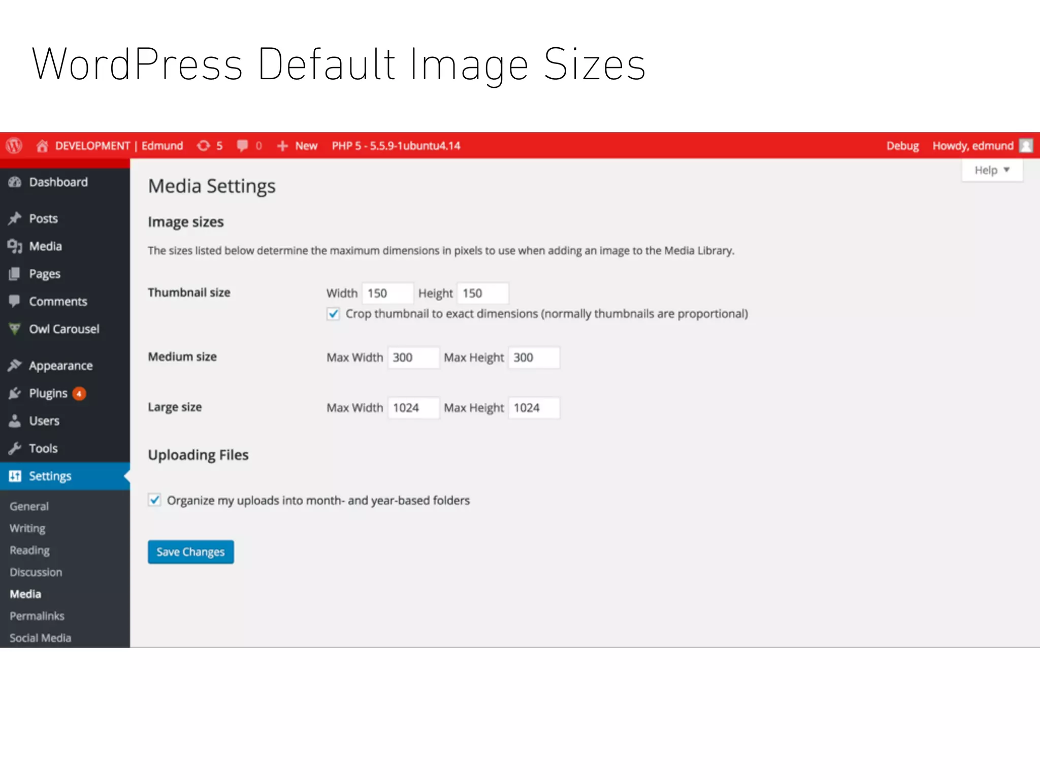
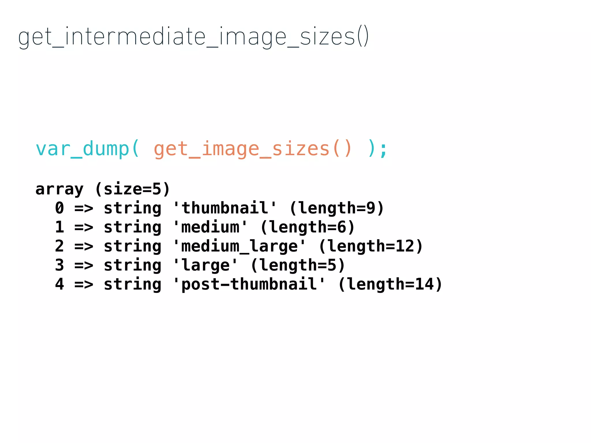
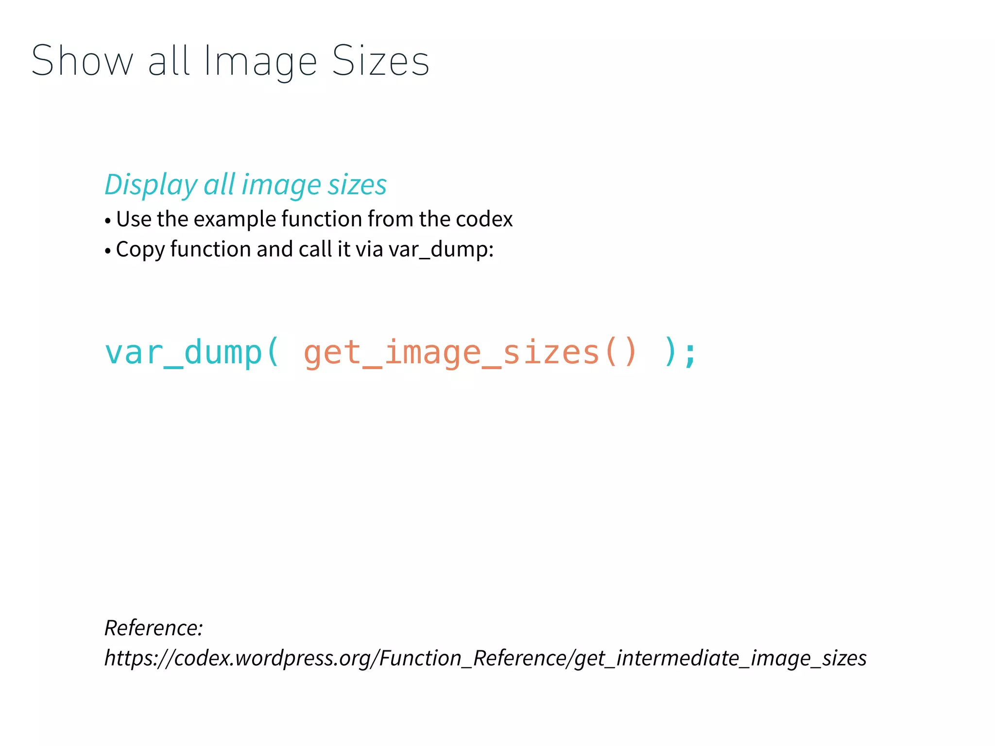
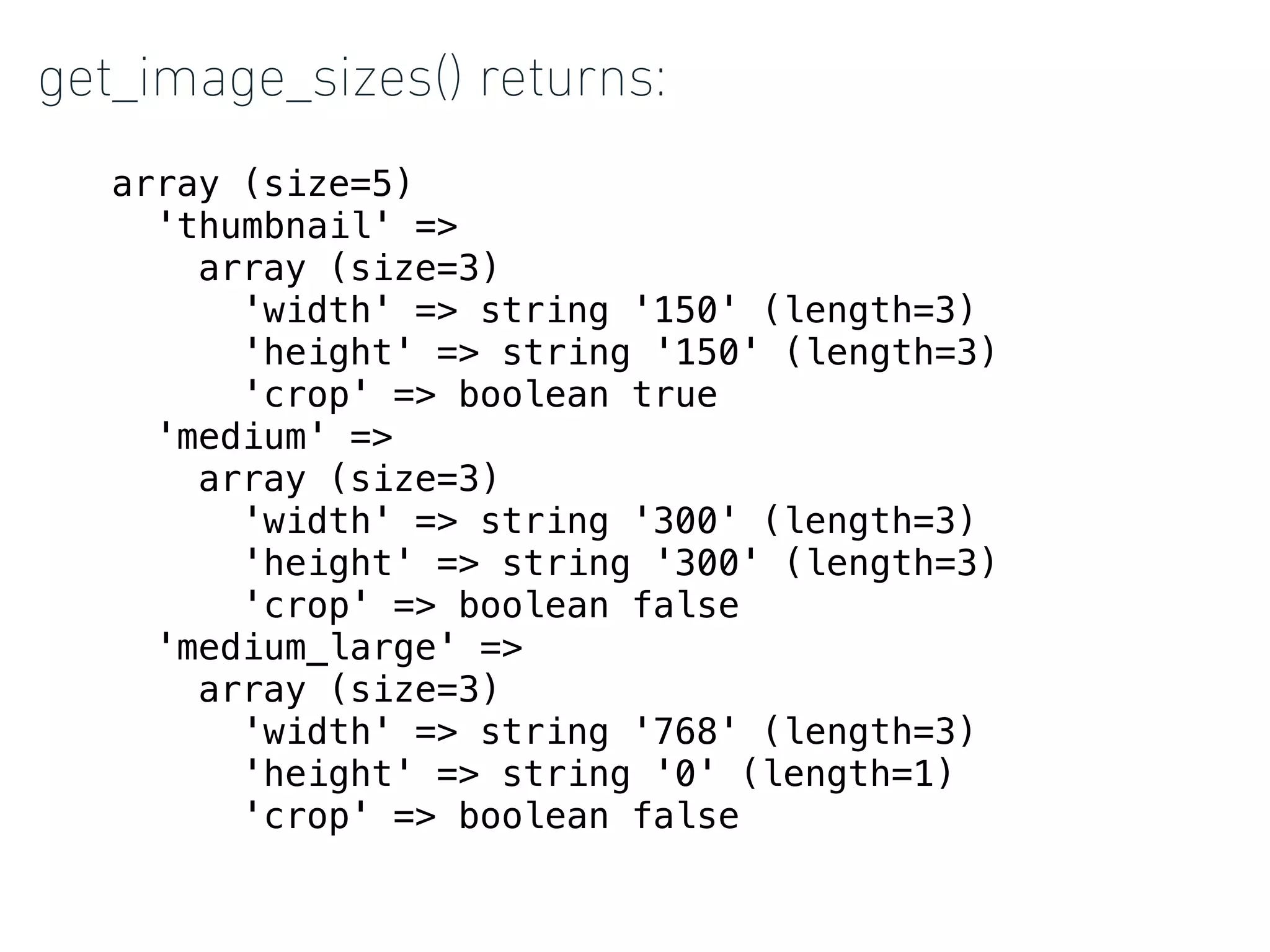
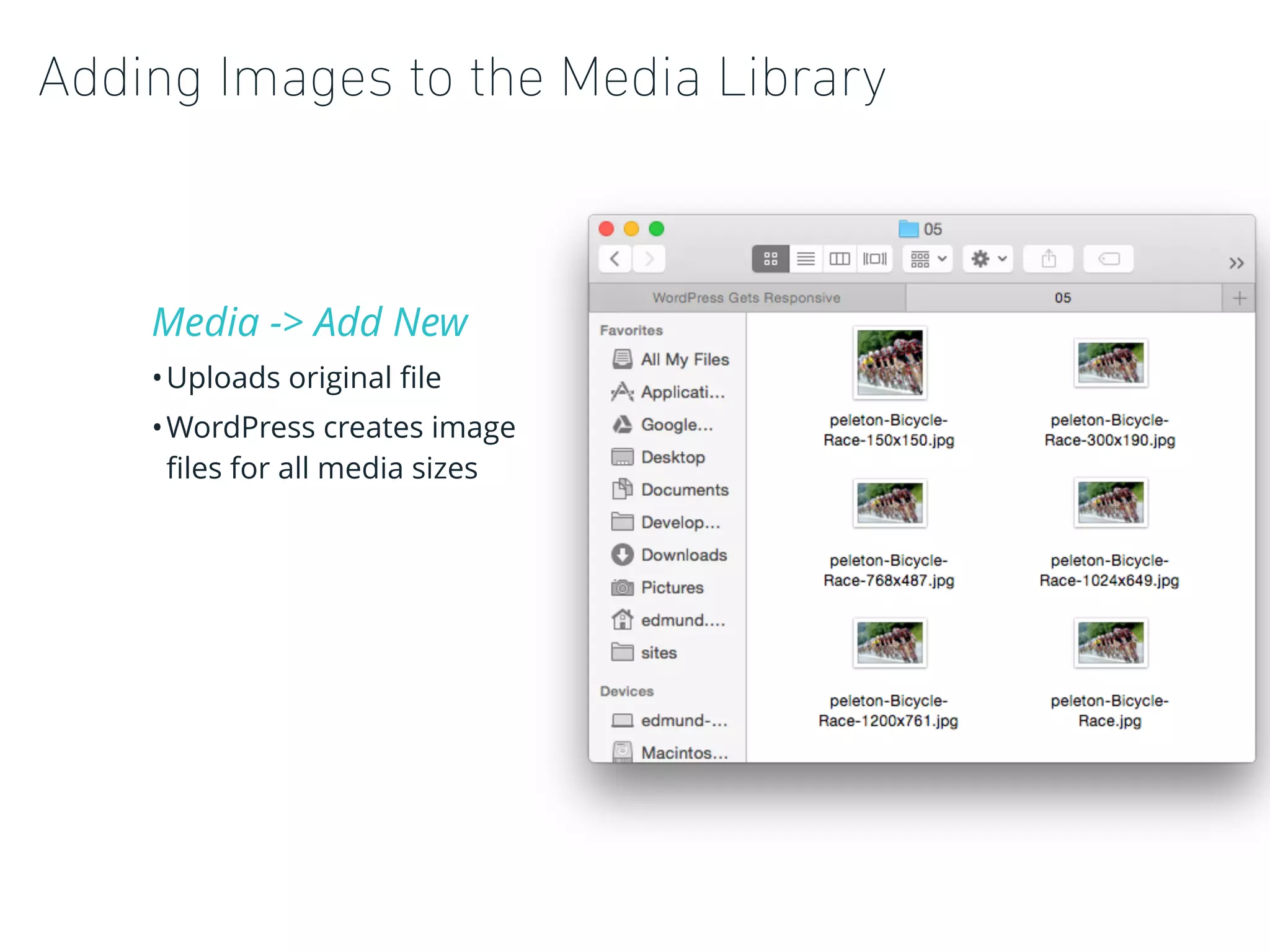
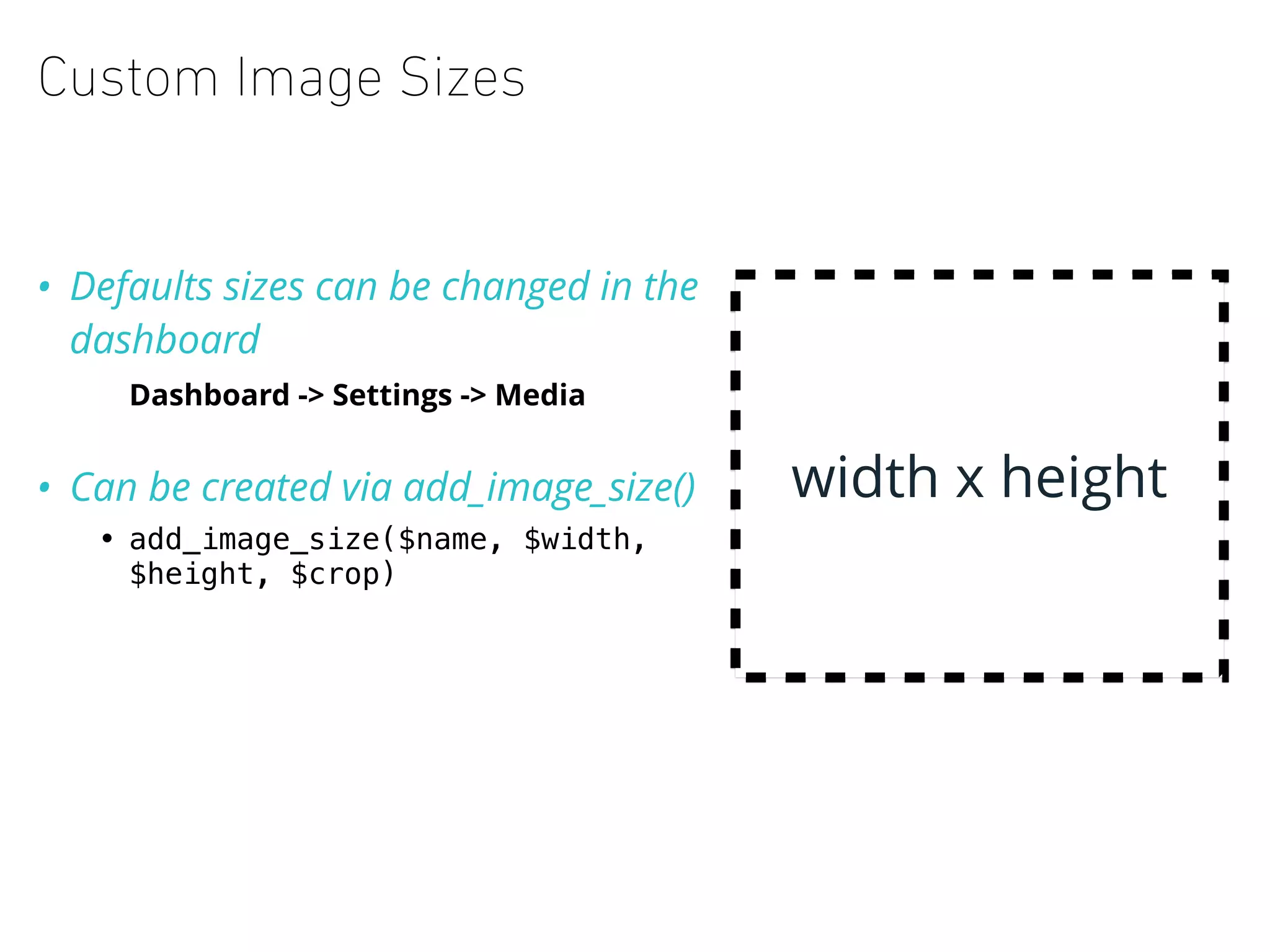
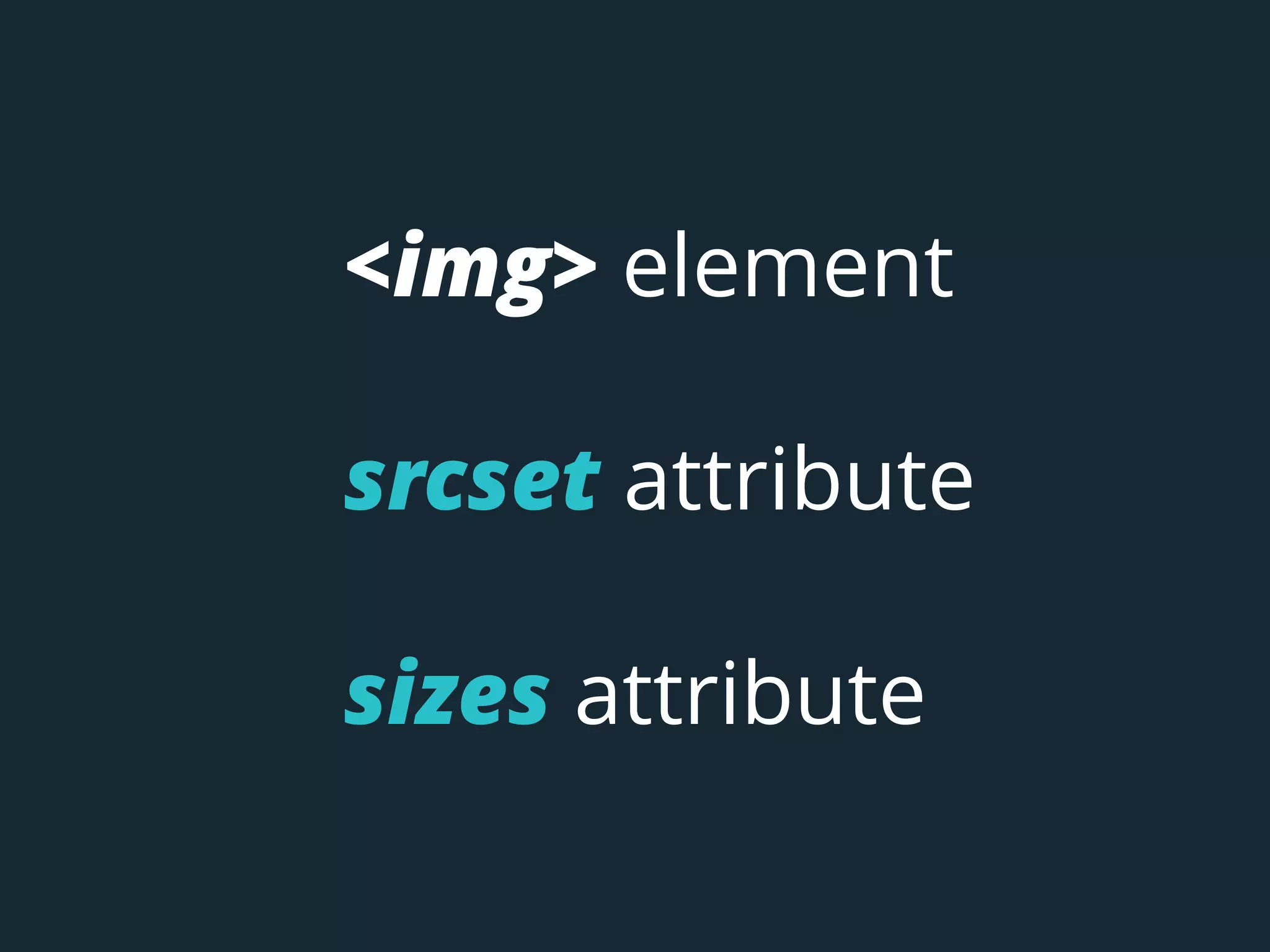
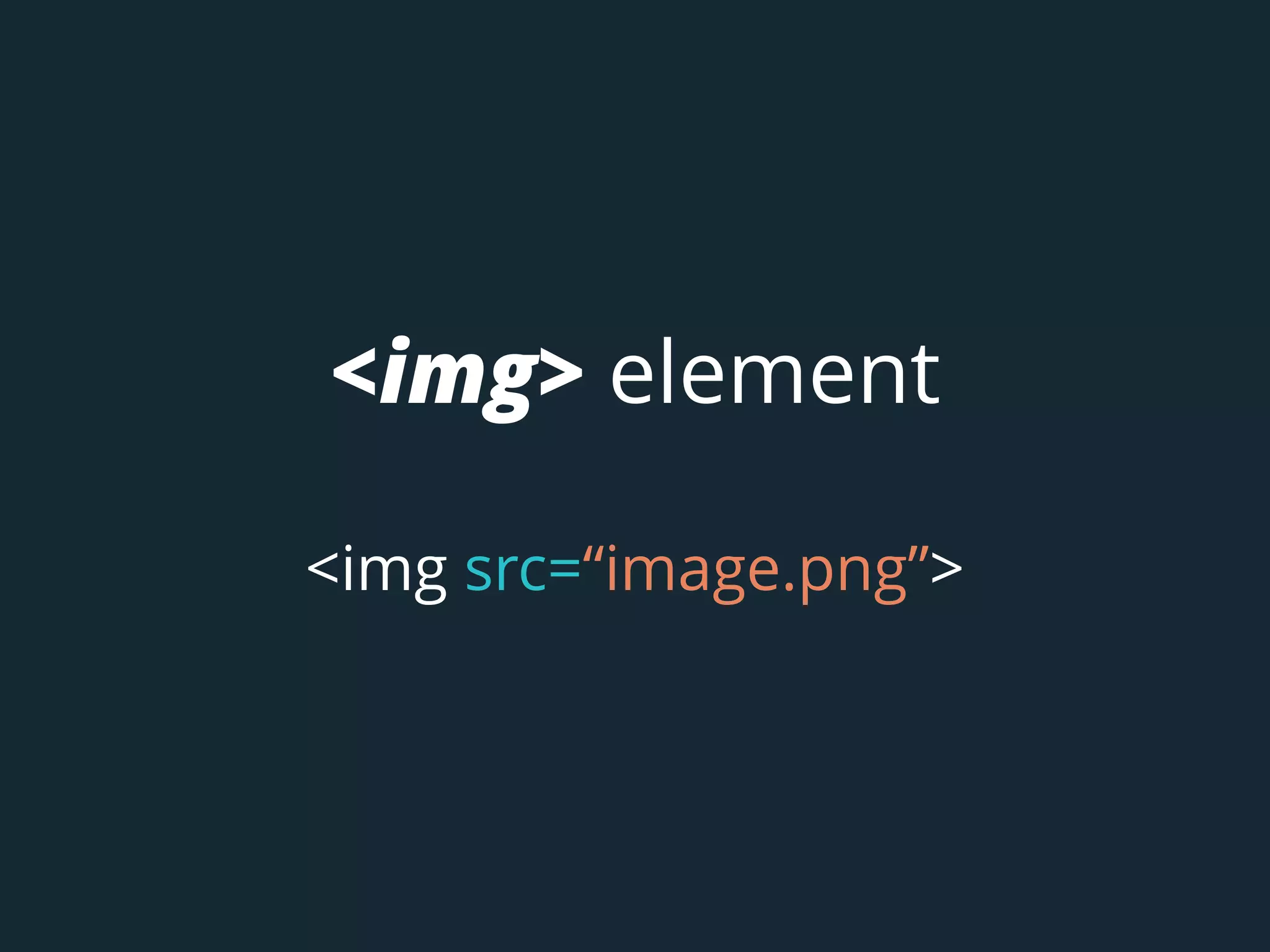
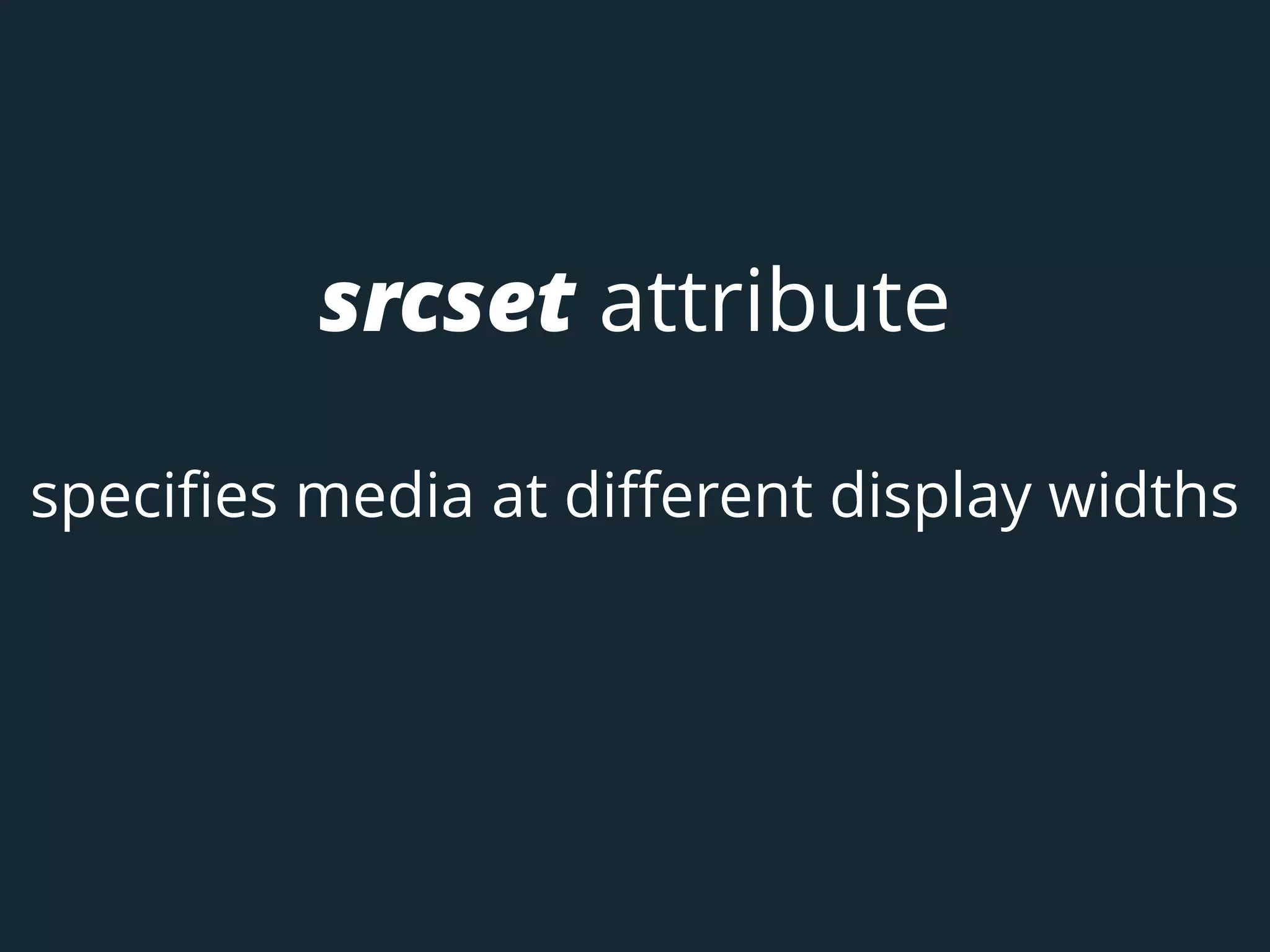
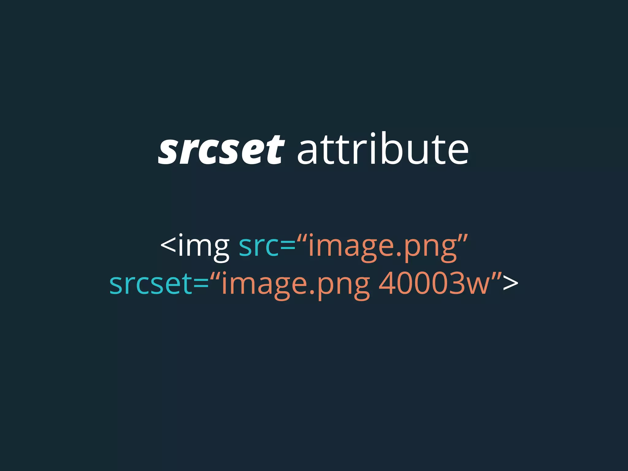
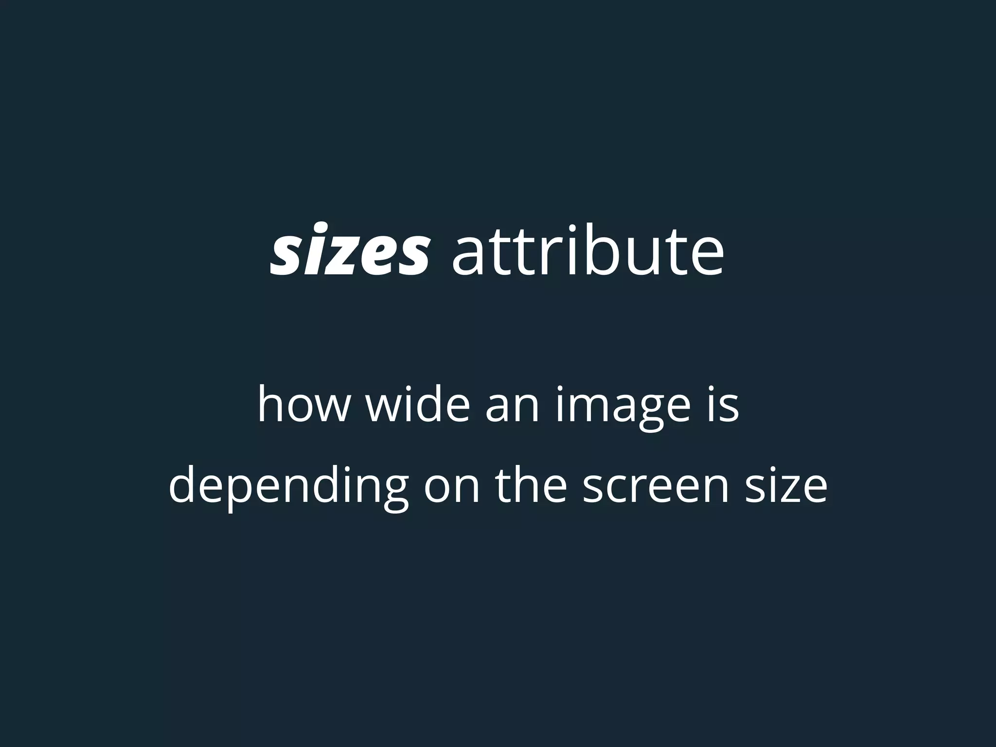
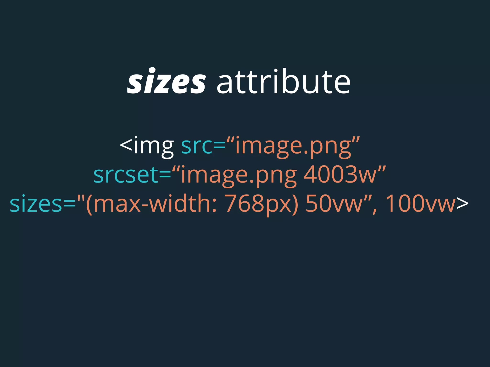
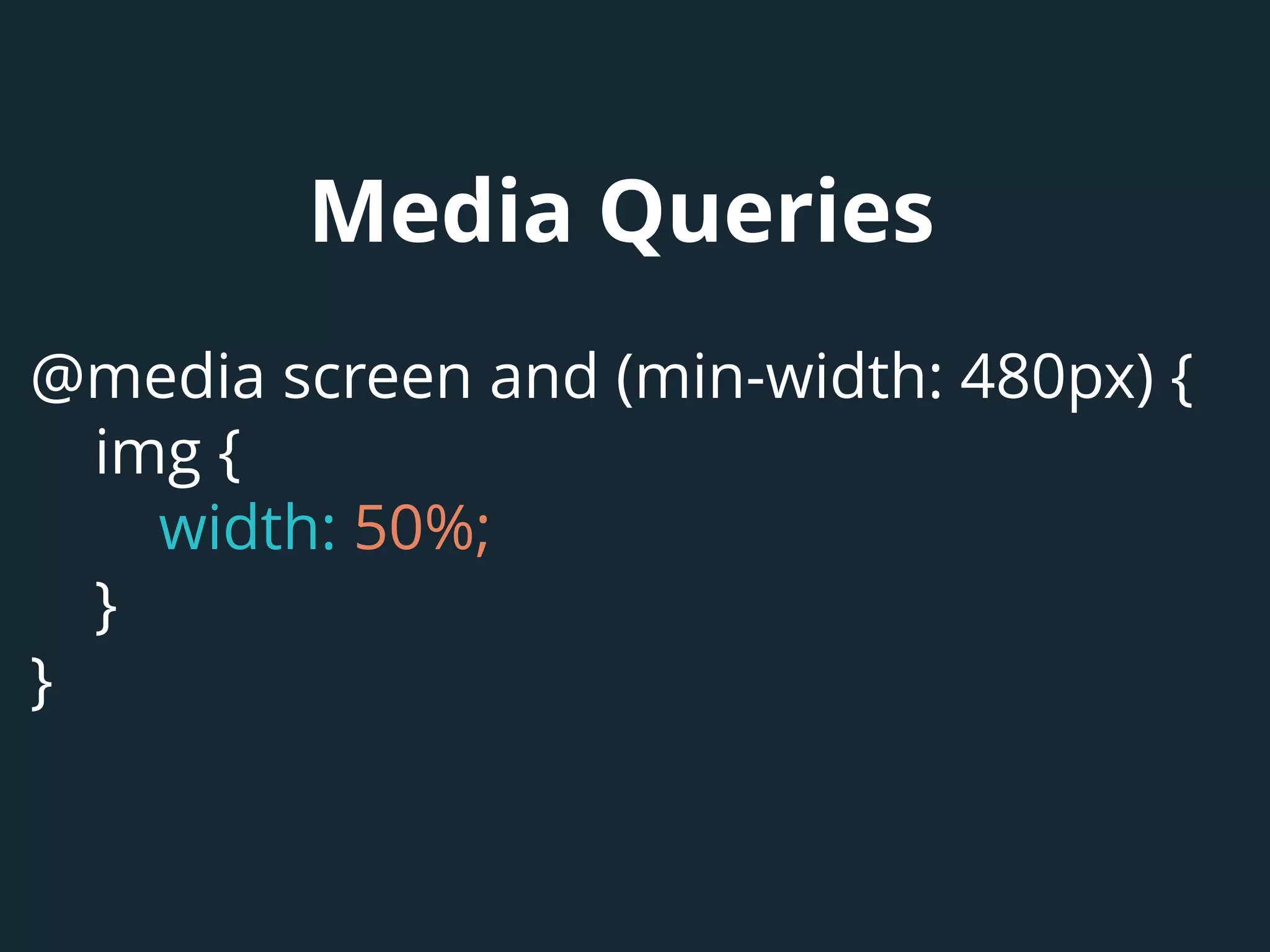
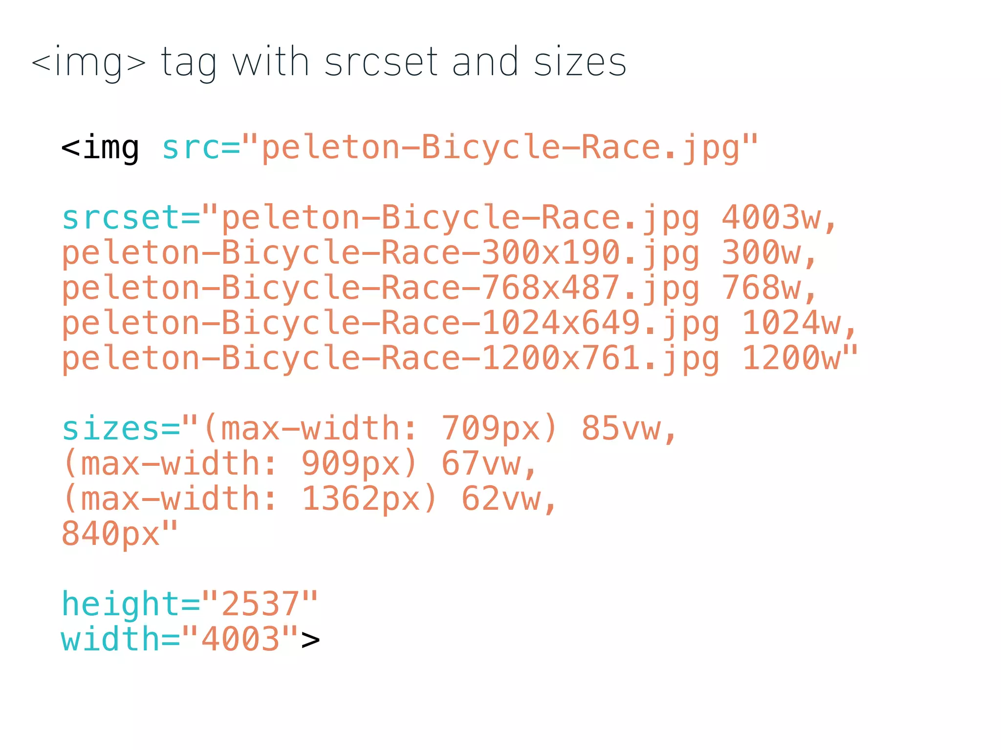
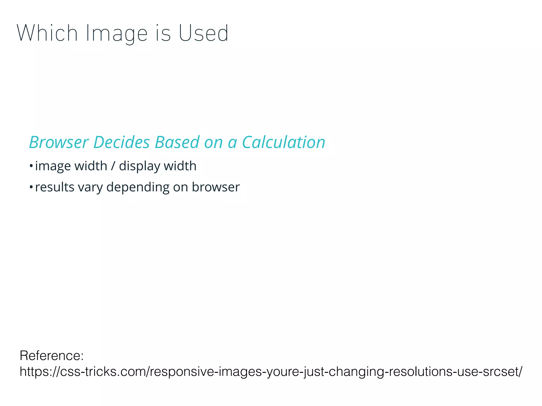
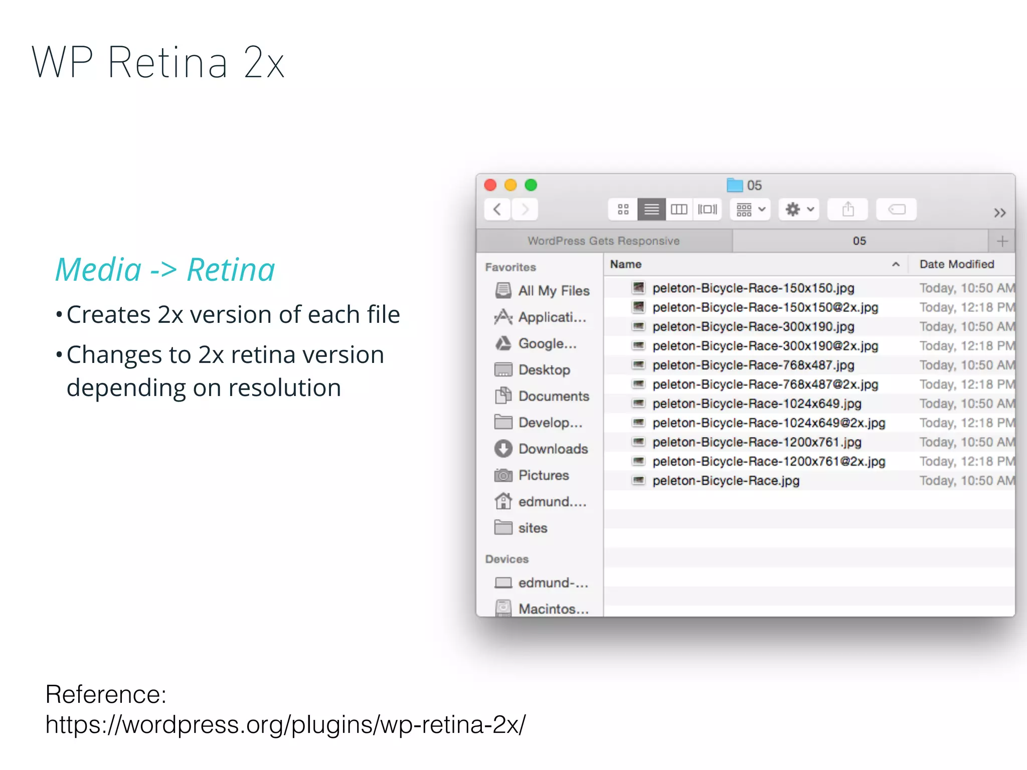
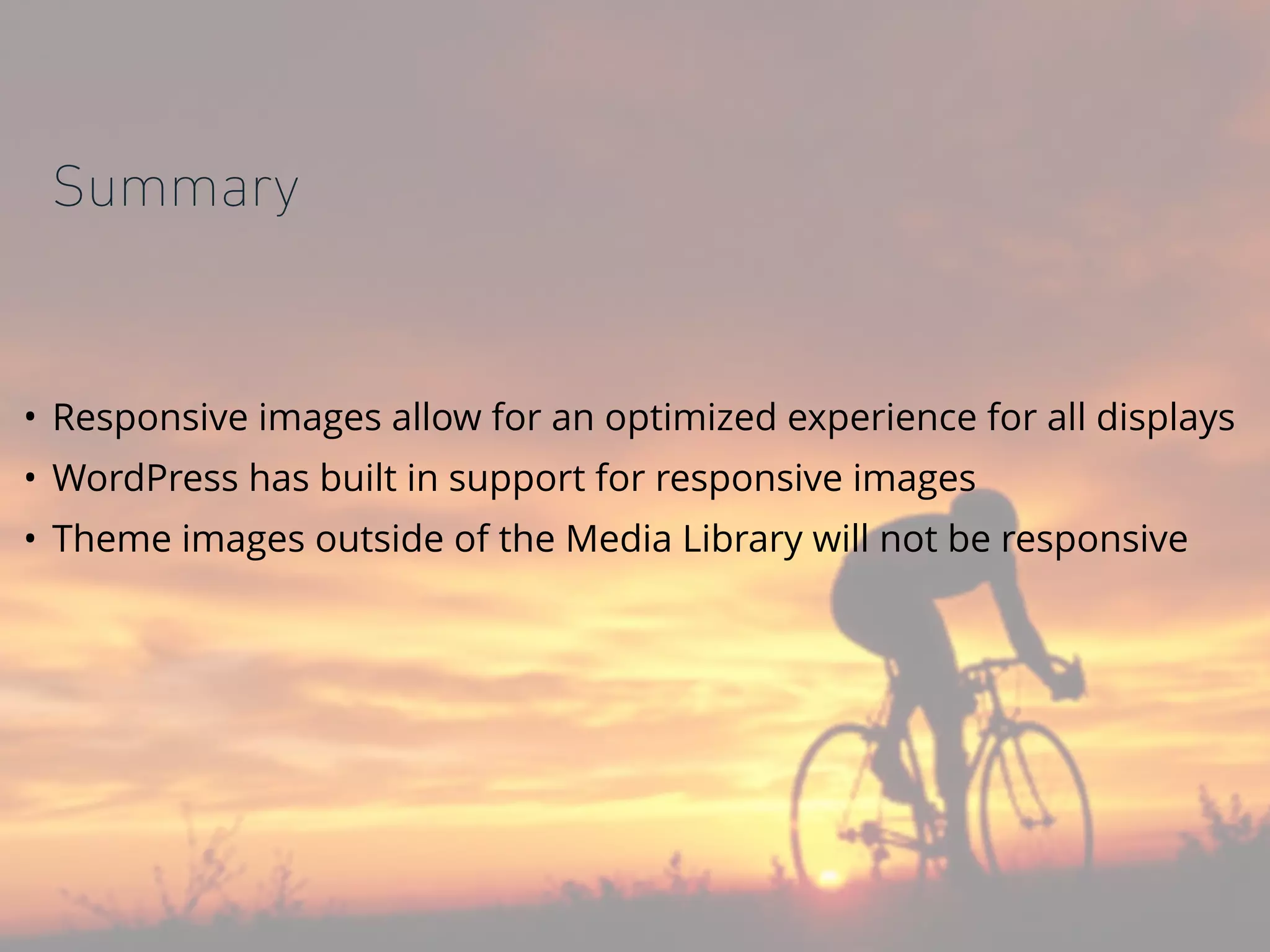

Responsive design tailors layouts for different screen sizes using techniques like media queries and flexible widths. Responsive images choose the best-sized image for each screen resolution using the srcset and sizes attributes. Retina images provide higher resolution versions for high pixel density displays. WordPress has built-in responsive image support through srcset and intermediate image sizes, but themes must implement these features for non-media images.


