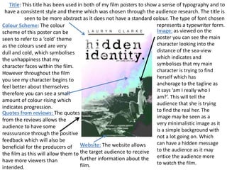
1. Title: This title has been used in both of my film posters to show a sense of typography and to
have a consistent style and theme which was chosen through the audience research. The title is
seen to be more abstract as it does not have a standard colour. The type of font chosen
represents a typewriter form.
Image: as viewed on the
poster you can see the main
character looking into the
distance of the sea-view
which indicates and
symbolises that my main
character is trying to find
herself which has
anchorage to the tagline as
it says ‘am I really who I
am?’. This will tell the
audience that she is trying
to find the real her. The
image may be seen as a
very minimalistic image as it
is a simple background with
not a lot going on. Which
can have a hidden message
to the audience as it may
entice the audience more
to watch the film.
Website: The website allows
the target audience to receive
further information about the
film.
Quotes from reviews: The quotes
from the reviews allows the
audience to have some
reassurance through the positive
feedback which will also be
beneficial for the producers of
the film as this will allow them to
have more viewers than
intended.
Colour Scheme: The colour
scheme of this poster can be
seen to refer to a ‘cold’ theme
as the colours used are very
dull and cold, which symbolises
the unhappiness that my
character faces within the film.
However throughout the film
you see my character begins to
feel better about themselves
therefore you can see a small
amount of colour rising which
indicates progression.