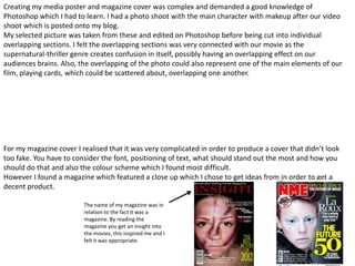
In what ways does your media
    product use, develop or challenge
   forms and conventions of real media
                products?
how long is your trailer? **
- how many clips did you use?**
- how much of the film narrative is revealed? **
- what transitions/captions/graphics etc did you use? **
- where is your trailer intended to be shown?
- In what ways do all of the above reinforce/challenge/develop the usual way of doing things of
real teaser trailers?**
- How did you go about designing your poster?**
- What information did you include? (actors names? release date? etc)**
- How did you chose the main image?**
- What were your influences?**
- How did you chose the name of your magazine?
- Why did you chose the colour scheme that you've used?
- Describe the creative process of laying out the cover -
The clips are very short and all in all, along with text screens, our trailer is intentionally 1minute long as we
are following the existing teaser trailers. Film teaser trailers last from 30 seconds to 1minute 30 seconds on
average, we found out this information as we watched many teasers and recorded the duration. Our teaser
trailer, Imminent, consists of 19 clips, not including title screens or our opening logo.
Being a teaser trailer our group decided that the narrative should not be revealed in order to create an
intrigued response from the audience. The lack of narrative that's revealed causes the audience to generate
endless enigmas for the movie, furthermore generating an interest into the film and causing them to be
drawn in. We used this element of real media products to produce a realistic media product ourselves,
meeting the typical duration allowed us to follow the convention of media teaser trailers.
Being the editor I took some typical elements and further developed them to fit in with our unique media
product. The main one being the captions I used and also I did not include a rhetorical question due to the
fact I was hoping the audience generated various ones themselves.

As the editor I had chosen to use white on the black background for the titles throughout as it was simple,
with an edgy bold font that's centralised, which connotes our genre. Below is screen shots of the two types
of text used. The bold one being just for the title and the “Coming this January”.


This lead to our trailer having a more subtle feel and then just one main build up of effects which was at the
end of the trailer. I used this to scare the audience at the end after creating a very vague knowledge of the
narrative, I hoped that this would intentionally leave them wanting more from the film and encourage them
to go and see the movie. The build up was a combination of sound layers, edited colour balance and the
cutting of one particular clip to create an overlapping effect when the main character turns her head. Films
such as the Exorcist inspired me to create this effect as it intensified the level in which the audience are
scared in relations to just a slow head movement.
When first considering a design for my poster I intended to develop the RITE movie poster and create
one for imminent. My first idea was to center the main characters face in-between a collage of playing
cards.
                       This was going to be where I would place the main characters face,
                       with a grey scale colour which was cold with enhanced shadows.


                        In place of what look like a front cover of a book, I would place cards
                        with the blue English pattern all around as a boarder that was
                        random.


                        My title of Imminent would have all been in capital letters, bold font
                        and stretched to the width of the poster.

However, after more research into movie posters and magazines I come across an interesting magazine
cover for the SHINING. The pictures form on the front cover was my inspiration as I pictured my
potential poster and decided to develop it into my own.
Creating my media poster and magazine cover was complex and demanded a good knowledge of
Photoshop which I had to learn. I had a photo shoot with the main character with makeup after our video
shoot which is posted onto my blog.
My selected picture was taken from these and edited on Photoshop before being cut into individual
overlapping sections. I felt the overlapping sections was very connected with our movie as the
supernatural-thriller genre creates confusion in itself, possibly having an overlapping effect on our
audiences brains. Also, the overlapping of the photo could also represent one of the main elements of our
film, playing cards, which could be scattered about, overlapping one another.


For my magazine cover I realised that it was very complicated in order to produce a cover that didn’t look
too fake. You have to consider the font, positioning of text, what should stand out the most and how you
should do that and also the colour scheme which I found most difficult.
However I found a magazine which featured a close up which I chose to get ideas from in order to get a
decent product.

                         The name of my magazine was in
                         relation to the fact it was a
                         magazine. By reading the
                         magazine you get an insight into
                         the movies, this inspired me and I
                         felt it was appropriate.
INSERT POSTER & ADD ARROWS & INFO WHAT WAS
INCLUDED (Actors/Characters/Date/Sponsors..)
Evaluation q1
Evaluation q1
Evaluation q1
Evaluation q1

Evaluation q1

  • 1.
    In what waysdoes your media product use, develop or challenge forms and conventions of real media products? how long is your trailer? ** - how many clips did you use?** - how much of the film narrative is revealed? ** - what transitions/captions/graphics etc did you use? ** - where is your trailer intended to be shown? - In what ways do all of the above reinforce/challenge/develop the usual way of doing things of real teaser trailers?** - How did you go about designing your poster?** - What information did you include? (actors names? release date? etc)** - How did you chose the main image?** - What were your influences?** - How did you chose the name of your magazine? - Why did you chose the colour scheme that you've used? - Describe the creative process of laying out the cover -
  • 2.
    The clips arevery short and all in all, along with text screens, our trailer is intentionally 1minute long as we are following the existing teaser trailers. Film teaser trailers last from 30 seconds to 1minute 30 seconds on average, we found out this information as we watched many teasers and recorded the duration. Our teaser trailer, Imminent, consists of 19 clips, not including title screens or our opening logo. Being a teaser trailer our group decided that the narrative should not be revealed in order to create an intrigued response from the audience. The lack of narrative that's revealed causes the audience to generate endless enigmas for the movie, furthermore generating an interest into the film and causing them to be drawn in. We used this element of real media products to produce a realistic media product ourselves, meeting the typical duration allowed us to follow the convention of media teaser trailers.
  • 3.
    Being the editorI took some typical elements and further developed them to fit in with our unique media product. The main one being the captions I used and also I did not include a rhetorical question due to the fact I was hoping the audience generated various ones themselves. As the editor I had chosen to use white on the black background for the titles throughout as it was simple, with an edgy bold font that's centralised, which connotes our genre. Below is screen shots of the two types of text used. The bold one being just for the title and the “Coming this January”. This lead to our trailer having a more subtle feel and then just one main build up of effects which was at the end of the trailer. I used this to scare the audience at the end after creating a very vague knowledge of the narrative, I hoped that this would intentionally leave them wanting more from the film and encourage them to go and see the movie. The build up was a combination of sound layers, edited colour balance and the cutting of one particular clip to create an overlapping effect when the main character turns her head. Films such as the Exorcist inspired me to create this effect as it intensified the level in which the audience are scared in relations to just a slow head movement.
  • 4.
    When first consideringa design for my poster I intended to develop the RITE movie poster and create one for imminent. My first idea was to center the main characters face in-between a collage of playing cards. This was going to be where I would place the main characters face, with a grey scale colour which was cold with enhanced shadows. In place of what look like a front cover of a book, I would place cards with the blue English pattern all around as a boarder that was random. My title of Imminent would have all been in capital letters, bold font and stretched to the width of the poster. However, after more research into movie posters and magazines I come across an interesting magazine cover for the SHINING. The pictures form on the front cover was my inspiration as I pictured my potential poster and decided to develop it into my own.
  • 5.
    Creating my mediaposter and magazine cover was complex and demanded a good knowledge of Photoshop which I had to learn. I had a photo shoot with the main character with makeup after our video shoot which is posted onto my blog. My selected picture was taken from these and edited on Photoshop before being cut into individual overlapping sections. I felt the overlapping sections was very connected with our movie as the supernatural-thriller genre creates confusion in itself, possibly having an overlapping effect on our audiences brains. Also, the overlapping of the photo could also represent one of the main elements of our film, playing cards, which could be scattered about, overlapping one another. For my magazine cover I realised that it was very complicated in order to produce a cover that didn’t look too fake. You have to consider the font, positioning of text, what should stand out the most and how you should do that and also the colour scheme which I found most difficult. However I found a magazine which featured a close up which I chose to get ideas from in order to get a decent product. The name of my magazine was in relation to the fact it was a magazine. By reading the magazine you get an insight into the movies, this inspired me and I felt it was appropriate.
  • 6.
    INSERT POSTER &ADD ARROWS & INFO WHAT WAS INCLUDED (Actors/Characters/Date/Sponsors..)