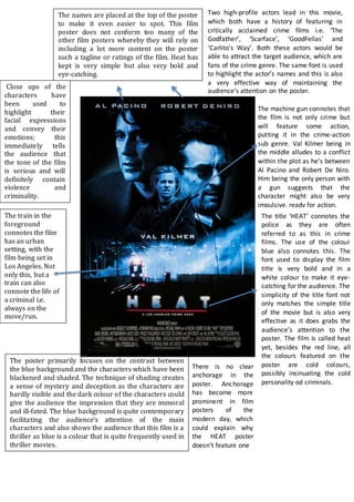
The poster primarily focuses on the contrast between
the blue background and the characters which have been
blackened and shaded. The technique of shading creates
a sense of mystery and deception as the characters are
hardly visible and the dark colour of the characters could
give the audience the impression that they are immoral
and ill-fated. The blue background is quite contemporary
facilitating the audience’s attention of the main
characters and also shows the audience that this film is a
thriller as blue is a colour that is quite frequently used in
thriller movies.
The title ‘HEAT’ connotes the
police as they are often
referred to as this in crime
films. The use of the colour
blue also connotes this. The
font used to display the film
title is very bold and in a
white colour to make it eye-
catching for the audience. The
simplicity of the title font not
only matches the simple title
of the movie but is also very
effective as it does grabs the
audience’s attention to the
poster. The film is called heat
yet, besides the red line, all
the colours featured on the
poster are cold colours,
possibly insinuating the cold
personality od criminals.
Two high-profile actors lead in this movie,
which both have a history of featuring in
critically acclaimed crime films i.e. ‘The
Godfather’, ‘Scarface’, ‘GoodFellas’ and
‘Carlito’s Way’. Both these actors would be
able to attract the target audience, which are
fans of the crime genre. The same font is used
to highlight the actor’s names and this is also
a very effective way of maintaining the
audience’s attention on the poster.
The machine gun connotes that
the film is not only crime but
will feature some action,
putting it in the crime-action
sub genre. Val Kilmer being in
the middle alludes to a conflict
within the plot as he’s between
Al Pacino and Robert De Niro.
Him being the only person with
a gun suggests that the
character might also be very
impulsive, ready for action.
There is no clear
anchorage in the
poster. Anchorage
has become more
prominent in film
posters of the
modern day, which
could explain why
the HEAT poster
doesn’t feature one
The names are placed at the top of the poster
to make it even easier to spot. This film
poster does not conform too many of the
other film posters whereby they will rely on
including a lot more content on the poster
such a tagline or ratings of the film. Heat has
kept is very simple but also very bold and
eye-catching.
The train in the
foreground
connotes the film
has an urban
setting, with the
film being set in
Los Angeles. Not
only this, but a
train can also
connote the life of
a criminal i.e.
always on the
move/run.
Close ups of the
characters have
been used to
highlight their
facial expressions
and convey their
emotions; this
immediately tells
the audience that
the tone of the film
is serious and will
definitely contain
violence and
criminality.

Heat poster analysis

  • 1.
    The poster primarilyfocuses on the contrast between the blue background and the characters which have been blackened and shaded. The technique of shading creates a sense of mystery and deception as the characters are hardly visible and the dark colour of the characters could give the audience the impression that they are immoral and ill-fated. The blue background is quite contemporary facilitating the audience’s attention of the main characters and also shows the audience that this film is a thriller as blue is a colour that is quite frequently used in thriller movies. The title ‘HEAT’ connotes the police as they are often referred to as this in crime films. The use of the colour blue also connotes this. The font used to display the film title is very bold and in a white colour to make it eye- catching for the audience. The simplicity of the title font not only matches the simple title of the movie but is also very effective as it does grabs the audience’s attention to the poster. The film is called heat yet, besides the red line, all the colours featured on the poster are cold colours, possibly insinuating the cold personality od criminals. Two high-profile actors lead in this movie, which both have a history of featuring in critically acclaimed crime films i.e. ‘The Godfather’, ‘Scarface’, ‘GoodFellas’ and ‘Carlito’s Way’. Both these actors would be able to attract the target audience, which are fans of the crime genre. The same font is used to highlight the actor’s names and this is also a very effective way of maintaining the audience’s attention on the poster. The machine gun connotes that the film is not only crime but will feature some action, putting it in the crime-action sub genre. Val Kilmer being in the middle alludes to a conflict within the plot as he’s between Al Pacino and Robert De Niro. Him being the only person with a gun suggests that the character might also be very impulsive, ready for action. There is no clear anchorage in the poster. Anchorage has become more prominent in film posters of the modern day, which could explain why the HEAT poster doesn’t feature one The names are placed at the top of the poster to make it even easier to spot. This film poster does not conform too many of the other film posters whereby they will rely on including a lot more content on the poster such a tagline or ratings of the film. Heat has kept is very simple but also very bold and eye-catching. The train in the foreground connotes the film has an urban setting, with the film being set in Los Angeles. Not only this, but a train can also connote the life of a criminal i.e. always on the move/run. Close ups of the characters have been used to highlight their facial expressions and convey their emotions; this immediately tells the audience that the tone of the film is serious and will definitely contain violence and criminality.