Download to read offline
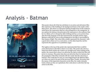

The document summarizes research on action and adventure film posters. It finds that such posters often use deep reds and greys in the background to symbolize action and explosions. An analysis of a Batman poster shows how reds represent anger and blues represent the protagonist with good intentions. The poster depicts an explosion, uses large font for the tagline and release date, and capitalizes important character names to advertise the film's genre, release, and actors. Based on this research, the author will use reds for antagonists and blues for protagonists, include an explosion, and use a capitalized tagline in their own stop motion animation poster.


