The document is an Outwear brand identity style guide that provides guidelines for basic branding elements, stationary design, signage design, UI design, and merchandise examples. It includes color palettes, approved typefaces, logo descriptions and usage rules. Mockups show applications of the logo and designs to various items like letterhead, business cards, signs, app interfaces, bags, clothing. Credits are provided for graphic assets used. The style guide establishes visual consistency for Outwear's branding across different applications and platforms.
This document provides guidelines for creating visual materials that align with SketchDeck's brand identity, including its logo, colors, typefaces, graphics, photos, and text. It outlines rules for proper usage of these brand elements and includes asset downloads. The goal is to help communicate SketchDeck's personality as both a tech startup and global design community in a warm, friendly, and flexible manner.
This document provides branding guidelines for the Beyondsoft brand. It outlines the logo, colors, typography, icons and other visual elements that make up the brand identity. The logo signature includes the wordmark and tagline together, and guidelines specify minimum sizes for print and screen use. Corporate colors are defined, along with secondary and accent colors. Typography styles are designated for headers, subheaders and body text. Icon design specifications cover sizing, spacing and color usage. The guidelines aim to maintain a consistent brand message across all channels.
This document provides style guidelines for Cherriots branding and communications, including colors, logos, photos, fonts, templates for various materials, writing tips, terminology, and formatting standards. It aims to ensure a consistent look and message across all of Cherriots' public-facing materials. Adhering to these guidelines helps build brand recognition and a positive public association with Cherriots.
The document provides brand guidelines for Sunbit, including sections on their brand, identity, colors, typography, photography and more. It establishes their mission as eliminating financial waste and passing value to merchants and customers. Their personality is described as caring, genuine, thoughtful and transparent. The guidelines cover their logo, colors, fonts, tone of voice and how to properly apply these brand elements in marketing materials.
This document provides guidelines for a corporate design manual (CD 2.0) for a company operating in the HVAC market. It outlines the key elements of the new design system, including the "Red Line" motif that connects brand messaging to product benefits, the "Red Wavy Wall" background, and photography style showing people in work or living environments. Guidelines are given for applying these elements to literature, logos, colors, typography, formats, graphics, and other brand touchpoints. The system is designed to present a unified yet differentiated brand identity across six company brands while reinforcing strategic positioning as committed, smart, and positive.
This document provides branding guidelines for Uncommon Solutions. It outlines the proper use of the logo and its variations, as well as guidelines for color, typography, and applying the brand across various collateral like business cards, invoices, presentations, and more. The logo, comprising an icon and wordmark, is at the core of the brand identity. Color palette, typefaces, hierarchy and applications are all defined to maintain brand consistency. Guidelines provide examples of correct and incorrect uses to preserve brand integrity.
This document provides branding and visual guidelines for Central Turf & Irrigation Supply. It outlines the proper uses of the company logo, approved typefaces, color palette, product icons, design elements and image choices to maintain a consistent brand identity across all communications. Adhering to these guidelines will ensure the company's identity remains strong and a consistent image is promoted to audiences.
Brand integrity is a fragile thing, so it needs to be treated as such. Brand guideline is, in essence, our owner’s manual on how to “use” Grinn brand. A brand book lies at the heart of the company, and reveals insider details, goals and marketing techniques.
This document outlines branding guidelines for Wash@Home, including:
- The logo, its variations, minimum sizes, and incorrect uses
- Primary and secondary colors that should be used consistently
- Gotham Rounded as the primary typography across all platforms
- Iconography that clearly communicates through rounded simple shapes
- Illustrations that are inclusive and help expand the visual language
- Graphical elements that showcase the brand across applications
The guidelines provide a flexible yet consistent brand identity system to represent Wash@Home.
The document discusses the key principles of effective logo design. It notes that logos should be simple, use a small color palette of 1-3 colors, have fonts that are distinctive but easy to read, and be practical and adaptable to different mediums. The design process involves starting with thumbnail sketches without technology, designing initially in black and white, keeping the design simple, and using appropriate colors, fonts and shapes that fit the company. Effective logos convey an impression through visual qualities like simplicity, proportion, color and font choices.
Certain qualities make logos more memorable and distinguishable, including simplicity, proportionality, and using a limited color palette. Effective logos are clean and uncluttered while still being proportional in size. Most recognized logos use one to three colors that contrast well. The design process begins with sketches without technology to focus ideas, then moves to black and white designs before adding color. Logos should follow principles of being simple, distinctive within their industry, and appropriately using font, color and shape associations.
At 7Frames, we create explainers, ads, social media videos, presentations, and more using various animation mediums. Known for our storytelling and creative visualization, we work with businesses and agencies to create more effective and engaging content. Visit 7frames.in for more details about videos and design.
WD is a creative agency that provides various design and marketing services through four departments: Creative Design, Media Production, Event Management, and Marketing & Communication. The document outlines the services each department provides and includes branding guidelines for clients with sections on logo formats, color palette, typography, and more. It aims to build strategic partnerships by presenting innovative creative ideas.
WD is a creative agency that provides various design and marketing services through four departments: Creative Design, Media Production, Event Management, and Marketing & Communication. The document outlines the agency's portfolio, including descriptions of each service department and examples of work. It also includes sections on the agency's vision, values, and confidentiality policies.
WD is a creative agency that provides various design and marketing services through 4 departments: Creative Design, Media Production, Event Management, and Marketing & Communication. The document outlines each department's services and provides branding guidelines for clients, including the company's vision, values, logo usage, typography, and color palette.
The document provides guidelines for Blink's visual identity and brand elements. It describes the company's logo including its different units and color versions. It also outlines typography guidelines specifying the house and supporting fonts. Finally, it provides specifications for business stationery items like visiting cards, letterheads, and envelopes that should adhere to the brand identity.
When I worked for CBS Interactive, I created some simple style guides for ZDNet to help me and future designers create the same branding for the company.
The document provides brand guidelines for Pzena, including:
1) Details on Pzena's logo, including allowed configurations, color specifications, and prohibited uses.
2) Information on Pzena's primary brand colors and specifications for using colors in various contexts.
3) Guidelines on typography, including the primary and secondary font families and specifications for their use.
4) Sections providing branding specifications for various communications materials like reports, letterhead, business cards, presentations, and more.
Union Bank provides a quick guide to its visual identity system, which includes specifications for proper usage of its logo, color palette, typography, and other brand elements. The guide establishes rules for logo formatting and placement, outlines the bank's core colors and their specifications, and provides guidance on typeface, layout, imagery, and applying the brand's graphic identity. Templates and examples are also included to demonstrate best practices for applying the visual identity across various marketing communications and digital channels. The document aims to ensure Union Bank's visual presence is cohesive and strengthens brand equity while connecting its offerings to the overarching MUFG brand.
This document provides branding guidelines for a company. It summarizes the purpose and importance of branding guidelines in establishing a consistent visual identity. It then outlines sections on the logo, fonts, colors, proper logo usage, logo formats, resizing guidelines, accessing brand assets, and includes a mockup logo example. The overall purpose is to ensure visual consistency of the brand across all communication materials and platforms.
This document provides brand standards and guidelines for KaiOS. It begins with an introduction to the KaiOS brand including its manifesto, platform, values, and tagline. It then covers the brand logo, approved colors, typography, and rules for using imagery and marketing materials. The document provides specifics on using the logo, approved color variations, minimum size and spacing requirements, and examples of incorrect logo usage. It also outlines the primary, secondary, neutral and additional colors in the brand palette and how they can be applied to various design elements.
The document provides brand guidelines for Coinsecure, an Indian company connecting India to Bitcoin. It outlines the brand identity including the logo, typefaces, colors, and graphic elements. The logo consists of a symbol and typeface in Junction Regular font. Open Sans Regular is used as the secondary typeface. The primary colors are royal blue and bright yellow. Guidelines are provided for proper usage of the logo, typefaces, and colors in business collaterals like letterheads and stationery. The brand aims to educate, simplify and enable Bitcoin usage in India.
The document provides brand guidelines for HomeStay, including sections on the brand logo, visuals like color palette and typography, and applications of the brand identity. The logo, using orange and dark grey colors, should always maintain clear space and only be used in specified versions. Visual elements like imagery and icons adhere to simple, solid designs. The brand font is Quicksand and should be used consistently across stationery, presentations, advertising, and signage to represent the HomeStay brand.
1) The document provides branding guidelines for the Giftxoxo and Frogo logos including proper usage, color reproduction, and examples of improper usage.
2) Various branding design templates are presented for printing and digital media including letterheads, envelopes, business cards, experience cards, boxes, banners, and app designs. Detailed specifications are provided for logo sizing, fonts, and dimensions.
3) The guidelines aim to maintain brand integrity and consistency by describing the correct applications of the logos and templates for various materials. Misuses of the logos are shown as examples to avoid.
Our brand reflects our identity, values, and behaviors. We have developed graphic standards to promote consistency across all materials and build brand recognition. These standards include logo usage and variations, color palettes, typography, photography styles, and application guidelines for materials like presentations, websites, and icons. Strict adherence to these standards will create a unified brand identity.
This document provides a checklist for designing a logo. It contains 5 points: 1) Keep the logo simple so it can be easily recognized, 2) Carefully select colors that are appropriate for the business and look good on different backgrounds, 3) Choose a tidy typography by selecting a clear, easy-to-read font, 4) Avoid special effects and keep the logo flat, and 5) Ensure the logo is scalable and flexible so it can be used in different contexts and sizes. The checklist aims to help create the best logo design.
This presentation discusses building a brand identity for City Fashions. It begins with an overview of what a brand is and its key functions. Market research is then presented on the souvenir t-shirt and fashion industries as well as competitors. Examples of brands with desirable aspects are shown. Three initial logo design options are proposed that incorporate elements like a label, flag, or illustration. The next steps would be selecting a logo, developing website designs, and applying the new brand identity across various marketing materials.
6. 3
Many teens and young adults are starting to get back into exploring nature and
wildlife. With our digital age of computers, it’s easy for us to get stressed and
filled with anxiety. What better way to relieve that stress than to spend some time
outdoors under the sun.
Las Vegas is a city surrounded by many landforms that allow for various spots to
hike, rock climb, and various other outdoor activities. Sometimes it may be hard to
find the right gear or clothing when going out for adventures. Outwear is an outdoor
exploration brand meant to supply its customers with the clothing and equipment
necessary for you to enjoy these outdoor adventures and activities.
Introduction
Project Overview
7. 4
Outwear creates a clean almost geometric look to the design of the clothing and
accessories. The designs will be bold but not aggressive, we would like for them to
match or contrast certain activities. For example, a jacket made for rock climbing
may include designs that center around the idea of rock formations and landmarks.
There may also be a contrasting version of the clothing that centers around the idea
of stripes that may focus more on the fashion side.
Another aspect that could possibly fit into the designs would be the wear of the
designs. As the designs of the clothing and accessories start to wear away, I would
like the wear of the designs to be part of the look of the clothing. This idea can help
indicate whether someone may be a frequent rock climber or someone who may
be new to the sport. In this way, it could help others feel more comfortable asking
professionals or experienced amateurs about tips or questions for certain activities.
Design Brief
10. 7
Fire Engine Red
Red has a range of symbolic meanings through many
different cultures, including life, health, vigor, war,
courage, anger, love and religious fervor.
Yellow Orange Color Wheel
Yellow is for happiness, hope and spontaneity
It’s another color that grabs your attention. It’s
another warm color that can feel upbeat and bright.
Ming
Blue green is also a hue that can be spotted on
magnificent damselfish. The color meaning behind
blue green refers to harmony and prosperity.
RGB: 193, 39, 45
CYMK: 17, 98, 92, 7
HEX: #C2262E
RGB: 247, 147, 30
CYMK: 0, 50, 98, 0
HEX: #
RGB: 34, 103, 115
CYMK: 87, 47, 45, 17
HEX: #226673
Color Palettes
Primary Colors
11. 8
Outwear Cream
Our Outwear cream symbolizes the starting point of
any journey. We use this cream color in our clothing to
express the importance of our quality in fabric. Cream
is an outstanding color to express our years of quality.
Gray
Our Gray is used mainly in our typeface and design
aspects of Outwear. Grey represents neutrality and
balance. Its color meaning likely comes from being
the shade between white and black.
RGB: 255, 255, 222
CYMK: 1, 0, 15, 0
HEX: #FFFFDE
RGB: 193, 39, 45
CYMK: 17, 98, 92, 7
HEX: #C2262E
Secondary Colors
Patterns
12. 9
Typefaces
Bahnschrift is a brand new digitization of the famous DIN
1451 character design standard and was released as a
variable font for Windows in 2017.
DIN 1451 is a standardization for letterforms designs
created by the German standards body Deutsches Institut
für Normung (German Institute for Standardization) in
1931, and was intended for use on road signs and other
technical implementations. The design was particularly
optimized for legibility, simplicity, and ease in replication.
Over the years, DIN has become a popular typeface for a
wide range of design applications.
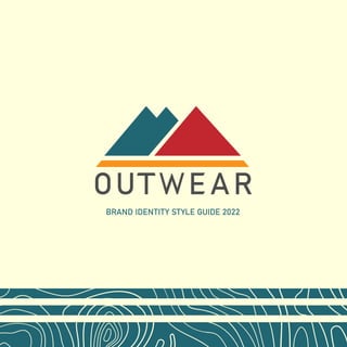
14. 11
Logo
Symbol Description
This logo is focused on
the idea of simplicity. The
focus is the mountain
range to signify nature and
terrain. There are 3 peaks
to signifiy the three sides
of the triangle, one of the
strongest shapes in nature.
The yellow bar under the
mountain range signifies a
foundation which is Outwear.
We want to be able to provide
the starting grounds for
newcomers and returning
wilderness explorers.
1
2
42. 39
UI Design
Tablet View
1. Main Menu, Logo,
Login, Shopping Cart,
and Hamburger Menu
2. Social Media Handles
and A Main Headline to
show our latest deals
and promotionals
3. A Newest Arrivals
section to feature our
latest products
43. 40
4. About Outwear section to
introduce the viewer to the
brand and our mission
44. 41
UI Design
Tablet View
5. A showcase of some of
our recent products which
the viewer can add to their
shopping cart
45. 42
6. A promotional
section where the
viewer can get deals
7. A Newsletter
section that you can
sign up for to hear
about our latest deals
8. Footer section
used with navigation
buttons, find us
section, and
social media.
46. 43
UI Design
Mobile View
1. Shopping cart and Hamburger
Menu
2. Social Media Callouts
3. Promotional Headline
4. All About Outwear
5. Winter Collection
47. 44
6. World Famous Gear
7. Promotional Deals
8. Newsletter
9. Footer Navigation
10. Find us
11. Social Media Callouts