Download to read offline
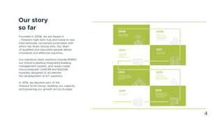
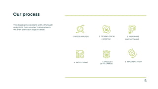
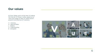
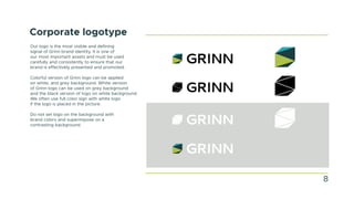


The Grinn Identity Guidelines serve as a comprehensive brand book detailing the company's identity, including its history, processes, values, and guidelines for logo usage, color palette, typography, and various corporate materials. Established in 2008, Grinn specializes in IoT solutions and emphasizes consistency in visual and written communication across all platforms. The document outlines specific design principles to ensure brand integrity and effective representation in all communications and marketing materials.


![[EN].CleverGroup Vietnam Profile 20251202](https://cdn.slidesharecdn.com/ss_thumbnails/en-260120091417-fe6f88ec-thumbnail.jpg?width=640&height=640&fit=bounds)

