Downloaded 46 times

.,;:-+§@
Headlines and emphases: “FF Meta Medium” Roman
ABCDEFGHIJKLMNOPQRSTUVWXYZ
abcdefghijklmnopqrstuvwxyz
1234567890/!?‘’*“”[]( ).,;:-+§@
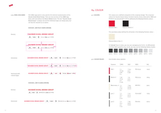
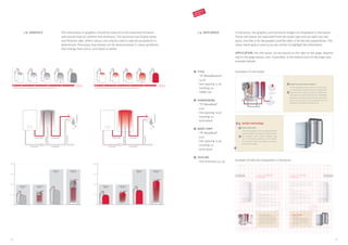
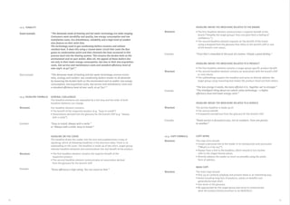
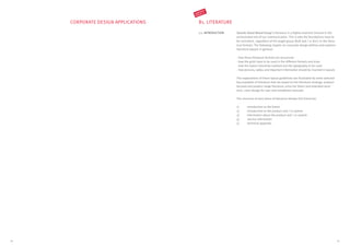
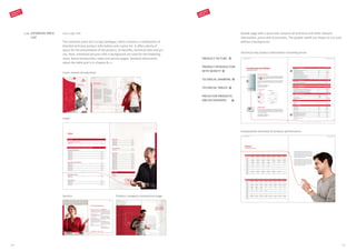
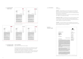
A5. TYPOGRAPHY
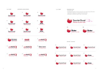
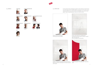
5.1. DESIGN In order to guarantee a uniform and unique brand image, we will use the
“Meta” font for all communications.
“Meta” was designed in 1985 by Erik Spikermann as a typographical alter-
native to “Helvetica”. Originally intended for easily readable body copy, it
is today a well-developed font available in most font styles. The “OpenType
Pro” version in particular contains numerous international font styles. These
attributes help make “Meta” an aesthetically distinctive, universally
applicable sans serif.
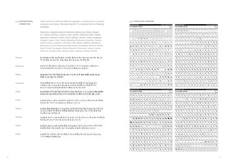
5.2. STYLES
The system font “Arial” should be chosen for digital use online (HTML and
email), for all print correspondence (Word letter templates for business
correspondence, PPT, etc.).
5.3. ONLINE AND CORRES-
PONDENCE FONT](https://image.slidesharecdn.com/2014corporatedesignmanualcd2-140521084644-phpapp01/85/2014-corporate-design_manual_cd2-0-13-320.jpg)
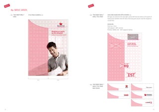
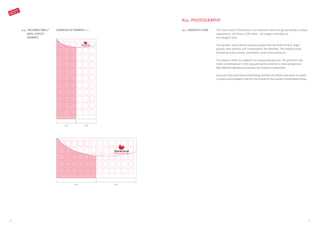
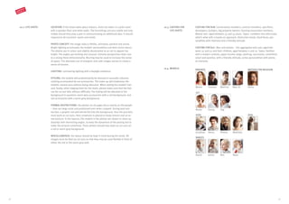
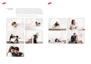
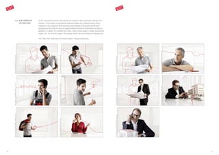
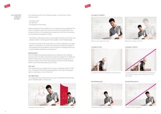
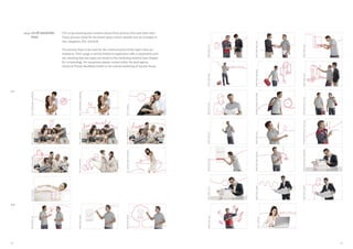
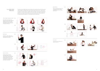
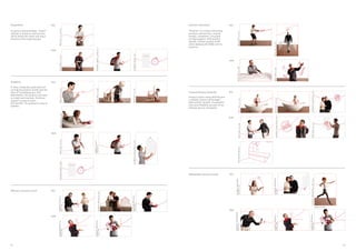
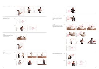
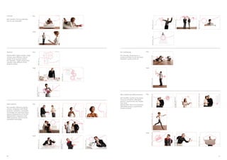
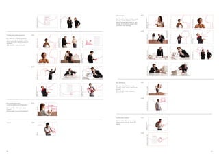
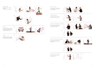
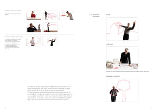
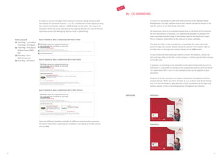
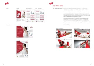
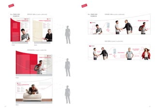
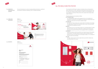
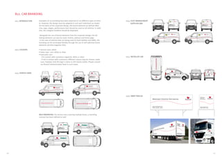

This document provides guidelines for a corporate design manual (CD 2.0) for a company operating in the HVAC market. It outlines the key elements of the new design system, including the "Red Line" motif that connects brand messaging to product benefits, the "Red Wavy Wall" background, and photography style showing people in work or living environments. Guidelines are given for applying these elements to literature, logos, colors, typography, formats, graphics, and other brand touchpoints. The system is designed to present a unified yet differentiated brand identity across six company brands while reinforcing strategic positioning as committed, smart, and positive.


