The document analyzes the layout, design elements, and conventions used in a magazine double page spread. Key points include:
- The heading is large and stands out to draw attention and indicate what the pages will cover.
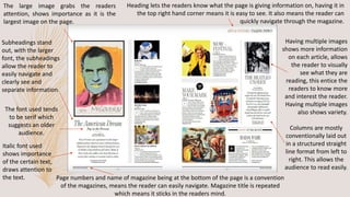
- Columns, images, subheadings, and lines are used to structure information and make it easy for the reader to navigate through the spread.
- Color schemes, font styles, sizing, bolding and underlining are employed to draw attention to important details and guide the reader through the text.
- Conventions like page numbers and positioning of elements make the spread familiar and user-friendly for readers.