
Recommended
More Related Content
What's hot
What's hot (20)
Similar to Analysis
Similar to Analysis (20)
Recently uploaded
Recently uploaded (20)
Analysis
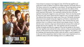
- 1. I have chosen to analyze an ap magazine cover. All of the key signifiers are using direct mode of address to grab the readers attention and draws them in. The colour scheme for my magazine is very vibrant. The writing stands out but also fits the background colours. The colour scheme for this edition of the magazine is orange, yellow, white and a slight bit of blue which highlights the most important information. The masthead is behind the One of the key signifiers meaning the magazine is very well known. There are very few words on the front cover which shows that the magazine is for a younger audience. The different fonts attract the readers even more and. The bands mentioned help attract more people to buy the magazine as if there is a band that the reader likes then they are more likely to buy it. Also, the fact that the cover mentions that it is a collector cover attracts more people to buy it. The fact that the cover mentions a big music festival will also increase the number of people who buy the magazine. The main signifiers will also increase the number of people who buy the magazine if the like the people on the covers. The main signifiers also contrast the colour scheme as they are wearing darker colours so they stand out from background of the magazine. The yellow is used for headings and important/buzz words, while the white is used to expand or in the case of the warped tour label to make it seem more important as it is is a different colour to the other headings and it is in a different font.