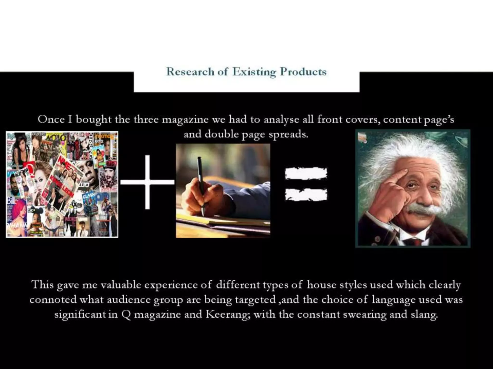
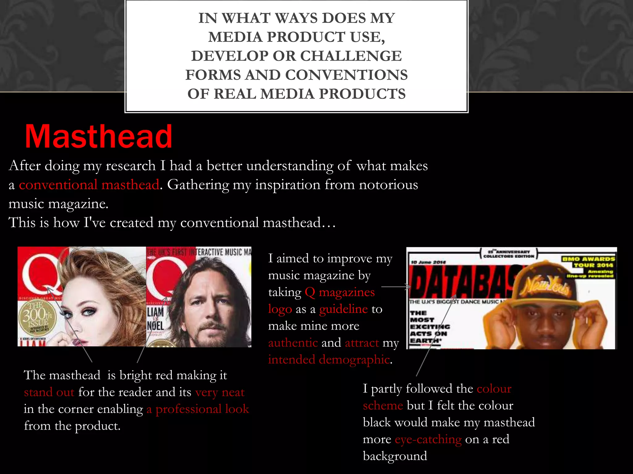
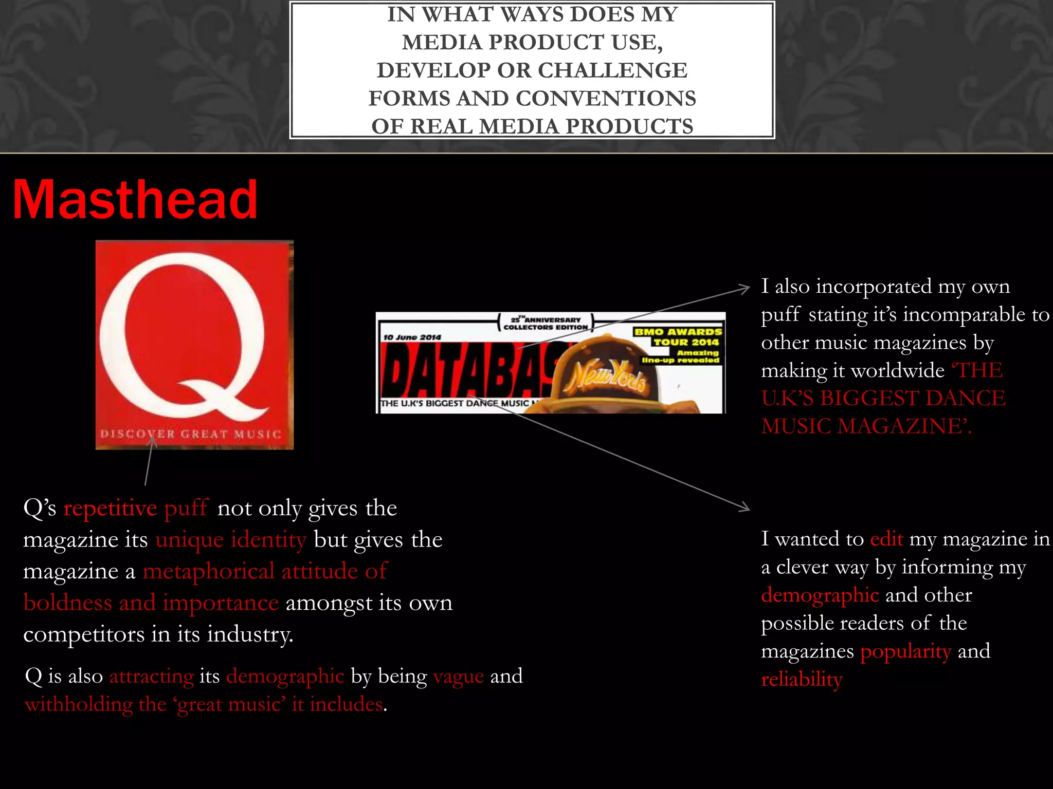
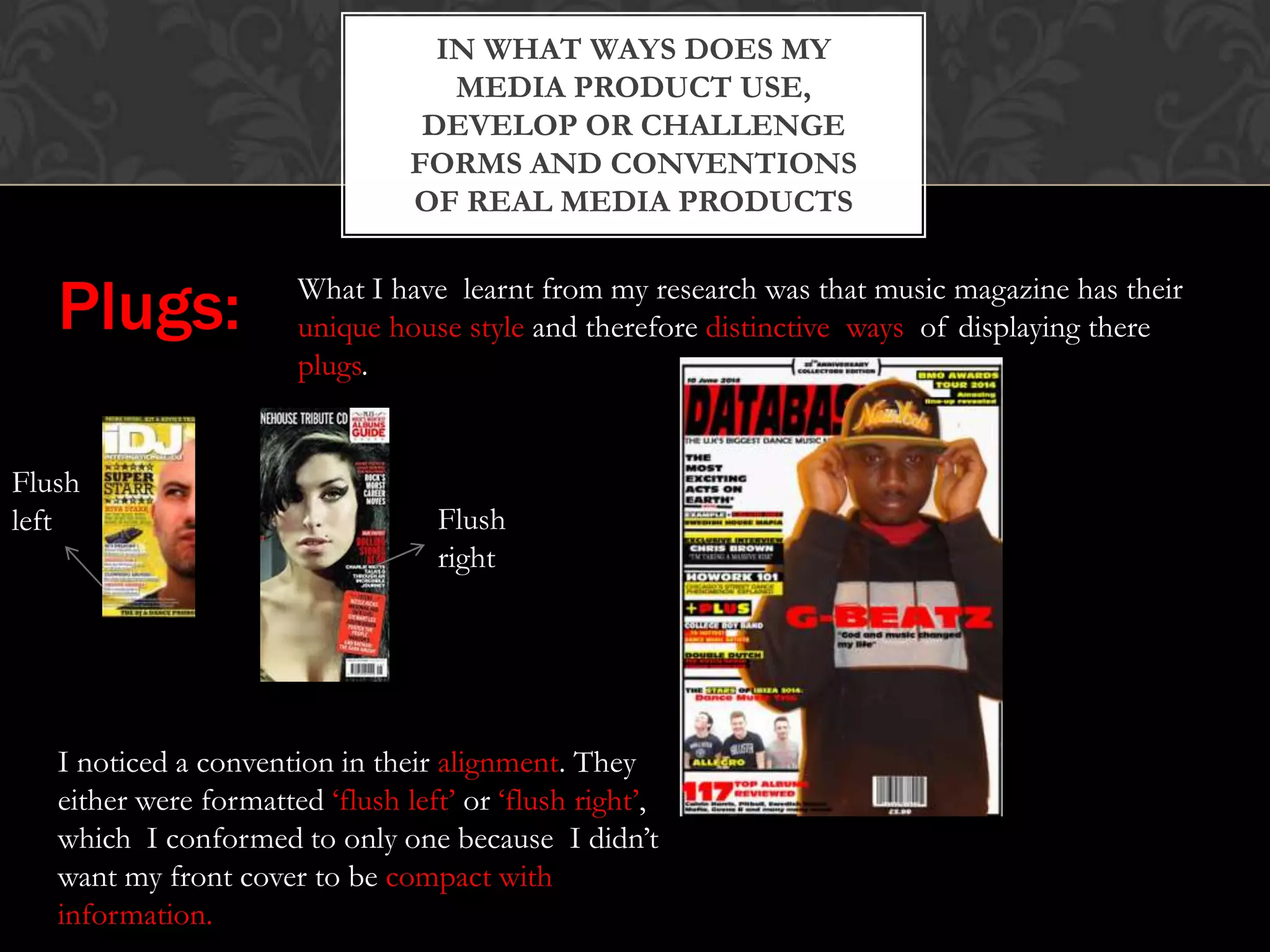
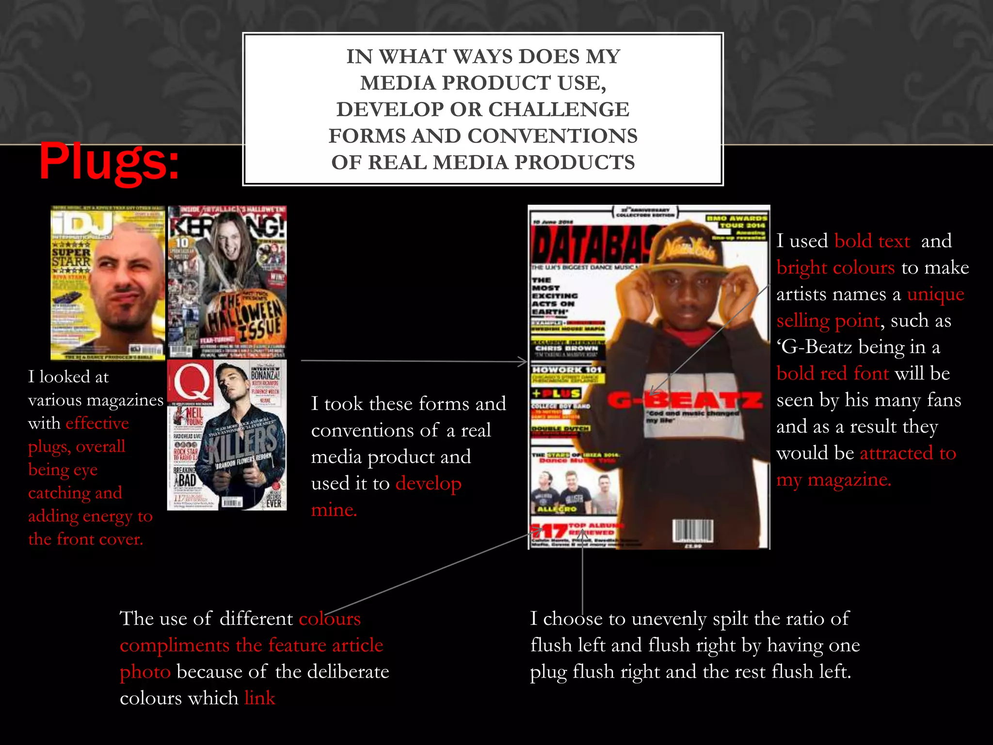
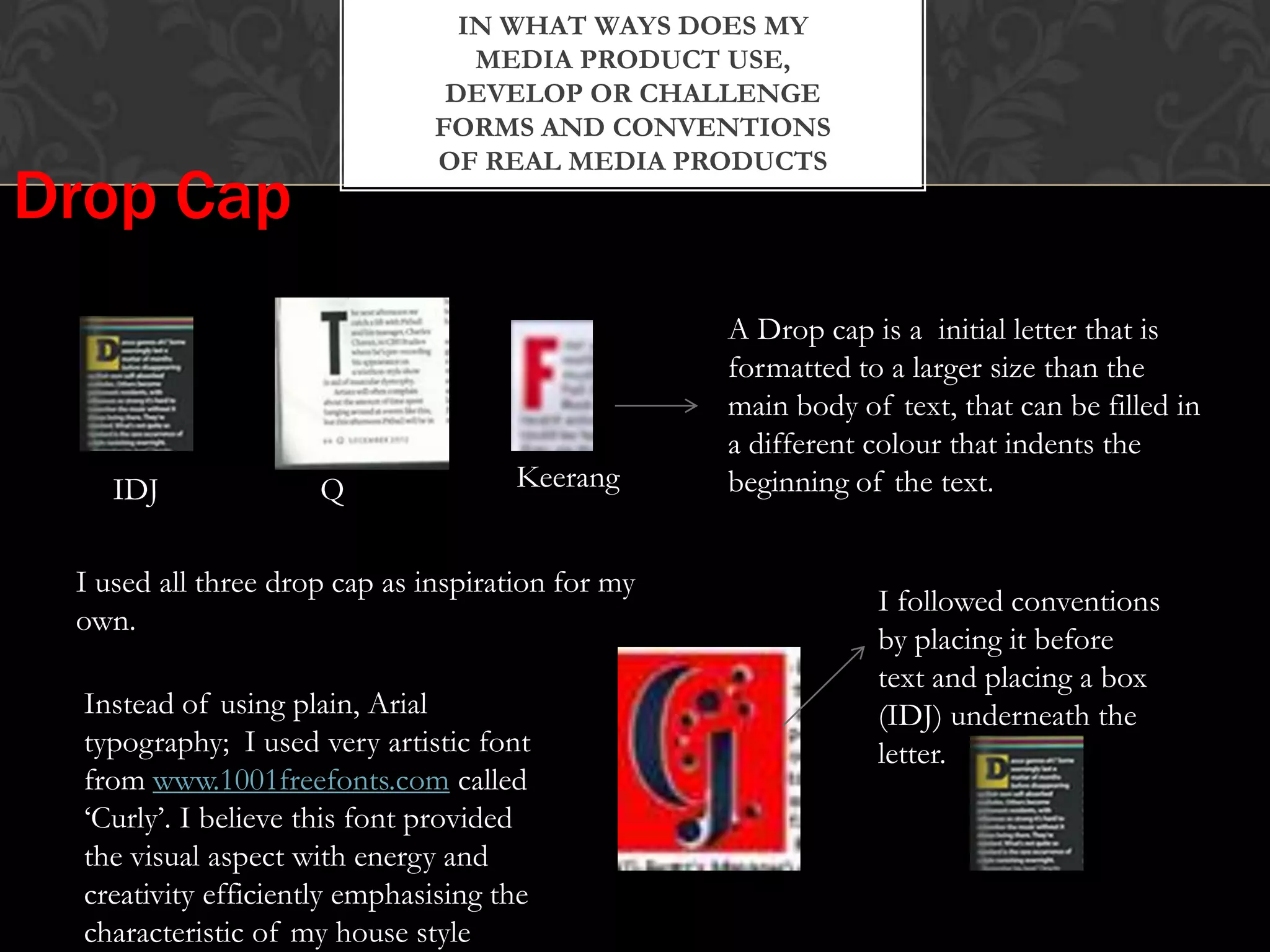
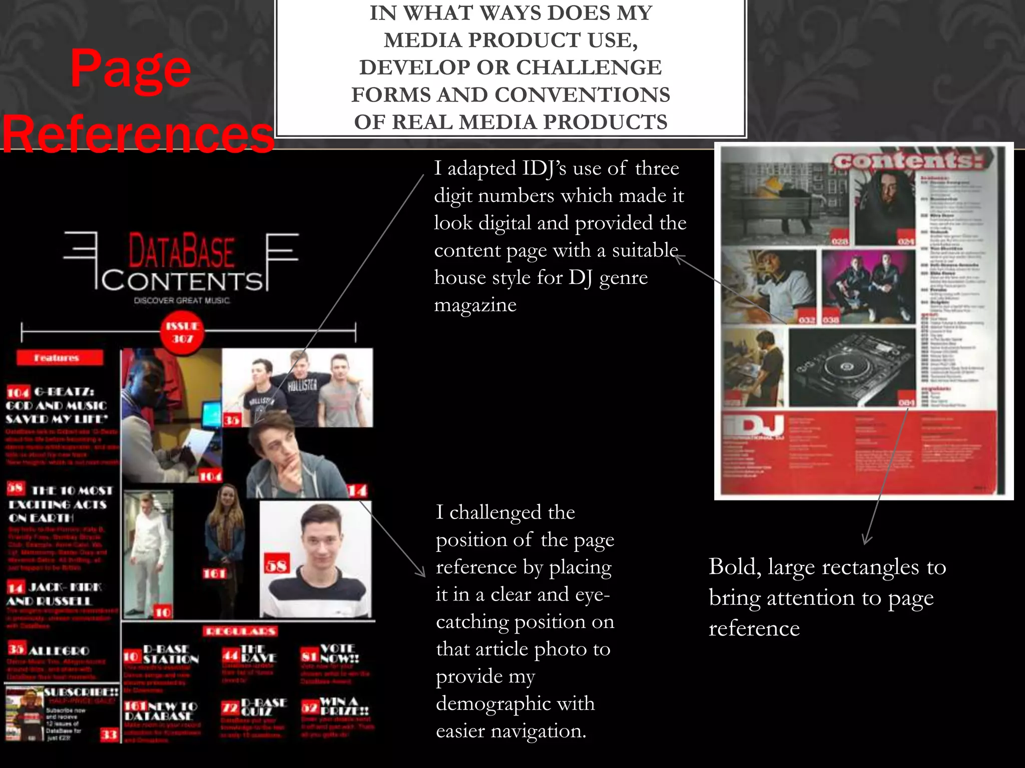
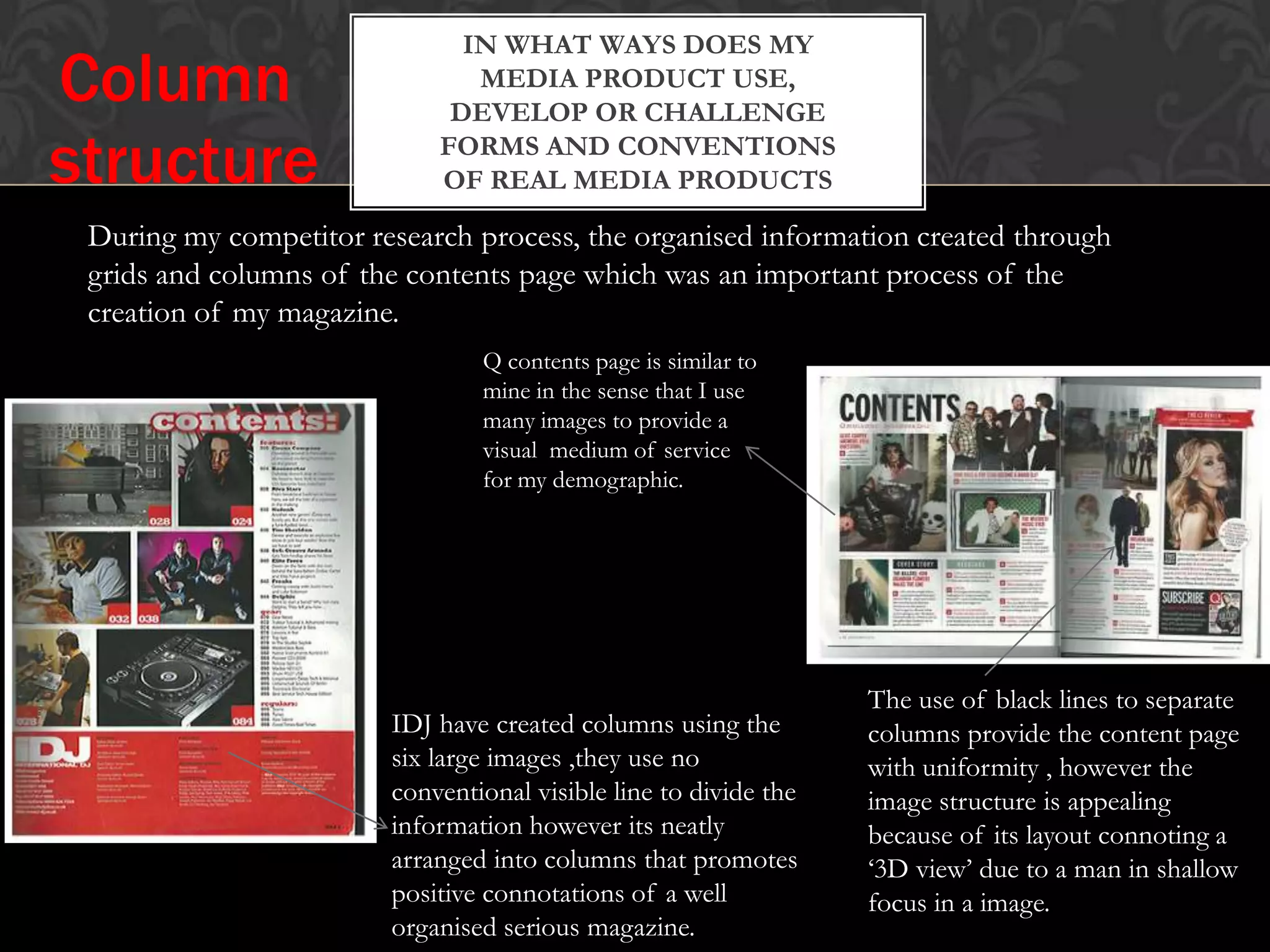
DESIGN BRIEF:
TO CREATE A NEW MUSIC MAGAZINE THAT IS DESIGNED TO A SPECIFIED
AUDIENCE.
IN WHAT WAYS DOES MY
MEDIA PRODUCT USE,
DEVELOP OR CHALLENGE
FORMS AND CONVENTIONS
OF REAL MEDIA PRODUCTS
After doing my research I had a better understanding of what makes
a conventional masthead. Gathering my inspiration from notorious
music magazine.
This is how I've created my conventional masthead…
The masthead is bright red making it
stand out for the reader and its very neat
in the corner enabling a professional look
from the product.
I aimed to improve my
music magazine by
taking Q magazines
logo as a guideline to
make mine more
authentic and attract my
intended demographic.
I partly followed the colour
scheme but I felt the colour
black would make my masthead
more eye-catching on a red
background
Masthead
IN WHAT WAYS DOES MY
MEDIA PRODUCT USE,
DEVELOP OR CHALLENGE
FORMS AND CONVENTIONS
OF REAL MEDIA PRODUCTS
Q’s repetitive puff not only gives the
magazine its unique identity but gives the
magazine a metaphorical attitude of
boldness and importance amongst its own
competitors in its industry.
Q is also attracting its demographic by being vague and
withholding the ‘great music’ it includes.
I also incorporated my own
puff stating it’s incomparable to
other music magazines by
making it worldwide ‘THE
U.K’S BIGGEST DANCE
MUSIC MAGAZINE’.
I wanted to edit my magazine in
a clever way by informing my
demographic and other
possible readers of the
magazines popularity and
reliability
Masthead
IN WHAT WAYS DOES MY
MEDIA PRODUCT USE,
DEVELOP OR CHALLENGE
FORMS AND CONVENTIONS
OF REAL MEDIA PRODUCTS
I had also
noticed while
researching
conventions that
the masthead is
usually placed
underneath the
feature article
photograph.
I felt that covering the
masthead did take focus
off it, however it could
be interpreted as the
name being well known
and readers being able to
notice part of the logo
and recognise it to be
‘Database’
Masthead
IN WHAT WAYS DOES MY
MEDIA PRODUCT USE,
DEVELOP OR CHALLENGE
FORMS AND CONVENTIONS
OF REAL MEDIA PRODUCTSCover line
I aimed for my cover lines
to add energy and colour to
my magazine. This was done
by using bright/strong
colours such as red, yellow
and black.
These type of cover lines
are conventional in
Dance/DJ magazines
allowing a balance of
focus on both the feature
article photo.
I also attempted to
create cover lines to
look like volume bars
to show creativity
and effectively
challenging
conventions
INFLUENCES
IN WHAT WAYS DOES MY
MEDIA PRODUCT USE,
DEVELOP OR CHALLENGE
FORMS AND CONVENTIONS
OF REAL MEDIA PRODUCTS
Plugs: What I have learnt from my research was that music magazine has their
unique house style and therefore distinctive ways of displaying there
plugs.
Flush
left Flush
right
I noticed a convention in their alignment. They
either were formatted ‘flush left’ or ‘flush right’,
which I conformed to only one because I didn’t
want my front cover to be compact with
information.
IN WHAT WAYS DOES MY
MEDIA PRODUCT USE,
DEVELOP OR CHALLENGE
FORMS AND CONVENTIONS
OF REAL MEDIA PRODUCTSPlugs:
I looked at
various magazines
with effective
plugs, overall
being eye
catching and
adding energy to
the front cover.
I took these forms and
conventions of a real
media product and
used it to develop
mine.
I choose to unevenly spilt the ratio of
flush left and flush right by having one
plug flush right and the rest flush left.
The use of different colours
compliments the feature article
photo because of the deliberate
colours which link
I used bold text and
bright colours to make
artists names a unique
selling point, such as
‘G-Beatz being in a
bold red font will be
seen by his many fans
and as a result they
would be attracted to
my magazine.
IN WHAT WAYS DOES MY
MEDIA PRODUCT USE,
DEVELOP OR CHALLENGE
FORMS AND CONVENTIONS
OF REAL MEDIA PRODUCTS
I used Vibe’s plug style
with others for creating
my own magazine, this
gave me the leverage to
add colours and
differentiate the article
name to the quote in the
text box; creating
uniformity.
My research informed me that depending on the genre of the magazine
influences the house style, causing it to be neat or like mine, being a
Dance music magazine; very eye-catching, connoting energy and a ‘cool’
attitude.
Plugs:
I did vary plug style, by
having big bold text
like the one in Q. I
found this much more
conventional but
effective due to
seriousness it connotes
in the black font
Researching my demographic I learned
that they would also prefer information
in a medium of a picture, so I used one
of a famous artists which could be seen
as more effective than their name
written
IN WHAT WAYS DOES MY
MEDIA PRODUCT USE,
DEVELOP OR CHALLENGE
FORMS AND CONVENTIONS
OF REAL MEDIA PRODUCTS
Feature Article Photograph Research
The feature article photo has been shot at a low angle
and shows a man dressed all in black looking down at
us by raising his head.
This connotes that the content may be serious but also
makes the man look arrogant , his clothing can also
suggest an ‘old school’ or manly impression about him.
His fists are almost clenched, but we see his knuckles,
this is called knuckle display and could also suggest
anger and dominance.
While his fists are clenched on to his jacket it looks like
his yanking it forward to convey he means business.
The lighting used to take the photo creates a shadow
on his face, creating intrigue and enforcing that he
means business, overall creating a serious tone.
IN WHAT WAYS DOES MY
MEDIA PRODUCT USE,
DEVELOP OR CHALLENGE
FORMS AND CONVENTIONS
OF REAL MEDIA PRODUCTS
The feature article photograph also creates a fierce but
playful tone, because its shows a man with an axe which
had been used due to the mess on it; his also shouting
which conveys that the magazine is going to be exciting
or gory.
The man is also wearing a black denim jacket also
conveys a Gothicism and rock and roll tone which
would identify their intended audience.
The artist is looking directly at the camera which could
be seen as effective because it could be seen as
communicating directly with your demographic what
type of content they are buying
IN WHAT WAYS DOES MY
MEDIA PRODUCT USE,
DEVELOP OR CHALLENGE
FORMS AND CONVENTIONS
OF REAL MEDIA PRODUCTS
The mise en scene of the feature article photo is a
background lemons, which can either be connoting a
playful tone and ‘not to take us serous’ or could be
conveying him as silly because there suggesting his
thinking off lemons due to his facial expressions.
The lemons are an intertextual reference which would
appeal to the target audience. Being bright yellow
makes it eye catching for potential buyers.
The Feature article photograph is a close up low angle
shot of his face to see his facial expressions which
suggest puzzlement, this contrast with the stereotype
of other DJ magazine which usually have a serious
tone.
IN WHAT WAYS DOES MY
MEDIA PRODUCT USE,
DEVELOP OR CHALLENGE
FORMS AND CONVENTIONS
OF REAL MEDIA PRODUCTS
I used a mid-shot and had my
artist look at the camera to
enable emotional engagement
with my demographic, allowing
the feature article to be the most
eye-catching subject on the page.
The artist is also holding his hat which
connotes a cool, informal and popular
mode of address.
I decided have my artist wear a
hoodie because the clothing is
associated with the
dance/RnB/Hip Hop genre.
I used the same bright colours
for both his clothing and the
plugs so there is a sense of
uniformity.
I covered the masthead with
the feature article photo and
had a puff saying ‘25th
anniversary’ which both
connotes that my magazine is
popular and well known.
The plug being in red and
having a bold typography
connotes it being a
passionate article
IN WHAT WAYS DOES MY
MEDIA PRODUCT USE,
DEVELOP OR CHALLENGE
FORMS AND CONVENTIONS
OF REAL MEDIA PRODUCTS
Keerang magazine being Halloween
themed had to include symbolic trait
associated with Halloween such as
having the running head as blood
dripping which possibly connotes
excitement and a eerie mode of
address
is a conventional feature to a feature article that embodies the
magazine’s house style and provides a brief introduction to the
type of article.
Continuity is shown
using ‘blood dripping’ to
represent symbolic
Halloween trait shown of
front cover
The warn out effect created
emphasises the noisy and
shattered connotations
associated with the masthead.
The wording ‘25th anniversary
collectors edition’ can be seen as a
running head due to similarity in
conventions of ‘providing a brief
intro’ however it could be
interpreted as a puff because it
raises the prestige of the magazine.
IN WHAT WAYS DOES MY
MEDIA PRODUCT USE,
DEVELOP OR CHALLENGE
FORMS AND CONVENTIONS
OF REAL MEDIA PRODUCTS
I both challenged conventions and followed them…
I incorporated my heading to
enhance my house style like Q
magazines
‘Contents’ is big at top of page,
instantly presents audience with
type of information
However…
I challenged conventions
by..
• Change in colour
(white, red clearer on
black background)
• Structure and
typography of fonts
(bolder text placed one
beneath another)
IN WHAT WAYS DOES MY
MEDIA PRODUCT USE,
DEVELOP OR CHALLENGE
FORMS AND CONVENTIONS
OF REAL MEDIA PRODUCTS
I subverted
convention as this
differs from the real
media product.
My running head is part of
the house style due to the use
of black line which is used to
construct sections of the
double page spread
Headline
IN WHAT WAYS DOES MY
MEDIA PRODUCT USE,
DEVELOP OR CHALLENGE
FORMS AND CONVENTIONS
OF REAL MEDIA PRODUCTSHeadline
The purpose of a headline is to attract a reader and to create a sense of
urgency, causing the reader to read that particular article.
An effective headline
should be eye catching as
it’s the first introduction
to the article.IDJ magazine use many
bright colours to connote it
being an exciting article
Attempted to follow
bright colours by using
red, yellow and a black
rectangular box to add
depth and to highlight as
prominent from the rest
IN WHAT WAYS DOES MY
MEDIA PRODUCT USE,
DEVELOP OR CHALLENGE
FORMS AND CONVENTIONS
OF REAL MEDIA PRODUCTS
I did follow conventions of a headline by
concentrating on the visual aspect, adding depth
to the typography, use of bright colours and the
size of the text… HOWEVER….
I challenged conventions of headlines by only
using the artists name. This was done because
• Its short, snappy and something my
demographic would expect, instead of having
to read a lot
• I used the artists popular name as a unique
selling point, instantly attracting readers
• I also highlighted typography with black
against a white background emphasising
importance and makes it eye catching .
IN WHAT WAYS DOES MY
MEDIA PRODUCT USE,
DEVELOP OR CHALLENGE
FORMS AND CONVENTIONS
OF REAL MEDIA PRODUCTS
Drop Cap
IDJ Q Keerang
A Drop cap is a initial letter that is
formatted to a larger size than the
main body of text, that can be filled in
a different colour that indents the
beginning of the text.
I used all three drop cap as inspiration for my
own.
I followed conventions
by placing it before
text and placing a box
(IDJ) underneath the
letter.
Instead of using plain, Arial
typography; I used very artistic font
from www.1001freefonts.com called
‘Curly’. I believe this font provided
the visual aspect with energy and
creativity efficiently emphasising the
characteristic of my house style
IN WHAT WAYS DOES MY
MEDIA PRODUCT USE,
DEVELOP OR CHALLENGE
FORMS AND CONVENTIONS
OF REAL MEDIA PRODUCTS
I adapted IDJ’s use of three
digit numbers which made it
look digital and provided the
content page with a suitable
house style for DJ genre
magazine
Bold, large rectangles to
bring attention to page
reference
Page
References
I challenged the
position of the page
reference by placing
it in a clear and eye-
catching position on
that article photo to
provide my
demographic with
easier navigation.
IN WHAT WAYS DOES MY
MEDIA PRODUCT USE,
DEVELOP OR CHALLENGE
FORMS AND CONVENTIONS
OF REAL MEDIA PRODUCTS
Column
structure
During my competitor research process, the organised information created through
grids and columns of the contents page which was an important process of the
creation of my magazine.
IDJ have created columns using the
six large images ,they use no
conventional visible line to divide the
information however its neatly
arranged into columns that promotes
positive connotations of a well
organised serious magazine.
Q contents page is similar to
mine in the sense that I use
many images to provide a
visual medium of service
for my demographic.
The use of black lines to separate
columns provide the content page
with uniformity , however the
image structure is appealing
because of its layout connoting a
‘3D view’ due to a man in shallow
focus in a image.
IN WHAT WAYS DOES MY
MEDIA PRODUCT USE,
DEVELOP OR CHALLENGE
FORMS AND CONVENTIONS
OF REAL MEDIA PRODUCTS
I created a ‘cut out’ image which was separated the
background from the subject creating a ‘3D
perspective’ and placed it in a rectangular column
of pictures
Like Q, I separated the
‘Features’ from the ‘Regulars’
which creates uniformity and
a professional impression to
the reader.
I also followed
conventions by including
a subscribe column due
to the extra space which
was provided by the
column lines, to give my
content page a authentic
impression contrasted
with a real magazine
HOW DOES MY MEDIA
PRODUCT REPRESENT
PARTICULAR SOCIAL
GROUPS?
I attempted to represent a large section of society, middle class and who are also
knowledgeable about dance music and enjoy catching up on news about the industry
and dance music artists.
The clothing worn on both images
being a hoodie was to show my
demographic their own representation
by society so they could both relate to
magazine content being for them and to
also suggest that the magazine should be
taken less seriously but casual.
I have aimed for a multi-diverse
demographic by including different
ethnic groups such as Black and white. I
believe this would increase my
demographic due to ethnic groups
presented .
Class/
Ethnic group
HOW DOES MY MEDIA
PRODUCT REPRESENT
PARTICULAR SOCIAL
GROUPS?
I have represent young artists in dance music, by my photographs having artists from 17-27, I did
this so my demographic could see artists in this magazine as aspirational due to being older than
them.
In this photo of Zack, Todd and Joe it connotes a
laid back expression due to them laughing and
furthermore connoting that there young and willing
to have a laugh- a trait which is conventionally found
in my young demographic
The artist expressions were also friendly
and warming which instantly removes the
thought of the articles being about these
artist, boring but instead light-hearted.
HOW DOES MY MEDIA
PRODUCT REPRESENT
PARTICULAR SOCIAL
GROUPS?
I have represented both male and female throughout my magazine in
order to reflect my entire demographic.
I have represented males as friendly,
funny, light-heart, and most
importantly not intimidating type of
people. I’ve done this by
presenting the bands and individuals
with natural expressions. Their
relax stances and smiling facial
expressions allows males to be seen
as light-heart, relatable and
approachable. The band become
recognisable due to unity they show
as being three normal friends by
being connected by the middle guy
connoting friendship
I have represent the female
demographic positively, connoting
that they are friendly, strong and
knowledgeable about fashion. The
image of Abby conveys
independence which can be seen as
a aspirational figure to young
woman in my demographic but the
image of her has been cut away
from the background which
conveys a sense of dominance that
connotes power. In further
analysis, Abbys clothing is
fashionable and what is perceived
for a young person to wear and be
interested in. This is a fresh open
interpretation of a female that my
audience would find more relevant
and aspirational .
WHAT KIND OF MEDIA
INSTITUTION MIGHT
DISTRIBUTE MY MEDIA
PRODUCT AND WHY?
International
Publishing
Company
• They produce over 60 iconic media brands.
• Print copies alone reach approximately 26
million adults in the UK
• IPC distribute their magazines in various
places such as shops, online supermarkets,
online websites.
• IPC have a large portfolio and sell over 350
million copies every year.
• Their worldwide distribution is fairly big, with
approximately 90 countries and a team of
international specialises at their disposal.
WHAT KIND OF MEDIA
INSTITUTION MIGHT
DISTRIBUTE MY MEDIA
PRODUCT AND WHY?
What music magazine’s do they
already publish?
IPC is not known for publishing music magazine however it does publish one in
particular that is very successful in the media business….
It has been said that NME is one of
the longest and most respective
music weekly in the world
WHAT KIND OF MEDIA
INSTITUTION MIGHT
DISTRIBUTE MY MEDIA
PRODUCT AND WHY?
Why IPC?
IPC have excellent publicity and efficient resources that can support and nurture the
integrity of my media product. Deciding with IPC as DataBase’s publisher, there is a chance
for worldwide distribution which could lead to more copies being sold and evidently making
DataBase magazine more successful.
IPC might wish to publish DataBase magazine because they achieve such a
success with NME and they are looking to extending their market.
Due to the similarities such as music
genre between NME and DataBase , IPC
would be knowledgeable at marketing my
product. Perhaps across different media
platforms such as apps and online
contents to reflex the trend of the
younger generation downloading content
onto their portable devises
WHO WOULD BE THE
AUDIENCE FOR MY MEDIA
PRODUCT?
Genre and Target Audience
What is my music genre for my magazine?
Dance/Electronic/Hip Hop music
Who is my target audience?
My target audience was predominately male orientated, multi-diverse and stretching from the
ages of 16-26. However, I didn’t single out the female demographic because I wanted my
magazine to appeal to all those who are interested in Dance music.
WHO WOULD BE THE
AUDIENCE FOR MY MEDIA
PRODUCT?
Learning about my Audience
I constructed a questionnaire to enable me to
know what exactly my audience expected to see.
These results reflect my demographic
being mainly male, however to stop my
questionnaire being biased I included a
female artist.
It was evident that having a single artist on
the front cover created a one on one
engagement with the individual viewing it,
making the individual more likely to purchase
it, and it adds all the focus to that artist
making it easier to spot.
WHO WOULD BE THE
AUDIENCE FOR MY MEDIA
PRODUCT?
These result clearly demonstrate that my
audience like to feel there self by being
engaged with and not just spoken to. I
already know how passionate they are
about music, this therefore highlights that
just don’t want to read about music, they
want to feel involved and as a result of this
learn new information. Perhaps they feel
ridiculed and uncomfortable with a serious
mode of address and formalities because
of the condescending impression it
connotes.
I have also learnt that the mode of address can instantly decide
whether a potential buyer decides to purchase it or not, this is
because as consumers we usually make are mind up by merely are
first site and decide whether its in our interest.
Learning about
my Audience
After researching deeper into how my target audience I can
specifically expand on my demographic. My audience does
consist of both male and females, ranging from 16-26 years
old that like Dance/Electronic/Hip Hop music. However, I
now know that they’re open minded characters that like to
feel that they have some control in situations along with
being passionate people that find their genre of music
aspirational. A typical DataBase reader may live around
south London that live a fairly hectic life, nonetheless make
the time to appreciate things that matter to them. This is key
for my audience, they are alternative and challenge the norm
and do what’s right for them not what is conformed by the
majority. Many may have creative connections and jobs,
some in the music industry itself or wanting to hit the big
stage.
My Audience
HOW DID I
ATTRACT/ADDRESS
MY AUDIENCE?
1. A recognisable branded
masthead with bright colours
2. A puff informing them
that DataBase are ‘The
U.K’s biggest Dance
music magazine’
3. A feature article
photograph
of a young male with a hat
and hoodie is closest
representation of
demographic to attract
them
4. A variety of
energetic plugs
informing the reader
of additional content.,
such as ‘the most
exciting acts on earth’
Having more than
one artist on the
cover to enable
attraction with a
glance, seeing an
artist they recognise
HOW DID I ATTRACT MY
AUDIENCE?
The masthead is a classic statement of red and black which are the colours my audience find exciting
and attractive.
The colours contrast each other effectively, making it a
prominent feature that demand the attention from the reader.
It’s very important to catch the readers eye so then it
increases the possibility of the reader to be engaged with the
rest of the content.
It was a conscious decision to have my
masthead conventional underneath my
feature article photo because I believed my
magazine already being a well known one,
having half of the lettering would still be
recognised. Examples of real media
products which do this are…
• Keerang
• Vibe
• Billboard
HOW DID I ATTRACT MY AUDIENCE?
‘line up revealed’
connote that this
information is exclusive
and instantly raising the
prestige of the magazine
The use of ‘plus’
connotes that the
demographic is
getting more than
other magazines may
give them. This word
also creates a sense of
benefiting more from
the magazine than
what you paid, creating
consumer satisfaction
The use of ‘25th anniversary
collectors edition’ provides the
magazine with prestige and
reliability for going so long.
HOW DID I ATTRACT MY AUDIENCE?
I attracted my audience by using
the artists name as a unique
selling point, along with the
quote ‘God and music changed
my life’ which creates intrigue
and accumulates new readers.
HOW DID I ATTRACT MY AUDIENCE?
I made DataBase appealing to its
demographic by using both multiple
images on the contents page that
represent my demographic and
embodies all the qualities of which
my audience find appropriate about
music.
Aaron’s pose could be seen as relaxed due
to him looking away from the camera and
posing in a dramatic way (hand on chin)
wanting to look cool.
Enabling reader to be interactive with
‘DataBase Quiz’ and also benefit from
winning a prize causing an attraction form
the demographic,
HOW DID I ATTRACT MY AUDIENCE?
The reason my audience like visuals is because photographs and pictures give
them some kind of creative control. It is already established that they are
creative individuals and images have more open interpretations that allow them
to play on their creativity. So despite my intentional connotations associated
with my photographs, the reader is free to think for themselves and isn’t
undermined and therefore turned off by the magazine.
I ensured the double page
spread is highly visual in order
to appeal to my audience who
may feel intimidated by a
feature . I did this by using
multiple images and an insert
and pull-out quote to break
up the sections of texts.
I also included information
concerning the artists new
album with a summary and
review. This can be used to
boost the artists name but
to also help the reader find
more information on him
HOW DID I ADDRESS MY AUDIENCE?
I addressed my audience with a combination of sophisticated language and
appropriate use of quirky colloquialism for my young demographic.
an example of my use of quirky colloquialism is
‘tunes raved to’
The use of language would be understandable for my
Demographic instead of a 50 year old for example, due
to the society and class they were brought up in.
Why did I use this mode of address?
My audience like to feel relaxed and comfortable
by reading easy material however not
overwhelmed by the refined language could be
seen as patronising.
They expressed to me directly that they prefer to
be communicated to in a less informal approach
but ‘calmly’.
WHAT HAVE I LEARNT ABOUT
TECHNOLOGIES FROM THE
PROCESS OF CONSTRUCTING
THIS PRODUCT?
Making the
Masthead
Using colour pad,
I selected a colour. Then used the
rectangle tool placed a
rectangle behind text
to create
highlighted/glowing
effect
WHAT HAVE I LEARNT ABOUT
TECHNOLOGIES FROM THE
PROCESS OF CONSTRUCTING
THIS PRODUCT?
I was then able to
selected the textbox tool
,that allowed me to
create text of my choice
for masthead.
Using the toolbar, I
edited the size/font
and colour of the
text.
Making the
Masthead
WHAT HAVE I LEARNT ABOUT
TECHNOLOGIES FROM THE
PROCESS OF CONSTRUCTING
THIS PRODUCT?
Separated every text so I was
able to manipulate them and
work them around the page
reference, overall giving it a
professional finish
I have also learnt making it
fashionable and visually appealing by
merely using default shapes such as
Q magazine.
WHAT HAVE I LEARNT ABOUT
TECHNOLOGIES FROM THE
PROCESS OF CONSTRUCTING
THIS PRODUCT?
Cutting content
images
My decision to cut out the background
was to create a sense of establishment
with the picture merging with the black
background.
Another reason to cut out the
background was due to what was in the
mise-en-scene. In the picture above
there are coats there which diminish the
quality of photography and focus, so by
removing will stop this mistake.
WHAT HAVE I LEARNT ABOUT
TECHNOLOGIES FROM THE
PROCESS OF CONSTRUCTING
THIS PRODUCT?
Cutting content
images
Images such as this require a
high knowledge of the
programme to effectively and
neatly cut out the mise-en-
scene of this photo with
bright contrasting colours in
the background.
This process required using the selection brush
tool and the magic eraser tool to complete this.
Editing Finished product is a better
photo than the original and
adds focus to the subject.
WHAT HAVE I LEARNT ABOUT
TECHNOLOGIES FROM THE
PROCESS OF CONSTRUCTING
THIS PRODUCT?
Filling negative space
On my double page I had negative
space were the article ended, I
decided that I didn’t want to add
anymore text but have a….
ALBUM REVIEW!!!
I did this to keep the enjoyment level of the article
up, I gave my demographic something new and
beneficial on whether they wanted to know more
about the artist.
WHAT HAVE I LEARNT ABOUT
TECHNOLOGIES FROM THE
PROCESS OF CONSTRUCTING
THIS PRODUCT?
I created the review surrounding
with simple default shapes and
changing the colour.
I originally got the idea of doing a
review form Q magazines interview
with Pitbull. It was evident that the
article was able to cover the
negative space so they inserted a
review on his book, which was
different but enjoyable and funny
to read
Filling negative space
WHAT HAVE I LEARNT ABOUT
TECHNOLOGIES FROM THE
PROCESS OF CONSTRUCTING
THIS PRODUCT?
Editing a Drop cap
A drop cap is a distinctive characteristic of a double page spread
which begins the article
Some drop caps
vary in just being a
bold letter or a
letter highlighted
by a text box
I used a red text box to bring
focus and style to my drop cap,
following IDJ’s type of drop
cap.
WHAT HAVE I LEARNT IN THE
PROGRESSION OF MY
PRELIMINARY TASK AND
MY FULL PRODUCT?
What I’ve learned?
The masthead shows no difference in colour and
font to the cover lines altogether portraying a poor
construct of the magazine and confusion of what
to read
The feature article photo is harshly cut
out giving it an untidy unprofessional
finish to the editing
There is no real colour coordination and the
colour green isn't the most visually appealing
colour to a demographic.
WHAT HAVE I LEARNT IN THE
PROGRESSION OF MY
PRELIMINARY TASK AND
MY FULL PRODUCT?
I have learned that making your magazine consistent and visually appealing in within my demographics
likes. I have made sure my magazine has more picture’s to word and emphasised with colour, text boxes
and punctuation important artist and information to be instantly seen.
WHAT HAVE I LEARNT IN THE
PROGRESSION OF MY
PRELIMINARY TASK AND
MY FULL PRODUCT?
The information on
the magazine is very
compact and
unstructured finishing
of the magazine
unprofessional.
This magazine is professionally structured
due to the research I did enabling me to
create a authentic magazine
WHAT HAVE I LEARNT IN THE
PROGRESSION OF MY
PRELIMINARY TASK AND
MY FULL PRODUCT?
I attempted to add urgency
to my cover lines by using
punctuation however
compared to my full product
it lacks the excitement to go
with it with the use of
different colours, different
shapes and intriguing
information..
The feature article photo has
no links and no connotations
which deems it as ineffective
and not appealing.
THE END

music magazine evaluation

  • 2.
    DESIGN BRIEF: TO CREATEA NEW MUSIC MAGAZINE THAT IS DESIGNED TO A SPECIFIED AUDIENCE.
  • 4.
    IN WHAT WAYSDOES MY MEDIA PRODUCT USE, DEVELOP OR CHALLENGE FORMS AND CONVENTIONS OF REAL MEDIA PRODUCTS After doing my research I had a better understanding of what makes a conventional masthead. Gathering my inspiration from notorious music magazine. This is how I've created my conventional masthead… The masthead is bright red making it stand out for the reader and its very neat in the corner enabling a professional look from the product. I aimed to improve my music magazine by taking Q magazines logo as a guideline to make mine more authentic and attract my intended demographic. I partly followed the colour scheme but I felt the colour black would make my masthead more eye-catching on a red background Masthead
  • 5.
    IN WHAT WAYSDOES MY MEDIA PRODUCT USE, DEVELOP OR CHALLENGE FORMS AND CONVENTIONS OF REAL MEDIA PRODUCTS Q’s repetitive puff not only gives the magazine its unique identity but gives the magazine a metaphorical attitude of boldness and importance amongst its own competitors in its industry. Q is also attracting its demographic by being vague and withholding the ‘great music’ it includes. I also incorporated my own puff stating it’s incomparable to other music magazines by making it worldwide ‘THE U.K’S BIGGEST DANCE MUSIC MAGAZINE’. I wanted to edit my magazine in a clever way by informing my demographic and other possible readers of the magazines popularity and reliability Masthead
  • 6.
    IN WHAT WAYSDOES MY MEDIA PRODUCT USE, DEVELOP OR CHALLENGE FORMS AND CONVENTIONS OF REAL MEDIA PRODUCTS I had also noticed while researching conventions that the masthead is usually placed underneath the feature article photograph. I felt that covering the masthead did take focus off it, however it could be interpreted as the name being well known and readers being able to notice part of the logo and recognise it to be ‘Database’ Masthead
  • 7.
    IN WHAT WAYSDOES MY MEDIA PRODUCT USE, DEVELOP OR CHALLENGE FORMS AND CONVENTIONS OF REAL MEDIA PRODUCTSCover line I aimed for my cover lines to add energy and colour to my magazine. This was done by using bright/strong colours such as red, yellow and black. These type of cover lines are conventional in Dance/DJ magazines allowing a balance of focus on both the feature article photo. I also attempted to create cover lines to look like volume bars to show creativity and effectively challenging conventions INFLUENCES
  • 8.
    IN WHAT WAYSDOES MY MEDIA PRODUCT USE, DEVELOP OR CHALLENGE FORMS AND CONVENTIONS OF REAL MEDIA PRODUCTS Plugs: What I have learnt from my research was that music magazine has their unique house style and therefore distinctive ways of displaying there plugs. Flush left Flush right I noticed a convention in their alignment. They either were formatted ‘flush left’ or ‘flush right’, which I conformed to only one because I didn’t want my front cover to be compact with information.
  • 9.
    IN WHAT WAYSDOES MY MEDIA PRODUCT USE, DEVELOP OR CHALLENGE FORMS AND CONVENTIONS OF REAL MEDIA PRODUCTSPlugs: I looked at various magazines with effective plugs, overall being eye catching and adding energy to the front cover. I took these forms and conventions of a real media product and used it to develop mine. I choose to unevenly spilt the ratio of flush left and flush right by having one plug flush right and the rest flush left. The use of different colours compliments the feature article photo because of the deliberate colours which link I used bold text and bright colours to make artists names a unique selling point, such as ‘G-Beatz being in a bold red font will be seen by his many fans and as a result they would be attracted to my magazine.
  • 10.
    IN WHAT WAYSDOES MY MEDIA PRODUCT USE, DEVELOP OR CHALLENGE FORMS AND CONVENTIONS OF REAL MEDIA PRODUCTS I used Vibe’s plug style with others for creating my own magazine, this gave me the leverage to add colours and differentiate the article name to the quote in the text box; creating uniformity. My research informed me that depending on the genre of the magazine influences the house style, causing it to be neat or like mine, being a Dance music magazine; very eye-catching, connoting energy and a ‘cool’ attitude. Plugs: I did vary plug style, by having big bold text like the one in Q. I found this much more conventional but effective due to seriousness it connotes in the black font Researching my demographic I learned that they would also prefer information in a medium of a picture, so I used one of a famous artists which could be seen as more effective than their name written
  • 11.
    IN WHAT WAYSDOES MY MEDIA PRODUCT USE, DEVELOP OR CHALLENGE FORMS AND CONVENTIONS OF REAL MEDIA PRODUCTS Feature Article Photograph Research The feature article photo has been shot at a low angle and shows a man dressed all in black looking down at us by raising his head. This connotes that the content may be serious but also makes the man look arrogant , his clothing can also suggest an ‘old school’ or manly impression about him. His fists are almost clenched, but we see his knuckles, this is called knuckle display and could also suggest anger and dominance. While his fists are clenched on to his jacket it looks like his yanking it forward to convey he means business. The lighting used to take the photo creates a shadow on his face, creating intrigue and enforcing that he means business, overall creating a serious tone.
  • 12.
    IN WHAT WAYSDOES MY MEDIA PRODUCT USE, DEVELOP OR CHALLENGE FORMS AND CONVENTIONS OF REAL MEDIA PRODUCTS The feature article photograph also creates a fierce but playful tone, because its shows a man with an axe which had been used due to the mess on it; his also shouting which conveys that the magazine is going to be exciting or gory. The man is also wearing a black denim jacket also conveys a Gothicism and rock and roll tone which would identify their intended audience. The artist is looking directly at the camera which could be seen as effective because it could be seen as communicating directly with your demographic what type of content they are buying
  • 13.
    IN WHAT WAYSDOES MY MEDIA PRODUCT USE, DEVELOP OR CHALLENGE FORMS AND CONVENTIONS OF REAL MEDIA PRODUCTS The mise en scene of the feature article photo is a background lemons, which can either be connoting a playful tone and ‘not to take us serous’ or could be conveying him as silly because there suggesting his thinking off lemons due to his facial expressions. The lemons are an intertextual reference which would appeal to the target audience. Being bright yellow makes it eye catching for potential buyers. The Feature article photograph is a close up low angle shot of his face to see his facial expressions which suggest puzzlement, this contrast with the stereotype of other DJ magazine which usually have a serious tone.
  • 14.
    IN WHAT WAYSDOES MY MEDIA PRODUCT USE, DEVELOP OR CHALLENGE FORMS AND CONVENTIONS OF REAL MEDIA PRODUCTS I used a mid-shot and had my artist look at the camera to enable emotional engagement with my demographic, allowing the feature article to be the most eye-catching subject on the page. The artist is also holding his hat which connotes a cool, informal and popular mode of address. I decided have my artist wear a hoodie because the clothing is associated with the dance/RnB/Hip Hop genre. I used the same bright colours for both his clothing and the plugs so there is a sense of uniformity. I covered the masthead with the feature article photo and had a puff saying ‘25th anniversary’ which both connotes that my magazine is popular and well known. The plug being in red and having a bold typography connotes it being a passionate article
  • 15.
    IN WHAT WAYSDOES MY MEDIA PRODUCT USE, DEVELOP OR CHALLENGE FORMS AND CONVENTIONS OF REAL MEDIA PRODUCTS Keerang magazine being Halloween themed had to include symbolic trait associated with Halloween such as having the running head as blood dripping which possibly connotes excitement and a eerie mode of address is a conventional feature to a feature article that embodies the magazine’s house style and provides a brief introduction to the type of article. Continuity is shown using ‘blood dripping’ to represent symbolic Halloween trait shown of front cover The warn out effect created emphasises the noisy and shattered connotations associated with the masthead. The wording ‘25th anniversary collectors edition’ can be seen as a running head due to similarity in conventions of ‘providing a brief intro’ however it could be interpreted as a puff because it raises the prestige of the magazine.
  • 16.
    IN WHAT WAYSDOES MY MEDIA PRODUCT USE, DEVELOP OR CHALLENGE FORMS AND CONVENTIONS OF REAL MEDIA PRODUCTS I both challenged conventions and followed them… I incorporated my heading to enhance my house style like Q magazines ‘Contents’ is big at top of page, instantly presents audience with type of information However… I challenged conventions by.. • Change in colour (white, red clearer on black background) • Structure and typography of fonts (bolder text placed one beneath another)
  • 17.
    IN WHAT WAYSDOES MY MEDIA PRODUCT USE, DEVELOP OR CHALLENGE FORMS AND CONVENTIONS OF REAL MEDIA PRODUCTS I subverted convention as this differs from the real media product. My running head is part of the house style due to the use of black line which is used to construct sections of the double page spread Headline
  • 18.
    IN WHAT WAYSDOES MY MEDIA PRODUCT USE, DEVELOP OR CHALLENGE FORMS AND CONVENTIONS OF REAL MEDIA PRODUCTSHeadline The purpose of a headline is to attract a reader and to create a sense of urgency, causing the reader to read that particular article. An effective headline should be eye catching as it’s the first introduction to the article.IDJ magazine use many bright colours to connote it being an exciting article Attempted to follow bright colours by using red, yellow and a black rectangular box to add depth and to highlight as prominent from the rest
  • 19.
    IN WHAT WAYSDOES MY MEDIA PRODUCT USE, DEVELOP OR CHALLENGE FORMS AND CONVENTIONS OF REAL MEDIA PRODUCTS I did follow conventions of a headline by concentrating on the visual aspect, adding depth to the typography, use of bright colours and the size of the text… HOWEVER…. I challenged conventions of headlines by only using the artists name. This was done because • Its short, snappy and something my demographic would expect, instead of having to read a lot • I used the artists popular name as a unique selling point, instantly attracting readers • I also highlighted typography with black against a white background emphasising importance and makes it eye catching .
  • 20.
    IN WHAT WAYSDOES MY MEDIA PRODUCT USE, DEVELOP OR CHALLENGE FORMS AND CONVENTIONS OF REAL MEDIA PRODUCTS Drop Cap IDJ Q Keerang A Drop cap is a initial letter that is formatted to a larger size than the main body of text, that can be filled in a different colour that indents the beginning of the text. I used all three drop cap as inspiration for my own. I followed conventions by placing it before text and placing a box (IDJ) underneath the letter. Instead of using plain, Arial typography; I used very artistic font from www.1001freefonts.com called ‘Curly’. I believe this font provided the visual aspect with energy and creativity efficiently emphasising the characteristic of my house style
  • 21.
    IN WHAT WAYSDOES MY MEDIA PRODUCT USE, DEVELOP OR CHALLENGE FORMS AND CONVENTIONS OF REAL MEDIA PRODUCTS I adapted IDJ’s use of three digit numbers which made it look digital and provided the content page with a suitable house style for DJ genre magazine Bold, large rectangles to bring attention to page reference Page References I challenged the position of the page reference by placing it in a clear and eye- catching position on that article photo to provide my demographic with easier navigation.
  • 22.
    IN WHAT WAYSDOES MY MEDIA PRODUCT USE, DEVELOP OR CHALLENGE FORMS AND CONVENTIONS OF REAL MEDIA PRODUCTS Column structure During my competitor research process, the organised information created through grids and columns of the contents page which was an important process of the creation of my magazine. IDJ have created columns using the six large images ,they use no conventional visible line to divide the information however its neatly arranged into columns that promotes positive connotations of a well organised serious magazine. Q contents page is similar to mine in the sense that I use many images to provide a visual medium of service for my demographic. The use of black lines to separate columns provide the content page with uniformity , however the image structure is appealing because of its layout connoting a ‘3D view’ due to a man in shallow focus in a image.
  • 23.
    IN WHAT WAYSDOES MY MEDIA PRODUCT USE, DEVELOP OR CHALLENGE FORMS AND CONVENTIONS OF REAL MEDIA PRODUCTS I created a ‘cut out’ image which was separated the background from the subject creating a ‘3D perspective’ and placed it in a rectangular column of pictures Like Q, I separated the ‘Features’ from the ‘Regulars’ which creates uniformity and a professional impression to the reader. I also followed conventions by including a subscribe column due to the extra space which was provided by the column lines, to give my content page a authentic impression contrasted with a real magazine
  • 24.
    HOW DOES MYMEDIA PRODUCT REPRESENT PARTICULAR SOCIAL GROUPS? I attempted to represent a large section of society, middle class and who are also knowledgeable about dance music and enjoy catching up on news about the industry and dance music artists. The clothing worn on both images being a hoodie was to show my demographic their own representation by society so they could both relate to magazine content being for them and to also suggest that the magazine should be taken less seriously but casual. I have aimed for a multi-diverse demographic by including different ethnic groups such as Black and white. I believe this would increase my demographic due to ethnic groups presented . Class/ Ethnic group
  • 25.
    HOW DOES MYMEDIA PRODUCT REPRESENT PARTICULAR SOCIAL GROUPS? I have represent young artists in dance music, by my photographs having artists from 17-27, I did this so my demographic could see artists in this magazine as aspirational due to being older than them. In this photo of Zack, Todd and Joe it connotes a laid back expression due to them laughing and furthermore connoting that there young and willing to have a laugh- a trait which is conventionally found in my young demographic The artist expressions were also friendly and warming which instantly removes the thought of the articles being about these artist, boring but instead light-hearted.
  • 26.
    HOW DOES MYMEDIA PRODUCT REPRESENT PARTICULAR SOCIAL GROUPS? I have represented both male and female throughout my magazine in order to reflect my entire demographic. I have represented males as friendly, funny, light-heart, and most importantly not intimidating type of people. I’ve done this by presenting the bands and individuals with natural expressions. Their relax stances and smiling facial expressions allows males to be seen as light-heart, relatable and approachable. The band become recognisable due to unity they show as being three normal friends by being connected by the middle guy connoting friendship I have represent the female demographic positively, connoting that they are friendly, strong and knowledgeable about fashion. The image of Abby conveys independence which can be seen as a aspirational figure to young woman in my demographic but the image of her has been cut away from the background which conveys a sense of dominance that connotes power. In further analysis, Abbys clothing is fashionable and what is perceived for a young person to wear and be interested in. This is a fresh open interpretation of a female that my audience would find more relevant and aspirational .
  • 27.
    WHAT KIND OFMEDIA INSTITUTION MIGHT DISTRIBUTE MY MEDIA PRODUCT AND WHY? International Publishing Company • They produce over 60 iconic media brands. • Print copies alone reach approximately 26 million adults in the UK • IPC distribute their magazines in various places such as shops, online supermarkets, online websites. • IPC have a large portfolio and sell over 350 million copies every year. • Their worldwide distribution is fairly big, with approximately 90 countries and a team of international specialises at their disposal.
  • 28.
    WHAT KIND OFMEDIA INSTITUTION MIGHT DISTRIBUTE MY MEDIA PRODUCT AND WHY? What music magazine’s do they already publish? IPC is not known for publishing music magazine however it does publish one in particular that is very successful in the media business…. It has been said that NME is one of the longest and most respective music weekly in the world
  • 29.
    WHAT KIND OFMEDIA INSTITUTION MIGHT DISTRIBUTE MY MEDIA PRODUCT AND WHY? Why IPC? IPC have excellent publicity and efficient resources that can support and nurture the integrity of my media product. Deciding with IPC as DataBase’s publisher, there is a chance for worldwide distribution which could lead to more copies being sold and evidently making DataBase magazine more successful. IPC might wish to publish DataBase magazine because they achieve such a success with NME and they are looking to extending their market. Due to the similarities such as music genre between NME and DataBase , IPC would be knowledgeable at marketing my product. Perhaps across different media platforms such as apps and online contents to reflex the trend of the younger generation downloading content onto their portable devises
  • 30.
    WHO WOULD BETHE AUDIENCE FOR MY MEDIA PRODUCT? Genre and Target Audience What is my music genre for my magazine? Dance/Electronic/Hip Hop music Who is my target audience? My target audience was predominately male orientated, multi-diverse and stretching from the ages of 16-26. However, I didn’t single out the female demographic because I wanted my magazine to appeal to all those who are interested in Dance music.
  • 31.
    WHO WOULD BETHE AUDIENCE FOR MY MEDIA PRODUCT? Learning about my Audience I constructed a questionnaire to enable me to know what exactly my audience expected to see. These results reflect my demographic being mainly male, however to stop my questionnaire being biased I included a female artist. It was evident that having a single artist on the front cover created a one on one engagement with the individual viewing it, making the individual more likely to purchase it, and it adds all the focus to that artist making it easier to spot.
  • 32.
    WHO WOULD BETHE AUDIENCE FOR MY MEDIA PRODUCT? These result clearly demonstrate that my audience like to feel there self by being engaged with and not just spoken to. I already know how passionate they are about music, this therefore highlights that just don’t want to read about music, they want to feel involved and as a result of this learn new information. Perhaps they feel ridiculed and uncomfortable with a serious mode of address and formalities because of the condescending impression it connotes. I have also learnt that the mode of address can instantly decide whether a potential buyer decides to purchase it or not, this is because as consumers we usually make are mind up by merely are first site and decide whether its in our interest. Learning about my Audience
  • 33.
    After researching deeperinto how my target audience I can specifically expand on my demographic. My audience does consist of both male and females, ranging from 16-26 years old that like Dance/Electronic/Hip Hop music. However, I now know that they’re open minded characters that like to feel that they have some control in situations along with being passionate people that find their genre of music aspirational. A typical DataBase reader may live around south London that live a fairly hectic life, nonetheless make the time to appreciate things that matter to them. This is key for my audience, they are alternative and challenge the norm and do what’s right for them not what is conformed by the majority. Many may have creative connections and jobs, some in the music industry itself or wanting to hit the big stage. My Audience
  • 34.
    HOW DID I ATTRACT/ADDRESS MYAUDIENCE? 1. A recognisable branded masthead with bright colours 2. A puff informing them that DataBase are ‘The U.K’s biggest Dance music magazine’ 3. A feature article photograph of a young male with a hat and hoodie is closest representation of demographic to attract them 4. A variety of energetic plugs informing the reader of additional content., such as ‘the most exciting acts on earth’ Having more than one artist on the cover to enable attraction with a glance, seeing an artist they recognise
  • 35.
    HOW DID IATTRACT MY AUDIENCE? The masthead is a classic statement of red and black which are the colours my audience find exciting and attractive. The colours contrast each other effectively, making it a prominent feature that demand the attention from the reader. It’s very important to catch the readers eye so then it increases the possibility of the reader to be engaged with the rest of the content. It was a conscious decision to have my masthead conventional underneath my feature article photo because I believed my magazine already being a well known one, having half of the lettering would still be recognised. Examples of real media products which do this are… • Keerang • Vibe • Billboard
  • 36.
    HOW DID IATTRACT MY AUDIENCE? ‘line up revealed’ connote that this information is exclusive and instantly raising the prestige of the magazine The use of ‘plus’ connotes that the demographic is getting more than other magazines may give them. This word also creates a sense of benefiting more from the magazine than what you paid, creating consumer satisfaction The use of ‘25th anniversary collectors edition’ provides the magazine with prestige and reliability for going so long.
  • 37.
    HOW DID IATTRACT MY AUDIENCE? I attracted my audience by using the artists name as a unique selling point, along with the quote ‘God and music changed my life’ which creates intrigue and accumulates new readers.
  • 38.
    HOW DID IATTRACT MY AUDIENCE? I made DataBase appealing to its demographic by using both multiple images on the contents page that represent my demographic and embodies all the qualities of which my audience find appropriate about music. Aaron’s pose could be seen as relaxed due to him looking away from the camera and posing in a dramatic way (hand on chin) wanting to look cool. Enabling reader to be interactive with ‘DataBase Quiz’ and also benefit from winning a prize causing an attraction form the demographic,
  • 39.
    HOW DID IATTRACT MY AUDIENCE? The reason my audience like visuals is because photographs and pictures give them some kind of creative control. It is already established that they are creative individuals and images have more open interpretations that allow them to play on their creativity. So despite my intentional connotations associated with my photographs, the reader is free to think for themselves and isn’t undermined and therefore turned off by the magazine. I ensured the double page spread is highly visual in order to appeal to my audience who may feel intimidated by a feature . I did this by using multiple images and an insert and pull-out quote to break up the sections of texts. I also included information concerning the artists new album with a summary and review. This can be used to boost the artists name but to also help the reader find more information on him
  • 40.
    HOW DID IADDRESS MY AUDIENCE? I addressed my audience with a combination of sophisticated language and appropriate use of quirky colloquialism for my young demographic. an example of my use of quirky colloquialism is ‘tunes raved to’ The use of language would be understandable for my Demographic instead of a 50 year old for example, due to the society and class they were brought up in. Why did I use this mode of address? My audience like to feel relaxed and comfortable by reading easy material however not overwhelmed by the refined language could be seen as patronising. They expressed to me directly that they prefer to be communicated to in a less informal approach but ‘calmly’.
  • 41.
    WHAT HAVE ILEARNT ABOUT TECHNOLOGIES FROM THE PROCESS OF CONSTRUCTING THIS PRODUCT? Making the Masthead Using colour pad, I selected a colour. Then used the rectangle tool placed a rectangle behind text to create highlighted/glowing effect
  • 42.
    WHAT HAVE ILEARNT ABOUT TECHNOLOGIES FROM THE PROCESS OF CONSTRUCTING THIS PRODUCT? I was then able to selected the textbox tool ,that allowed me to create text of my choice for masthead. Using the toolbar, I edited the size/font and colour of the text. Making the Masthead
  • 43.
    WHAT HAVE ILEARNT ABOUT TECHNOLOGIES FROM THE PROCESS OF CONSTRUCTING THIS PRODUCT? Separated every text so I was able to manipulate them and work them around the page reference, overall giving it a professional finish I have also learnt making it fashionable and visually appealing by merely using default shapes such as Q magazine.
  • 44.
    WHAT HAVE ILEARNT ABOUT TECHNOLOGIES FROM THE PROCESS OF CONSTRUCTING THIS PRODUCT? Cutting content images My decision to cut out the background was to create a sense of establishment with the picture merging with the black background. Another reason to cut out the background was due to what was in the mise-en-scene. In the picture above there are coats there which diminish the quality of photography and focus, so by removing will stop this mistake.
  • 45.
    WHAT HAVE ILEARNT ABOUT TECHNOLOGIES FROM THE PROCESS OF CONSTRUCTING THIS PRODUCT? Cutting content images Images such as this require a high knowledge of the programme to effectively and neatly cut out the mise-en- scene of this photo with bright contrasting colours in the background. This process required using the selection brush tool and the magic eraser tool to complete this. Editing Finished product is a better photo than the original and adds focus to the subject.
  • 46.
    WHAT HAVE ILEARNT ABOUT TECHNOLOGIES FROM THE PROCESS OF CONSTRUCTING THIS PRODUCT? Filling negative space On my double page I had negative space were the article ended, I decided that I didn’t want to add anymore text but have a…. ALBUM REVIEW!!! I did this to keep the enjoyment level of the article up, I gave my demographic something new and beneficial on whether they wanted to know more about the artist.
  • 47.
    WHAT HAVE ILEARNT ABOUT TECHNOLOGIES FROM THE PROCESS OF CONSTRUCTING THIS PRODUCT? I created the review surrounding with simple default shapes and changing the colour. I originally got the idea of doing a review form Q magazines interview with Pitbull. It was evident that the article was able to cover the negative space so they inserted a review on his book, which was different but enjoyable and funny to read Filling negative space
  • 48.
    WHAT HAVE ILEARNT ABOUT TECHNOLOGIES FROM THE PROCESS OF CONSTRUCTING THIS PRODUCT? Editing a Drop cap A drop cap is a distinctive characteristic of a double page spread which begins the article Some drop caps vary in just being a bold letter or a letter highlighted by a text box I used a red text box to bring focus and style to my drop cap, following IDJ’s type of drop cap.
  • 49.
    WHAT HAVE ILEARNT IN THE PROGRESSION OF MY PRELIMINARY TASK AND MY FULL PRODUCT? What I’ve learned? The masthead shows no difference in colour and font to the cover lines altogether portraying a poor construct of the magazine and confusion of what to read The feature article photo is harshly cut out giving it an untidy unprofessional finish to the editing There is no real colour coordination and the colour green isn't the most visually appealing colour to a demographic.
  • 50.
    WHAT HAVE ILEARNT IN THE PROGRESSION OF MY PRELIMINARY TASK AND MY FULL PRODUCT? I have learned that making your magazine consistent and visually appealing in within my demographics likes. I have made sure my magazine has more picture’s to word and emphasised with colour, text boxes and punctuation important artist and information to be instantly seen.
  • 51.
    WHAT HAVE ILEARNT IN THE PROGRESSION OF MY PRELIMINARY TASK AND MY FULL PRODUCT? The information on the magazine is very compact and unstructured finishing of the magazine unprofessional. This magazine is professionally structured due to the research I did enabling me to create a authentic magazine
  • 52.
    WHAT HAVE ILEARNT IN THE PROGRESSION OF MY PRELIMINARY TASK AND MY FULL PRODUCT? I attempted to add urgency to my cover lines by using punctuation however compared to my full product it lacks the excitement to go with it with the use of different colours, different shapes and intriguing information.. The feature article photo has no links and no connotations which deems it as ineffective and not appealing.
  • 53.