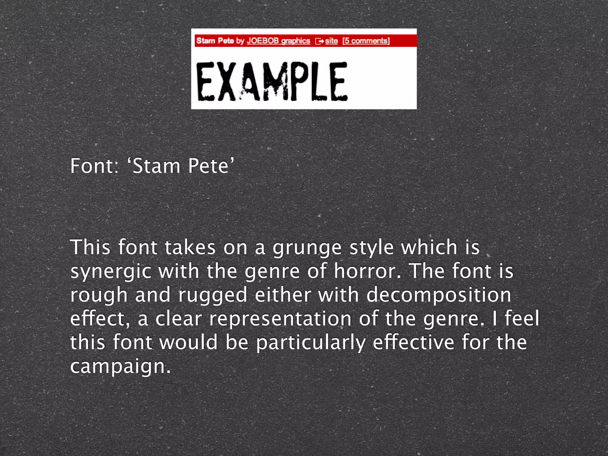
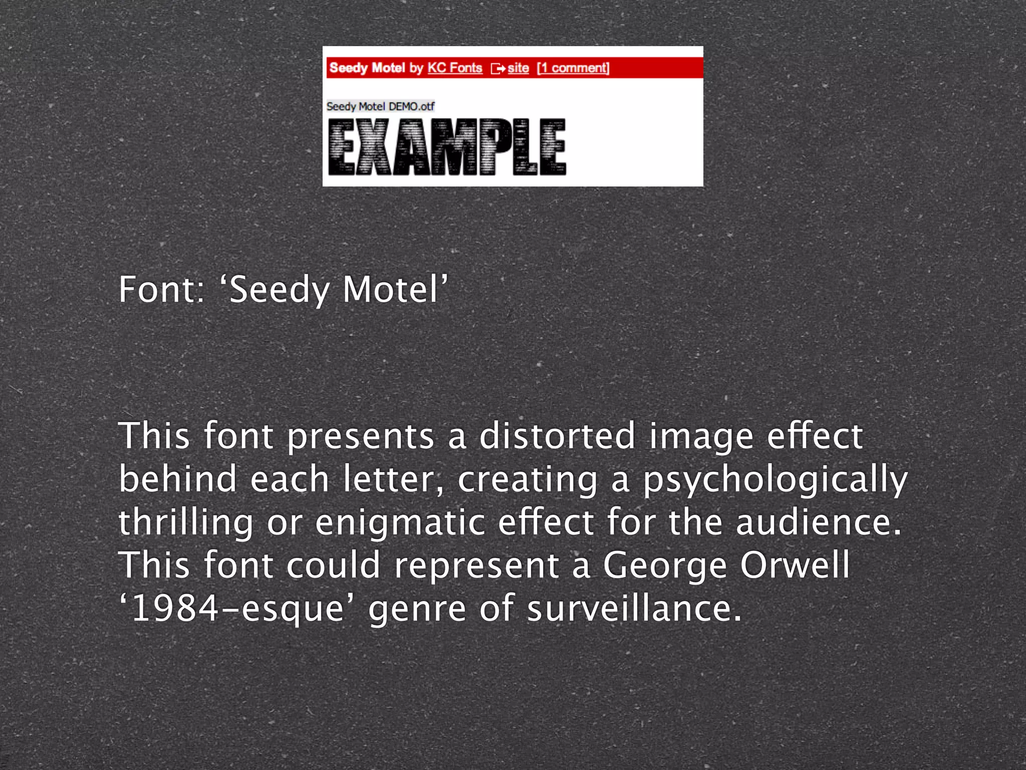
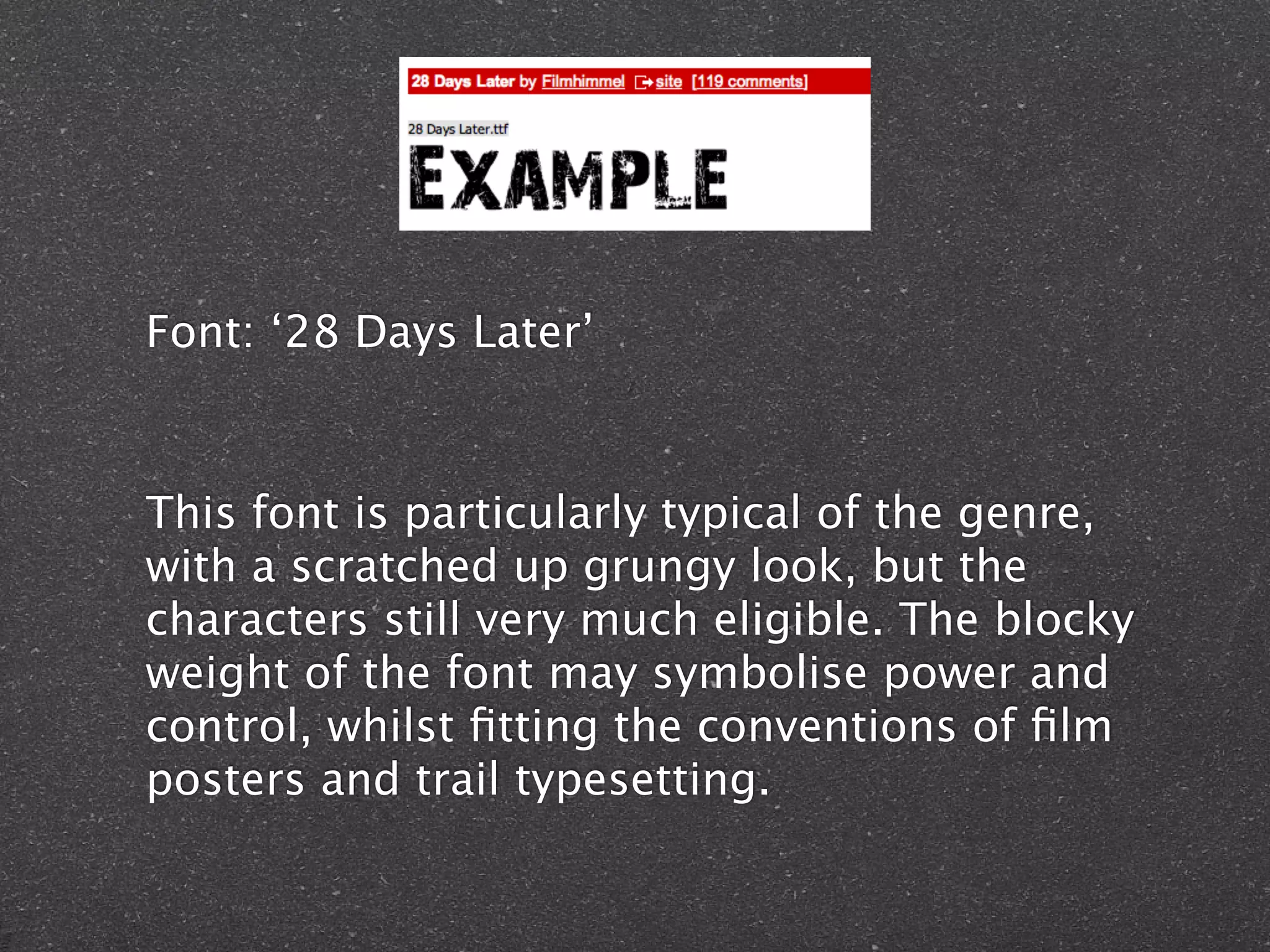
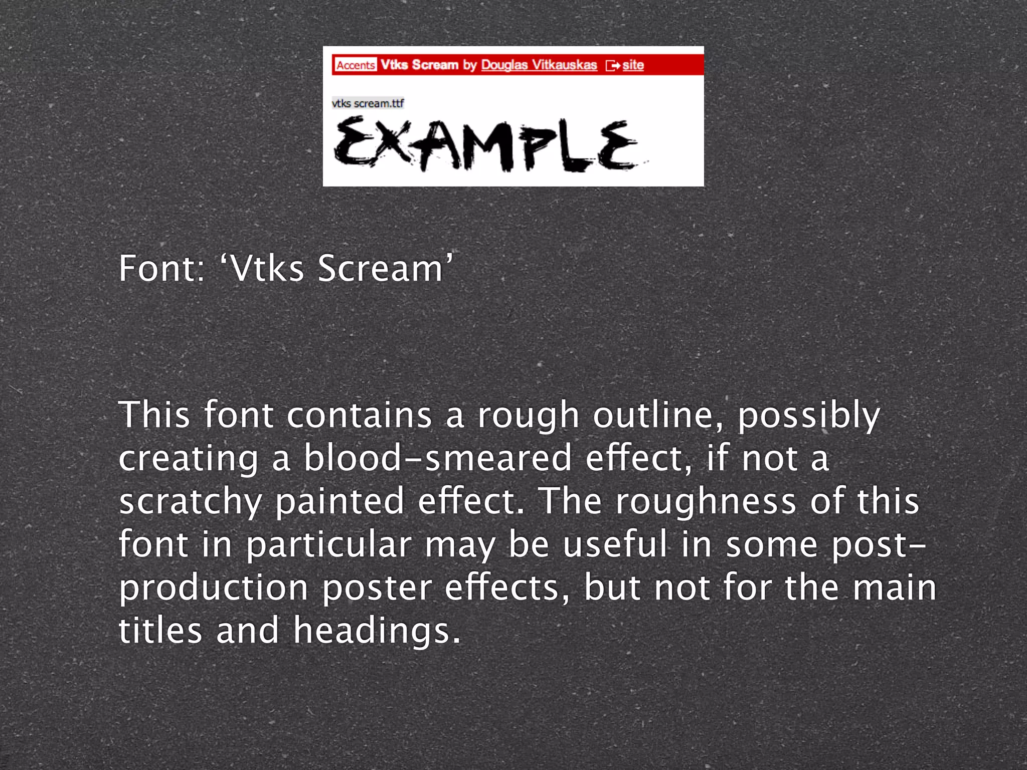
Sourced from
 DaFont.com
Font: ‘Stam Pete’


This font takes on a grunge style which is
synergic with the genre of horror. The font is
rough and rugged either with decomposition
effect, a clear representation of the genre. I feel
this font would be particularly effective for the
campaign.
Font: ‘Seedy Motel’


This font presents a distorted image effect
behind each letter, creating a psychologically
thrilling or enigmatic effect for the audience.
This font could represent a George Orwell
‘1984-esque’ genre of surveillance.
Font: ‘28 Days Later’


This font is particularly typical of the genre,
with a scratched up grungy look, but the
characters still very much eligible. The blocky
weight of the font may symbolise power and
control, whilst fitting the conventions of film
posters and trail typesetting.
Font: ‘Vtks Scream’


This font contains a rough outline, possibly
creating a blood-smeared effect, if not a
scratchy painted effect. The roughness of this
font in particular may be useful in some post-
production poster effects, but not for the main
titles and headings.

Font experiment

  • 1.
  • 2.
    Font: ‘Stam Pete’ Thisfont takes on a grunge style which is synergic with the genre of horror. The font is rough and rugged either with decomposition effect, a clear representation of the genre. I feel this font would be particularly effective for the campaign.
  • 3.
    Font: ‘Seedy Motel’ Thisfont presents a distorted image effect behind each letter, creating a psychologically thrilling or enigmatic effect for the audience. This font could represent a George Orwell ‘1984-esque’ genre of surveillance.
  • 4.
    Font: ‘28 DaysLater’ This font is particularly typical of the genre, with a scratched up grungy look, but the characters still very much eligible. The blocky weight of the font may symbolise power and control, whilst fitting the conventions of film posters and trail typesetting.
  • 5.
    Font: ‘Vtks Scream’ Thisfont contains a rough outline, possibly creating a blood-smeared effect, if not a scratchy painted effect. The roughness of this font in particular may be useful in some post- production poster effects, but not for the main titles and headings.

Editor's Notes