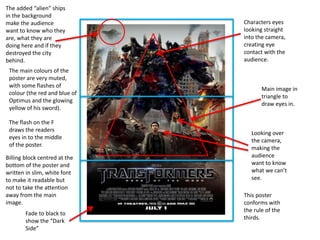
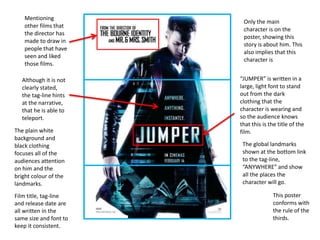
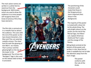
Main image in
triangle to
draw eyes in.
Characters eyes
looking straight
into the camera,
creating eye
contact with the
audience.
Looking over
the camera,
making the
audience
want to know
what we can’t
see.
Fade to black to
show the “Dark
Side”
The added “alien” ships
in the background
make the audience
want to know who they
are, what they are
doing here and if they
destroyed the city
behind.
The main colours of the
poster are very muted,
with some flashes of
colour (the red and blue of
Optimus and the glowing
yellow of his sword).
The flash on the F
draws the readers
eyes in to the middle
of the poster.
This poster
conforms with
the rule of the
thirds.
Billing block centred at the
bottom of the poster and
written in slim, white font
to make it readable but
not to take the attention
away from the main
image.
This poster
conforms with
the rule of the
thirds.
Only the main
character is on the
poster, showing this
story is about him. This
also implies that this
character is
The plain white
background and
black clothing
focuses all of the
audiences attention
on him and the
bright colour of the
landmarks.
Mentioning
other films that
the director has
made to draw in
people that have
seen and liked
those films.
Although it is not
clearly stated,
the tag-line hints
at the narrative,
that he is able to
teleport.
The global landmarks
shown at the bottom link
to the tag-line,
“ANYWHERE” and show
all the places the
character will go.
“JUMPER” is written in a
large, light font to stand
out from the dark
clothing that the
character is wearing and
so the audience knows
that this is the title of the
film.
Film title, tag-line
and release date are
all written in the
same size and font to
keep it consistent.
This poster
conforms with
the rule of the
thirds.
The positioning of the
characters could
imply that those in
the foreground are
more important then
those in the
background.
The majority of the poster
is muted with a blue tint
to the whole thing. The
only bright colours on the
poster are the red of the
Marvel logo, Iron Mans'
suit, Captain Americas
shield and Thor’s cape,
and the orange of the
flames.
The main actors names are
written in a white font to
stand out from the
background. Well known
actors are used to draw the
audience in as many people
will recognise them and
know of previous films they
have starred in.
The film title is centred and
in a metallic font to attract
the audience. This suits with
the rest of the poster as the
two closest characters, Iron
Man and Thor, are wearing
metallic armour. The silver
font fits with the glowing of
Iron Man's arc reactor,
Thor’s armour and the
glowing light on the top of
the tower in the
background. The A from the
“Avengers” logo is also used
on the release date to keep
it consistent.
Billing block centred at the
bottom of the poster and
written in slim, blue font to
make it readable but not to take
the attention away from the
main image.

Textual analysis of posters

  • 1.
    Main image in triangleto draw eyes in. Characters eyes looking straight into the camera, creating eye contact with the audience. Looking over the camera, making the audience want to know what we can’t see. Fade to black to show the “Dark Side” The added “alien” ships in the background make the audience want to know who they are, what they are doing here and if they destroyed the city behind. The main colours of the poster are very muted, with some flashes of colour (the red and blue of Optimus and the glowing yellow of his sword). The flash on the F draws the readers eyes in to the middle of the poster. This poster conforms with the rule of the thirds. Billing block centred at the bottom of the poster and written in slim, white font to make it readable but not to take the attention away from the main image.
  • 2.
    This poster conforms with therule of the thirds. Only the main character is on the poster, showing this story is about him. This also implies that this character is The plain white background and black clothing focuses all of the audiences attention on him and the bright colour of the landmarks. Mentioning other films that the director has made to draw in people that have seen and liked those films. Although it is not clearly stated, the tag-line hints at the narrative, that he is able to teleport. The global landmarks shown at the bottom link to the tag-line, “ANYWHERE” and show all the places the character will go. “JUMPER” is written in a large, light font to stand out from the dark clothing that the character is wearing and so the audience knows that this is the title of the film. Film title, tag-line and release date are all written in the same size and font to keep it consistent.
  • 3.
    This poster conforms with therule of the thirds. The positioning of the characters could imply that those in the foreground are more important then those in the background. The majority of the poster is muted with a blue tint to the whole thing. The only bright colours on the poster are the red of the Marvel logo, Iron Mans' suit, Captain Americas shield and Thor’s cape, and the orange of the flames. The main actors names are written in a white font to stand out from the background. Well known actors are used to draw the audience in as many people will recognise them and know of previous films they have starred in. The film title is centred and in a metallic font to attract the audience. This suits with the rest of the poster as the two closest characters, Iron Man and Thor, are wearing metallic armour. The silver font fits with the glowing of Iron Man's arc reactor, Thor’s armour and the glowing light on the top of the tower in the background. The A from the “Avengers” logo is also used on the release date to keep it consistent. Billing block centred at the bottom of the poster and written in slim, blue font to make it readable but not to take the attention away from the main image.