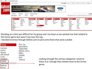
This document discusses choosing a font for a horror film trailer. The author looked at fonts in the horror category on Dafont.com but felt they were too childlike. Four fonts were considered: one resembling bloody drips but seemed outdated; another with scratches representing terror but was too bold; and a third called "Bloody Cre" that could look like writing in blood. The author ultimately selected "Bloody Cre" as it was easy to read but still represented the horror genre.