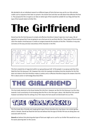
The document discusses different fonts that could be used for the title and credits of a thriller film. It analyzes several fonts in terms of how well they relate to and represent the storyline and tone of the film. While some fonts were deemed too simplistic, 3D-looking, or associated with a certain gender, the group overall agreed that planning font choices early would aid their later film production work.
