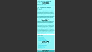
Downloaded 31 times

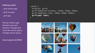
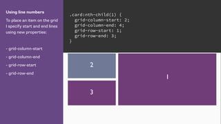

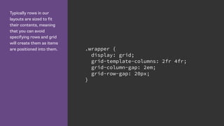
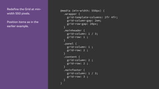
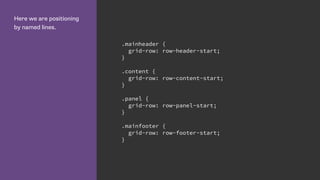
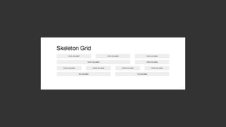
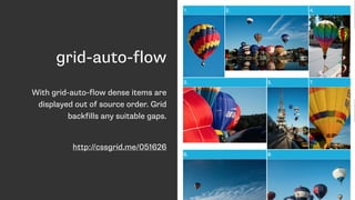
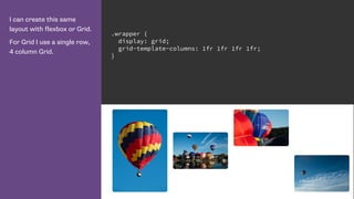
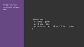
![Using line names
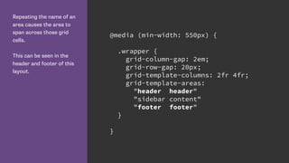
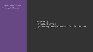
We name lines when
creating the grid. The name
goes in square brackets.
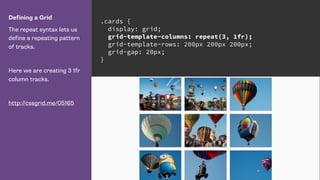
.cards {
display: grid;
grid-gap: 20px;
grid-template-columns: [side-start] 1fr
[main-start] 1fr 1fr
[main-end];
grid-template-rows: [main-start] 200px 200px
[main-end];
}](https://image.slidesharecdn.com/css-grid-40-ato-2016-161025190132/85/CSS-Grid-Layout-All-Things-Open-28-320.jpg)
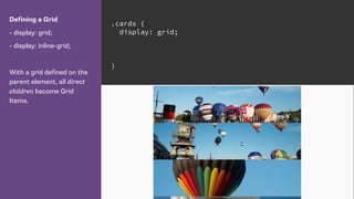
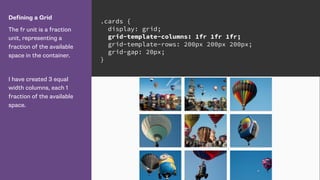
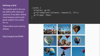
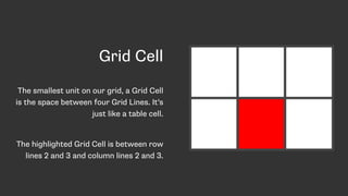
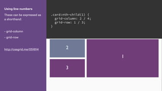
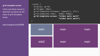
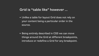
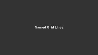
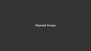
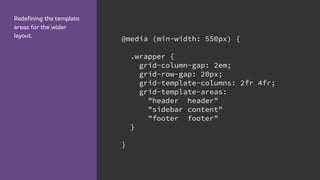
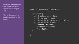
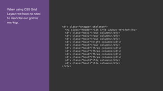
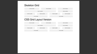
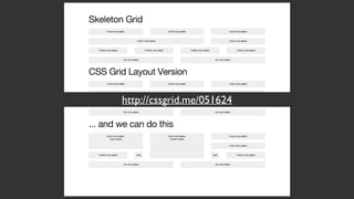
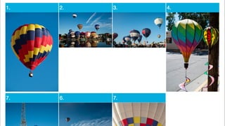
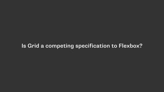
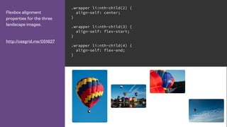
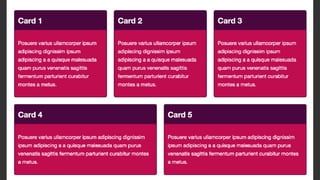
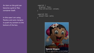
![Lines define Grid Areas
By creating lines named
main-start and end for
rows and columns, grid has
created me a named grid
area called ‘main’.
I can use that to position
my element rather than the
line numbers or names.
http://cssgrid.me/051617
.cards {
display: grid;
grid-gap: 20px;
grid-template-columns: [side-start] 1fr
[main-start] 1fr 1fr
[main-end];
grid-template-rows: [main-start] 200px 200px
[main-end];
}
.card:nth-child(1) {
grid-area: main;
}](https://image.slidesharecdn.com/css-grid-40-ato-2016-161025190132/85/CSS-Grid-Layout-All-Things-Open-30-320.jpg)

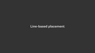


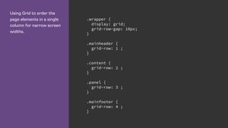
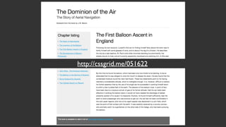
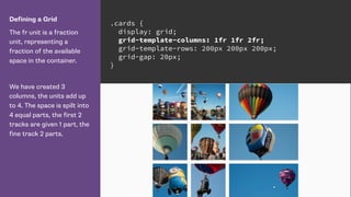
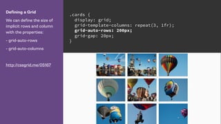
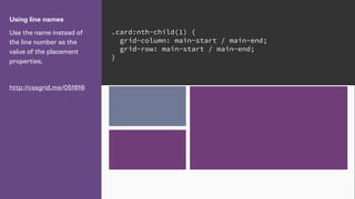
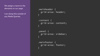
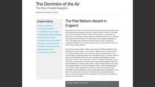
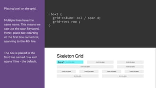
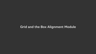
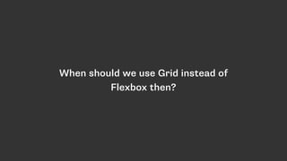
![Name lines with the name
in square brackets.
Remember we are naming
grid lines and not grid
tracks. .wrapper {
display: grid;
grid-row-gap: 10px;
grid-template-rows:
[row-header-start] auto
[row-content-start] auto
[row-panel-start] auto
[row-footer-start] auto [row-footer-end];
}](https://image.slidesharecdn.com/css-grid-40-ato-2016-161025190132/85/CSS-Grid-Layout-All-Things-Open-54-320.jpg)

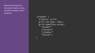

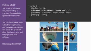
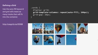
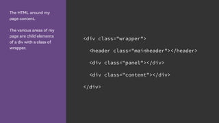
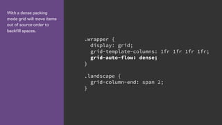
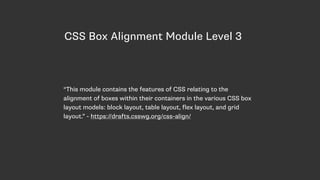
![Defining the 12 column
grid.
The repeat keyword
repeats the pattern of
columns or rows the
number of times specified
before the comma.
.wrapper {
display: grid;
grid-template-columns: repeat(12, [col] 1fr );
grid-template-rows: repeat(5, [row] auto) ;
grid-column-gap: 1em;
grid-row-gap: 15px;
}](https://image.slidesharecdn.com/css-grid-40-ato-2016-161025190132/85/CSS-Grid-Layout-All-Things-Open-80-320.jpg)
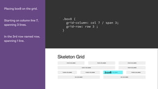
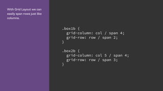
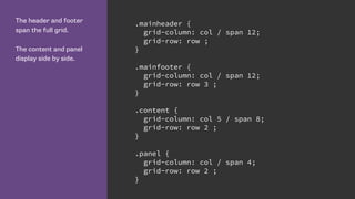


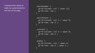

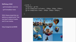
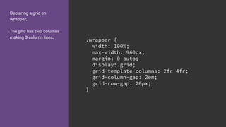
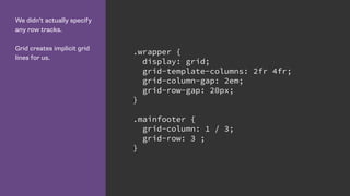
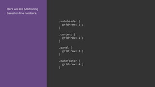
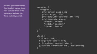
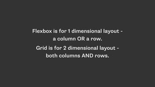
![This is the entire CSS
defining our layout.
No framework required.
.wrapper {
display: grid;
grid-template-columns: repeat(12, [col] 1fr );
grid-template-rows: repeat(5, [row] auto) ;
grid-column-gap: 1em;
grid-row-gap: 15px;
}
.mainheader {
grid-column: col / span 12;
grid-row: row ;
}
.mainfooter {
grid-column: col 5 / span 8;
grid-row: row 3 ;
}
.content {
grid-column: col 5 / span 8;
grid-row: row 2 ;
}
.panel {
grid-column: col / span 4;
grid-row: row 2 / span 2 ;
}](https://image.slidesharecdn.com/css-grid-40-ato-2016-161025190132/85/CSS-Grid-Layout-All-Things-Open-91-320.jpg)


This document summarizes Rachel Andrew's presentation on CSS Grid Layout. Some key points include: - CSS Grid Layout provides a two-dimensional grid system for CSS layout, as an alternative to floats and positioning. - Grid uses line-based placement rather than block/inline flows, allowing items to be placed precisely on the grid. - Defining a grid involves setting grid-template-columns, grid-template-rows and other properties to establish the structure and tracks. - Items can then be placed on the grid using grid-row and grid-column to position them across specific row and column lines.