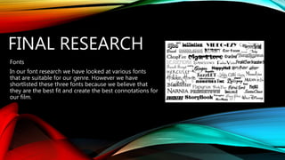
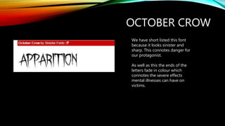
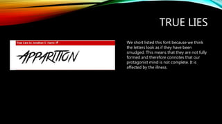
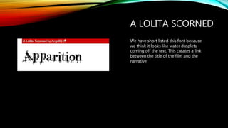
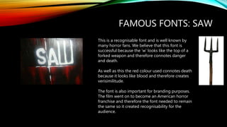
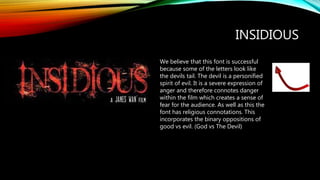
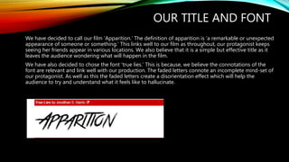
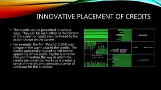
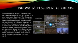
FINAL RESEARCH
Fonts
In our font research we have looked at various fonts
that are suitable for our genre. However we have
shortlisted these three fonts because we believe that
they are the best fit and create the best connotations for
our film.
OCTOBER CROW
We have short listed this font
because it looks sinister and
sharp. This connotes danger for
our protagonist.
As well as this the ends of the
letters fade in colour which
connotes the severe effects
mental illnesses can have on
victims.
TRUE LIES
We short listed this font because we think
the letters look as if they have been
smudged. This means that they are not fully
formed and therefore connotes that our
protagonist mind is not complete. It is
affected by the illness.
A LOLITA SCORNED
We have short listed this font because
we think it looks like water droplets
coming off the text. This creates a link
between the title of the film and the
narrative.
FAMOUS FONTS: SAW
This is a recognisable font and is well known by
many horror fans. We believe that this font is
successful because the ‘w’ looks like the top of a
forked weapon and therefore connotes danger
and death.
As well as this the red colour used connotes death
because it looks like blood and therefore creates
verisimilitude.
The font is also important for branding purposes.
The film went on to become an American horror
franchise and therefore the font needed to remain
the same so it created recognisability for the
audience.
We believe that this font is successful
because some of the letters look like
the devils tail. The devil is a personified
spirit of evil. It is a severe expression of
anger and therefore connotes danger
within the film which creates a sense of
fear for the audience. As well as this the
font has religious connotations. This
incorporates the binary oppositions of
good vs evil. (God vs The Devil)
INSIDIOUS
OUR TITLE AND FONT
We have decided to call our film ‘Apparition.’ The definition of apparition is ‘a remarkable or unexpected
appearance of someone or something.’ This links well to our film as throughout, our protagonist keeps
seeing her friends appear in various locations. We also believe that it is a simple but effective title as it
leaves the audience wondering what will happen in the film.
We have also decided to chose the font ‘true lies.’ This is because, we believe the connotations of the
font are relevant and link well with our production. The faded letters connote an incomplete mind-set of
our protagonist. As well as this the faded letters create a disorientation effect which will help the
audience to try and understand what it feels like to hallucinate.
CREDITS
The opening credits includes a list that shows the names of the most
important members of the production, for example the director and executive
producer. The names are shown at the very start of the opening sequence so
that the audience are aware of who is in the film or who created it etc.
The distributor is sometimes listed in the same text as the rest of the credits,
however it could be presented as a logo or even a standalone clip. The
producer is also shown. Audiences today are used to seeing the director’s
name before the film title, this is because the producer is seen as the ‘auteur’
or visionary of the film. The standard wording for the opening credits of
producer and distributor is ‘(distribution company), presents a (production
company) film/production. For our production the standard wording would
read…’Studio Canal UK presents a Warp films production.’
The cast of the film is shown in both the opening and ending credits. When
the cast are shown in the opening credits it can excite the audience as one of
their favourite actors/actresses could be in the film. After all the cast and crew
have been listed the film logo, digital service logo or FBI warnings could be
presented.
The production crew is also shown at the end of the film.
INNOVATIVE PLACEMENT OF CREDITS
• The credits can be presented in various
ways. They can be seen either at the bottom
of the screen or could even be linked to the
action shown on the screen.
• For example, the film ‘Psycho’ (1998) was
unique in the way it placed the credits. The
credits appeared chopped in half before
appearing whole again. Psycho is a horror
film and therefore the way in which the
credits are presented works as it creates a
sense of mystery and connotes a sense of
unknown for the audience.
INNOVATIVE PLACEMENT OF CREDITS
The film Candyman 1992 is a horror film. The
film is about a murderous soul with a hook for a
hand, know as the ‘Candyman.’ The Candyman
is accidentally summoned to reality by a skeptic
grad student researching the monster's myth.
This film also uses an innovative placement of
credits. The credits appear amongst roads.
Roads connote destination. Therefore by having
the credits appear above many different roads
connote that the danger of the Candyman can
be felt everywhere. It also connotes that the
victims are isolated and have know where to
hide as the Candyman can see their every
move!
MUSIC
We want to use an orchestral score, this is because it is conventional for a
psychological horror film. We believe that music in a film is one of the most powerful
elements as it taps into deep, instinctive fears and therefore we want to make it
unique to our production.
Below are some of the inspirational scores that we are thinking about using in our
production:
1) https://www.youtube.com/watch?v=AC2T2hS-UiM
2) https://www.youtube.com/watch?v=gHF8w7Jpugc
We find both of these scores inspirational because they are powerful and connote
both danger and threat for the characters. It also provides the audience with a visceral
pleasure as it is engaging and will hence make them react in a physical way. For
example it could increase their heartrate.

Final research fonts

  • 1.
    FINAL RESEARCH Fonts In ourfont research we have looked at various fonts that are suitable for our genre. However we have shortlisted these three fonts because we believe that they are the best fit and create the best connotations for our film.
  • 2.
    OCTOBER CROW We haveshort listed this font because it looks sinister and sharp. This connotes danger for our protagonist. As well as this the ends of the letters fade in colour which connotes the severe effects mental illnesses can have on victims.
  • 3.
    TRUE LIES We shortlisted this font because we think the letters look as if they have been smudged. This means that they are not fully formed and therefore connotes that our protagonist mind is not complete. It is affected by the illness.
  • 4.
    A LOLITA SCORNED Wehave short listed this font because we think it looks like water droplets coming off the text. This creates a link between the title of the film and the narrative.
  • 5.
    FAMOUS FONTS: SAW Thisis a recognisable font and is well known by many horror fans. We believe that this font is successful because the ‘w’ looks like the top of a forked weapon and therefore connotes danger and death. As well as this the red colour used connotes death because it looks like blood and therefore creates verisimilitude. The font is also important for branding purposes. The film went on to become an American horror franchise and therefore the font needed to remain the same so it created recognisability for the audience.
  • 6.
    We believe thatthis font is successful because some of the letters look like the devils tail. The devil is a personified spirit of evil. It is a severe expression of anger and therefore connotes danger within the film which creates a sense of fear for the audience. As well as this the font has religious connotations. This incorporates the binary oppositions of good vs evil. (God vs The Devil) INSIDIOUS
  • 7.
    OUR TITLE ANDFONT We have decided to call our film ‘Apparition.’ The definition of apparition is ‘a remarkable or unexpected appearance of someone or something.’ This links well to our film as throughout, our protagonist keeps seeing her friends appear in various locations. We also believe that it is a simple but effective title as it leaves the audience wondering what will happen in the film. We have also decided to chose the font ‘true lies.’ This is because, we believe the connotations of the font are relevant and link well with our production. The faded letters connote an incomplete mind-set of our protagonist. As well as this the faded letters create a disorientation effect which will help the audience to try and understand what it feels like to hallucinate.
  • 8.
    CREDITS The opening creditsincludes a list that shows the names of the most important members of the production, for example the director and executive producer. The names are shown at the very start of the opening sequence so that the audience are aware of who is in the film or who created it etc. The distributor is sometimes listed in the same text as the rest of the credits, however it could be presented as a logo or even a standalone clip. The producer is also shown. Audiences today are used to seeing the director’s name before the film title, this is because the producer is seen as the ‘auteur’ or visionary of the film. The standard wording for the opening credits of producer and distributor is ‘(distribution company), presents a (production company) film/production. For our production the standard wording would read…’Studio Canal UK presents a Warp films production.’ The cast of the film is shown in both the opening and ending credits. When the cast are shown in the opening credits it can excite the audience as one of their favourite actors/actresses could be in the film. After all the cast and crew have been listed the film logo, digital service logo or FBI warnings could be presented. The production crew is also shown at the end of the film.
  • 9.
    INNOVATIVE PLACEMENT OFCREDITS • The credits can be presented in various ways. They can be seen either at the bottom of the screen or could even be linked to the action shown on the screen. • For example, the film ‘Psycho’ (1998) was unique in the way it placed the credits. The credits appeared chopped in half before appearing whole again. Psycho is a horror film and therefore the way in which the credits are presented works as it creates a sense of mystery and connotes a sense of unknown for the audience.
  • 10.
    INNOVATIVE PLACEMENT OFCREDITS The film Candyman 1992 is a horror film. The film is about a murderous soul with a hook for a hand, know as the ‘Candyman.’ The Candyman is accidentally summoned to reality by a skeptic grad student researching the monster's myth. This film also uses an innovative placement of credits. The credits appear amongst roads. Roads connote destination. Therefore by having the credits appear above many different roads connote that the danger of the Candyman can be felt everywhere. It also connotes that the victims are isolated and have know where to hide as the Candyman can see their every move!
  • 11.
    MUSIC We want touse an orchestral score, this is because it is conventional for a psychological horror film. We believe that music in a film is one of the most powerful elements as it taps into deep, instinctive fears and therefore we want to make it unique to our production. Below are some of the inspirational scores that we are thinking about using in our production: 1) https://www.youtube.com/watch?v=AC2T2hS-UiM 2) https://www.youtube.com/watch?v=gHF8w7Jpugc We find both of these scores inspirational because they are powerful and connote both danger and threat for the characters. It also provides the audience with a visceral pleasure as it is engaging and will hence make them react in a physical way. For example it could increase their heartrate.