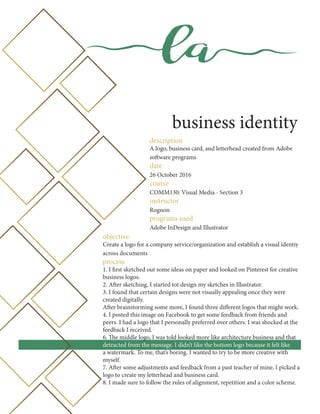
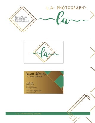
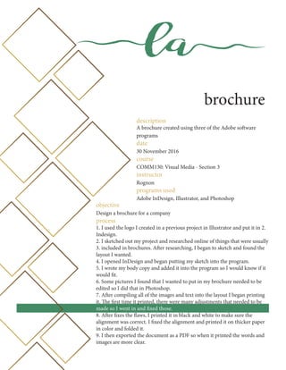
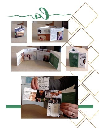
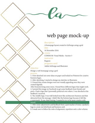
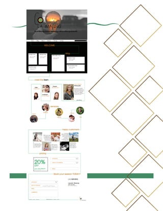
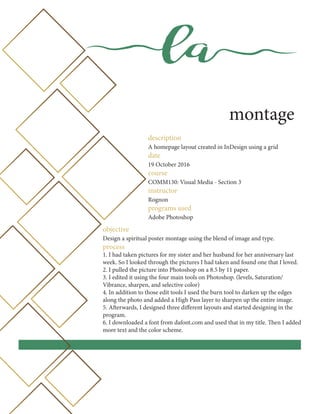
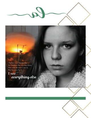
la
PORTFOLIO
Lauren Alvarez
la
contact information
NAME Lauren Alvarez
EMAIL lauren.teresa2@gmail.com
PHONE 208.123.4567
TWITTER @Albinomexican
WEBSITE laphotoblog.com
la
table of contents
4 Business Identity
6 Brochure
8 Web Page Mock-Up
10 PhotoDesign
12 Montage
14 Infographic
16 Prezi
18 HTML & CSS Coding
la
la
business identity
description
A logo, business card, and letterhead created from Adobe
software programs
date
26 October 2016
course
COMM130: Visual Media - Section 3
instructor
Rognon
programs used
Adobe InDesign and Illustrator
objective
Create a logo for a company service/organization and establish a visual identiy
across documents
process
1. I first sketched out some ideas on paper and looked on Pinterest for creative
business logos.
2. After sketching, I started tot design my sketches in Illustrator.
3. I found that certain designs were not visually appealing once they were
created digitally.
After brainstorming some more, I found three different logos that might work.
4. I posted this image on Facebook to get some feedback from friends and
peers. I had a logo that I personally preferred over others. I was shocked at the
feedback I received.
6. The middle logo, I was told looked more like architecture business and that
detracted from the message. I didn’t like the bottom logo because it felt like
a watermark. To me, that’s boring. I wanted to try to be more creative with
myself.
7. After some adjustments and feedback from a past teacher of mine, I picked a
logo to create my letterhead and business card.
8. I made sure to follow the rules of alignment, repetition and a color scheme.
la la
Lauren Alvarez
208.123.4567
laphotoblog.com
L.A. PHOTOGRAPHY
77 S. 1234 W. Rexburg, ID 83440
la
L.A. PHOTOGRAPHY
Lauren Alvarez
208.123.5678
77 S. 1234 W.
Rexburg, ID 83440
lauren.teresa2@gmail.com
la.photoblog.com
t
la
brochure
description
A brochure created using three of the Adobe software
programs
date
30 November 2016
course
COMM130: Visual Media - Section 3
instructor
Rognon
programs used
Adobe InDesign, Illustrator, and Photoshop
objective
Design a brochure for a company
process
1. I used the logo I created in a previous project in Illustrator and put it in 2.
Indesign.
2. I sketched out my project and researched online of things that were usually
3. included in brochures. After researching, I began to sketch and found the
layout I wanted.
4. I opened InDesign and began putting my sketch into the program.
5. I wrote my body copy and added it into the program so I would know if it
would fit.
6. Some pictures I found that I wanted to put in my brochure needed to be
edited so I did that in Photoshop.
7. After compiling all of the images and text into the layout I began printing
it. The first time it printed, there were many adjustments that needed to be
made so I went in and fixed those.
8. After fixes the flaws, I printed it in black and white to make sure the
alignment was correct. I fixed the alignment and printed it on thicker paper
in color and folded it.
9. I then exported the document as a PDF so when it printed the words and
images are more clear.
la
la
web page mock-up
description
A homepage layout created in InDesign using a grid
date
16 November 2016
course
COMM130: Visual Media - Section 3
instructor
Rognon
programs used
Adobe InDesign and Illustrator
objective
Design a web homepage using a grid
process
1. I first sketched out some ideas on paper and looked on Pinterest for creative
business logos.
2. After sketching, I started to design my sketches in Illustrator.
3. I found that certain designs were not visually appealing once they were
created digitally.
After brainstorming some more, I found three different logos that might work.
4. I posted this image on Facebook to get some feedback from friends and
peers. I had a logo that I personally preferred over others. I was shocked at the
feedback I received.
6. The middle logo, I was told looked more like architecture business and that
detracted from the message. I didn’t like the bottom logo because it felt like
a watermark. To me, that’s boring. I wanted to try to be more creative with
myself.
7. After some adjustments and feedback from a past teacher of mine, I picked a
logo to create my letterhead and business card.
8. I made sure to follow the rules of alignment, repetition and a color scheme.
la
la
montage
description
A homepage layout created in InDesign using a grid
date
19 October 2016
course
COMM130: Visual Media - Section 3
instructor
Rognon
programs used
Adobe Photoshop
objective
Design a spiritual poster montage using the blend of image and type.
process
1. I had taken pictures for my sister and her husband for her anniversary last
week. So I looked through the pictures I had taken and found one that I loved.
2. I pulled the picture into Photoshop on a 8.5 by 11 paper.
3. I edited it using the four main tools on Photoshop. (levels, Saturation/
Vibrance, sharpen, and selective color)
4. In addition to those edit tools I used the burn tool to darken up the edges
along the photo and added a High Pass layer to sharpen up the entire image.
5. Afterwards, I designed three different layouts and started designing in the
program.
6. I downloaded a font from dafont.com and used that in my title. Then I added
more text and the color scheme.
la
la
photodesign
description
A picture that I had taken with design elements that sends a
message with the color scheme in mind.
date
12 October 2016
course
COMM130: Visual Media - Section 3
instructor
Rognon
programs used
Adobe Photoshop
objective
By using photography and design skills, create a project that empasses a
consistent color scheme from the image.
process
1. I searched through pictures I had taken in the past and saw how these two
images correlated. The spiritual topic I had chosen dealt with light.
2. I found a texture high resolution image and used that as the background.
3. Through Photoshop, I combined these three images creating multiple masks
and using the Brush tool to blend the images together. I also utilized the
opacity tool.
4. I looked online for a quote that best suited the message and my roommate
found this one.
5. I made sure to follow the rules of alignment and rule of thirds. I wanted
the phrase “everything else” to stand out. That is why the phrase is out of
alignment.
la
la
infographic
description
An infographic that visually portrays data
date
2 November 2016
course
COMM130: Visual Media - Section 3
instructor
Rognon
programs used
Adobe InDesign and Illustrator
objective
Create an infographic that organzes date in a visually pleasing way.
process
1. I thought of some topics that interested me and decided on one that involves
hairstyles.
2. I researched the topic and found that hairstyles can reveal your personality
and mood.
3. There wasn’t an official study done online so I decided on completing one of
my own.
4. After gathering the information, I sketched some ideas on how I wanted the
flow of the graphic.
5. After deciding which sketch and color scheme worked best, I started to
design it on Adobe Illustrator.
6. I found an image on Pixabay.com that I wanted to use for my background.
7. I created both a pie chart and bar graph to portray my data.
la
la
prezi
description
A presentation created using Prezi software
date
5 October 2016
course
COMM130: Visual Media - Section 3
instructor
Rognon
programs used
Prezi software and Adobe InDesign
objective
Create an instructional presentation using the Prezi software to demonstrate
its’ features and capabilities.
process
1. I then started to sketch some ideas for the layout of the preentation.
2. Once I decided on a topic, I went into Prezi and started to add the content
and layout.
3. I realized that Prezi didn’t have more options for headlines so I opened
InDesign and designed a basic format for each headline
4. I went through my presentation over and over to make sure the content was
in the right position and the transitions were good.
5. I added creative path rotations to make the presentation more interesting.
https://prezi.com/-xfv5zxqapgl/10-ways-to-make-general-conference-more-meaningful/
la
la
html & css coding project
description
A webpage created using html & css coding
date
9 November 2016
course
COMM130: Visual Media - Section 3
instructor
Rognon
programs used
Brackets
objective
Code a cutrom webpage with HTML & CSS.
process
1. I designed my logo on Illustrator. I love Photography and that was the
company that I was going to plan for.
2. I resized my logo so that it was no longer than 500 px on the long side.
3.Then I created my HTML file and started adding my content and tags.
4. Then I created my CSS file and made sure to link it in the HTML code.
5. I customized the CSS code so that it correlated with my logo.
6. I also changed the fonts so that it worked alongside my logo as well.
7. I then made sure to validate my CSS and HTML.
la

Visual Media Portfolio

  • 1.
  • 2.
    la contact information NAME LaurenAlvarez EMAIL lauren.teresa2@gmail.com PHONE 208.123.4567 TWITTER @Albinomexican WEBSITE laphotoblog.com
  • 3.
    la table of contents 4Business Identity 6 Brochure 8 Web Page Mock-Up 10 PhotoDesign 12 Montage 14 Infographic 16 Prezi 18 HTML & CSS Coding la
  • 4.
    la business identity description A logo,business card, and letterhead created from Adobe software programs date 26 October 2016 course COMM130: Visual Media - Section 3 instructor Rognon programs used Adobe InDesign and Illustrator objective Create a logo for a company service/organization and establish a visual identiy across documents process 1. I first sketched out some ideas on paper and looked on Pinterest for creative business logos. 2. After sketching, I started tot design my sketches in Illustrator. 3. I found that certain designs were not visually appealing once they were created digitally. After brainstorming some more, I found three different logos that might work. 4. I posted this image on Facebook to get some feedback from friends and peers. I had a logo that I personally preferred over others. I was shocked at the feedback I received. 6. The middle logo, I was told looked more like architecture business and that detracted from the message. I didn’t like the bottom logo because it felt like a watermark. To me, that’s boring. I wanted to try to be more creative with myself. 7. After some adjustments and feedback from a past teacher of mine, I picked a logo to create my letterhead and business card. 8. I made sure to follow the rules of alignment, repetition and a color scheme.
  • 5.
    la la Lauren Alvarez 208.123.4567 laphotoblog.com L.A.PHOTOGRAPHY 77 S. 1234 W. Rexburg, ID 83440 la L.A. PHOTOGRAPHY Lauren Alvarez 208.123.5678 77 S. 1234 W. Rexburg, ID 83440 lauren.teresa2@gmail.com la.photoblog.com t
  • 6.
    la brochure description A brochure createdusing three of the Adobe software programs date 30 November 2016 course COMM130: Visual Media - Section 3 instructor Rognon programs used Adobe InDesign, Illustrator, and Photoshop objective Design a brochure for a company process 1. I used the logo I created in a previous project in Illustrator and put it in 2. Indesign. 2. I sketched out my project and researched online of things that were usually 3. included in brochures. After researching, I began to sketch and found the layout I wanted. 4. I opened InDesign and began putting my sketch into the program. 5. I wrote my body copy and added it into the program so I would know if it would fit. 6. Some pictures I found that I wanted to put in my brochure needed to be edited so I did that in Photoshop. 7. After compiling all of the images and text into the layout I began printing it. The first time it printed, there were many adjustments that needed to be made so I went in and fixed those. 8. After fixes the flaws, I printed it in black and white to make sure the alignment was correct. I fixed the alignment and printed it on thicker paper in color and folded it. 9. I then exported the document as a PDF so when it printed the words and images are more clear.
  • 7.
  • 8.
    la web page mock-up description Ahomepage layout created in InDesign using a grid date 16 November 2016 course COMM130: Visual Media - Section 3 instructor Rognon programs used Adobe InDesign and Illustrator objective Design a web homepage using a grid process 1. I first sketched out some ideas on paper and looked on Pinterest for creative business logos. 2. After sketching, I started to design my sketches in Illustrator. 3. I found that certain designs were not visually appealing once they were created digitally. After brainstorming some more, I found three different logos that might work. 4. I posted this image on Facebook to get some feedback from friends and peers. I had a logo that I personally preferred over others. I was shocked at the feedback I received. 6. The middle logo, I was told looked more like architecture business and that detracted from the message. I didn’t like the bottom logo because it felt like a watermark. To me, that’s boring. I wanted to try to be more creative with myself. 7. After some adjustments and feedback from a past teacher of mine, I picked a logo to create my letterhead and business card. 8. I made sure to follow the rules of alignment, repetition and a color scheme.
  • 9.
  • 10.
    la montage description A homepage layoutcreated in InDesign using a grid date 19 October 2016 course COMM130: Visual Media - Section 3 instructor Rognon programs used Adobe Photoshop objective Design a spiritual poster montage using the blend of image and type. process 1. I had taken pictures for my sister and her husband for her anniversary last week. So I looked through the pictures I had taken and found one that I loved. 2. I pulled the picture into Photoshop on a 8.5 by 11 paper. 3. I edited it using the four main tools on Photoshop. (levels, Saturation/ Vibrance, sharpen, and selective color) 4. In addition to those edit tools I used the burn tool to darken up the edges along the photo and added a High Pass layer to sharpen up the entire image. 5. Afterwards, I designed three different layouts and started designing in the program. 6. I downloaded a font from dafont.com and used that in my title. Then I added more text and the color scheme.
  • 11.
  • 12.
    la photodesign description A picture thatI had taken with design elements that sends a message with the color scheme in mind. date 12 October 2016 course COMM130: Visual Media - Section 3 instructor Rognon programs used Adobe Photoshop objective By using photography and design skills, create a project that empasses a consistent color scheme from the image. process 1. I searched through pictures I had taken in the past and saw how these two images correlated. The spiritual topic I had chosen dealt with light. 2. I found a texture high resolution image and used that as the background. 3. Through Photoshop, I combined these three images creating multiple masks and using the Brush tool to blend the images together. I also utilized the opacity tool. 4. I looked online for a quote that best suited the message and my roommate found this one. 5. I made sure to follow the rules of alignment and rule of thirds. I wanted the phrase “everything else” to stand out. That is why the phrase is out of alignment.
  • 13.
  • 14.
    la infographic description An infographic thatvisually portrays data date 2 November 2016 course COMM130: Visual Media - Section 3 instructor Rognon programs used Adobe InDesign and Illustrator objective Create an infographic that organzes date in a visually pleasing way. process 1. I thought of some topics that interested me and decided on one that involves hairstyles. 2. I researched the topic and found that hairstyles can reveal your personality and mood. 3. There wasn’t an official study done online so I decided on completing one of my own. 4. After gathering the information, I sketched some ideas on how I wanted the flow of the graphic. 5. After deciding which sketch and color scheme worked best, I started to design it on Adobe Illustrator. 6. I found an image on Pixabay.com that I wanted to use for my background. 7. I created both a pie chart and bar graph to portray my data.
  • 15.
  • 16.
    la prezi description A presentation createdusing Prezi software date 5 October 2016 course COMM130: Visual Media - Section 3 instructor Rognon programs used Prezi software and Adobe InDesign objective Create an instructional presentation using the Prezi software to demonstrate its’ features and capabilities. process 1. I then started to sketch some ideas for the layout of the preentation. 2. Once I decided on a topic, I went into Prezi and started to add the content and layout. 3. I realized that Prezi didn’t have more options for headlines so I opened InDesign and designed a basic format for each headline 4. I went through my presentation over and over to make sure the content was in the right position and the transitions were good. 5. I added creative path rotations to make the presentation more interesting. https://prezi.com/-xfv5zxqapgl/10-ways-to-make-general-conference-more-meaningful/
  • 17.
  • 18.
    la html & csscoding project description A webpage created using html & css coding date 9 November 2016 course COMM130: Visual Media - Section 3 instructor Rognon programs used Brackets objective Code a cutrom webpage with HTML & CSS. process 1. I designed my logo on Illustrator. I love Photography and that was the company that I was going to plan for. 2. I resized my logo so that it was no longer than 500 px on the long side. 3.Then I created my HTML file and started adding my content and tags. 4. Then I created my CSS file and made sure to link it in the HTML code. 5. I customized the CSS code so that it correlated with my logo. 6. I also changed the fonts so that it worked alongside my logo as well. 7. I then made sure to validate my CSS and HTML.
  • 19.