This document analyzes and summarizes the key visual elements and their intended meanings in a horror movie poster. It describes how the cold, gritty font and bloody imagery indicate a graphic and dangerous film. The lone character holding a gun creates a sense of mystery, isolation and threat. Dark colors and a bleak background suggest a hopeless situation for the characters. Fog and an obscured figure at the door leave the threat level unknown, increasing tension for the viewer. Overall, the poster uses visual cues to set an unsettling and ominous tone that prepares viewers for a frightening horror experience.
This is a simple analysis comparing the film poster and the trailer for two contrasting films to see if there is a high level of continuity between the posters and the film trailers
This is a simple analysis comparing the film poster and the trailer for two contrasting films to see if there is a high level of continuity between the posters and the film trailers
דו"ח רכישות ומיזוגים השנתי של פרייס וואטרהאוס קופרסTashtiot media
על פי הדו"ח השנתי של רשת פרייס ווטרהאוס קופרס (PwC) בנושא מיזוגים ורכישות ברחבי העולם של חברות בענף האנרגיה המתחדשת, הגיעו ערכי העסקאות לשיא חדש של 53.5 מיליארד דולר, עלייה של 40% בהשוואה לשנה שעברה.
How to make a Personal Single Page Application with CozyFrank Rousseau
This is a small tutorial explaining how to develop your application for Cozy Cloud in a painless way.
https://cozycloud.cc
Talk performed @ LyonJS Meetup, April 2013
The Next Web Conference 2013: A Photographic Journey #TNW2013Daniel McClure
This slideshare was inspired by my recent visit to The Next Web Conference 2013 in Amsterdam and consists of pictures taken from the event. It covers a small section of themes from the conference. For my full round up of the event visit - http://danielmcclure.com/blog/general/themes-from-the-next-web-conference-2013/
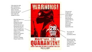
1. Cold, gritty font style
gives indication as
how what this film is
about. From the
detail on the font we
know the film will
have rough and
dangerous scenes.
Blood Red figure on a
lighter red
background shows
how gory this film
will be. With the man
being faced from the
side, the shot gives a
sense of mystery and
danger as it hides the
viewers vision
beyond the character
and fills us with
unease as the
character is holding
the gun ready to fire.
This pure red
background
could represent
blood. Maybe
the man has
killed people or
zombies? But the
red also is a
cover. A curtain,
which hides
everything
beyond this man.
The number 28
seems like a
countdown almost.
Biohazard symbol
shows danger. This
can frighten the
audience and make
the atmosphere
tense
2. Colour scheme is set
similar to a
wasteland. This
shows danger and
simulates the
isolation of a
wasteland for the
character.
The character is depicted
alone. Viewers can relate
to this and may become
attached to the character.
This makes the viewer
worried as we can see this
man alone in the
wilderness with a gun
running into the distance.
We can see a home
in the distance.
Perhaps the
character is running
to safety in the
house? But
considering the
nature of the show,
we know that a
majority of locations
like this are
dangerous.
Rough, gritty exposure
and terrain give
indication to the nature
of the show. And
weather could be seen
to foreshadow terrible
events in the future.
3. Black background
appears bleak and
void of any future. It
appears spooky, it
gives an indication
to the audience that
any outcome for the
protagonists will be
tough.
Title of the film is
mixed with a splatter
of blood. This shows
the audience the
film will be full of
horror and gore. This
reality makes us, the
audience, worried
for the group.
The only normal
sight we can see in
the poster is this
ominous house. But
even then, with the
strange white
contrasting clouds
behind, we can see
that something else
could be in the
house. And
especially as the
lights in the house
are on. And with the
title indicating the
last house, it may be
the last choice they
make.
4. The foggy background
scares the viewer as we
can see one figure
already in our face but
with the fog we have no
idea how many more
there could be. And
combining this aspect
with the title, the
uninvited is plural,
meaning there is more
than one intruder, but as
we don’t know the exact
number, it scares the
audience even more.
We can see this figure
right in front of us, but
it’s face is hidden. This
hides this persons face
and expression. Because
of this, we have no idea
of the figure's true
intentions. This
realisation is what scares
the viewers.
The border/frame of
the poster is depicted
as a window frame.
This can relate to the
average person as they
can visual being in the
same situation. With
an intruder at their
doorstep.
We can see the
panes of glass in the
frame have chilled
up with frost. Now in
most ghost films, this
happens when a
paranormal presence
is nearby. But
considering the
weather (foggy) this
could be
coincidence. And
because of this, the
audience has no real
idea if this film is
murder horror or
paranormal.