1. Colour:
The colour is based on the idea of
fire. Katniss is known as ‘The Girl on
Fire’ so this links perfectly to the first
film, reminding the viewers. The
black background can show danger
is ahead and that there may never
be an end (cant see beyond it). The
fire colour scheme also shows
danger. Because the fire is
surrounding Katniss, it shows she is
the dangerous one and that the other
tributes should keep well away as
she can burn ( hurt, kill them). The
title is in a yellow gold colour which
still ties in with the fire theme.
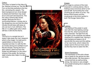
Images:
The image is a picture of the main
character in a strong stance. She is
holding a bow and arrow which is her
special skill. Surrounding her is the
mocking jay pin which is on fire. The
flames show bravery and the
mocking jay is the iconic symbol in
both The Hunger Game films.
Font:
The font is in a simple font so it
doesn’t take away the main viewpoint
which is the image. It is bold and in
capital letters to show that it is
important and ties it in with the film
as it looks strong and confident much
like the tributes. Having the font in
gold makes it stand out from the
poster but still keeps it in the colour
scheme if the poster. By having a
slight shadow also helps it to stand
out more.
Lighting:
The lighting of the poster is quite
dark with the main lighting coming
from the fire, which surrounds the
main character. The light from the
fire lights up the character and allows
shadows for a realistic look. Having a
dark background keeps a lot of
secrets like the arena and the setting
of her new home, which makes the
viewer want to find out more and to
do this they have to watch the film.
Actors Expression:
The expression of the actor shows
she is ready for the games but also
still a little worried. Her face gives a
concerned look as well as being
strong. Her stance is very straight
and upright showing she is ready for
the games.