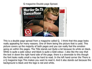
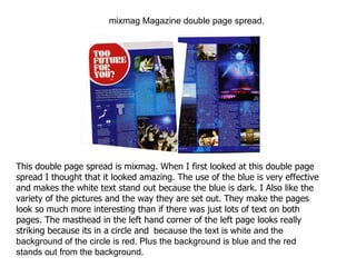
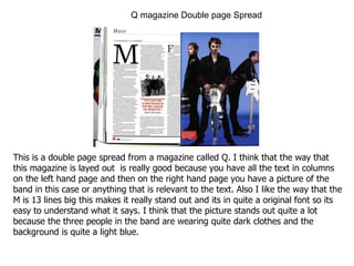
The document summarizes and compares two magazine double page spreads. For the first spread from Q magazine, the large central picture draws the viewer in and the bold black title stands out against the pale background. The second spread from mixmag effectively uses blue tones that make the white text pop and features varied pictures that break up the text. Both spreads employ striking mastheads in high-contrast colors and layouts that balance text and images across the two pages.


![Alumni Presentation Sept 10 09[1]](https://cdn.slidesharecdn.com/ss_thumbnails/alumnipresentationsept10091-1252673348039-phpapp02-thumbnail.jpg?width=640&height=640&fit=bounds)


