Russian Call Girls In South Delhi Delhi 9711199012 💋✔💕😘 Independent Escorts D...
mixed genre front pages
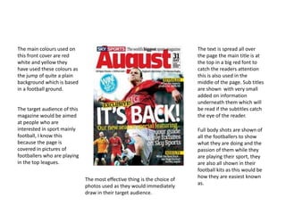
1. The main colours used on
this front cover are red
white and yellow they
have used these colours as
the jump of quite a plain
background which is based
in a football ground.
The text is spread all over
the page the main title is at
the top in a big red font to
catch the readers attention
this is also used in the
middle of the page. Sub titles
are shown with very small
added on information
underneath them which will
be read if the subtitles catch
the eye of the reader.
The target audience of this
magazine would be aimed
at people who are
interested in sport mainly
football, I know this
because the page is
covered in pictures of
footballers who are playing
in the top leagues.
Full body shots are shown of
all the footballers to show
what they are doing and the
passion of them while they
are playing their sport, they
are also all shown in their
football kits as this would be
how they are easiest known
as.
The most effective thing is the choice of
photos used as they would immediately
draw in their target audience.
2. The colours used on this are only a
white font this is used as it stands out
well on the models black clothing.
There is writing at the top
of the page as a title in a
big font. There is also a sub
title of great expectation
which has smaller writing
underneath of added
information.
The target audience would be
people who are interested in
sport more specifically golf, I
know this because the title is
‘sport’ which would attract a
specific target audience and the
model used is a professional
golfer.
A mid shot is used of the
model wearing golfing
clothes, the mid shot is
used to show the models
facial expression which
shows he must be having a
run of good form to be
smiling while playing his
sport.
The most effective thing on this page is the
shot used as it shows how the well the golfer
must be playing it also shows how he must be
enjoying his current form as it shows his
happiness while playing golf.
3. The colours used on this
magazine are black white and a
brown colour they have used
the black and white as the two
colours go well together and
the brown has been used to
stand out on the page.
The writing is at the
top of the page where
the title of the
magazine is. What is
included in the
magazine is going
down the right side of
the page. There is a
small bit of writing in
the top right of the
page showing who the
model is and some at
the bottom right of the
page to show some
extra information.
The fonts used vary there is a
thick font for the more imported
titles and a thinner slicker font
used for the added information
the writing which has been made
bold are the words which are
expected to hook the reader in.
A mid shot has been used of the
model so that we can see in detail
what he is wearing at the top of
his body as this clothing fits in
with the colour scheme of the
magazine.
The most effective thing used
on this magazine cover is the
use of the bold writing to
highlight key words as these
words would hook the reader
in and make them want to read
what's inside the magazine.
4. The colours used are black and
white and a mint green sort of
colour this is used so that the
mint green will be made to
stand out by everything else as
they are in plain black and
white this will make whatever is
in green stand out.
The writing is based at the top
left corner of the page this is
the title. There is some writing
going across the page at the
bottom and also the name of
the models at the bottom in
the right corner of the page.
The font at the top if the page is a
slick futuristic looking font. The
writing going across the page is in a
big spaced font making it clear and
easy to read and there is a posh
looking font in the right bottom
corner which is used to give the
autograph effect on the models
name.
The target audience of this magazines would be
people who are interested in fashion mainly
women as the model would attract them to
want to see what she is wearing.
A mid shot is used of the model to
show her facial expressions and
what she's wearing creating a
passionate feeling from the look of
the front page.
The effectiveness of the black and white
on this page gives it a good look as the
green title of the magazine name is
emphasized on the page attracted the
reader to the magazine.
5. The colours used on this page
are red, grey and white these
colours are used so the red and
grey stand out on the white
backgrounds hooking a reader
in.
The writing on this page is at
the top of the page where
there is a title and a bit of a
insight of what's in the
magazine. There is also some
information on the model on
the right side of the page
near the bottom.
The title is in a massive
red font to make the
reader be able to quickly
understand what the title
of the magazine is. The
more important the text
is the bolder the font that
it is in will be.
The target audience for
this magazine would be
people who are
interested in history I
know this because of the
name of the title and the
genre of the magazine, it
would also interested
people who are into
politics as it has
information on the
American president.
The model has had is photo taken in a
mid shot to show his facial expressions
showing him smiling this shows him as
a positive person also his suit wear
shows him as a smart and intellectual
person.
The most effective thing shown on this page is
the model as he from a political point of view
looks positive for the American people.