What is my neighbourhood like: Data collectingAmarni Wood
When developing your First Steps plan (and when applying to other funders) it is important to have good evidence of what your area is really like. Statistical information collected by various public bodies can be an excellent way of doing this.
This guidance provides information on: Why statistical data about your local area is important, what statistical information is available for public use, and how to find & present data about your local area.
The creation of this prototype involved harnessing the capabilities of AI to analyze and process immunization data, enabling the generation of insightful reports. Power BI, a robust data visualization platform, was employed to present the data in an interactive and user-friendly manner. By utilizing Cloud Technology, the prototype ensures that the information is readily available online to the wider community.
The primary goal of this initiative is to enhance the accessibility of health information, specifically related to nationwide immunization exercises. By making this information easily accessible online, leaders, policymakers, partners, and the general public can stay informed about the progress, coverage, and performance of immunization efforts. This empowers them to make data-driven decisions that can positively impact public health.
Overall, the integration of AI, Power BI, and Cloud Technology in the creation of this prototype serves as a testament to the potential of these technologies to transform healthcare systems. By providing timely and comprehensive information, it enables leaders and policymakers to make more informed decisions, ultimately leading to improved health outcomes for the community.
Urban Development Scenarios and Probability Mapping for Greater Dublin Region...Beniamino Murgante
Urban Development Scenarios and Probability Mapping for Greater Dublin Region: The MOLAND Model Applications
Harutyun Shahumyan, Laura Petrov, Brendan Williams, Sheila Convery,
Michael Brennan - University College Dublin Urban Institute Ireland
Roger White - Memorial University of Newfoundland Canada
You are instructed by Lands Department to review their web-based GeoInfo Map applications. Please critically review the strength and limitations of the technologies employed, and suggest improvements.
Cambridge Sub-RegionFuel Poverty Atlas 2014
The atlas shows fuel poverty in the Cambridge sub-region (Cambridgeshire and West Suffolk) from 2008 to 2012, based on estimates from the Department of Energy and Climate Change.
Estimates are for Lower Super Output Areas (LSOAs), which are areas containing around 1,500 residents/600 households.
This slideshow provides technical tips for how to use the atlas.
This presentation uses the spatial analysis completed over the past year on 20 villages in Andhra Paradesh to demonstrate the effectiveness of mapping as a way of analysing and understanding factors that influence life-cycle costs and WASH service levels.
Drawing an orienteering map is often portrayed as a complex task best left to the experts. In some cases that is true but that should not stop anyone from taking advantage of relatively new tools available on line to make realistic orienteering maps with all the right symbols of their neighborhood park, school ground or other interesting area. This show is designed to point Americans to the resources they have readily available FOR FREE.
APPS EXPO LIVE DEMOS
Monday June 3, 2013 • 1:30pm - 5:00pm
Location: Ambassador Ballroom
The Community Data Portal (CDP) gives health care and community organizations the ability to easily analyze and share tabular, graphical, and geospatial displays of community indicators. It also enables within-region comparisons of counties, cities, neighborhoods, and other custom geographies. The CDP provides a powerful, interactive, user-friendly, and customizable webbased tool for organizations to share their data with the public, and is complemented by Health Landscape’s existing rich library of health and social determinants of health data. Tool configuration and data management are controlled entirely by the client, allowing them to update datasets and add additional indicators whenever the need arises.
The 2012 American Community Survey (ACS), Table B22010, shows that approx. 7 million of the approx. 16 million households receiving Food Stamps/SNAPS nationwide have 1 or more family member living with at least 1 disability. Yup- that's approx. 44% (43.7%)
Census Transportation Planning Products ProgramRPO America
During the National Regional Transportation Conference, Penelope Weinberger shared information on the Census Transportation Planning Products (CTPP) program and other data sets useful for transportation planning.
July 21, 2021
NCompass Live - http://nlc.nebraska.gov/NCompassLive/
Introduction to U.S. Census Bureau Data Products and Tools, American Community Survey Concepts and Profiles, and new data access platform data.census.gov. The purpose of this informational data session is to acquaint organizations to Census data tools and data.census.gov. By the end of the presentation, participants will be able to access Quick Facts, American Community Survey (ACS) Narrative Profile, and Data Social/Economic Profiles, which provides quick and easy access to select statistics collected by the U.S. Census Bureau.
Presenter: Blanca E. Ramirez-Salazar, Partnership Specialist, Dallas Regional Census Center/Field Division/Denver Region, U.S. Census Bureau.
Greater Cambridge Greater Peterborough Economic Assessment Data Atlas IntroCambridgeshireInsight
The Greater Cambridge Greater Peterborough Economic Assessment provides a wealth of economic evidence for the Greater Cambridge Greater Peterborough Local Enterprise Partnership (GCGP LEP) area and its constituent districts.
The GCGP Economic Assessment is divided into three sections: People, Business and Place. The Assessment presents a variety of data from different sources. The main geographies used in this Atlas are districts and 2011 wards, although others are used where necessary. The Atlas sits alongside analysis of the evidence and the raw data (Excel spreadsheets).
More data will be available as further datasets are added to the Assessment over the coming months. All available data can be explored from the Data Index.
This slideshow provides tips on how to use the GCGP Economic Assessment Atlas.
Similar to Exploring the Census 2021 Maps from ONS Guide.pdf (20)
How to Create Map Views in the Odoo 17 ERPCeline George
The map views are useful for providing a geographical representation of data. They allow users to visualize and analyze the data in a more intuitive manner.
This presentation provides an introduction to quantitative trait loci (QTL) analysis and marker-assisted selection (MAS) in plant breeding. The presentation begins by explaining the type of quantitative traits. The process of QTL analysis, including the use of molecular genetic markers and statistical methods, is discussed. Practical examples demonstrating the power of MAS are provided, such as its use in improving crop traits in plant breeding programs. Overall, this presentation offers a comprehensive overview of these important genomics-based approaches that are transforming modern agriculture.
We all have good and bad thoughts from time to time and situation to situation. We are bombarded daily with spiraling thoughts(both negative and positive) creating all-consuming feel , making us difficult to manage with associated suffering. Good thoughts are like our Mob Signal (Positive thought) amidst noise(negative thought) in the atmosphere. Negative thoughts like noise outweigh positive thoughts. These thoughts often create unwanted confusion, trouble, stress and frustration in our mind as well as chaos in our physical world. Negative thoughts are also known as “distorted thinking”.
Embracing GenAI - A Strategic ImperativePeter Windle
Artificial Intelligence (AI) technologies such as Generative AI, Image Generators and Large Language Models have had a dramatic impact on teaching, learning and assessment over the past 18 months. The most immediate threat AI posed was to Academic Integrity with Higher Education Institutes (HEIs) focusing their efforts on combating the use of GenAI in assessment. Guidelines were developed for staff and students, policies put in place too. Innovative educators have forged paths in the use of Generative AI for teaching, learning and assessments leading to pockets of transformation springing up across HEIs, often with little or no top-down guidance, support or direction.
This Gasta posits a strategic approach to integrating AI into HEIs to prepare staff, students and the curriculum for an evolving world and workplace. We will highlight the advantages of working with these technologies beyond the realm of teaching, learning and assessment by considering prompt engineering skills, industry impact, curriculum changes, and the need for staff upskilling. In contrast, not engaging strategically with Generative AI poses risks, including falling behind peers, missed opportunities and failing to ensure our graduates remain employable. The rapid evolution of AI technologies necessitates a proactive and strategic approach if we are to remain relevant.
The Art Pastor's Guide to Sabbath | Steve ThomasonSteve Thomason
What is the purpose of the Sabbath Law in the Torah. It is interesting to compare how the context of the law shifts from Exodus to Deuteronomy. Who gets to rest, and why?
The Indian economy is classified into different sectors to simplify the analysis and understanding of economic activities. For Class 10, it's essential to grasp the sectors of the Indian economy, understand their characteristics, and recognize their importance. This guide will provide detailed notes on the Sectors of the Indian Economy Class 10, using specific long-tail keywords to enhance comprehension.
For more information, visit-www.vavaclasses.com
Synthetic Fiber Construction in lab .pptxPavel ( NSTU)
Synthetic fiber production is a fascinating and complex field that blends chemistry, engineering, and environmental science. By understanding these aspects, students can gain a comprehensive view of synthetic fiber production, its impact on society and the environment, and the potential for future innovations. Synthetic fibers play a crucial role in modern society, impacting various aspects of daily life, industry, and the environment. ynthetic fibers are integral to modern life, offering a range of benefits from cost-effectiveness and versatility to innovative applications and performance characteristics. While they pose environmental challenges, ongoing research and development aim to create more sustainable and eco-friendly alternatives. Understanding the importance of synthetic fibers helps in appreciating their role in the economy, industry, and daily life, while also emphasizing the need for sustainable practices and innovation.
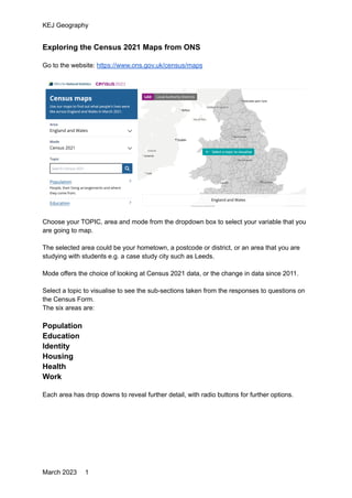
1. KEJ Geography
Exploring the Census 2021 Maps from ONS
Go to the website: https://www.ons.gov.uk/census/maps
Choose your TOPIC, area and mode from the dropdown box to select your variable that you
are going to map.
The selected area could be your hometown, a postcode or district, or an area that you are
studying with students e.g. a case study city such as Leeds.
Mode offers the choice of looking at Census 2021 data, or the change in data since 2011.
Select a topic to visualise to see the sub-sections taken from the responses to questions on
the Census Form.
The six areas are:
Population
Education
Identity
Housing
Health
Work
Each area has drop downs to reveal further detail, with radio buttons for further options.
March 2023 1
2. KEJ Geography
E.g. Work
For most of these sub-sections (variables) there are radio buttons to make further selections
from within the data using radio buttons.
E.g. For Distance travelled to work, you will then be asked to select a distance.
For some of the variables, there are pandemic-related quality considerations which may
have changed the nature of the results from previous census data.
E.g. Distance travelled for work
https://www.ons.gov.uk/employmentandlabourmarket/peopleinwork/employmentandemploye
etypes/methodologies/traveltoworkqualityinformationforcensus2021
A choropleth shaded map will appear with data shown at LAD (Local authority district) level
Mousing over any area will show the percentages for that area for the chosen variable.
March 2023 2
3. KEJ Geography
Zooming in reveals more detail (granularity is the phrase used)
Top level: Local Authority Districts (LAD)
Next level: Middle Layer Super Output Area (MSOA)
Next level: Output Areas (OA)
The different ‘areas’ for which Census data are available are described here:
https://www.ons.gov.uk/methodology/geography/ukgeographies/censusgeographies/census2
021geographies#:~:text=Outputs%20from%20Census%202021%20are%20for%202021%20
LSOAs%20and%20are,on%20our%20Open%20Geography%20website.
There is some variation in the mapping depending on the variable.
Maps can be shared, downloaded and embedded under the Open Government License
which allows for free sharing.
The latter option would be good if you have a blog or website which allows embedding.
March 2023 3
4. KEJ Geography
From the HOME area, select Change since 2011 to see data presented in terms of
percentage change.
E.g.
-2.6pp is a 2.6% drop in the people in KIng’s Lynn and West Norfolk who were born in the
UK in this example.
Students may need to be guided through what that means in terms of migration etc.
Other mapping and data download options are available:
Custom Area Profiles can be produced here
https://www.ons.gov.uk/visualisations/customprofiles/draw/
Try this Dot Density map too
https://onsvisual.github.io/dot-density-demo/
Alan Parkinson
@GeoBlog
March 2023 4