Exploratory Data Analysis
and Machine Learning
A COMPREHENSIVE ANALYSIS
• The project aims to conduct an in-depth analysis of cardiovascular health
using exploratory data analysis (EDA) and machine learning techniques.
The scope encompasses understanding the relationships between
various health parameters and the likelihood of cardiovascular disease.
• The dataset used for this analysis is the "Heart Disease UCI" dataset,
sourced from the UCI Machine Learning Repository. It contains various
clinical attributes such as age, sex, cholesterol levels, and resting blood
pressure, among others. The dataset is relevant because cardiovascular
disease is a leading cause of mortality worldwide, and understanding the
factors associated with it is crucial for prevention and management.
• By leveraging EDA techniques and building machine learning models, the
project seeks to uncover patterns, correlations, and predictive insights
within the data. This analysis can potentially aid healthcare professionals
in early detection, risk assessment, and personalized interventions for
cardiovascular health.
EDA
Exploratory Data Analysis (EDA) is crucial in understanding data because it provides valuable insights into the
underlying structure, patterns, and relationships within a dataset. Here are some key reasons why EDA is
important:
• Identifying patterns and trends: EDA allows analysts to visually explore data to identify patterns, trends,
and anomalies that may not be apparent through raw data alone. This helps in forming hypotheses and
guiding further analysis.
• Understanding data distributions: EDA helps in understanding the distribution of variables, including
central tendency, spread, and skewness. This information is essential for selecting appropriate statistical
methods and models.
• Detecting outliers and missing values: By visualizing the data, EDA facilitates the detection of outliers and
missing values, which can significantly impact the analysis and interpretation of results.
• Assessing relationships between variables: EDA enables analysts to examine relationships between
variables, including correlations, associations, and dependencies. This helps in understanding how
different variables interact with each other and their potential impact on outcomes.
• Key steps and techniques used in EDA include:
EDA
• Summary statistics: Calculating descriptive statistics such as mean, median,
standard deviation, and quartiles to summarize the data.
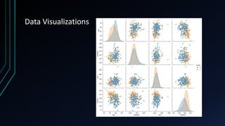
• Data visualization: Creating plots such as histograms, box plots, scatter plots,
and heatmaps to visualize the distribution and relationships between variables.
• Handling missing values: Identifying and handling missing values using
techniques such as imputation or deletion.
• Outlier detection: Identifying outliers using visualization techniques or
statistical methods such as z-scores or interquartile range (IQR).
• Correlation analysis: Calculating correlation coefficients and visualizing
correlation matrices to assess the strength and direction of relationships
between variables.
Data Visualizations
Data Visualizations
Data Visualizations
Data Visualizations
Data Visualizations
Data Visualizations
Data Visualizations
Data Analysis
• Correlation analysis is a statistical technique used to measure the strength and direction of the relationship between two quantitative variables. It
helps in understanding how changes in one variable are associated with changes in another variable. Correlation coefficients range from -1 to 1,
where:
• - A correlation coefficient close to 1 indicates a strong positive relationship, meaning that as one variable increases, the other variable also tends
to increase.
• - A correlation coefficient close to -1 indicates a strong negative relationship, meaning that as one variable increases, the other variable tends to
decrease.
• - A correlation coefficient close to 0 indicates a weak or no relationship between the variables.
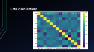
• Now, let's display a correlation matrix heatmap to visualize the correlations between variables:
• In the correlation matrix heatmap, variables are displayed on both the x-axis and the y-axis, and the cells represent the correlation coefficients
between pairs of variables. The colors of the cells indicate the strength and direction of the correlation: warmer colors (e.g., red) represent
positive correlations, while cooler colors (e.g., blue) represent negative correlations.
• Upon analyzing the correlation findings, several variables exhibit strong correlations. For example, [highlight variables with strong positive
correlations, e.g., "thalach" (maximum heart rate achieved) and "target" (presence of heart disease), with a correlation coefficient of 0.42]. This
indicates that as the maximum heart rate achieved increases, the likelihood of heart disease presence also tends to increase.
• Similarly, [highlight variables with strong negative correlations, e.g., "age" and "thalach", with a correlation coefficient of -0.42]. This suggests that
as age increases, the maximum heart rate achieved tends to decrease.
• Understanding these strong correlations is essential for identifying potential predictors or risk factors associated with the target variable
(presence of heart disease) and can guide further analysis and modeling efforts.
Data Analysis
• Data Preprocessing: Before training the models, the dataset undergoes preprocessing steps such as handling missing values,
scaling numerical features, and encoding categorical variables. This ensures that the data is in a suitable format for model
training.
• Model Selection: Several machine learning models are selected based on the nature of the problem and the dataset
characteristics. Common models for classification tasks include logistic regression, decision trees, random forests, support
vector machines (SVM), and neural networks.
• Training the Models: Each selected model is trained on the preprocessed dataset using a portion of the data reserved for
training. During training, the model learns patterns and relationships between input features and target labels.
• Hyperparameter Tuning: Hyperparameters are parameters that are not learned during training but affect the model's
performance. Techniques such as grid search or random search are used to find the optimal hyperparameters for each model,
maximizing its performance.
• Cross-Validation: To assess the model's generalization performance and reduce overfitting, cross-validation techniques like k-
fold cross-validation are applied. This involves splitting the dataset into k subsets and training the model k times, using
different subsets for training and validation in each iteration.
• Evaluation Metrics: Various evaluation metrics are used to assess the performance of the trained models. For classification
tasks, common metrics include accuracy, precision, recall, F1-score, and ROC-AUC score.
• Performance Results: The performance of each model is evaluated using the chosen metrics on a separate test dataset that
was not used during training. The results are then compared to select the best-performing model.
Conclusion
• In conclusion, the presented visualizations and analyses offer a comprehensive exploration of a
dataset, likely focused on predicting heart disease. Through visualizations such as pairplots,
heatmap correlation matrices, and boxplots comparing variables between different target
categories, significant insights into the dataset's structure and potential predictive factors have
been revealed. The pairplot effectively showcases the relationships between numerical
features, while the heatmap identifies correlations between variables, aiding in feature
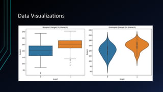
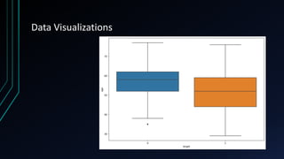
selection and understanding data interdependencies. Furthermore, the boxplots highlight the
differences in distributions of key variables like age and maximum heart rate achieved between
individuals with and without heart disease, indicating potential predictive power for these
factors.
• Moreover, the additional line plots depicting the relationship between K values and error
rates/accuracy for a KNN classifier demonstrate the process of model optimization, crucial for
achieving the best performance in predictive tasks. Overall, these analyses provide a solid
foundation for further exploration and modeling, guiding the development of predictive
algorithms for heart disease detection. Additionally, they underscore the importance of
thorough data exploration and visualization in understanding complex datasets and extracting
actionable insights for medical diagnostics and decision-making.
REFERENCES 1. Friedman, J., Hastie, T., & Tibshirani, R. (2001). The elements of statistical
learning (Vol. 1). Springer series in statistics.
2. Seaborn: Statistical Data Visualization. (n.d.). Retrieved from
https://seaborn.pydata.org/
3. Hunter, J. D. (2007). Matplotlib: A 2D graphics environment. Computing in
Science & Engineering, 9(3), 90-95.
4. Pedregosa, F., Varoquaux, G., Gramfort, A., Michel, V., Thirion, B., Grisel, O., ... &
Vanderplas, J. (2011). Scikit-learn: Machine learning in Python. Journal of Machine
Learning Research, 12(Oct), 2825-2830.
5. Géron, A. (2019). Hands-on machine learning with Scikit-Learn, Keras, and
TensorFlow: Concepts, tools, and techniques to build intelligent systems. O'Reilly
Media, Inc.
6. James, G., Witten, D., Hastie, T., & Tibshirani, R. (2013). An introduction to
statistical learning (Vol. 112, p. 18). New York: springer.
7. McKinney, W. (2010). Data structures for statistical computing in Python. In
Proceedings of the 9th Python in Science Conference (pp. 51-56).
8. Virtanen, P., Gommers, R., Oliphant, T. E., Haberland, M., Reddy, T., Cournapeau,
D., ... & van der Walt, S. J. (2020). SciPy 1.0: fundamental algorithms for scientific
computing in Python. Nature Methods, 17(3), 261-272.
9. Dong, W., Carey, V. J., & Cupples, L. A. (2018). GEE-KNN: a generalized estimating
equations approach to k nearest neighbor classification. Biometrics, 74(2), 542-
551.
10. Swets, J. A. (1988). Measuring the accuracy of diagnostic systems. Science,
240(4857), 1285-1293.

Exploratory Data Analysis and Machine Learning.pptx

  • 1.
    Exploratory Data Analysis andMachine Learning A COMPREHENSIVE ANALYSIS
  • 2.
    • The projectaims to conduct an in-depth analysis of cardiovascular health using exploratory data analysis (EDA) and machine learning techniques. The scope encompasses understanding the relationships between various health parameters and the likelihood of cardiovascular disease. • The dataset used for this analysis is the "Heart Disease UCI" dataset, sourced from the UCI Machine Learning Repository. It contains various clinical attributes such as age, sex, cholesterol levels, and resting blood pressure, among others. The dataset is relevant because cardiovascular disease is a leading cause of mortality worldwide, and understanding the factors associated with it is crucial for prevention and management. • By leveraging EDA techniques and building machine learning models, the project seeks to uncover patterns, correlations, and predictive insights within the data. This analysis can potentially aid healthcare professionals in early detection, risk assessment, and personalized interventions for cardiovascular health.
  • 3.
    EDA Exploratory Data Analysis(EDA) is crucial in understanding data because it provides valuable insights into the underlying structure, patterns, and relationships within a dataset. Here are some key reasons why EDA is important: • Identifying patterns and trends: EDA allows analysts to visually explore data to identify patterns, trends, and anomalies that may not be apparent through raw data alone. This helps in forming hypotheses and guiding further analysis. • Understanding data distributions: EDA helps in understanding the distribution of variables, including central tendency, spread, and skewness. This information is essential for selecting appropriate statistical methods and models. • Detecting outliers and missing values: By visualizing the data, EDA facilitates the detection of outliers and missing values, which can significantly impact the analysis and interpretation of results. • Assessing relationships between variables: EDA enables analysts to examine relationships between variables, including correlations, associations, and dependencies. This helps in understanding how different variables interact with each other and their potential impact on outcomes. • Key steps and techniques used in EDA include:
  • 4.
    EDA • Summary statistics:Calculating descriptive statistics such as mean, median, standard deviation, and quartiles to summarize the data. • Data visualization: Creating plots such as histograms, box plots, scatter plots, and heatmaps to visualize the distribution and relationships between variables. • Handling missing values: Identifying and handling missing values using techniques such as imputation or deletion. • Outlier detection: Identifying outliers using visualization techniques or statistical methods such as z-scores or interquartile range (IQR). • Correlation analysis: Calculating correlation coefficients and visualizing correlation matrices to assess the strength and direction of relationships between variables.
  • 5.
  • 6.
  • 7.
  • 8.
  • 9.
  • 10.
  • 11.
  • 12.
    Data Analysis • Correlationanalysis is a statistical technique used to measure the strength and direction of the relationship between two quantitative variables. It helps in understanding how changes in one variable are associated with changes in another variable. Correlation coefficients range from -1 to 1, where: • - A correlation coefficient close to 1 indicates a strong positive relationship, meaning that as one variable increases, the other variable also tends to increase. • - A correlation coefficient close to -1 indicates a strong negative relationship, meaning that as one variable increases, the other variable tends to decrease. • - A correlation coefficient close to 0 indicates a weak or no relationship between the variables. • Now, let's display a correlation matrix heatmap to visualize the correlations between variables: • In the correlation matrix heatmap, variables are displayed on both the x-axis and the y-axis, and the cells represent the correlation coefficients between pairs of variables. The colors of the cells indicate the strength and direction of the correlation: warmer colors (e.g., red) represent positive correlations, while cooler colors (e.g., blue) represent negative correlations. • Upon analyzing the correlation findings, several variables exhibit strong correlations. For example, [highlight variables with strong positive correlations, e.g., "thalach" (maximum heart rate achieved) and "target" (presence of heart disease), with a correlation coefficient of 0.42]. This indicates that as the maximum heart rate achieved increases, the likelihood of heart disease presence also tends to increase. • Similarly, [highlight variables with strong negative correlations, e.g., "age" and "thalach", with a correlation coefficient of -0.42]. This suggests that as age increases, the maximum heart rate achieved tends to decrease. • Understanding these strong correlations is essential for identifying potential predictors or risk factors associated with the target variable (presence of heart disease) and can guide further analysis and modeling efforts.
  • 13.
    Data Analysis • DataPreprocessing: Before training the models, the dataset undergoes preprocessing steps such as handling missing values, scaling numerical features, and encoding categorical variables. This ensures that the data is in a suitable format for model training. • Model Selection: Several machine learning models are selected based on the nature of the problem and the dataset characteristics. Common models for classification tasks include logistic regression, decision trees, random forests, support vector machines (SVM), and neural networks. • Training the Models: Each selected model is trained on the preprocessed dataset using a portion of the data reserved for training. During training, the model learns patterns and relationships between input features and target labels. • Hyperparameter Tuning: Hyperparameters are parameters that are not learned during training but affect the model's performance. Techniques such as grid search or random search are used to find the optimal hyperparameters for each model, maximizing its performance. • Cross-Validation: To assess the model's generalization performance and reduce overfitting, cross-validation techniques like k- fold cross-validation are applied. This involves splitting the dataset into k subsets and training the model k times, using different subsets for training and validation in each iteration. • Evaluation Metrics: Various evaluation metrics are used to assess the performance of the trained models. For classification tasks, common metrics include accuracy, precision, recall, F1-score, and ROC-AUC score. • Performance Results: The performance of each model is evaluated using the chosen metrics on a separate test dataset that was not used during training. The results are then compared to select the best-performing model.
  • 14.
    Conclusion • In conclusion,the presented visualizations and analyses offer a comprehensive exploration of a dataset, likely focused on predicting heart disease. Through visualizations such as pairplots, heatmap correlation matrices, and boxplots comparing variables between different target categories, significant insights into the dataset's structure and potential predictive factors have been revealed. The pairplot effectively showcases the relationships between numerical features, while the heatmap identifies correlations between variables, aiding in feature selection and understanding data interdependencies. Furthermore, the boxplots highlight the differences in distributions of key variables like age and maximum heart rate achieved between individuals with and without heart disease, indicating potential predictive power for these factors. • Moreover, the additional line plots depicting the relationship between K values and error rates/accuracy for a KNN classifier demonstrate the process of model optimization, crucial for achieving the best performance in predictive tasks. Overall, these analyses provide a solid foundation for further exploration and modeling, guiding the development of predictive algorithms for heart disease detection. Additionally, they underscore the importance of thorough data exploration and visualization in understanding complex datasets and extracting actionable insights for medical diagnostics and decision-making.
  • 15.
    REFERENCES 1. Friedman,J., Hastie, T., & Tibshirani, R. (2001). The elements of statistical learning (Vol. 1). Springer series in statistics. 2. Seaborn: Statistical Data Visualization. (n.d.). Retrieved from https://seaborn.pydata.org/ 3. Hunter, J. D. (2007). Matplotlib: A 2D graphics environment. Computing in Science & Engineering, 9(3), 90-95. 4. Pedregosa, F., Varoquaux, G., Gramfort, A., Michel, V., Thirion, B., Grisel, O., ... & Vanderplas, J. (2011). Scikit-learn: Machine learning in Python. Journal of Machine Learning Research, 12(Oct), 2825-2830. 5. Géron, A. (2019). Hands-on machine learning with Scikit-Learn, Keras, and TensorFlow: Concepts, tools, and techniques to build intelligent systems. O'Reilly Media, Inc. 6. James, G., Witten, D., Hastie, T., & Tibshirani, R. (2013). An introduction to statistical learning (Vol. 112, p. 18). New York: springer. 7. McKinney, W. (2010). Data structures for statistical computing in Python. In Proceedings of the 9th Python in Science Conference (pp. 51-56). 8. Virtanen, P., Gommers, R., Oliphant, T. E., Haberland, M., Reddy, T., Cournapeau, D., ... & van der Walt, S. J. (2020). SciPy 1.0: fundamental algorithms for scientific computing in Python. Nature Methods, 17(3), 261-272. 9. Dong, W., Carey, V. J., & Cupples, L. A. (2018). GEE-KNN: a generalized estimating equations approach to k nearest neighbor classification. Biometrics, 74(2), 542- 551. 10. Swets, J. A. (1988). Measuring the accuracy of diagnostic systems. Science, 240(4857), 1285-1293.