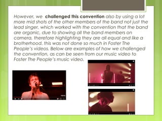
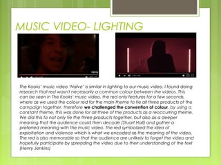
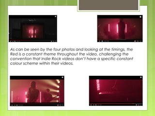
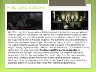
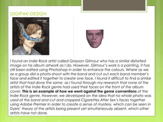
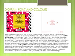
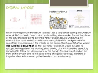
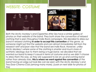
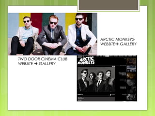
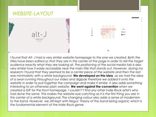
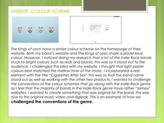
This document analyzes how a media product for an indie rock band uses, develops, and challenges conventions of real indie rock products. Specifically, it examines the band's music video, digipak, and website compared to those of similar bands. While some conventions are followed, such as camera shots and fonts, conventions are also challenged, like the extensive use of the color red throughout the music video and combining band members' faces on the digipak cover, which creates a sense of mystery not seen elsewhere in the genre. The document provides examples to support how the media product borrows from, improves on, and innovates beyond typical conventions.