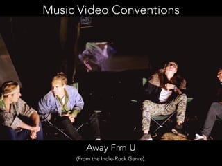
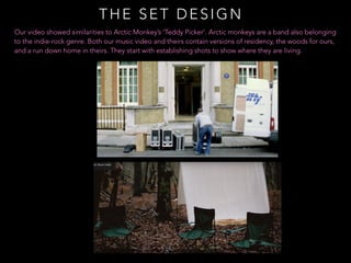
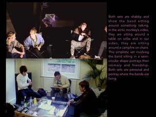
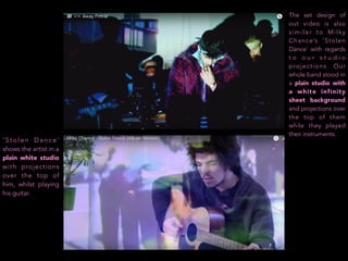
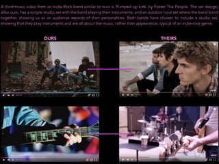
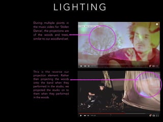
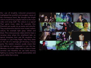
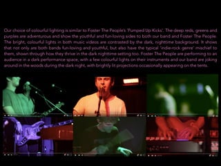
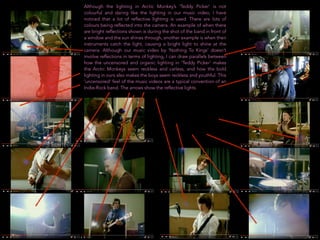
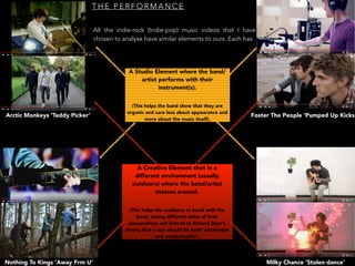
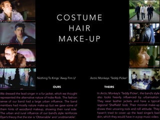
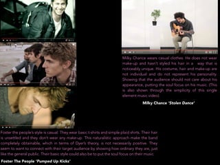
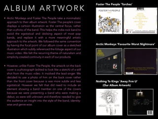
SlideShare a Scribd company logo
E VA L U AT I O N TA S K ONE
I N W H AT WAY S D O E S Y O U R M E D I A P R O D U C T U S E ,
D E V E L O P O R C H A L L E N G E F O R M S A N D C O N V E N T I O N S O F
R E A L M E D I A P R O D U C T S ?
Conventions in the music industry are popular stereotypes specific to different music genres. The
characteristics and stereotypes within; the music video, the website, the album and the star
image, help the audience to instantly recognise which genre the artist or band belongs to.
Conventions and stereotypes are useful in order for the artist or band to attract the appropriate
audience. Genre conventions can be portrayed through; set design, camera work (lighting),
performance, costume/hair.make-up and editing.
TECHNICAL
CONVENTIONS
Technical conventions are when technological equipment is used to tell the story, for
example, the pace of editing specific to a certain genre would be a technical convention.
The technical conventions of a genre could be constructed through the camera angles of
the music video, the framing or the typography.
SYMBOLIC CONVENTIONS
These show what is beneath the
surface of what we see. For example,
the band or artist’s actions or facial
expressions show us how they feel. In
a rock genre, they may be scowling,
connoting their anger, typical of a rock
genre.
The visuals of a music video usually
have a symbolic meaning which the
audience have to decode. These are
connoted through; the colours/lighting,
the mis-en-scene/objects, body
language, clothing and setting.
Here are some lighting conventions:
Low Key: Dramatic, moody
High Key: Bright and exciting
Low contrast: Not many different colours, everyday
High contrast: Dramatic, volatile
Music Video Conventions
Away Frm U
(From the Indie-Rock Genre).
THE SET DESIGN
Our video showed similarities to Arctic Monkey’s ‘Teddy Picker’. Arctic monkeys are a band also belonging
to the indie-rock genre. Both our music video and theirs contain versions of residency, the woods for ours,
and a run down home in theirs. They start with establishing shots to show where they are living.
Both sets are shabby and
show the band sitting
around something talking,
in the arctic monkey’s video,
they are sitting around a
table on sofas and in our
video, they are sitting
around a campfire on chairs.
This simplistic set involving
the band sitting in a semi-
circular shape portrays their
intimacy and friendship.
Both sets are personal and
portray where the bands are
living.
‘ S t o l e n D a n c e ’
shows the artist in a
plain white studio
with projections
over the top of
him, whilst playing
his guitar.
The set design of
out video is also
similar to Milky
Chance’s ‘Stolen
Dance’ with regards
t o o u r s t u d i o
projections. Our
whole band stood in
a plain studio with
a white infinity
sheet background
and projections over
the top of them
while they played
their instruments.
A third music video from an Indie-Rock band similar to ours is ‘Pumped up kids’ by Foster The People. The set design,
alike ours, has a simple studio set with the band playing their instruments, and an outdoor rural set where the band bond
together, showing us as an audience aspects of their personalities. Both bands have chosen to include a studio set,
showing that they play instruments and are all about the music, rather than appearance, typical of an indie-rock genre.
OURS THEIRS
L I G H T I N G
During multiple points in
the music video for ‘Stolen
Dance’, the projections are
of the woods and trees,
similar to our woodland set.
This is the reverse our
projection element. Rather
then projecting the woods
onto the band when they
performed in the studio, we
projected the studio on to
them when they performed
in the woods.
Our use of brightly coloured projections
highlighted the youthful and energetic nature of
the mischievous band. We thought that bright
colours would bring a playful nature to the music
video and song itself. The colours in a typical
‘Pop’ genre music video (for example; One
Direction) are usually not as wacky and colourful.
They would tend to stick for more muted, realistic
colours, for example light greys, whites and
blues. This is because pop videos tend to have a
narrative story where the artist/band take on
typical characters from real life situations, for
example, in ‘Last Friday Night’, Katy Perry takes
on the roll of a teenage girl throwing a house
party. The realistic situation usually means that
the lighting isn’t exaggerated or over the top.
Whereas, our music video does not have a linear
narrative and therefore we use bold exciting
lighting to portray the band’s personalities and
youth, rather than a story.
Our choice of colourful lighting is similar to Foster The People’s ‘Pumped Up Kicks’. The deep reds, greens and
purples are adventurous and show the youthful and fun-loving sides to both our band and Foster The People.
The bright, colourful lights in both music videos are contrasted by the dark, nighttime background. It shows
that not only are both bands fun-loving and youthful, but also have the typical ‘indie-rock genre’ mischief to
them, shown through how they thrive in the dark nighttime setting too. Foster The People are performing to an
audience in a dark performance space, with a few colourful lights on their instruments and our band are joking
around in the woods during the dark night, with brightly lit projections occasionally appearing on the tents.
Although the lighting in Arctic Monkey’s ‘Teddy Picker’ is not
colourful and daring like the lighting in our music video, I have
noticed that a lot of reflective lighting is used. There are lots of
colours being reflected into the camera. An example of when there
are bright reflections shown is during the shot of the band in front of
a window and the sun shines through, another example is when their
instruments catch the light, causing a bright light to shine at the
camera. Although our music video by ‘Nothing To Kings’ doesn’t
involve reflections in terms of lighting, I can draw parallels between
how the uncensored and organic lighting in ‘Teddy Picker’ makes
the Arctic Monkeys seem reckless and carless, and how the bold
lighting in ours also makes the boys seem reckless and youthful. This
‘uncensored’ feel of the music videos are a typical convention of an
Indie-Rock band. The arrows show the reflective lights.
In Arctic Monkey’s ‘Teddy Picker’, the band use facial close-ups to show that each member in the
band is as important as the other. They all have the same amount of air-time in the video. The facial
close-ups of each band member show that there is no lead member of the band, unlike in regular
pop bands where there is a lead-member (for example Nicole Scherzinger in the Pussycat Dolls).
We also used close up shots of all members in the music video for our band ‘Nothing To Kings’ to
show that Ashen, our lead singer, is not the main focus of the band and that each band member
plays an equally important role.
T H E C A M E R A - W O R K
In both our band’s music video and Milky Chance’s ‘Stolen Dance’, the camera cuts to and
from the guitar to the person playing. This shows how all the band members are talented
instrumentalists and, by cutting from the instrument to their facial expression, we can see
that they are pulling intense, serious expressions, mirroring how they are serious about their
music.
HIS OURS
Similar to our music video, Foster the people use handheld
camera shots in ‘Pumped Up Kicks’ which show the band’s
intimacy and make the audience feel as though they know
them on a personal level. It also conforms to the indie-rock
convention of a band being organic and not over-edited,
which is shown through the poor camera quality in some
shots which the band did not want to edit out.
In our music video, handheld camera shots
are used to depict the band’s cheeky and
youthful nature. They also show the band’s
intimacy, alike Foster The People, who
make us as an audience feel involved as if
we are following the band while they
continue with everyday life, promoting the
indie-rock band’s informality.
T H E P E R F O R M A N C E
All the indie-rock (Indie-pop) music videos that I have
chosen to analyse have similar elements to ours. Each has:
Arctic Monkeys ‘Teddy Picker’
Nothing To Kings ‘Away Frm U’ Milky Chance ‘Stolen dance’
Foster The People ‘Pumped Up Kicks
A Studio Element where the band/
artist performs with their
instrument(s).
(This helps the band show that they are
organic and care less about appearance and
more about the music itself).
A Creative Element shot in a
different environment (usually
outdoors) where the band/artist
messes around.
(This helps the audience to bond with the
band, seeing different sides of their
personalities and links in to Richard Dyer’s
theory that a star should be both ‘obtainable
and unobtainable’).
C O S T U M E
H A I R
M A K E - U P
We dressed the lead singer in a fur jacket, which we thought
represented the alternative nature of Indie-Rock. The fashion
sense of our band had a large urban influence. The band
members had mostly nature make-up but we gave some of
them hints of woodland makeup, showing their rural side.
The urban and rural influence of our band’s style reinforces
Dyer’s theory that the star is ‘Obtainable’ and ‘unobtainable’.
In Arctic Monkey’s ‘Teddy Picker’, the band’s style
also looks heavily influenced by urbanisation.
They wear leather jackets and have a typical
regional ‘Sheffield’ look. Their minimal make-up
shows their uncaring rock and roll attitude. They
haven’t tried to cover up the lead singer’s bad
skin, which they would have in a pop music video.
Nothing To Kings ‘Away Frm U’
OURS
Arctic Monkeys ‘Teddy Picker’
THEIRS
Milky Chance wears casual clothes. He does not wear
make-up and hasn’t styled his hair in a way that is
noticeably unique. His costume, hair and make-up are
not individual and do not represent his personality.
Showing that the audience should not care about his
appearance, putting the soul focus on his music. (This
is also shown through the simplicity of this single
element music video).
Foster the people’s style is casual. They wear basic t-shirts and simple plaid shirts. Their hair
is unsettled and they don’t wear any make-up. This naturalistic approach make the band
completely obtainable, which in terms of Dyer’s theory, is not necessarily positive. They
seem to want to connect with their target audience by showing how ordinary they are, just
like the general public. Their basic style could also be to put the soul focus on their music.
Milky Chance ‘Stolen Dance’
Foster The People ‘Pumped Up Kicks’
Nothing To Kings ‘Away Frm U’
(Our Album Artwork)
Arctic Monkeys ‘Favourite Worst Nightmare’
Foster The People ‘Torches’
• Arctic Monkeys and Foster The People take a minimalistic
approach to their album artwork. Foster The people’s cover
displays a cartoon illustration as the central focus, rather
than a photo of the band. This helps the indie-rock band to
avoid the egotistical and idolising aspect of most pop
bands, and replace it with a more meaningful artistic
approach to the artwork. We followed the same convention
by having the focal point of our album cover as a sketched
illustration which subtly referenced the foliage aspect of our
music video. We felt the recurring theme of naturalism and
simplicity created continuity in each of our products.
• However, unlike Foster The People, the artwork on the back
cover is a photograph (edited to look like a sketch) of a still
shot from the music video. It involved the lead singer. We
decided to use a photo of him on the back cover rather
than the front cover because is was more subtle and less
egotistical. However we felt that did need to include an
element showing a band member on one of the covers
because we were presenting a band who were making a
debut, so were still unknown and therefore needed to give
the audience an insight into the style of the band, identity-
wise and genre-wise.
A L B U M A R T W O R K
• Similar to Arctic Monkey’s covers, we chose the
colour scheme as monotone blacks and whites,
simplifying the imagery to reflect the morbid title of
our band. Our band name states that the band went
from being ‘nothing’, shown by the dull black back-
cover, to being ‘kings’, represented by the bright
uplifting white on the front cover.
• The writing which says the name of the band and
the title of the album on our front cover is central.
We wanted the name of the band and album title to
be the central point of focus because it is important
to market an album so that the name of it is
memorable.This is similar to Arctic Monkeys, the
way that they have used a paler yellow colour for the
writing in order to contrast the dark background,
making it stand out. Foster The People also do this
by creating a lot of blank space at the top of the
page and filling it with the band name and album
title in large letters to emphasise it’s importance.
• On the back cover, Arctic Monkey and Foster The
people included obvious conventions such as;
barcode, legal information and album contents. We
also thought it was necessary to use these
conventions.
Nothing To Kings ‘Away Frm U’
(Our Album Artwork)
Arctic Monkeys ‘Favourite Worst Nightmare’
Foster The People ‘Torches’
W E B S I T E S - H O M E PA G E S
Arctic Monkeys has a strong emphasis on it’s imagery. Their name is
written in large letters in a font and style which mirrors the text on
their album artwork. Alike their album artwork, the black and white
theme is shown throughout. This links both products together in
terms of font and colour scheme.
Similarly to Arctic Monkeys, we chose to create a simplistic basic
colour scheme with blacks, whites and greys. This colour scheme
subtly links into our album artwork, creating the look of the boys’
star image. Although images of each of the band members are
present on the homepage, we found it important to make the lead
singer, Ashen, slightly more prominent in order to link to the album
artwork and music video. The colour scheme for Foster The
People’s website is mildly colourful yet simplistic and not to fake.
They stick to a dull blue, yellow and white.
The websites of Foster The People and Arctic Monkeys, unlike pop
bands, do not put their image as the main focus of the page.
Instead, they present us with their recent travels and what they have
been up to. Because they are both established bands already with a
large fan following, they do not need to post images of themselves.
This is why they keep the fans posted on where they are, because
that is what the fans would want to know the most. Arctic Monkeys
post a video of them touring South America. Foster The People
post exclusive pictures and biographical text of them on the way to
Machu Picchu. 
On our website homepage however, because our band has only just
released their debut album, we thought that we should use images
of the boys which we took in the studio to familiarise the audience
with the style and look of the band, exhibiting their youthful and
mischievous look to the female (teenaged) target audience.
T O U R I N G L I N K S A N D D AT E S
Both Arctic Monkeys and Foster The People included tour dates and gig dates on their websites. This appears to be a
standard convention of a website. It promotes the artist and entices the audience to buy tickets for their upcoming
events. We also included this feature on our website, giving direct links to where the audience could purchase tickets.
We also gave links to social medias such as Twitter and Facebook in order to enhance spreadability of awareness of the
band, increasing ticket sales and the band’s popularity.
Nothing To Kings (our band) Arctic Monkeys Foster The People
P I C T U R E S
Both Foster The People’s website and Arctic Monkeys’ website include galleries where the audience can see exclusive
backstage photos of them and photos taken in recent photoshoots. We also included a range of images in our gallery. The
photos we uploaded were either from ‘behind the scenes’ or a photoshoot, or photos from the music video. We thought it was
important to include a gallery because it is typical website convention and it provides exclusive visual content for fans, making
the relationship between the audience and the band more intimate. The primary role of a band’s website is to promote the
band, therefore, alike Foster The People, and Arctic Monkeys, we made the ticket and album promotion prominent in our
photos by including themes of nature and the outdoors which occur in our album artwork and music video linking the website
photos to the other two products.
Arctic Monkeys Foster The PeopleNothing To Kings (our band)

More Related Content

What's hot (20)

Question 1 media
Question 1 mediaQuestion 1 media
Question 1 media
 
Evaluation Task 1
Evaluation Task 1Evaluation Task 1
Evaluation Task 1
 
Media Evaluation 1
Media Evaluation 1Media Evaluation 1
Media Evaluation 1
 
Question 1 media
Question 1 mediaQuestion 1 media
Question 1 media
 
Eval 2
Eval 2Eval 2
Eval 2
 
EVALUATION TASK 1
EVALUATION TASK 1EVALUATION TASK 1
EVALUATION TASK 1
 
Evaluation task 1
Evaluation task 1Evaluation task 1
Evaluation task 1
 
EVALUATION TASK 1
EVALUATION TASK 1EVALUATION TASK 1
EVALUATION TASK 1
 
evaluation 1
evaluation 1 evaluation 1
evaluation 1
 
Advanced Portfolio
Advanced  PortfolioAdvanced  Portfolio
Advanced Portfolio
 
Q1
Q1Q1
Q1
 
Conventions of real media products media
Conventions of real media products mediaConventions of real media products media
Conventions of real media products media
 
Evaluation task 3
Evaluation task 3Evaluation task 3
Evaluation task 3
 
Pitch
PitchPitch
Pitch
 
Evaluation question 1
Evaluation question 1Evaluation question 1
Evaluation question 1
 
Hype in the booth evaluation two
Hype in the booth evaluation twoHype in the booth evaluation two
Hype in the booth evaluation two
 
Evaluation Question 1
Evaluation Question 1Evaluation Question 1
Evaluation Question 1
 
Evaluation Task 1
Evaluation Task 1Evaluation Task 1
Evaluation Task 1
 
Task 1
Task 1Task 1
Task 1
 
Task 1 Evaluation
Task 1 EvaluationTask 1 Evaluation
Task 1 Evaluation
 

Similar to Evaluation Task One (1)

Analysis of 3 music videos (1)
Analysis of 3 music videos (1)Analysis of 3 music videos (1)
Analysis of 3 music videos (1)
lydsjones
 
Conventions of Piano Rock.
Conventions of Piano Rock.Conventions of Piano Rock.
Conventions of Piano Rock.
thedawnishere
 

Similar to Evaluation Task One (1) (20)

Own artist
Own artistOwn artist
Own artist
 
Evaluation Question 1
Evaluation Question 1Evaluation Question 1
Evaluation Question 1
 
RESEARCH: A2 Media Music Video Analysis (Alternative Genre)
RESEARCH: A2 Media Music Video Analysis (Alternative Genre)RESEARCH: A2 Media Music Video Analysis (Alternative Genre)
RESEARCH: A2 Media Music Video Analysis (Alternative Genre)
 
genre analysis rock
genre analysis rockgenre analysis rock
genre analysis rock
 
Analysis of 3 music videos (1)
Analysis of 3 music videos (1)Analysis of 3 music videos (1)
Analysis of 3 music videos (1)
 
GroupPitch2
GroupPitch2GroupPitch2
GroupPitch2
 
Powerpoint pitch
Powerpoint pitch Powerpoint pitch
Powerpoint pitch
 
Imagine Dragons Music Video Analysis
Imagine Dragons Music Video AnalysisImagine Dragons Music Video Analysis
Imagine Dragons Music Video Analysis
 
A2
A2A2
A2
 
music video 1
music video 1music video 1
music video 1
 
Media evaluation
Media evaluationMedia evaluation
Media evaluation
 
EVALUATION TASK 1
EVALUATION TASK 1EVALUATION TASK 1
EVALUATION TASK 1
 
new a2 video analysis
new a2 video analysis new a2 video analysis
new a2 video analysis
 
Textual analysis1
Textual analysis1Textual analysis1
Textual analysis1
 
Video analysis
Video analysisVideo analysis
Video analysis
 
Crystal whites evaluation 1
Crystal whites evaluation 1 Crystal whites evaluation 1
Crystal whites evaluation 1
 
Media evaluation slide share 2
Media evaluation slide share 2Media evaluation slide share 2
Media evaluation slide share 2
 
Media evaluation slide share 2
Media evaluation slide share 2Media evaluation slide share 2
Media evaluation slide share 2
 
Crystal whites evaluation 1 final
Crystal whites evaluation 1 finalCrystal whites evaluation 1 final
Crystal whites evaluation 1 final
 
Conventions of Piano Rock.
Conventions of Piano Rock.Conventions of Piano Rock.
Conventions of Piano Rock.
 

Recently uploaded

Recently uploaded (11)

What Makes Candle Making The Ultimate Bachelorette Celebration
What Makes Candle Making The Ultimate Bachelorette CelebrationWhat Makes Candle Making The Ultimate Bachelorette Celebration
What Makes Candle Making The Ultimate Bachelorette Celebration
 
deloitte-2024-genz-millennial-survey.pdf
deloitte-2024-genz-millennial-survey.pdfdeloitte-2024-genz-millennial-survey.pdf
deloitte-2024-genz-millennial-survey.pdf
 
erevna-influencers-social-media-stin-ellada
erevna-influencers-social-media-stin-elladaerevna-influencers-social-media-stin-ellada
erevna-influencers-social-media-stin-ellada
 
The Golden Rule of Post-Cycle Therapy (PCT) in bodybuilding.pdf
The Golden Rule of  Post-Cycle Therapy (PCT) in bodybuilding.pdfThe Golden Rule of  Post-Cycle Therapy (PCT) in bodybuilding.pdf
The Golden Rule of Post-Cycle Therapy (PCT) in bodybuilding.pdf
 
How to Maintain Healthy Life style.pptx
How to Maintain  Healthy Life style.pptxHow to Maintain  Healthy Life style.pptx
How to Maintain Healthy Life style.pptx
 
Introducing Stealth Attraction: Master the Art of Attracting Women Easily
Introducing Stealth Attraction: Master the Art of Attracting Women EasilyIntroducing Stealth Attraction: Master the Art of Attracting Women Easily
Introducing Stealth Attraction: Master the Art of Attracting Women Easily
 
What To Do If Your Ring Is Too Big? Must Read
What To Do If Your Ring Is Too Big? Must ReadWhat To Do If Your Ring Is Too Big? Must Read
What To Do If Your Ring Is Too Big? Must Read
 
Horsley U3A monthly slide show June 2024.pptx
Horsley U3A monthly slide show June 2024.pptxHorsley U3A monthly slide show June 2024.pptx
Horsley U3A monthly slide show June 2024.pptx
 
From Stress to Success How Oakland's Corporate Wellness Programs are Cultivat...
From Stress to Success How Oakland's Corporate Wellness Programs are Cultivat...From Stress to Success How Oakland's Corporate Wellness Programs are Cultivat...
From Stress to Success How Oakland's Corporate Wellness Programs are Cultivat...
 
Nirshaa Ecommerce_Ready To Ship Products
Nirshaa Ecommerce_Ready To Ship ProductsNirshaa Ecommerce_Ready To Ship Products
Nirshaa Ecommerce_Ready To Ship Products
 
Unique Wedding Bands For Women Who Want To Stand Out.pptx
Unique Wedding Bands For Women Who Want To Stand Out.pptxUnique Wedding Bands For Women Who Want To Stand Out.pptx
Unique Wedding Bands For Women Who Want To Stand Out.pptx
 

Evaluation Task One (1)

  • 1. E VA L U AT I O N TA S K ONE I N W H AT WAY S D O E S Y O U R M E D I A P R O D U C T U S E , D E V E L O P O R C H A L L E N G E F O R M S A N D C O N V E N T I O N S O F R E A L M E D I A P R O D U C T S ?
  • 2. Conventions in the music industry are popular stereotypes specific to different music genres. The characteristics and stereotypes within; the music video, the website, the album and the star image, help the audience to instantly recognise which genre the artist or band belongs to. Conventions and stereotypes are useful in order for the artist or band to attract the appropriate audience. Genre conventions can be portrayed through; set design, camera work (lighting), performance, costume/hair.make-up and editing.
  • 3. TECHNICAL CONVENTIONS Technical conventions are when technological equipment is used to tell the story, for example, the pace of editing specific to a certain genre would be a technical convention. The technical conventions of a genre could be constructed through the camera angles of the music video, the framing or the typography.
  • 4. SYMBOLIC CONVENTIONS These show what is beneath the surface of what we see. For example, the band or artist’s actions or facial expressions show us how they feel. In a rock genre, they may be scowling, connoting their anger, typical of a rock genre. The visuals of a music video usually have a symbolic meaning which the audience have to decode. These are connoted through; the colours/lighting, the mis-en-scene/objects, body language, clothing and setting. Here are some lighting conventions: Low Key: Dramatic, moody High Key: Bright and exciting Low contrast: Not many different colours, everyday High contrast: Dramatic, volatile
  • 5. Music Video Conventions Away Frm U (From the Indie-Rock Genre).
  • 6. THE SET DESIGN Our video showed similarities to Arctic Monkey’s ‘Teddy Picker’. Arctic monkeys are a band also belonging to the indie-rock genre. Both our music video and theirs contain versions of residency, the woods for ours, and a run down home in theirs. They start with establishing shots to show where they are living.
  • 7. Both sets are shabby and show the band sitting around something talking, in the arctic monkey’s video, they are sitting around a table on sofas and in our video, they are sitting around a campfire on chairs. This simplistic set involving the band sitting in a semi- circular shape portrays their intimacy and friendship. Both sets are personal and portray where the bands are living.
  • 8. ‘ S t o l e n D a n c e ’ shows the artist in a plain white studio with projections over the top of him, whilst playing his guitar. The set design of out video is also similar to Milky Chance’s ‘Stolen Dance’ with regards t o o u r s t u d i o projections. Our whole band stood in a plain studio with a white infinity sheet background and projections over the top of them while they played their instruments.
  • 9. A third music video from an Indie-Rock band similar to ours is ‘Pumped up kids’ by Foster The People. The set design, alike ours, has a simple studio set with the band playing their instruments, and an outdoor rural set where the band bond together, showing us as an audience aspects of their personalities. Both bands have chosen to include a studio set, showing that they play instruments and are all about the music, rather than appearance, typical of an indie-rock genre. OURS THEIRS
  • 10. L I G H T I N G During multiple points in the music video for ‘Stolen Dance’, the projections are of the woods and trees, similar to our woodland set. This is the reverse our projection element. Rather then projecting the woods onto the band when they performed in the studio, we projected the studio on to them when they performed in the woods.
  • 11. Our use of brightly coloured projections highlighted the youthful and energetic nature of the mischievous band. We thought that bright colours would bring a playful nature to the music video and song itself. The colours in a typical ‘Pop’ genre music video (for example; One Direction) are usually not as wacky and colourful. They would tend to stick for more muted, realistic colours, for example light greys, whites and blues. This is because pop videos tend to have a narrative story where the artist/band take on typical characters from real life situations, for example, in ‘Last Friday Night’, Katy Perry takes on the roll of a teenage girl throwing a house party. The realistic situation usually means that the lighting isn’t exaggerated or over the top. Whereas, our music video does not have a linear narrative and therefore we use bold exciting lighting to portray the band’s personalities and youth, rather than a story.
  • 12. Our choice of colourful lighting is similar to Foster The People’s ‘Pumped Up Kicks’. The deep reds, greens and purples are adventurous and show the youthful and fun-loving sides to both our band and Foster The People. The bright, colourful lights in both music videos are contrasted by the dark, nighttime background. It shows that not only are both bands fun-loving and youthful, but also have the typical ‘indie-rock genre’ mischief to them, shown through how they thrive in the dark nighttime setting too. Foster The People are performing to an audience in a dark performance space, with a few colourful lights on their instruments and our band are joking around in the woods during the dark night, with brightly lit projections occasionally appearing on the tents.
  • 13. Although the lighting in Arctic Monkey’s ‘Teddy Picker’ is not colourful and daring like the lighting in our music video, I have noticed that a lot of reflective lighting is used. There are lots of colours being reflected into the camera. An example of when there are bright reflections shown is during the shot of the band in front of a window and the sun shines through, another example is when their instruments catch the light, causing a bright light to shine at the camera. Although our music video by ‘Nothing To Kings’ doesn’t involve reflections in terms of lighting, I can draw parallels between how the uncensored and organic lighting in ‘Teddy Picker’ makes the Arctic Monkeys seem reckless and carless, and how the bold lighting in ours also makes the boys seem reckless and youthful. This ‘uncensored’ feel of the music videos are a typical convention of an Indie-Rock band. The arrows show the reflective lights.
  • 14. In Arctic Monkey’s ‘Teddy Picker’, the band use facial close-ups to show that each member in the band is as important as the other. They all have the same amount of air-time in the video. The facial close-ups of each band member show that there is no lead member of the band, unlike in regular pop bands where there is a lead-member (for example Nicole Scherzinger in the Pussycat Dolls). We also used close up shots of all members in the music video for our band ‘Nothing To Kings’ to show that Ashen, our lead singer, is not the main focus of the band and that each band member plays an equally important role. T H E C A M E R A - W O R K
  • 15. In both our band’s music video and Milky Chance’s ‘Stolen Dance’, the camera cuts to and from the guitar to the person playing. This shows how all the band members are talented instrumentalists and, by cutting from the instrument to their facial expression, we can see that they are pulling intense, serious expressions, mirroring how they are serious about their music. HIS OURS
  • 16. Similar to our music video, Foster the people use handheld camera shots in ‘Pumped Up Kicks’ which show the band’s intimacy and make the audience feel as though they know them on a personal level. It also conforms to the indie-rock convention of a band being organic and not over-edited, which is shown through the poor camera quality in some shots which the band did not want to edit out. In our music video, handheld camera shots are used to depict the band’s cheeky and youthful nature. They also show the band’s intimacy, alike Foster The People, who make us as an audience feel involved as if we are following the band while they continue with everyday life, promoting the indie-rock band’s informality.
  • 17. T H E P E R F O R M A N C E All the indie-rock (Indie-pop) music videos that I have chosen to analyse have similar elements to ours. Each has: Arctic Monkeys ‘Teddy Picker’ Nothing To Kings ‘Away Frm U’ Milky Chance ‘Stolen dance’ Foster The People ‘Pumped Up Kicks A Studio Element where the band/ artist performs with their instrument(s). (This helps the band show that they are organic and care less about appearance and more about the music itself). A Creative Element shot in a different environment (usually outdoors) where the band/artist messes around. (This helps the audience to bond with the band, seeing different sides of their personalities and links in to Richard Dyer’s theory that a star should be both ‘obtainable and unobtainable’).
  • 18. C O S T U M E H A I R M A K E - U P We dressed the lead singer in a fur jacket, which we thought represented the alternative nature of Indie-Rock. The fashion sense of our band had a large urban influence. The band members had mostly nature make-up but we gave some of them hints of woodland makeup, showing their rural side. The urban and rural influence of our band’s style reinforces Dyer’s theory that the star is ‘Obtainable’ and ‘unobtainable’. In Arctic Monkey’s ‘Teddy Picker’, the band’s style also looks heavily influenced by urbanisation. They wear leather jackets and have a typical regional ‘Sheffield’ look. Their minimal make-up shows their uncaring rock and roll attitude. They haven’t tried to cover up the lead singer’s bad skin, which they would have in a pop music video. Nothing To Kings ‘Away Frm U’ OURS Arctic Monkeys ‘Teddy Picker’ THEIRS
  • 19. Milky Chance wears casual clothes. He does not wear make-up and hasn’t styled his hair in a way that is noticeably unique. His costume, hair and make-up are not individual and do not represent his personality. Showing that the audience should not care about his appearance, putting the soul focus on his music. (This is also shown through the simplicity of this single element music video). Foster the people’s style is casual. They wear basic t-shirts and simple plaid shirts. Their hair is unsettled and they don’t wear any make-up. This naturalistic approach make the band completely obtainable, which in terms of Dyer’s theory, is not necessarily positive. They seem to want to connect with their target audience by showing how ordinary they are, just like the general public. Their basic style could also be to put the soul focus on their music. Milky Chance ‘Stolen Dance’ Foster The People ‘Pumped Up Kicks’
  • 20. Nothing To Kings ‘Away Frm U’ (Our Album Artwork) Arctic Monkeys ‘Favourite Worst Nightmare’ Foster The People ‘Torches’ • Arctic Monkeys and Foster The People take a minimalistic approach to their album artwork. Foster The people’s cover displays a cartoon illustration as the central focus, rather than a photo of the band. This helps the indie-rock band to avoid the egotistical and idolising aspect of most pop bands, and replace it with a more meaningful artistic approach to the artwork. We followed the same convention by having the focal point of our album cover as a sketched illustration which subtly referenced the foliage aspect of our music video. We felt the recurring theme of naturalism and simplicity created continuity in each of our products. • However, unlike Foster The People, the artwork on the back cover is a photograph (edited to look like a sketch) of a still shot from the music video. It involved the lead singer. We decided to use a photo of him on the back cover rather than the front cover because is was more subtle and less egotistical. However we felt that did need to include an element showing a band member on one of the covers because we were presenting a band who were making a debut, so were still unknown and therefore needed to give the audience an insight into the style of the band, identity- wise and genre-wise. A L B U M A R T W O R K
  • 21. • Similar to Arctic Monkey’s covers, we chose the colour scheme as monotone blacks and whites, simplifying the imagery to reflect the morbid title of our band. Our band name states that the band went from being ‘nothing’, shown by the dull black back- cover, to being ‘kings’, represented by the bright uplifting white on the front cover. • The writing which says the name of the band and the title of the album on our front cover is central. We wanted the name of the band and album title to be the central point of focus because it is important to market an album so that the name of it is memorable.This is similar to Arctic Monkeys, the way that they have used a paler yellow colour for the writing in order to contrast the dark background, making it stand out. Foster The People also do this by creating a lot of blank space at the top of the page and filling it with the band name and album title in large letters to emphasise it’s importance. • On the back cover, Arctic Monkey and Foster The people included obvious conventions such as; barcode, legal information and album contents. We also thought it was necessary to use these conventions. Nothing To Kings ‘Away Frm U’ (Our Album Artwork) Arctic Monkeys ‘Favourite Worst Nightmare’ Foster The People ‘Torches’
  • 22. W E B S I T E S - H O M E PA G E S Arctic Monkeys has a strong emphasis on it’s imagery. Their name is written in large letters in a font and style which mirrors the text on their album artwork. Alike their album artwork, the black and white theme is shown throughout. This links both products together in terms of font and colour scheme. Similarly to Arctic Monkeys, we chose to create a simplistic basic colour scheme with blacks, whites and greys. This colour scheme subtly links into our album artwork, creating the look of the boys’ star image. Although images of each of the band members are present on the homepage, we found it important to make the lead singer, Ashen, slightly more prominent in order to link to the album artwork and music video. The colour scheme for Foster The People’s website is mildly colourful yet simplistic and not to fake. They stick to a dull blue, yellow and white. The websites of Foster The People and Arctic Monkeys, unlike pop bands, do not put their image as the main focus of the page. Instead, they present us with their recent travels and what they have been up to. Because they are both established bands already with a large fan following, they do not need to post images of themselves. This is why they keep the fans posted on where they are, because that is what the fans would want to know the most. Arctic Monkeys post a video of them touring South America. Foster The People post exclusive pictures and biographical text of them on the way to Machu Picchu.  On our website homepage however, because our band has only just released their debut album, we thought that we should use images of the boys which we took in the studio to familiarise the audience with the style and look of the band, exhibiting their youthful and mischievous look to the female (teenaged) target audience.
  • 23. T O U R I N G L I N K S A N D D AT E S Both Arctic Monkeys and Foster The People included tour dates and gig dates on their websites. This appears to be a standard convention of a website. It promotes the artist and entices the audience to buy tickets for their upcoming events. We also included this feature on our website, giving direct links to where the audience could purchase tickets. We also gave links to social medias such as Twitter and Facebook in order to enhance spreadability of awareness of the band, increasing ticket sales and the band’s popularity. Nothing To Kings (our band) Arctic Monkeys Foster The People
  • 24. P I C T U R E S Both Foster The People’s website and Arctic Monkeys’ website include galleries where the audience can see exclusive backstage photos of them and photos taken in recent photoshoots. We also included a range of images in our gallery. The photos we uploaded were either from ‘behind the scenes’ or a photoshoot, or photos from the music video. We thought it was important to include a gallery because it is typical website convention and it provides exclusive visual content for fans, making the relationship between the audience and the band more intimate. The primary role of a band’s website is to promote the band, therefore, alike Foster The People, and Arctic Monkeys, we made the ticket and album promotion prominent in our photos by including themes of nature and the outdoors which occur in our album artwork and music video linking the website photos to the other two products. Arctic Monkeys Foster The PeopleNothing To Kings (our band)