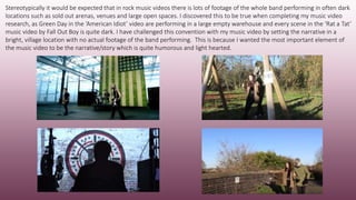
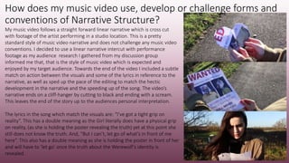
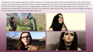
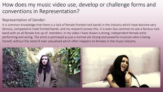
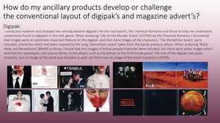
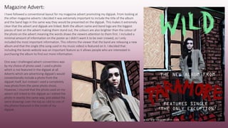
The document summarizes how the media product uses, develops, and challenges conventions of real music videos. It discusses using common music video conventions like including performance elements but also challenging conventions by setting the narrative in bright locations instead of stereotypical dark venues. It also discusses using conventions like a linear narrative but developing it by changing the artist's attitude during performance based on the narrative. Representation of a strong female artist is also discussed. The document then summarizes how the ancillary products like the digipak and magazine ad develop conventions through layout, images, colors, and fonts while also challenging some conventions.
2137ad Merindol Colony Interiors where refugee try to build a seemengly norm...luforfor
This are the interiors of the Merindol Colony in 2137ad after the Climate Change Collapse and the Apocalipse Wars. Merindol is a small Colony in the Italian Alps where there are around 4000 humans. The Colony values mainly around meritocracy and selection by effort.
Explore the multifaceted world of Muntadher Saleh, an Iraqi polymath renowned for his expertise in visual art, writing, design, and pharmacy. This SlideShare delves into his innovative contributions across various disciplines, showcasing his unique ability to blend traditional themes with modern aesthetics. Learn about his impactful artworks, thought-provoking literary pieces, and his vision as a Neo-Pop artist dedicated to raising awareness about Iraq's cultural heritage. Discover why Muntadher Saleh is celebrated as "The Last Polymath" and how his multidisciplinary talents continue to inspire and influence.
Hadj Ounis's most notable work is his sculpture titled "Metamorphosis." This piece showcases Ounis's mastery of form and texture, as he seamlessly combines metal and wood to create a dynamic and visually striking composition. The juxtaposition of the two materials creates a sense of tension and harmony, inviting viewers to contemplate the relationship between nature and industry.
2137ad - Characters that live in Merindol and are at the center of main storiesluforfor
Kurgan is a russian expatriate that is secretly in love with Sonia Contado. Henry is a british soldier that took refuge in Merindol Colony in 2137ad. He is the lover of Sonia Contado.
1. In what ways does your media product
use, develop or challenge forms
and conventions
of real media products?
2. How does my music video use, develop or challenge forms and
conventions in expressing Genre?
Before starting the planning process for my music video, I conducted research into already existent music videos to help give
me an insight into common music video forms and conventions. I watched many rock music videos and found a common
feature among all of them was including performance elements in the music video. According to Lynch performance is one of
the three main music video structures. The two music videos which I studied in depth included two different ways of showing
the musicians performing. In the video for ‘American Idiot’ by Green Day, the video mainly features the whole band performing
and playing their instruments. In the video for ‘Rat a Tat’ by Fall Out Boy however, the only performance included in the video is
by the lead singer who is lip-syncing whilst also being a part of the music video’s narrative.
3. I decided to use both of these performance styles
in my own music video and had the main artist
singing/lip-syncing to the song at the beginning
of the video during part of the narrative. As well
as singing in the narrative I also included the
artist performing and singing into a microphone
in a studio location. In my music video I intercut
this footage with the music video’s narrative.
4. As a strong element of my music video is the narrative I decided to include opening titles to introduce the story. From watching lots of rock
music videos I learnt that it is not uncommon for rock musicians to make videos featuring strong narratives and that they are often introduced
in a similar way as to how you would introduce a film. This especially works for my music video as one of the main characters featured in the
narrative is a Werewolf which is a character audiences would expect to see in a film, especially a horror. I coloured the opening titles red to
foreshadow the horror element of the video. Red is associated with horror as it has connotations of subject matters such as danger and blood.
The use of the colour red also has a connotation of love as the song used is a love song and the narrative is about the relationship between the
Girl and the Werewolf.
The horror and rock genres fit well together
as many people associate rock music with
being ‘heavy’ and ‘dark’ in a similar way that
horrors are known for being scary and dark.
The band I have promoted are Alternative
Rock, however the song used in the video is
much calmer and gentler than the bands
other music. The use of a calming song and a
strong ‘horror’ inspired narrative creates a
juxtaposition in the music video.
The opening titles I created for my music video: The opening titles used in a rock music video which I gained inspiration from. Fall Out Boy’s
music video for ‘A Little Less Sixteen Candles A Little More “Touch Me”. This video also has a
strong horror inspired narrative as it features vampires.
5. I followed stereotypical forms and conventions of rock music whilst expressing the genre through the costume styling of the
main artist. I felt this was an extremely important feature I needed to include to help make the genre of the band obvious. I
needed to make it clear that the band is an alternative rock band as the song used in my music video is slower than the
bands usual music which is heavier, and much clearer in genre.
I have expressed the genre through costume styling in many ways.
The main artist is wearing dark and heavy eye make-up and has long
darkly coloured hair. These are both characteristics which would be
stereotypically associated with artists in the rock industry. The artist is
also wearing dark clothing and a choker. This style of clothing and
accessories are again associated with musicians linked to the rock
industry. The artist is also wearing identifiable brands in the music
video which are commonly worn by artists in this genre of music. The
brands are Doc Marten’s boots and a Drop Dead jacket. The whole of
the artists costume gives off a ‘rock’ image and would be easily
recognised and identified with by the bands audience.
6. Stereotypically it would be expected that in rock music videos there is lots of footage of the whole band performing in often dark
locations such as sold out arenas, venues and large open spaces. I discovered this to be true when completing my music video
research, as Green Day in the ‘American Idiot’ video are performing in a large empty warehouse and every scene in the ‘Rat a Tat’
music video by Fall Out Boy is quite dark. I have challenged this convention with my music video by setting the narrative in a
bright, village location with no actual footage of the band performing. This is because I wanted the most important element of
the music video to be the narrative/story which is quite humorous and light hearted.
7. How does my music video use, develop or challenge forms and
conventions of Narrative Structure?
My music video follows a straight forward linear narrative which is cross cut
with footage of the artist performing in a studio location. This is a pretty
standard style of music video narrative and does not challenge any music video
conventions. I decided to use a linear narrative intercut with performance
footage as my audience research I gathered from my discussion group
informed me that, that is the style of music video which is expected and
enjoyed by my target audience. Towards the end of the video I included a subtle
match on action between the visuals and some of the lyrics in reference to the
narrative, as well as sped up the pace of the editing to match the hectic
development in the narrative and the speeding up of the song. The video’s
narrative ends on a cliff-hanger by cutting to black and ending with a scream.
This leaves the end of the story up to the audiences personal interpretation.
The lyrics in the song which match the visuals are: “I’ve got a tight grip on
reality”. This has a double meaning as the Girl literally does have a physical grip
on reality, (as she is holding the poster revealing the truth) yet at this point she
still does not know the truth. And, “But I can’t, let go of what’s in front of me
here”. This also has a double meaning as she is holding the poster in front of her
and will have to ‘let go’ once the truth about the Werewolf’s identity is
revealed.
8. I decided that as the video progressed, and the narrative was revealed the attitude of the artist performing in the studio would
change. This change shows the artists reaction to what is happening in the video. At the beginning of the narrative when the Girl
and the Werewolf are happy, the artist is singing happily and looks as if she is remembering the good times. However, as it is
revealed that the Werewolf is actually bad, she looks more angry and upset whilst performing. I have shown this anger by making
the once white and pure background dark grey and fuzzy.
9. How does my music video use, develop or challenge forms and
conventions in Representation?
Representation of Gender:
It is common knowledge that there is a lack of female fronted rock bands in the industry which have become very
famous, compared to male fronted bands, and my research proves this. It is even less common to see a famous rock
band with an all female line up of members. In my video I have shown a strong, independent female artist
performing and acting. The artist is portrayed as just a normal yet strong and powerful musician who is being
herself, without the need of over-sexualised which often happens to females in the music industry.
10. How do my ancillary products develop or challenge
the conventional layout of digipak’s and magazine advert’s?
Digipak:
I conducted research and analysed two already existent digipak’s for the rock band’s, My Chemical Romance and Muse to help me understand
conventions found in digipak’s in the rock genre. When analysing ‘Life on the Murder Scene’ (LOTMS) by My Chemical Romance I discovered
that images were an extremely important feature on the digipak, and that many images of the characters, ‘The Demolition lovers’ were
included, characters which had been inspired by the song ‘Demolition Lovers’ taken from the bands previous album. When analysing ‘Black
Holes and Revelations’ (BHAR) by Muse, I found that less images of actual people/character were included, but there were some images which
matched the apocalyptic and spacey theme of the album, such as the planet on the third inside panel. The rest of the digipak was quite
simplistic, but an image of the band was included as well, yet there was no image of the band included in LOTMS.
11. I combined ideas from both of the digipak’s I analysed when creating my own digipak. I followed a conventional digipak structure and included images of the characters
featured in my music video in a similar way to how LOTMS includes many images of the ‘Lovers’ characters. I also included images of props linked to the characters in
my music video in the digipak as well. I included more images of the main artist than what was included in BHAR as the main artist was also the main character in my
music video. I also made sure that my images matched across panels as this made the digipak look professional and complete in a similar way to how the images in the
digipak’s I analysed do the same.
My digipak:
12. In LOTMS, a serif font was used.
This font can be seen as an ‘old’
style font, however this matches
the bands logo as this is also in a
serif ‘style’. This use of ‘older’
looking fonts matches the
‘Demolition Lovers’ theme in the
album as both characters are
dressed in old fashioned style
wedding clothing.
BHAR uses sand serif typeface
through out. This again matches
the bands logo which is also a
sans serif ‘style’. Sans serif is seen
as a more modern and futuristic
font and therefore matches the
digipaks spacey and apocalyptic
theme.
I learnt from my analysis that digipak’s tend not to include that much text and that the bigger focus is on the images, even thought not that
much text was included, the typeface used in both the digipak’s I analysed still ‘matched’ the visual theme of the digipak.
13. The logo I designed for the band is made up of bold
strokes and heavy lines. This logo works well and
makes it clear to fans of the artist that the bands
genre is rock as the heavy lines used represent the
heavier style of music. This style of logo’s among rock
bands is quite common meaning it will be easy for
music fans to read and understand the genre of the
bands music.
As my analysis of digipak’s taught me that an effective way to make text look
interesting was to make it match the theme of the album, I decided to do
the same in my own digipak. I created graphics which made my digipak have
a partly illustrated and ‘sketchy’ theme, and my band logo I created works
well with this theme already. This inspired me to create the rest of the text
on my digipak in a similar way to my band logo. I created the album name
using the exact same style of paint tools in PhotoShop as I did when making
the band logo. I then created a ‘handwritten’ looking style for the rest of the
text in my digipak which matches my logos and band title. The handwritten
quality to my text matches the hand drawn and sketchy quality to my
graphics making the visual theme of the album clear.
From analysing digipak’s I learnt that including a
barcode and copyright information is an
important and necessary feature which must be
included. To keep this looking professional I
decided to use a normal serif font apposed to the
hand written style of text I have used in the rest
of the digipak.
14. I have followed the same colour scheme throughout
the whole of my promotional package. In my digipak
the most evident colour is different shades of green. I
wanted to use the colour green as connotations of this
include, nature, and the wilderness. I thought this
would be appropriate for the main colour of my
digipak as I decided to call the album ‘WILD’, and the
music video, as well as the digipak feature a wild
animal, the Werewolf. Basing my digipak in all outside
locations also makes sense as the whole narrative
element of my video is set outside. Using green as the
main colour in my digipak challenges conventions in
rock digipak’s as from the ones I analysed I discovered
the most common colour used is black, a colour very
often associated with rock genres.
15. Despite not using black, a colour very often associated with rock
genres, I did use some red, a colour which sometimes associated
with rock genres. During the creation of my music video, when
making the ‘WANTED’ poster prop I used the colour red as this
connotes danger. As I included this prop in my digipak I decided
making the band logo red would match this, as well as standing
out against the mainly green background. As the poster prop is
coloured white, I decided to colour the Girl and Werewolf
silhouettes white as well. This was again to make the colour
scheme match throughout the digipak but also because these
characters and the prop have been taken from the music videos
narrative, and making them the same colour links them.
16. Magazine Advert:
I have followed a conventional layout for my magazine advert promoting my digipak. From looking at
the other magazine adverts I decided it was extremely important to include the title of the album
and the band logo in the same way they would be presented on the digipak. This makes it extremely
clear that the advert and digipak are linked. Both the album name and band logo are the biggest
pieces of text on the advert making them stand out, the colours are also brighter than the colour of
the photo on the advert meaning the words draws the viewers attention to them first. I included a
minimal amount of information on the poster as I didn’t want it to be over crowed, so I only
included the most important information. This informs the viewer that the band are releasing a new
album and that the single (the song used in my music video) is featured on it. I decided that
including the bands website was an important feature as it allows people who are interested in
purchasing the album to find out more information.
One way I challenged advert conventions was
by my choice of photo used. I used a photo
which is not featured in the digipak at all.
Adverts which are advertising digipak’s would
conventionally include a photo from the
digipak itself, but instead I used a completely
new photo from the same photo-shoot.
However, I insured that the photo used on my
advert still linked to the digipak as I edited the
photo in exactly the same way, and added the
same drawings over the top as I did to one of
the photos featured in the inside of my
digipak.