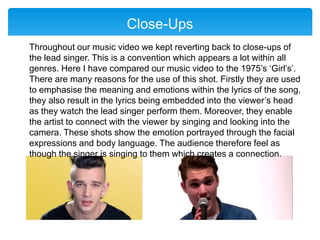
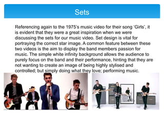
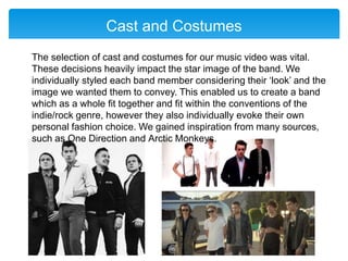
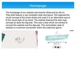
In What Ways Does Your Media
product use, develop or
challenge forms and conventions
of real media products?
Rachel Harrison
What are media forms?
A form is the overall shape of a media product, for example a music
video.
The media form will typically determine:
 The medium that is used, for example a music video is made in
video or film.
 The length of the product, a music video is typically 3-5 minutes
long.
 The content, e.g. a music video would contain a performance,
narrative, lip sync, stylistic elements or a combination.
What are media conventions?
Conventions are the codes that identify what type of media text or
genre it is. These are things that an audience expects from a
particular type of text and also from different types of genre.
For example:
 A western would include horses, deserts, cowboys and
tumbleweed.
 A chat show would include a celebrity presenter and guests.
VIDEO
CAMERA
CONVENTIONS
Tracking Shot
Here I am comparing my music video to 5 seconds of Summer’s
video ‘She looks so perfect’. Towards the end of our music video in
our third set we wanted to add more expressive and free camera
shots. Therefore we set up a tracking shot surrounding the band
while they were performing. These shots add movement to the
image which flows with the pace of the music. This was inspired by
many music videos as it is a very common convention, here I have
compared it with a music video by 5 seconds of Summer’s, ‘She
looks so perfect’. These shots also enable the sets to appear more
dynamic and 3D.
Hand Held
Another section of our music video is based within the recording
studio. This is a very common convention within the indie/rock
genre. We have seen many examples of this in other bands music
video’s such as, The Kooks, Kings of Leon and George Ezra. For
me, George Ezra’s video of ‘Leaving it up to you’ was the most
influential. Within this environment the use of handheld camera is
very common and fitting. The intention for this in our music video
was to make it appear as though the band members were simply
messing about filming on their phones while recording a song. It
enables the viewers to connect with the cast members and it allows
them to showcase their real personalities in a natural environment. It
also gives the audience the idea that they are viewing ‘behind the
scenes’ footage.
Close-Ups
Throughout our music video we kept reverting back to close-ups of
the lead singer. This is a convention which appears a lot within all
genres. Here I have compared our music video to the 1975’s ‘Girl’s’.
There are many reasons for the use of this shot. Firstly they are used
to emphasise the meaning and emotions within the lyrics of the song,
they also result in the lyrics being embedded into the viewer’s head
as they watch the lead singer perform them. Moreover, they enable
the artist to connect with the viewer by singing and looking into the
camera. These shots show the emotion portrayed through the facial
expressions and body language. The audience therefore feel as
though the singer is singing to them which creates a connection.
Mid-Shots
We also featured many mid/wide shots in our video. This enabled the
viewer to see and understand the setting and more importantly the
costumes. The costumes are a very good indicator of the genre.
These shots show the stylised yet simple studio set which is a
common feature within the indie/rock genre. I have compared our
music video again to the 1975’s ‘Girls’. This is evidently one of the
most influential music videos for us.
EDITING
Jump - Cuts
A key element to editing a music video is cutting to the beat. This is
something which appears within all genres. It makes the cuts seem
more seamless. We featured many different editing techniques within
our video, for example jump-cuts. This is an indication of passing
time. It could be considered as discontinuity editing. Here I have
compared the jump-cuts in our music video to the 1975’s ‘Girls’. In
the 1975’s video the jump-cuts show the transition between the girl
band and boy band; however in our music video is suggests the
band members moving around the set being directed by the team.
SYMBOLIC
CONVENTIONS
Sets
Referencing again to the 1975’s music video for their song ‘Girls’, it
is evident that they were a great inspiration when we were
discussing the sets for our music video. Set design is vital for
portraying the correct star image. A common feature between these
two videos is the aim to display the band members passion for
music. The simple white infinity background allows the audience to
purely focus on the band and their performance, hinting that they are
not wanting to create an image of being highly stylised and
controlled; but simply doing what they love; performing music.
Lighting
Lighting can evoke many emotions and change the whole mood and
feel of a music video. Here it shows that we took inspiration from the
1975’s music video for ‘Chocolate.’ In the last set of our music video
we featured expressive and experimental lighting; such as the five
rows of blinders and a neon blue triangle surrounding the drummer.
This lighting compared to the other sets was much more fitting to the
indie/rock genre. In the music video for ‘Chocolate’ similar lighting
was features; however they also included smoke which we didn’t.
Cast and Costumes
The selection of cast and costumes for our music video was vital.
These decisions heavily impact the star image of the band. We
individually styled each band member considering their ‘look’ and the
image we wanted them to convey. This enabled us to create a band
which as a whole fit together and fit within the conventions of the
indie/rock genre, however they also individually evoke their own
personal fashion choice. We gained inspiration from many sources,
such as One Direction and Arctic Monkeys.
DIGI-PAK
Front Cover
From the start we had a clear idea of what we wanted our digi-pak to
look like. We gained a lot of inspiration from artists such as, Kings of
Leon and Blur. We wanted to photograph each band member
individually and cut them together to make one face. We take a
section of each portrait and positioned it carefully to blend with
another members features. We tested out various techniques of how
to each this most effectively before reaching our final design. A
similar concept it portrayed on the front cover of Kings of Leon’s digi-
pak of ‘Only by the Night’. Blur have also portrayed a similar idea;
however they have created a ‘split’ screen effect on their digi-pak
featuring a strong pop art style.
WEBSITE
Homepage
The homepage of our website was heavily influenced by Alt-J’s.
They both feature a very simplistic style and layout. We captured the
visual concept of the brush stroke and used it in an alternative way to
fit the visual style of our band. The website featured the tube map
concept as does the digi-pak. This was a idea which we wanted to
connect the website and the digi-pak. This minimalistic style of
website is a common convention within the indie/rock genre.’
Merchandise
We wanted to feature merchandise on our website available for sale.
This is very common within all music genres and allows the audience
to buy clothing, music and other accessories from the band. We took
initial inspiration from Arctic Monkeys considering what merchandise
to create. I used a website called www.vistaprint.com to design t-
shirts featuring the bands name and logo. I also created some vinyl's
available for sale. This was a simple process of finding an image of a
vinyl on good and adding text to it to support the band.
Logo/Branding
We decided that we wanted to create a logo/branding for our band.
This is common within all genre’s however does not always feature.
We took inspiration from artist's such as ACDC and RUN DMC.
Although our style is visually different we took inspiration considering
the initial concept. We wanted to create a logo which would make the
audience remember the band for. The logo is fairly self explanatory
and describes the name of the band visually. It features an elephant
with elements of a castle. I originally drew this design drawing
inspiration from Google and then scanned it onto my laptop to use
Photoshop to edit it and remove the background.

Evaluation Task 1

  • 1.
    In What WaysDoes Your Media product use, develop or challenge forms and conventions of real media products? Rachel Harrison
  • 2.
    What are mediaforms? A form is the overall shape of a media product, for example a music video. The media form will typically determine:  The medium that is used, for example a music video is made in video or film.  The length of the product, a music video is typically 3-5 minutes long.  The content, e.g. a music video would contain a performance, narrative, lip sync, stylistic elements or a combination.
  • 3.
    What are mediaconventions? Conventions are the codes that identify what type of media text or genre it is. These are things that an audience expects from a particular type of text and also from different types of genre. For example:  A western would include horses, deserts, cowboys and tumbleweed.  A chat show would include a celebrity presenter and guests.
  • 4.
  • 5.
  • 6.
    Tracking Shot Here Iam comparing my music video to 5 seconds of Summer’s video ‘She looks so perfect’. Towards the end of our music video in our third set we wanted to add more expressive and free camera shots. Therefore we set up a tracking shot surrounding the band while they were performing. These shots add movement to the image which flows with the pace of the music. This was inspired by many music videos as it is a very common convention, here I have compared it with a music video by 5 seconds of Summer’s, ‘She looks so perfect’. These shots also enable the sets to appear more dynamic and 3D.
  • 7.
    Hand Held Another sectionof our music video is based within the recording studio. This is a very common convention within the indie/rock genre. We have seen many examples of this in other bands music video’s such as, The Kooks, Kings of Leon and George Ezra. For me, George Ezra’s video of ‘Leaving it up to you’ was the most influential. Within this environment the use of handheld camera is very common and fitting. The intention for this in our music video was to make it appear as though the band members were simply messing about filming on their phones while recording a song. It enables the viewers to connect with the cast members and it allows them to showcase their real personalities in a natural environment. It also gives the audience the idea that they are viewing ‘behind the scenes’ footage.
  • 8.
    Close-Ups Throughout our musicvideo we kept reverting back to close-ups of the lead singer. This is a convention which appears a lot within all genres. Here I have compared our music video to the 1975’s ‘Girl’s’. There are many reasons for the use of this shot. Firstly they are used to emphasise the meaning and emotions within the lyrics of the song, they also result in the lyrics being embedded into the viewer’s head as they watch the lead singer perform them. Moreover, they enable the artist to connect with the viewer by singing and looking into the camera. These shots show the emotion portrayed through the facial expressions and body language. The audience therefore feel as though the singer is singing to them which creates a connection.
  • 9.
    Mid-Shots We also featuredmany mid/wide shots in our video. This enabled the viewer to see and understand the setting and more importantly the costumes. The costumes are a very good indicator of the genre. These shots show the stylised yet simple studio set which is a common feature within the indie/rock genre. I have compared our music video again to the 1975’s ‘Girls’. This is evidently one of the most influential music videos for us.
  • 10.
  • 11.
    Jump - Cuts Akey element to editing a music video is cutting to the beat. This is something which appears within all genres. It makes the cuts seem more seamless. We featured many different editing techniques within our video, for example jump-cuts. This is an indication of passing time. It could be considered as discontinuity editing. Here I have compared the jump-cuts in our music video to the 1975’s ‘Girls’. In the 1975’s video the jump-cuts show the transition between the girl band and boy band; however in our music video is suggests the band members moving around the set being directed by the team.
  • 12.
  • 13.
    Sets Referencing again tothe 1975’s music video for their song ‘Girls’, it is evident that they were a great inspiration when we were discussing the sets for our music video. Set design is vital for portraying the correct star image. A common feature between these two videos is the aim to display the band members passion for music. The simple white infinity background allows the audience to purely focus on the band and their performance, hinting that they are not wanting to create an image of being highly stylised and controlled; but simply doing what they love; performing music.
  • 14.
    Lighting Lighting can evokemany emotions and change the whole mood and feel of a music video. Here it shows that we took inspiration from the 1975’s music video for ‘Chocolate.’ In the last set of our music video we featured expressive and experimental lighting; such as the five rows of blinders and a neon blue triangle surrounding the drummer. This lighting compared to the other sets was much more fitting to the indie/rock genre. In the music video for ‘Chocolate’ similar lighting was features; however they also included smoke which we didn’t.
  • 15.
    Cast and Costumes Theselection of cast and costumes for our music video was vital. These decisions heavily impact the star image of the band. We individually styled each band member considering their ‘look’ and the image we wanted them to convey. This enabled us to create a band which as a whole fit together and fit within the conventions of the indie/rock genre, however they also individually evoke their own personal fashion choice. We gained inspiration from many sources, such as One Direction and Arctic Monkeys.
  • 16.
  • 17.
    Front Cover From thestart we had a clear idea of what we wanted our digi-pak to look like. We gained a lot of inspiration from artists such as, Kings of Leon and Blur. We wanted to photograph each band member individually and cut them together to make one face. We take a section of each portrait and positioned it carefully to blend with another members features. We tested out various techniques of how to each this most effectively before reaching our final design. A similar concept it portrayed on the front cover of Kings of Leon’s digi- pak of ‘Only by the Night’. Blur have also portrayed a similar idea; however they have created a ‘split’ screen effect on their digi-pak featuring a strong pop art style.
  • 18.
  • 19.
    Homepage The homepage ofour website was heavily influenced by Alt-J’s. They both feature a very simplistic style and layout. We captured the visual concept of the brush stroke and used it in an alternative way to fit the visual style of our band. The website featured the tube map concept as does the digi-pak. This was a idea which we wanted to connect the website and the digi-pak. This minimalistic style of website is a common convention within the indie/rock genre.’
  • 20.
    Merchandise We wanted tofeature merchandise on our website available for sale. This is very common within all music genres and allows the audience to buy clothing, music and other accessories from the band. We took initial inspiration from Arctic Monkeys considering what merchandise to create. I used a website called www.vistaprint.com to design t- shirts featuring the bands name and logo. I also created some vinyl's available for sale. This was a simple process of finding an image of a vinyl on good and adding text to it to support the band.
  • 21.
    Logo/Branding We decided thatwe wanted to create a logo/branding for our band. This is common within all genre’s however does not always feature. We took inspiration from artist's such as ACDC and RUN DMC. Although our style is visually different we took inspiration considering the initial concept. We wanted to create a logo which would make the audience remember the band for. The logo is fairly self explanatory and describes the name of the band visually. It features an elephant with elements of a castle. I originally drew this design drawing inspiration from Google and then scanned it onto my laptop to use Photoshop to edit it and remove the background.