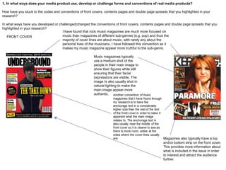
1. In what ways does your media product use, develop or challenge forms and conventions of real media products?
How have you stuck to the codes and conventions of front covers, contents pages and double page spreads that you highlighted in your
research?
In what ways have you developed or challenged/changed the conventions of front covers, contents pages and double page spreads that you
highlighted in your research?
FRONT COVER
Music magazines typically
use a medium shot of the
people in their main image to
show their figures while still
ensuring that their facial
expressions are visible. The
image Is also usually shot in
natural lighting to make the
main image appear more
authentic.
Magazines also typically have a top
and/or bottom strip on the front cover.
This provides more information about
what is included in the issue in order
to interest and attract the audience
further.
I have found that rock music magazines are much more focused on
music than magazines of different sub-genres (e.g. pop) and thus the
majority of cover lines are about music, with rarely any about the
personal lives of the musicians. I have followed this convention as it
makes my music magazine appear more truthful to the sub-genre.
1. In what ways does your media product use, develop or challenge forms and conventions of real media products?
How have you stuck to the codes and conventions of front covers, contents pages and double page spreads that you highlighted in your
research?
In what ways have you developed or challenged/changed the conventions of front covers, contents pages and double page spreads that you
highlighted in your research?
From my research into front covers of music
magazines I have found that it is a common
convention for them to have their masthead at
the very top of the page and to have their main
image overlap it. I decided to follow this
convention but as this is the first issue of my
music magazine I ensured that the main image
did not overlap the masthead too much so it is
still legible and recognisable for my audience. I
also decided to use a bold font for my masthead
in order to recreate the dynamic look that similar
magazines of the rock genre adopt.
1. In what ways does your media product use, develop or challenge forms and conventions of real media products?
How have you stuck to the codes and conventions of front covers, contents pages and double page spreads that you highlighted in your
research?
In what ways have you developed or challenged/changed the conventions of front covers, contents pages and double page spreads that you
highlighted in your research?
CONTENTS PAGE
A convention of music magazines I
have found through my research is
to have an image which dominates
the page, with a page number next
to it to help the readers locate the
article associated with it. I have
followed this convention as it attract
the audience’s attention to the article
which relates to the image.
From looking at my style models I have
found that they usually have their
articles separated by type under
subheadings with page references
alongside them. I have followed this as
it makes the contents page appear
more organised and aids readers to find
what they are looking for.
I have included the date of the issue
along with the issue number as I
have found, through looking at my
style models, this is a commonly
used by music magazines in order to
make the magazine appear
professional and firmly establish
which issue the magazine is.
I chose to follow the convention of
having a consistent house style
by using the colour scheme
included on my front cover on my
contents page as well. I have
done this as it makes the
magazine more appealing to my
audience as it features colours
reflecting the genre of rock music.
Magazines will usually include a caption
with an image which describes what the
figure(s) are doing. Through looking at
my style models I have found that in rock
music magazines they are often informal
and quite humorous in order to reflect
the relaxed manner of the genre.
Another convention of
magazines that I have found
is to include an anchor next
to an image which credits the
photographer on the majority
of images featured in the
magazine (excluding the
main image on the front
cover).
Magazines usually have a note from the editor
on the contents page alongside a picture of the
editor. I have followed this convention as I feel it
establishes a relationship between the reader
and the magazine, something which is vital in
order to have a dedicated audience. This is
especially important as this is the first issue of
my music magazine. The inclusion of an
additional picture on the contents page also
makes it seem more interesting to my audience
as it is not all text and so stimulates them
visually.
I have also found that it is a
common convention of music
magazines to have the title of the
contents page in the same font as
the masthead on the front cover. I
have followed this convention as it
provides a sense of familiarity within
the magazine which will aid in
attracting my audience.
1. In what ways does your media product use, develop or challenge forms and conventions of real media products?
How have you stuck to the codes and conventions of front covers, contents pages and double page spreads that you highlighted in your
research?
In what ways have you developed or challenged/changed the conventions of front covers, contents pages and double page spreads that you
highlighted in your research?
DOUBLE PAGE SPREAD
Like in a contents page, an image
usually dominates the double page
spread, however this is more extreme as
the image is more prominent than in any
other page as it typically takes over half
of the double page spread. I have
followed this convention by having my
image take over an entire page as this
brings the audience's attention to the
double page spread and thus they will
be more interested in it.
I have chosen to follow the
convention of including a stand
first under the title of my double
page spread as I have found
that many magazines do this to
briefly explain what the article is
about to the reader in order to
interest them into reading it.
Magazines usually include a pull quote
on a double page spread. This grabs
the reader’s attention as the quote is
often something interesting that the
featured musicians have said and also
relates to the focus of the article.
In the majority of double pages spreads I
have looked at, the colour scheme is much
more restricted than the rest of the
magazine. This brings the focus more onto
the article. I have followed this convention
by slightly drifting from my house style and
not using the colour yellow on my double
page spread as I felt this was to bright a
colour. The exclusion of this colour makes
my double page spread appear more
serious and professional.
1. In what ways does your media product use, develop or challenge forms and conventions of real media products?
How have you stuck to the codes and conventions of front covers, contents pages and double page spreads that you highlighted in your
research?
In what ways have you developed or challenged/changed the conventions of front covers, contents pages and double page spreads that you
highlighted in your research?
From looking at my style models, I have found that most
magazines will usually have the copy of their double page
spread in a black or white font on a contrasting coloured
background in order to make it stand out and so it
appears professional. I have chosen to have my copy in a
white font on a black background as I feel this will seem
more attractive to my audience.
As with every other page in a magazine,
page numbers are commonly included in
a double page spread. I have followed
this convention and have also included
the name of my magazine next to it in
order to make my magazine familiar to
my audience, this is particularly
important as this is the first issue of my
magazine and thus the first time my
audience will be reading it.
It is a convention of magazines to
have the copy of their articles
organised into columns. I have
chosen to follow this convention by
having my copy organised into
three columns as this makes my
magazine appear more authentic
and professional.
Through my research into music magazines,
I have found that it is a common convention
for them to include the name of the artist or
band being featured in the double page
spread, especially if they are a relatively
unknown band. I have followed this
convention as it lets my audience know
exactly who the band in my double page
spread are, which is useful as they are quite
new and yet to receive much recognition.

Question 1

  • 1.
    1. In whatways does your media product use, develop or challenge forms and conventions of real media products? How have you stuck to the codes and conventions of front covers, contents pages and double page spreads that you highlighted in your research? In what ways have you developed or challenged/changed the conventions of front covers, contents pages and double page spreads that you highlighted in your research? FRONT COVER Music magazines typically use a medium shot of the people in their main image to show their figures while still ensuring that their facial expressions are visible. The image Is also usually shot in natural lighting to make the main image appear more authentic. Magazines also typically have a top and/or bottom strip on the front cover. This provides more information about what is included in the issue in order to interest and attract the audience further. I have found that rock music magazines are much more focused on music than magazines of different sub-genres (e.g. pop) and thus the majority of cover lines are about music, with rarely any about the personal lives of the musicians. I have followed this convention as it makes my music magazine appear more truthful to the sub-genre.
  • 2.
    1. In whatways does your media product use, develop or challenge forms and conventions of real media products? How have you stuck to the codes and conventions of front covers, contents pages and double page spreads that you highlighted in your research? In what ways have you developed or challenged/changed the conventions of front covers, contents pages and double page spreads that you highlighted in your research? From my research into front covers of music magazines I have found that it is a common convention for them to have their masthead at the very top of the page and to have their main image overlap it. I decided to follow this convention but as this is the first issue of my music magazine I ensured that the main image did not overlap the masthead too much so it is still legible and recognisable for my audience. I also decided to use a bold font for my masthead in order to recreate the dynamic look that similar magazines of the rock genre adopt.
  • 3.
    1. In whatways does your media product use, develop or challenge forms and conventions of real media products? How have you stuck to the codes and conventions of front covers, contents pages and double page spreads that you highlighted in your research? In what ways have you developed or challenged/changed the conventions of front covers, contents pages and double page spreads that you highlighted in your research? CONTENTS PAGE A convention of music magazines I have found through my research is to have an image which dominates the page, with a page number next to it to help the readers locate the article associated with it. I have followed this convention as it attract the audience’s attention to the article which relates to the image. From looking at my style models I have found that they usually have their articles separated by type under subheadings with page references alongside them. I have followed this as it makes the contents page appear more organised and aids readers to find what they are looking for. I have included the date of the issue along with the issue number as I have found, through looking at my style models, this is a commonly used by music magazines in order to make the magazine appear professional and firmly establish which issue the magazine is. I chose to follow the convention of having a consistent house style by using the colour scheme included on my front cover on my contents page as well. I have done this as it makes the magazine more appealing to my audience as it features colours reflecting the genre of rock music.
  • 4.
    Magazines will usuallyinclude a caption with an image which describes what the figure(s) are doing. Through looking at my style models I have found that in rock music magazines they are often informal and quite humorous in order to reflect the relaxed manner of the genre. Another convention of magazines that I have found is to include an anchor next to an image which credits the photographer on the majority of images featured in the magazine (excluding the main image on the front cover). Magazines usually have a note from the editor on the contents page alongside a picture of the editor. I have followed this convention as I feel it establishes a relationship between the reader and the magazine, something which is vital in order to have a dedicated audience. This is especially important as this is the first issue of my music magazine. The inclusion of an additional picture on the contents page also makes it seem more interesting to my audience as it is not all text and so stimulates them visually. I have also found that it is a common convention of music magazines to have the title of the contents page in the same font as the masthead on the front cover. I have followed this convention as it provides a sense of familiarity within the magazine which will aid in attracting my audience. 1. In what ways does your media product use, develop or challenge forms and conventions of real media products? How have you stuck to the codes and conventions of front covers, contents pages and double page spreads that you highlighted in your research? In what ways have you developed or challenged/changed the conventions of front covers, contents pages and double page spreads that you highlighted in your research?
  • 5.
    1. In whatways does your media product use, develop or challenge forms and conventions of real media products? How have you stuck to the codes and conventions of front covers, contents pages and double page spreads that you highlighted in your research? In what ways have you developed or challenged/changed the conventions of front covers, contents pages and double page spreads that you highlighted in your research? DOUBLE PAGE SPREAD Like in a contents page, an image usually dominates the double page spread, however this is more extreme as the image is more prominent than in any other page as it typically takes over half of the double page spread. I have followed this convention by having my image take over an entire page as this brings the audience's attention to the double page spread and thus they will be more interested in it. I have chosen to follow the convention of including a stand first under the title of my double page spread as I have found that many magazines do this to briefly explain what the article is about to the reader in order to interest them into reading it. Magazines usually include a pull quote on a double page spread. This grabs the reader’s attention as the quote is often something interesting that the featured musicians have said and also relates to the focus of the article. In the majority of double pages spreads I have looked at, the colour scheme is much more restricted than the rest of the magazine. This brings the focus more onto the article. I have followed this convention by slightly drifting from my house style and not using the colour yellow on my double page spread as I felt this was to bright a colour. The exclusion of this colour makes my double page spread appear more serious and professional.
  • 6.
    1. In whatways does your media product use, develop or challenge forms and conventions of real media products? How have you stuck to the codes and conventions of front covers, contents pages and double page spreads that you highlighted in your research? In what ways have you developed or challenged/changed the conventions of front covers, contents pages and double page spreads that you highlighted in your research? From looking at my style models, I have found that most magazines will usually have the copy of their double page spread in a black or white font on a contrasting coloured background in order to make it stand out and so it appears professional. I have chosen to have my copy in a white font on a black background as I feel this will seem more attractive to my audience. As with every other page in a magazine, page numbers are commonly included in a double page spread. I have followed this convention and have also included the name of my magazine next to it in order to make my magazine familiar to my audience, this is particularly important as this is the first issue of my magazine and thus the first time my audience will be reading it. It is a convention of magazines to have the copy of their articles organised into columns. I have chosen to follow this convention by having my copy organised into three columns as this makes my magazine appear more authentic and professional. Through my research into music magazines, I have found that it is a common convention for them to include the name of the artist or band being featured in the double page spread, especially if they are a relatively unknown band. I have followed this convention as it lets my audience know exactly who the band in my double page spread are, which is useful as they are quite new and yet to receive much recognition.
  • 7.
    1. In whatways does your media product use, develop or challenge forms and conventions of real media products? How have you stuck to the codes and conventions of front covers, contents pages and double page spreads that you highlighted in your research? In what ways have you developed or challenged/changed the conventions of front covers, contents pages and double page spreads that you highlighted in your research? From looking at my style models, I have found that most magazines will usually have the copy of their double page spread in a black or white font on a contrasting coloured background in order to make it stand out and so it appears professional. I have chosen to have my copy in a white font on a black background as I feel this will seem more attractive to my audience. As with every other page in a magazine, page numbers are commonly included in a double page spread. I have followed this convention and have also included the name of my magazine next to it in order to make my magazine familiar to my audience, this is particularly important as this is the first issue of my magazine and thus the first time my audience will be reading it. It is a convention of magazines to have the copy of their articles organised into columns. I have chosen to follow this convention by having my copy organised into three columns as this makes my magazine appear more authentic and professional. Through my research into music magazines, I have found that it is a common convention for them to include the name of the artist or band being featured in the double page spread, especially if they are a relatively unknown band. I have followed this convention as it lets my audience know exactly who the band in my double page spread are, which is useful as they are quite new and yet to receive much recognition.